Robomart: driverless grocery at your door

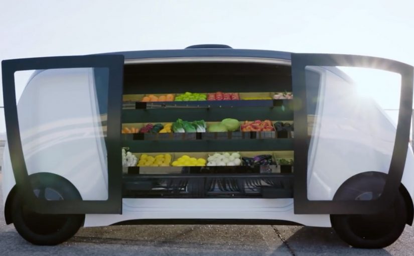
A mobile grocery store pulls up outside your door. You unlock it with a code, step up to the vehicle, pick what you want from everyday items and meal kits, and you are done. This spring, Robomart, a California-based company, teams up with grocery chain Stop & Shop to trial what it positions as a driverless grocery store service in Boston, Massachusetts.

What Robomart is solving in grocery

Grocery is often described as a roughly $1 trillion market, yet only a small fraction of spend moves online. Two frictions dominate. On-demand delivery is expensive for retailers to fund sustainably. And for many shoppers, the moment that matters is still the same: picking your own food.

How the Robomart experience works

The flow is designed to feel like the convenience of the old door-to-door model, updated with autonomous tech.

  1. You summon the mobile store using a mobile app.
  2. When it arrives outside your door, you enter a code to unlock the doors.
  3. You grab what you want from the on-board selection of everyday items and meal kits.

In this post, “driverless” is shorthand for a self-serve visit where the customer interaction is handled by software, not a human driver at the door.

In US metro areas where time-poor households do quick top-up shops, a curbside micro-store can trade delivery labor for self-serve convenience.

Why the code-unlock handoff feels trustworthy

The mechanism is simple: you physically see the inventory, you choose the exact item, and you only open what you are entitled to via an authenticated code. Because the handoff is “pick it yourself” instead of “accept a substitution,” the model reduces the trust and quality anxiety that makes grocery delivery feel risky for fresh and high-preference items.

Extractable takeaway: If you want on-demand convenience without paying full delivery labor, move the last meter of work back to the shopper, but keep the moment of choice in their hands.

The bigger pattern: autonomy scales door-to-door retail

For decades, consumers have enjoyed the convenience of a local greengrocer, milkman, or ice-cream vendor coming door to door. It rarely makes economic sense to scale. The claim here is that autonomous driving changes the cost equation enough to make the model viable at scale. The vehicle becomes a moving retail shelf, and the app becomes the “front door” that controls access and payment.

This model succeeds when autonomy removes labor cost, while shopper control stays high on selection, timing, and authentication.

For digital and retail leaders, the key design move is the same across variants. Make the pickup moment fast, self-serve, and verifiably secure. The rest is unit economics, route density, and replenishment discipline.

A second proof point: Nuro and Kroger’s autonomous lockers

A similar model shows up in summer 2018, when Nuro teams up with supermarket giant Kroger for autonomous grocery delivery in Scottsdale, Arizona. The mechanics differ. It is not a roaming mini-store. It is pre-picked orders loaded into secure lockers. But the handoff is the same. A code unlocks your groceries.

  • Customers place an order with Kroger via a smartphone app.
  • Staff load the autonomous pod’s secure lockers with the customer order at the depot.
  • When the “R1” autonomous delivery pod arrives, the customer enters a code to open the locker and access their groceries.

The two examples illustrate a useful split. Robomart maximizes shopper choice at the vehicle. Nuro and Kroger maximize efficiency by pre-picking, then making the handoff secure and low-touch.

What to steal for retail and CX teams

  • Design for viewer control at the moment of choice. If customers cannot see and select, they will demand tighter guarantees on substitutions, freshness, and refunds.
  • Make access visibly secure. Code-based access is not just a security control. It is a trust signal that “this is yours” and that the inventory is protected.
  • Keep the interaction time-boxed. The value proposition collapses if a “2-minute pickup” becomes a 10-minute browse, and route plans start to break.
  • Instrument the handoff, not just the app. Track unlock success, dwell time, abandoned sessions, and replenishment accuracy. That is where the model wins or dies.
  • Decide what you are scaling. If you scale choice, accept more on-vehicle assortment and replenishment complexity. If you scale efficiency, accept more pre-pick labor and substitution policy.

A few fast answers before you act

What is Robomart, in this post?

A “store on wheels” experience you summon via app, then unlock with a code so you can pick items directly from the vehicle.

Where does the Stop & Shop trial take place?

Boston, Massachusetts.

Why has grocery been slow to move online?

Retailers struggle to fund on-demand delivery economics, and many consumers prefer to pick their own food, especially for fresh and high-preference items.

What is the comparable example mentioned?

Nuro and Kroger’s autonomous grocery delivery service in Scottsdale, Arizona, using secure lockers opened by code on an “R1” pod.

What has to be true for this model to scale?

High route density, fast and reliable unlock-and-pickup flows, disciplined replenishment, and clear policies for availability, substitutions, and refunds.

Mercedes-Benz: Yes, A.I. Do

For the world premiere of their new Mercedes-Benz EQC at CES 2019 in Las Vegas, Mercedes transformed their new model into a wedding carriage. Four lucky couples were invited to test drive the new Mercedes-Benz EQC on the roads of Las Vegas and experience its special A.I. features first hand. In this context, “A.I. features” refers to the in-car intelligent functions Mercedes chose to demonstrate during the drive.

The real question is how you make a new, tech-heavy product feel experienceable in minutes, not explainable in slides.

Why this launch twist works

By wrapping a CES tech premiere in a wedding ritual and putting couples behind the wheel, Mercedes turns abstract capability into visible behavior. The ritual creates instant stakes and attention, so the A.I. moments are noticed as part of a real drive, not as claims.

Extractable takeaway: If your features are hard to describe, borrow a human ritual people already recognize so the experience carries the technology.

  • It turns a product reveal into a story. A “wedding carriage” reframes a tech premiere into an experience people immediately understand.
  • It makes A.I. tangible. Instead of describing features on a stage, it puts them into a real drive where reactions matter.
  • It earns attention without shouting. The setup is unusual enough to travel, while still keeping the car at the center.

In consumer-tech and automotive launches where attention is fragmented and skepticism is high, familiar rituals help audiences grasp “what is happening” before they judge “what it does”.

Steal the ritual frame for launches

Wrap a launch moment in a simple, human ritual. Then invite a small group to experience the product in-context so the story carries the technology, not the other way around.

  • Pick a ritual that already means something. Use a simple human frame to make the launch instantly legible.
  • Let real use do the persuading. Put the product into an in-context experience so reactions carry more weight than narration.
  • Keep the product as the stage. The theme should guide attention toward the product experience, not away from it.

A few fast answers before you act

What happened in the Mercedes-Benz “Yes, A.I. Do” activation?

For CES 2019 in Las Vegas, Mercedes used the EQC premiere as a wedding-carriage themed experience and invited four couples to test drive the car and experience its A.I. features first hand.

Why use couples and a wedding theme for a car launch?

It creates an instantly recognizable narrative frame, which makes the activation easier to remember and easier to share than a standard demo.

What is the main takeaway for product launches?

Give the viewer a clear story hook, then let the product prove itself through a real experience rather than through claims.

How do you keep a stunt from overshadowing the product?

Make the product the “stage”. The theme should guide attention toward the experience of the product, not away from it.

Jaguar launches in-car cashless fuel payment

Drive up to a Shell pump. Choose your fuel amount on the car’s touchscreen. Pay without leaving the seat. In a world-first, Jaguar and Land Rover owners can pay for fuel via the touchscreen of their car at Shell service stations. Rather than paying at the pump or queuing to pay in the shop, installing the Shell app via InControl means drivers can drive up to a pump at participating Shell service stations, select how much fuel they require, and pay with PayPal or Apple Pay on the vehicle’s touchscreen.

For more details see Jaguar’s announcement.

Why this matters beyond fuel

This is not really a “payments innovation” story. It is a friction story. The value comes from removing context switching, meaning the driver does not have to break the refuelling task to pull out a phone, walk to the shop, and re-authenticate. No wallet. No phone. No queue. By keeping selection and payment inside the in-car interface, the flow reduces both steps and “did it work” anxiety, which is why it feels meaningfully faster. This is the right direction for in-car commerce, but only if station and pump identification are unambiguous and receipts are immediate. In connected-vehicle ecosystems where multiple brands share the same moment, the primary interface should own the transaction at the point of need.

Extractable takeaway: Collapse checkout into the moment of intent inside the primary interface, and the “innovation” will be felt as time and effort saved.

It moves checkout into the moment of intent

The moment you decide to refuel is the moment you can complete the transaction. That reduces drop-off, reduces effort, and makes the experience feel modern without changing the core product.

It turns the car into a commerce surface

Once the dashboard becomes a trusted place to authenticate and pay, the opportunity expands to other “on-the-go” services where drivers normally step out, wait, or juggle devices. A commerce surface is any interface that can identify the context, confirm the choice, and take payment without switching devices.

It is a clean example of partner-led experience design

Jaguar provides the in-car platform. Shell provides the forecourt context and operational integration. The user experiences it as one flow, not two brands handing off a task.

The real question is whether your primary interface can complete payment at the exact moment intent forms, without sending people into a separate device, screen, or queue.

The reusable pattern

  1. Embed the action where the context already is. Put the transaction inside the primary interface, not a separate detour.
  2. Keep the flow short and explicit. Select, confirm, pay, receipt. Anything more breaks the promise.
  3. Design for trust signals. Clear station identification, clear confirmation, and a clear receipt reduce “did it work” anxiety.
  4. Make the benefit obvious in one sentence. “Pay from your car” is enough. The value is immediate.

What to measure beyond views

  • Adoption. Percentage of eligible drivers who activate the in-car payment feature.
  • Repeat usage. Whether people use it again after the first try.
  • Time saved. Reduction in “fuel stop duration” compared with paying in-store.
  • Experience confidence. Drop-off rates between selecting the pump and confirming payment.

Guardrails to steal for in-car checkout

  • False positives. The system must reliably know which station and which pump the driver is using.
  • Failure recovery. If payment fails, the user needs a clear next step that does not create embarrassment at the pump.
  • Trust. Drivers need clear confirmation, receipts, and predictable behavior every time.

A few fast answers before you act

What is Jaguar’s in-car cashless fuel payment?

A Shell fuel payment flow that lets Jaguar and Land Rover drivers select an amount and pay from the vehicle touchscreen via the Shell app in InControl.

What problem does it solve?

It removes the need to pay at the pump or queue inside the shop. The entire task completes from the car.

What is the core mechanism?

A contextual in-car experience that links the driver, the station, and the payment method into one short flow.

What is the most reusable lesson?

Move checkout into the moment of intent inside the primary interface. Then keep the steps minimal and confidence high.

What is the biggest failure mode?

Any ambiguity about station or pump, or any unclear “did I pay” outcome. Trust collapses fast in payments.