
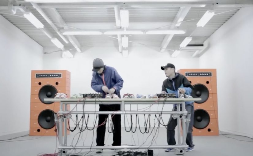
Nike: Music Shoes

Shoes as we know it are never going to be the same again. Nike has just come up with the first of its kind music shoes!

Here is a short video showing how the shoes were made…

This is the final Nike Music Shoes ad…

Why this idea feels like a shift

The shoes are not styled as fashion first. They are staged as an instrument. They are also staged as an interface. Here, “interface” means the shoe becomes a control surface that converts movement into sound. That reframing matters because it turns product into performance. Because the movement-to-sound mapping is immediate, the audience can grasp the idea without extra explanation. In global consumer marketing, proof-led product storytelling like this tends to travel further than style-led messaging. You do not watch someone wear them. You watch someone play them.

Extractable takeaway: When you introduce a new interaction, show the input and output in the same moment, so belief is earned through observable cause and effect, not claims.

  • Product becomes interface. Movement is translated into sound, which makes the shoe feel “alive”.
  • Proof in the making. The build film adds credibility and curiosity before the final creative payoff.
  • Shareable demonstration. People want to show others because the concept is easiest to understand when you see it.

What to learn from the two-video structure

Pairing a “how it was made” film with the final ad is a smart sequencing move. First you earn belief. Then you deliver the spectacle. In innovation storytelling, that order often performs better than going straight to the hero spot. The real question is whether your innovation needs a proof chapter before you ask people to share it. For novel product behaviors, lead with proof, then pay off with spectacle.

  • Earn belief first. Let the making-of do the minimum explanation needed for “this could be real”.
  • Then stage the performance. Use the final ad as the payoff where the product is “played”, not described.
  • Keep it demo-able. If a viewer cannot retell it after one watch, it will not travel.

A few fast answers before you act

What are Nike “Music Shoes”?

They are a concept where the shoe is treated like a musical instrument, translating movement into sound to create music through performance.

Why include a making-of film as well as the final ad?

The build film establishes credibility and explains just enough to make the final ad feel possible, not magical.

What is the core creative pattern here?

Turn a product into an interface, then let a live-style demonstration carry the message without heavy explanation.

How can brands reuse this idea without copying it?

Identify one product behavior you can translate into a new medium, then show both the “proof” and the “performance” as two linked chapters.
Magic Tee: Augmented Reality Kids Clothing

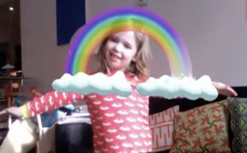
No one likes getting dressed in the morning. It is routine and usually boring. Magic Tee flips that by making clothes feel alive. Put the T-shirt on, stand in front of a webcam, and the print becomes an interactive animation that responds to the child’s movement.

It is described as the first piece of children’s clothing to incorporate augmented reality in this way, designed and developed by creative agency Brothers and Sisters for kidswear brand Brights & Stripes.

How a T-shirt becomes a screen

The mechanism is straightforward. The T-shirt print is designed so a webcam can recognize it reliably, then align a 3D animation to the child’s torso on-screen. When the child moves, the animation moves with them, so the shirt feels like a trigger for a small story rather than a static graphic.

Augmented reality kids clothing, in this context, is apparel whose printed design can be recognized by a camera so digital characters and effects can be layered onto the garment and react to the wearer’s motion.

In consumer brands looking to fuse physical products with digital play, this kind of camera-triggered interaction is a simple way to turn ownership into an experience.

Why this lands with kids and parents

For kids, the reward is immediate. Movement creates feedback, so the child quickly learns that they control what happens. That sense of viewer control is what turns novelty into repeat use.

Extractable takeaway: If you want repeat engagement, tie the reward loop to the user’s movement. Fast feedback turns “try once” into “play again.”

For parents, the concept reframes clothing from “something you have to put on” into “something that starts play.” It also creates a natural share moment because the experience is easiest to show when someone is watching the screen with you.

What the brand is really doing

The real question is whether you can make the product itself the interface, so the experience earns repeat attention inside a routine.

On paper, it is an AR stunt. In practice, it is a product differentiation play. The shirt becomes a conversation piece, and the brand earns a place in the child’s routine through interaction rather than purely through design.

It also sets up a longer runway. If the platform exists, new prints can unlock new animations, which turns a clothing line into a renewable content system.

Steal the pattern: product-triggered play

  • Make the trigger physical. When the product starts the experience, engagement feels earned.
  • Keep the first win fast. The first 10 seconds should produce a visible reaction.
  • Design for repeat play. Add simple variation so it does not feel “seen once.”
  • Build a shareable moment. Parents share outcomes, not features. Give them an outcome.

A few fast answers before you act

What is the core idea of Magic Tee?

A children’s T-shirt that acts as a trigger for an on-screen AR animation. A webcam recognizes the print and overlays moving characters that respond to the child’s motion.

Is this mobile AR or webcam-based AR?

As described in the campaign write-ups, it is webcam-based. The interaction happens when the child stands in front of a computer camera and sees the augmented layer on screen.

Why use clothing as the marker instead of a card or poster?

Because the marker is worn. That makes the experience personal, repeatable, and closely tied to identity and play.

What makes interactive apparel feel “not gimmicky”?

Speed and reliability. If recognition is instant and the animation responds smoothly to movement, the experience feels like play. If setup is slow, it feels like tech.

What is the most transferable lesson for marketers?

Turn the product into the interface. When the item in the basket is also the trigger for the experience, you get differentiation and word of mouth without adding more media.

Google Goggles: Translate Text in Photos

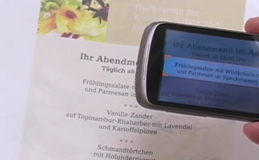
A user takes a photo of text with an Android device, and Google Goggles translates the text in the photo in a fraction of a second.

It uses Google’s machine translation plus image recognition to add a useful layer of context on top of what the camera sees.

Right now, it supports German-to-English translations.

What Google Goggles is really doing here

This is not “just translation.” It is camera-based understanding. The app recognises text inside an image, then runs it through machine translation so the result appears immediately as usable meaning.

In everyday travel and commerce, camera-first translation removes friction at the exact moment that text blocks action. By camera-first translation, I mean pointing a phone at printed text and getting a translated overlay instantly in the same view. Because the result appears in place, people do not have to retype or switch apps, which is why it feels immediate.

In European travel and retail settings, camera-first translation turns printed text into immediate, actionable guidance.

The real question is whether your interface can turn raw capture into meaning without making users switch contexts.

This is the kind of feature worth shipping because it removes friction exactly where action stalls.

Why this matters in everyday moments

If the camera becomes a translator, a lot of friction disappears in situations where text blocks action. Think menus, signs, instructions, tickets, posters, and product labels. The moment you can translate what you see, the environment becomes more navigable.

Extractable takeaway: When you translate what people see in the same view they are already using, you turn blocked moments into forward motion.

The constraint that limits the experience today

Language coverage determines usefulness. At the moment the feature only supports German-to-English, which is a strong proof point but still a narrow slice of what people want in real life.

The obvious next step

I can’t wait to see the day when Google comes up with a real-time voice translation device. At that point, we will never need to learn another language.

What to copy from camera-first translation

  • Remove friction at the moment of intent. Translate or explain text exactly when it blocks action, not after users detour into search.
  • Keep meaning in the same view. Overlay the translation in-place so people stay oriented and do not have to retype or switch contexts.
  • Expand coverage before polishing edges. Language breadth determines usefulness more than UI refinements.

A few fast answers before you act

What does Google Goggles do in this example?

It translates text inside a photo taken from an Android device, using machine translation and image recognition.

How fast is the translation described to be?

It translates the text in a fraction of a second.

Which language pair is supported right now?

German-to-English.

What is the bigger idea behind this feature?

An additional layer of useful context on top of what the camera sees.

What next-step capability is called out?

Real-time voice translation.