Rise of the Machines: Siri and Quadrotors

Here are two videos (fictional and real) that create the same feeling. A Skynet reality does not seem too far away.

Two clips, one unsettling takeaway

One is a short parody where a voice assistant turns from helpful to threatening. The other is a real lab demo where tiny quadrotors fly as a coordinated swarm. Put them next to each other and the “machines are getting clever” idea stops being a movie line and starts feeling like a trajectory.

Fiction, then engineering
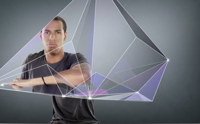
Psycho Siri

Andrew Films USA delivers a compact piece of sci-fi anxiety. Siri is framed as familiar, then reframed as unpredictable, with polished visual effects that make the escalation feel plausible.

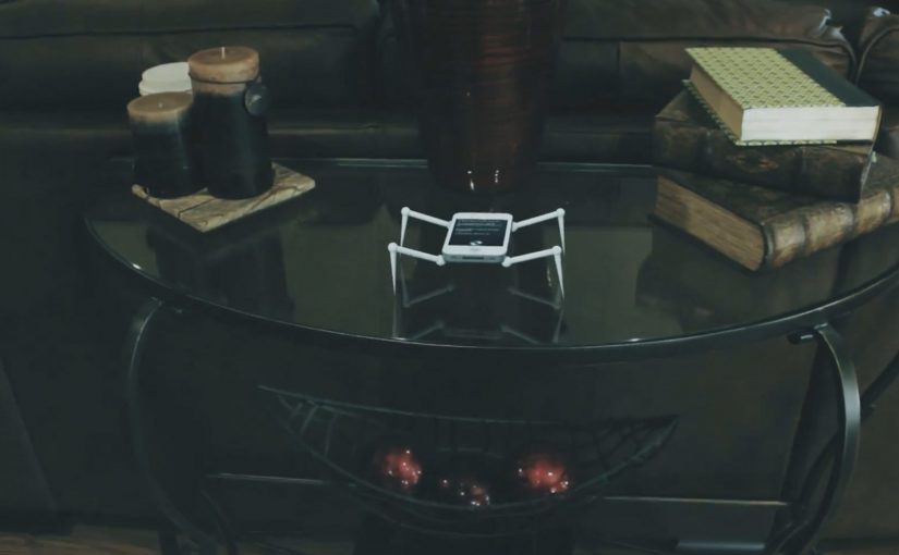
A swarm of Nano Quadrotors

GRASP Lab at the University of Pennsylvania shows coordinated micro flight with a team of nano quadrotors, presented as experiments in swarm behavior and formation control. The choreography is the point. It looks like one organism, not many small machines.

Here, “swarm behavior” means several machines coordinating as one system rather than acting as isolated units.

In consumer technology and robotics, capabilities move from demo to everyday life faster than most people update their mental models.

The real question is not whether machines look intelligent, but whether people can understand, predict, and control what they do.

Why it lands: the same story from two directions

Parody works because it exaggerates a fear people already carry. When the “assistant” becomes the aggressor, the joke is that the interface you trust most is the one you cannot physically switch off in the moment.

Extractable takeaway: When technology feels “sudden”, it is often because interface adoption outpaces public understanding of the underlying capability. Brands and product teams win trust by making capabilities legible, bounded, and explainable before they become ambient.

The swarm demo lands for the opposite reason. It is not exaggerated. It is controlled, repeatable engineering that still feels uncanny because coordination at that scale used to belong to animation.

Smart systems should earn trust through visible boundaries and user control, not spectacle alone.

What to steal if you build products around “smart” systems

  • Show constraints, not just power: users relax when they understand what the system cannot do.
  • Design for graceful failure: surprise is fun in demos, but costly in daily use.
  • Make control obvious: clear opt-outs and visible states reduce anxiety.
  • Translate capability into plain language: the best trust-building copy explains behavior, not architecture.

A few fast answers before you act

What is the point of pairing these two videos?

They tell the same story from different angles. One is cultural fear through fiction. The other is real capability through engineering. Together they make the “Skynet” feeling emotionally credible.

What makes swarm robotics feel unsettling to non-experts?

Coordination. Many small machines behaving like one system reads as intelligence, even when it is pre-programmed control and sensing.

Is this actually “AI taking over”?

No. One clip is fiction. The other is a technical demonstration of coordinated flight. The useful takeaway is about perception, trust, and control, not doomsday prediction.

What should product teams do to reduce user anxiety around smart systems?

Make system boundaries explicit, provide obvious controls, and communicate how decisions are made and when humans can override them.

What is a practical business use of swarm behavior?

Tasks that benefit from coverage and redundancy, like inspection, mapping, search, and coordinated movement in constrained spaces. The key is safety, predictability, and clear operational limits.

Samsung: Unleash Your Fingers

For the launch of the Galaxy S II in France, Samsung brought JayFunk, the internet finger tutting phenomenon, from Los Angeles to Paris to deliver an incredible and surprising choreography.

When “touch” becomes performance

Finger tutting is a style of dance where intricate shapes and geometric figures are created using hands and arms. Samsung frames that craft as the purest expression of what a touch device asks of you. Your fingers become the headline.

The mechanic is the metaphor

The film does one clear thing. It takes a niche skill. It stages it like a reveal. It lets the choreography do the talking, then uses visual treatment to make the hands feel almost “interface-like”. The message is implicit. This is a phone built for what your fingers can do.

In consumer electronics launches, the fastest route to preference is often a single metaphor that makes a feature feel obvious without listing specifications.

Why it lands

This works because it respects attention. There is no explanation tax, no product demo checklist, and no forced storyline. It is a short, repeatable spectacle that makes “touch” feel expressive, not functional. Because the performance externalizes touch as a visible skill, the product promise becomes intuitive before the viewer processes a single specification. Samsung’s own newsroom later described the video as quickly climbing viral charts and reaching millions of views at the time, which fits the format. It is built to be replayed and forwarded.

Extractable takeaway: When your product benefit is hard to visualize, borrow a human craft that embodies it, then let the craft carry the proof while the brand stays in the background.

What Samsung is really signalling

The brand is not only selling a handset. It is staking a position in culture. Touchscreens are not just input. They are a playground. Casting a specialist performer signals modernity, precision, and mastery, all without ever saying those words.

The real question is how to make touch feel culturally meaningful before anyone asks about specifications.

What launch teams can take from this

  • Lead with a single, watchable skill. Spectacle beats explanation when the benefit is sensory.
  • Make the metaphor tight. Fingers, touch, gestures. Everything points to one idea.
  • Keep product presence restrained. Let the audience connect the dots. It feels smarter and travels better.
  • Design for replay. Short, surprising sequences outperform long narratives for launch buzz.
  • Use culture as targeting. A niche community can become your amplification engine if you treat it with respect.

A few fast answers before you act

What is the main idea behind “Unleash Your Fingers”?

Turn touch interaction into a cultural performance, so the phone’s core benefit is felt rather than explained.

Why use finger tutting instead of a normal product demo?

Because it externalizes “dexterity on glass” in a way people can immediately understand and want to share.

What should a brand be careful about with a performance-led launch film?

Do not let the performance become disconnected from the product. The metaphor must stay legible, and the brand role must feel earned.

How could a non-tech brand apply the same approach?

Pick a human craft that embodies your promise, then film it so the craft proves the point without heavy narration or feature lists.

What is a practical success metric for work like this?

Beyond views, look for lift in branded search, share rate, completion rate, and recall of the single idea the film is built around.

The One Ronnie: My BlackBerry Isn’t Working

Ronnie Corbett turns 80 in December 2010, and the BBC marks it with an all-star sketch show built around a simple idea: take the old “shop misunderstanding” format and swap the props for modern tech brands.

A classic shop sketch, updated for the BlackBerry era

The setup is instantly familiar if you grew up on British sketch comedy. A customer walks into a shop with a straightforward complaint. The assistant tries to help. Language gets in the way, and the conversation collapses into escalating misunderstanding.

Here, the misunderstanding is brand vocabulary. “BlackBerry” sounds like fruit. “Apple” could be a device or something you eat. “Orange” lands as both a fruit and a UK telecom brand. The sketch plays the confusion straight, like a modern homage to the kind of wordplay that made The Two Ronnies famous.

The mechanic: support jargon collides with everyday language

What makes it work is how the dialogue keeps switching frames. Corbett speaks in tech-support phrases. The shopkeeper responds as if it’s a greengrocer problem. Each “helpful” instruction becomes more absurd because both sides believe they are being perfectly clear.

In mass-market consumer technology, product naming and support language often drift away from how normal people naturally describe problems.

The laugh: watching certainty unravel

The comedy is not “tech is hard”. It is “tech words are slippery”. The sketch lands because it reflects a real feeling from the BlackBerry moment, the phase when a device is mainstream but the language around it still feels specialist. Lots of people own the device, but few feel fluent in the language around it.

Extractable takeaway: If your product lives in mainstream culture, treat naming, onboarding, and help content as part of the product. When everyday meanings collide with brand meanings, users do not just get confused. They get confidently confused, which is harder to recover from.

The intent: a birthday special that doubles as cultural commentary

This is not an ad. But it is a sharp snapshot of the era. BlackBerry is big enough to be a shared reference point. Apple is mainstream enough to be the punchline without explanation. That is exactly when a technology brand crosses from “product” into “culture”. Words are part of the product experience, not just the support layer around it. The real question is whether your product still makes sense once it is explained in ordinary language.

What to steal if you build digital products

  • Audit your vocabulary: if your support scripts sound like a different language than your users speak, you are creating avoidable friction.
  • Name things the way people describe them: features, settings, and errors should map to user intent, not internal architecture.
  • Test for double meanings: brand names and feature names should survive casual conversation without constant clarification.
  • Design for “first explanation wins”: early misunderstandings set the mental model. Fixing them later costs more.

A few fast answers before you act

What is this sketch actually parodying?

It’s a modern take on the British “shop misunderstanding” sketch format, using tech brand names and support language as the source of confusion.

Why does BlackBerry work as a joke prop here?

Because the name has an everyday meaning (fruit) and a product meaning (phone). The sketch exploits how quickly conversations derail when people assume different meanings.

What’s the product lesson behind the comedy?

Words are part of UX. Naming, labels, and help content shape whether users can describe problems accurately and follow instructions confidently.

How do you reduce this kind of confusion in real products?

Use plain-language labels, test terminology with non-experts, and rewrite help steps to match how users describe issues, not how engineers describe systems.

Is this still relevant once the device changes?

Yes. The device is a period reference. The underlying problem, jargon colliding with everyday language, repeats with every new platform and feature wave.