Microsoft Office Project 2007: Mega Woosh

Microsoft Office Project 2007: Mega Woosh

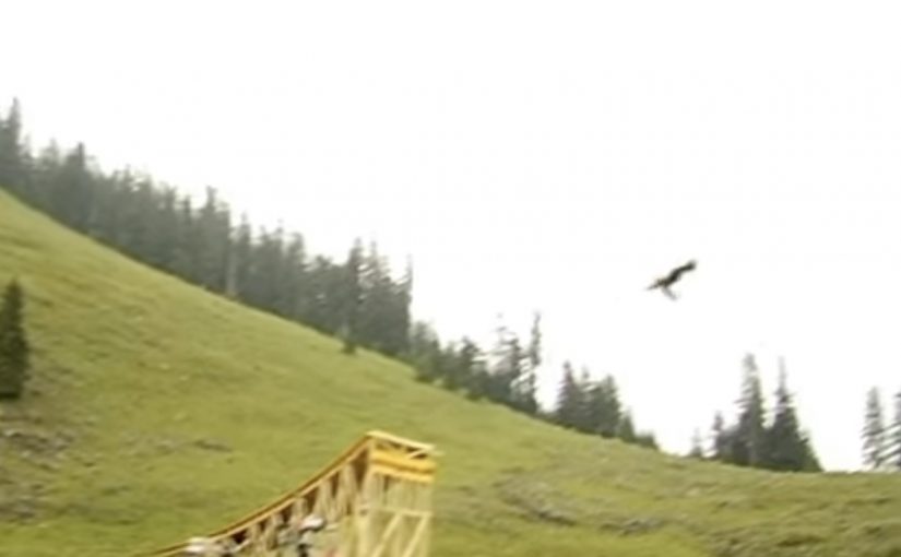
Microsoft created a viral featuring Bruno Kammerl, described as building the biggest waterslide on earth. The test run was more than successful, and the film leans into that “did I just see that” energy from the first second.

A stunt film that behaves like a project story

The mechanism is classic viral bait. A bigger-than-life engineering build. A simple premise. A single high-risk moment. Then just enough mystery around “who is this” and “why does this exist” to make people share it while they debate whether it is real.

In enterprise project-management software marketing, a bold proof-like narrative can communicate “we make impossible plans doable” faster than feature lists ever will.

Why it lands

It uses constraint and payoff. The build feels specific enough to be plausible, and the jump delivers an instant, physical climax. Even if viewers suspect it is staged, the film still works because the emotion is the product. Surprise, disbelief, and the urge to forward it.

Extractable takeaway: If you want a product that sells “capability” to feel memorable, show one exaggerated outcome, then let the audience connect the dots back to the promise.

What this says about the brand

The strategic intent is to borrow the energy of ambitious personal projects and map it onto a tool used for complex planning. The viral creates a mental shortcut. Big plan. Bold execution. Managed outcome.

The real question is whether this kind of spectacle makes enterprise planning feel ambitious enough to remember. It does, because the campaign turns project management into a visible, shareable outcome instead of a software demo.

What to steal from Mega Woosh

  • Make the promise physical. If your product sells “capability”, dramatize it with a single, extreme outcome people can picture instantly.
  • Lock one simple story rule. Big build. One test. One payoff. The simpler the rule, the easier the share.
  • Use specificity to create plausibility. Named protagonist, concrete build details, and a clear “test run” moment make the film feel real enough to debate.
  • Let the audience connect the metaphor. Do not over-explain the product. Give them the leap from “impossible project” to “project management”.
  • Design the talk trigger. The best virals are built around a single question people argue about. “Is this real” is a distribution engine.
  • Keep the brand cue clean and minimal. Too much branding breaks the spell. Too little branding loses the credit.

A few fast answers before you act

What is Mega Woosh in one line?

A viral stunt film built around an oversized waterslide jump, used to signal “anything is possible” as a metaphor for managing big projects.

Why does this work as marketing for project software?

Because it dramatizes planning and execution as a single, bold narrative. The story does the positioning work without needing specs.

What makes it so shareable?

One premise, one payoff, and a high-disbelief moment that triggers debate and forwarding.

What is the risk of this approach?

If the audience feels tricked rather than entertained, trust can take a hit. The framing needs to stay playful, not deceptive.

What should marketers copy from this format?

Use one extreme, easy-to-explain outcome to embody the promise, then keep the branding light enough for the spectacle to travel.

Opticana Eyewear’s $500 Campaign

Opticana Eyewear’s $500 Campaign

You see an online coupon that reads “100 NIS Discount on eyeglasses” with a single call-to-action. “Print coupon”. It is simple, direct, and designed to convert immediately.

The campaign in one line

Here is a $500 campaign done by Mccann Erickson Israel for Opticana Eyewear.

The real question is whether a plain offer with almost no production spend can still move people from browser to store.

This is a strong example of low-budget marketing because it spends almost nothing on explanation and everything on conversion clarity.

The business intent is straightforward: drive measurable store traffic and coupon redemption without wasting spend on awareness theatre.

Why the “print coupon” mechanic works

The offer is obvious, the action is frictionless, and the value is tangible. By “print coupon” mechanic, the ad uses a digital message to create a physical redemption trigger people can carry into the store.

That works because the printed coupon turns vague interest into a concrete next step and gives the store a simple way to connect attention to redemption.

In retail categories where the final decision still happens in store, digital work gets stronger when it creates a clear handoff into the physical purchase moment.

Why this lands when budgets are tight

When budget is constrained, clarity becomes the creative advantage. A single strong offer, a single next step, and a design that makes the benefit impossible to miss can outperform “bigger” ideas that ask too much of the audience.

Extractable takeaway: If you cannot outspend the category, remove friction so completely that the offer itself becomes the creative.

What to borrow for offer-led retail work

  • Lead with the benefit. Show the value before anything else.
  • Reduce the path to action. One next step is often stronger than multiple choices.
  • Design for redemption. Make it easy for people to carry intent from screen to store.

A few fast answers before you act

What is the core idea of this $500 Opticana campaign?

A printable discount coupon that is easy to understand and easy to act on.

Why does a printable coupon still matter in retail?

It bridges online intent to offline purchase. It gives the customer a reason to visit, and it gives the store a clear redemption trigger.

What makes a low-budget campaign feel smart instead of cheap?

One clear promise, one clear action, and a design that prioritises the benefit over decoration.

What should you measure on an offer like this?

Prints, redemptions, and incremental sales during the offer window. If possible, track coupon code usage to separate organic uplift from campaign-driven traffic.

What kind of brands suit this approach best?

Brands with a clear retail offer and a store-based purchase moment. It works best when the value exchange is immediate and easy to redeem.

Chubb Nord-Alarm: Hardcore DM via a Balloon

Chubb Nord-Alarm: Hardcore DM via a Balloon

A balloon that turns “DM” into a moment

Here is a direct mailing done for Chubb Nord-Alarm Security Systems by an agency in Germany called Philipp und Keuntje. “Hardcore DM” here simply means direct mail that commits to a physical object. Not a brochure with a clever headline, but a mailed item that changes the mood of a room the second you notice it.

The mechanics behind the balloon

The piece centers on a black balloon printed with a face. It is simple, low-tech, and instantly legible as “something is here” once it is out of the envelope and in your space.

That works because the object turns a printed message into an intrusion cue the recipient experiences in real space.

In European direct marketing, physical mail earns attention when the object itself carries the idea and the reveal happens in the recipient’s hands.

Earlier this year, “Balloon” received major award recognition in direct mail and ambient-style media, which matches what it is doing: turning a familiar household item into a trigger.

Why this lands in the hallway

Security is a category where attention is driven by felt risk, not feature lists. A balloon with a face works because it creates a tiny, harmless violation of normality. That emotional jolt is the message.

Extractable takeaway: If your product protects people, make the first touchpoint feel like the problem entering the room. Then let the brand arrive as the solution.

What it is trying to sell

The business intent is straightforward: make “intrusion” visceral, then attach that feeling to the brand name so the next step, quote request, call-back, or site visit, feels justified rather than optional.

The real question is whether the mailer can make intrusion feel immediate before the brand makes its sales case.

This is strong direct mail because the object does the persuasion before the copy starts.

What to steal for your next direct-mail drop

  • Choose an object people already understand. The less explanation needed, the more the brain focuses on meaning.
  • Make the reveal tactile. If the recipient has to touch it, the message gets encoded as experience, not as copy.
  • Keep the brand role clean. First create the “problem cue,” then let the brand be the relief.
  • Design for shareability without asking for shares. If it looks strange in a home or office, it becomes a conversation starter.

A few fast answers before you act

What makes this “hardcore” direct mail?

It is not “hardcore” because it is expensive or complex. It is “hardcore” because it uses a physical object as the core idea, not as packaging around a printed message.

When does a tactile mailer beat digital?

When you need emotional comprehension fast, especially for categories tied to safety, risk, or trust. A physical cue can create a felt reaction in seconds, before rational evaluation starts.

How do you make direct mail feel like an experience?

Build the message into the object, not into a paragraph. Aim for a single action, a single reveal, and a single meaning the recipient can explain to someone else in one sentence.

How do you know the object is carrying the idea?

If the object still communicates the core tension before anyone reads supporting copy, it is doing the strategic work. If not, it is only decoration.

What are the common failure modes of stunt mail?

If the object needs a long note to explain it, it collapses. If the brand arrives too early, it feels like a gimmick. If the follow-up path is unclear, the attention does not convert.