Wimpy: Braille Burgers

Wimpy: Braille Burgers

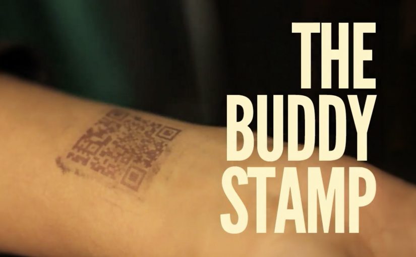
Wimpy wanted to let visually impaired people know that it offered braille menus in all of its restaurants. Instead of announcing it with a poster, it turned the message into the product itself.

With the help of skilled chefs, sesame seeds were meticulously placed on burger buns so the seeds formed a braille message. The bun becomes a tactile line of communication. You do not have to ask. You can read it with your fingertips.

A message built for the audience

This is a campaign that respects the medium. If the audience reads through touch, the communication should be touchable. The craft is the point. Someone had to care enough to place every seed, because that effort signals the same care the brand claims to have for accessibility.

It is also a quiet reversal of how “accessibility features” often get communicated. Normally, the burden is on the customer to ask for the braille menu. Here, the brand leads with the fact that it is already available.

In mass-market food and retail brands, inclusive design travels fastest when people can discover it in the experience itself rather than having to request it.

The real question is whether accessibility is discoverable by default, or only available to people who already know to ask for it.

Brands should make accessibility features self-revealing inside the product experience, not tucked behind a request.

Why it lands

This works because the message arrives through touch in the moment of use, which removes the “ask” step and makes the accessibility promise instantly usable.

Extractable takeaway: Inclusion marketing lands when the communication channel matches the audience’s access mode. Here, the message is readable by touch at the exact moment of consumption, so the customer discovers the braille-menu promise without needing to ask.

It is specific, not generic. The idea is built around one concrete barrier, then removes it in a way that feels native to the category.

It creates earned attention without begging for it. The story spreads because it is surprising and easily retold. A burger bun you can read is instantly legible as a headline.

It avoids “awareness theater”. By “awareness theater,” I mean symbolic inclusion messaging without a usable change for the customer. The message is not “we support inclusion” in abstract terms. It is “here is the inclusive thing, already made real”.

How to make accessibility discoverable

  • Match the channel to the audience. If your audience cannot access the default channel, redesign the channel. Do not just add copy.
  • Let the product do the talking. The most credible claims show up as a behavior, feature, or ritual inside the experience.
  • Make the proof tactile or visible. When a customer can feel the difference, you do not need to over-explain it.
  • Use craft as a credibility signal. The effort in execution communicates intent more strongly than any tagline.

A few fast answers before you act

What was Wimpy trying to communicate?

That braille menus were available across its restaurants, and that visually impaired customers were welcome without extra friction.

How did the “braille burgers” actually work?

Sesame seeds were placed on the bun in braille patterns that could be read by touch. The braille spelled out a short message or burger description.

Why is this more effective than a standard ad?

Because the audience can directly access the message. It does not depend on sight, and it does not depend on asking staff for information.

What is the business intent behind an inclusion idea like this?

To increase awareness and usage of an accessibility feature, strengthen brand warmth, and reduce the “I did not know you had that” barrier that stops people from choosing the brand.

What is the most transferable lesson?

Build the message in the same mode your audience uses. When the communication format is accessible by design, the campaign becomes self-validating.

Turquoise Cottage: The Buddy Stamp

Turquoise Cottage: The Buddy Stamp

Most nightclubs in India put an admittance stamp on the wrist of their customers. Turquoise Cottage, a nightclub based in Vasant Vihar, New Delhi, was no different. However, with their digital agency, Webchutney, they created what then went on to be coined as “The Buddy Stamp”.

“The Buddy Stamp” was a unique QR code stamp which upon scanning gave customers useful and actionable information depending on the time of night.

A wrist stamp that keeps working after entry

The clever move is that the stamp is not branding. It is a tool. You already have it on you, so the lowest-effort scan becomes a doorway to whatever you need next, without searching, asking staff, or opening a menu.

How the QR code changes by time of night

The stamp routes to different content depending on when it is scanned. Early in the evening it can point to venue offers and drink specials. Later it can switch to practical “get home” help like cab options. It can even pivot the next day into recovery-style tips, which extends the brand’s care beyond the club.

In high-energy hospitality environments, time-based mobile utilities work when they reduce friction at the exact moment the customer needs help.

Why this lands

It respects how nights actually unfold. People do not want a generic microsite when they are out. They want one fast answer that fits the current hour, and they want it without social overhead.

Extractable takeaway: If you already “touch” the customer as part of entry, turn that touchpoint into a changing utility that anticipates the next decision, not just a logo.

What the club and agency are really optimizing

This is experience design disguised as a stamp. It upgrades service without adding staff steps, and it makes responsibility and convenience feel like part of the venue’s personality, not a lecture.

The real question is how a venue can turn a mandatory entry ritual into timely help people will actually use.

What venue teams can steal from this

  • Attach the utility to an unavoidable ritual. Admission is the perfect moment because everyone participates.
  • Use time as the personalization layer. You do not need profiles when the clock predicts needs well enough.
  • Design for the “next 30 minutes”. The best content is the thing people would otherwise ask a friend.
  • Extend care past the venue. Post-night help builds goodwill that outlasts the party.

A few fast answers before you act

What is The Buddy Stamp?

It is a QR code wrist stamp used as a nightclub admission stamp that links to different, practical information depending on the time of night.

What makes it different from a normal QR code poster?

The QR code lives on the customer. That makes it always available, and the time-based switching makes it feel context-aware without asking the user to do anything extra.

Why does “time of night” matter as a design input?

Because needs change predictably across an evening. Offers and discovery matter early. Getting home safely matters late. The best experiences match that rhythm.

What is the transferable pattern for other venues or brands?

Turn an existing physical touchpoint into a dynamic utility. Let one simple scan deliver the most useful next step for the customer’s current situation.

Why is the wrist stamp a better utility surface than a poster?

Because entry already puts it on every guest. That makes the utility universal, immediate, and easy to revisit without asking people to find a sign again.

The Folding Car: Hiriko

The Folding Car: Hiriko

Hiriko is a folding car that has been in the making for the last 5 years. This city car is positioned for mobility services (car sharing) that aim to reduce the congestion generated by automobiles in cities.

The folding car resembles a Smart Car and has the ability to fold itself into an upright, space-saving parking position that feels straight out of a sci-fi novel.

A working model of Hiriko is unveiled in Brussels, and it is described as commercially available in 2013.

At a reported estimated price of around €12,500 (excluding tax), the future of driving feels close.

How the fold-up parking mode works

The core trick is simple: Hiriko can retract into an upright, space-saving parking position, shrinking the footprint it occupies when it is not moving.

In dense European city centers, shared electric city-car concepts live or die on parking efficiency and last-mile convenience.

The real question is whether a dramatic fold-up parking mode delivers enough operational advantage to make shared fleets meaningfully more viable in tight urban cores.

Done well, a fold-up parking mode is worth betting on for shared mobility, because it turns parking from a constraint into a lever for utilization and staging.

Why it lands in dense city fleets

Because the car can retract into a smaller parked footprint, operators can stage more vehicles closer to the places riders actually start and end trips, which reduces pickup friction and dead time.

Extractable takeaway: If your product promise is “better city mobility,” make the benefit visible in one glance, especially at the moment that usually breaks the experience (parking, pickup, handoff).

What it optimizes for

This is framed for car sharing rather than private ownership because the value is operational: higher parking density, easier staging near demand, and better fleet utilization in tight city environments.

What to copy from Hiriko

  • Make the constraint visible: Turn the hard part (parking density) into a concrete before/after moment.
  • Design for staging, not only driving: Optimize where vehicles live between trips, not just how they perform in motion.
  • One-glance differentiation: If you need behavior change, build a benefit people understand without a manual.

A few fast answers before you act

What is Hiriko?

Hiriko is a fold-up two-seat electric city car concept designed for urban mobility services such as car sharing, with a body that retracts to reduce parking footprint.

What problem is the folding mechanism trying to solve?

Parking density. By shrinking its footprint when parked, the car is meant to make it easier to operate shared fleets in tight city environments.

Why is this framed for car sharing rather than private ownership?

Because the core value comes from fleet efficiency: easier parking, easier staging near transit nodes, and higher utilization in dense areas.

What makes the concept feel “sci-fi” in practice?

The upright, compact parked stance changes the familiar silhouette of a car and makes the space-saving benefit immediately visible.

What is the simplest lesson for mobility and product teams?

If your promise is “better city mobility,” make the benefit visible in one glance. A fold-up parking mode is a benefit people can understand without explanation.