Runway Characters: Real-time AI avatars

Runway Characters: Real-time AI avatars

A real-time AI avatar is a video-based conversational agent that can listen, respond, and show synchronized facial movement during a live interaction.

Runway Characters is not just another image-to-video feature. It points to a bigger shift: interfaces that talk back, maintain expression, and sit inside websites, apps, support journeys and training environments as an interactive layer.

From chatbot box to embodied interface

For years, the consumer web has treated conversation as a text box. Runway Characters pushes the interaction into a more human-shaped format: a visual character with a voice, a defined personality, domain knowledge and live responsiveness.

The enterprise value is not the avatar; it is the controlled interaction layer around the avatar.

A controlled interaction layer is the set of rules, knowledge sources, permissions, actions, escalation paths and measurement signals that determine what the avatar can say and do.

This is why the product is more interesting for operators than for novelty-watchers. A branded face is easy to demo; turning it into a trusted, scalable and measurable service interface is the hard part.

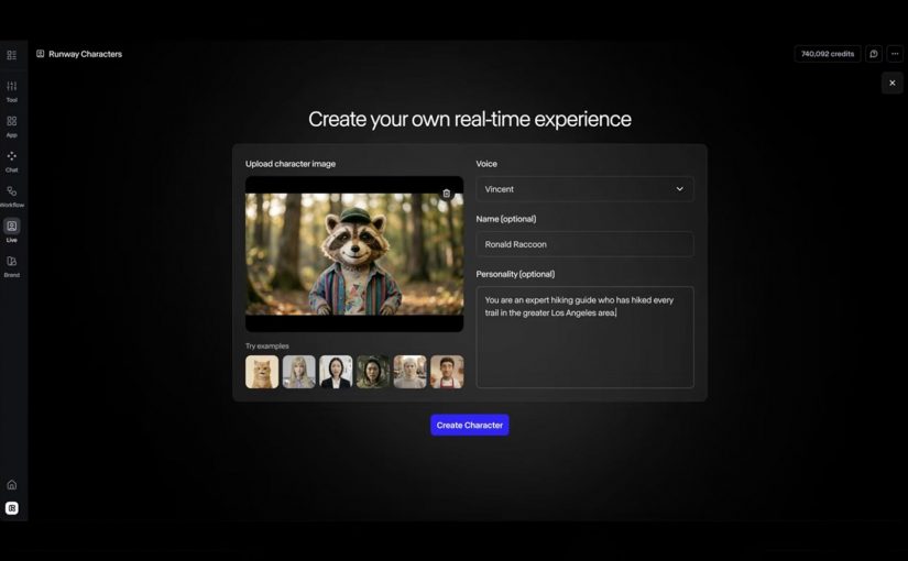
The mechanism: image, voice, knowledge and action

The mechanism is straightforward: a single reference image defines the character, voice and personality shape the interaction, a knowledge base keeps the response inside a domain, and API actions allow the character to do work rather than just talk.

For enterprise teams, this turns the avatar from a creative asset into a governed service surface that sits between consumers, content, data and workflow.

A governed service surface is a customer-facing interface whose content, permissions, actions, analytics and escalation rules are deliberately controlled.

Because the avatar can combine expression, domain knowledge and actions in the same interaction, the experience can move from navigation to guided execution.

That is the commercial hinge. The avatar is not valuable because it smiles; it is valuable when it helps someone finish a task faster, with less confusion and fewer handoffs.

Where Runway Characters could create real utility

The obvious use cases are the ones Runway highlights: tutoring and education, customer support, training simulations, and interactive entertainment or gaming. Those are credible because the value depends on response, patience, expression and repetition.

The stronger enterprise use case is guided commerce and product selection. A character that understands a product range, asks clarifying questions, checks fit, explains trade-offs and hands off to the right next step could reduce decision friction in categories where consumers need guidance.

Brand and marketing experiences are another useful path, but only if they avoid becoming mascot theatre. A brand character should answer, guide, qualify, educate or convert; otherwise it is just a high-cost animation layer with weak business intent.

The real question is not whether the avatar looks impressive; it is whether the interaction reduces effort, shortens a service path, or improves a decision.

The operating model matters more than the character

The failure mode is predictable: teams launch a polished avatar before defining ownership, content governance, privacy boundaries, escalation logic and measurement. That creates a visible interface with unclear accountability.

For consumer experience platforms, the hard work sits behind the face. The avatar needs approved knowledge, consent-aware data access, clear action limits, analytics events, brand controls, QA scripts and a fallback path when confidence is low.

This also changes the content model. Product information, policy content, service scripts and training material need to be structured enough for a live character to use safely, not just published as static pages for humans to browse.

Runway Characters takeaway for enterprise teams

Runway Characters should be evaluated less like a creative tool and more like a new front-end pattern for service, learning, commerce and brand interaction. The adoption question is not “can we make a character?” but “which consumer or employee journey deserves a live conversational interface, and can we govern it?”

Takeaway: Treat real-time AI avatars as governed service surfaces, not animated brand assets. The winning teams will connect character design to knowledge governance, journey ownership, action permissions, measurement and fallback logic before scaling the experience.


A few fast answers before you act

What is Runway AI?

Runway is an AI company building generative media tools and world-simulation research systems. Runway describes its mission as building AI to simulate the world through the merging of art and science.

What is Runway Characters?

Runway Characters is Runway’s real-time avatar product for creating conversational video characters with customizable appearance, voice, personality, knowledge and actions.

Why does it matter for brands?

It matters because it can turn static content, support flows and training material into live guided interactions that feel more natural than a chatbot.

What are the best first use cases?

The best first use cases are narrow, repeatable journeys where guidance reduces effort: product advice, customer support triage, onboarding, training practice and education.

What is the main enterprise risk?

The main enterprise risk is launching a convincing avatar without clear governance over what it knows, what it can say, what it can do and when it must escalate.

How should teams measure success?

Teams should measure task completion, deflection quality, conversion support, time saved, escalation rate, user satisfaction and the cost of maintaining the knowledge base.

KitKat: The Slooowest Vending Machine

KitKat: The Slooowest Vending Machine

I have covered dozens of unique vending machines over the years. The last one was as far back as 2018, when Ford used a car vending machine in Guangzhou, China. Now fast forward to 2026 and KitKat has successfully reimagined waiting time at a regular vending machine into the brand experience itself.

When a break brand faces a speed problem

KitKat’s reported premise is simple. In a culture of compressed attention, even the break is getting shortened. So the brand in Hyderabad, India took one of the most convenience-coded retail objects possible, a vending machine, and used it to restage “Have a Break” as something you feel, not just something you read. The activation was developed by VML India and VML Netherlands and brought to life with Delhi-based production house The Other Half.

That setup matters because vending machines normally stand for speed, utility, and instant gratification. KitKat flipped that expectation on purpose. Instead of using the machine to remove waiting, it used the machine to make waiting visible, memorable, and unmistakably on-brand.

How KitKat turned waiting into the product demo

Instead of dropping a bar in seconds, the transparent machine sends it through a miniature sequence inspired by everyday Indian life, including a toy train, a Ferris wheel, a truck ride, a river journey, and a festive procession. Reported timings make the contrast do real work. A normal vending machine interaction is framed at about three seconds. This one stretches the moment to around three minutes.

That matters more because the machine sat inside one of Hyderabad’s busiest commercial hubs, where speed is the default behavior and pausing is the unusual act.

The mechanism works because the extra time is not dead time. It is branded time, which turns delay into attention and makes the promise of a break tangible before the product is even consumed.

The smart part is that the machine does not merely slow the transaction. It choreographs the delay. That is why the pause feels closer to a scenic reward than a service failure.

Why the stunt lands harder than a normal activation

This is the rare activation where added friction strengthens the brand instead of weakening it.

KitKat wins here by using deliberate friction. Deliberate friction is an intentional pause or extra step added to an experience so the brand can increase attention, memory, or meaning instead of just reducing effort.

Most friction in customer experience is accidental and expensive. It comes from broken UX, poor orchestration, slow service, or unclear process. KitKat does the reverse. The pause is visibly intentional, visibly crafted, and tightly linked to a long-established brand promise, which is why reported reactions centered on watching, smiling, lingering, and sharing instead of irritation.

There is also a crowd mechanic at work here. The machine is slow enough to create curiosity, visual enough to hold attention, and simple enough for bystanders to understand within seconds. That combination turns one person’s purchase into a shared piece of theatre.

Where the business value actually sits

The enterprise lesson is not that brands should slow down checkout, navigation, or service recovery. The real question is where speed is hygiene and where tempo is part of the value exchange.

For consumer experience platforms and MarTech teams, that translates into a cleaner operating rule. Keep utility moments brutally fast, such as search, payment, account access, and complaint handling. But in moments tied to ritual, reveal, education, reward, sampling, or branded storytelling, controlled pacing can sometimes do more commercial work than raw speed because it increases attention, recall, and distinctiveness.

The business intent here is not transaction efficiency. It is brand encoding. KitKat is defending a recognizable promise in a category where faster is easy to copy, but a meaningful pause is harder to own.

That is the part many teams miss. Brand platforms do not become durable because they are repeated in copy. They become durable when the operating design of the experience makes the promise physically true.

How deliberate friction can strengthen a break brand

Deliberate friction only works when three conditions hold. The pause must express the brand idea, the consumer must understand why it exists, and the wait must be short enough and crafted well enough to feel rewarding rather than defective. Break any one of those rules and the same device becomes irritation, not experience design.

Add friction only when it makes the promise more tangible than speed would. If the delay is not visibly on-brand, clearly signposted, and tightly controlled, it is not experience design but bad service.


A few fast answers before you act

What is KitKat’s Slooowest Vending Machine?

It is a reported experiential installation in Hyderabad that turns a snack vending machine into a three-minute miniature journey, so the wait itself becomes the break.

Why does the idea work?

It works because the delay is visibly intentional and tightly tied to KitKat’s break positioning, so the pause feels like the product experience rather than a machine malfunction.

What is the operator lesson?

Speed is not the only KPI. In selected touchpoints, controlled pacing can increase attention, memory, and brand fit more effectively than pure efficiency.

Where should brands not copy this?

Do not add friction to utility-heavy moments like payment, login, navigation, or complaint handling, where speed and clarity are the promise.

What should CX and MarTech teams measure if they test a similar move?

Measure dwell time, completion rate, abandonment, recall, sharing, and whether the experience strengthened the brand association you intended to encode.

WestJet Flight Light

WestJet Flight Light

WestJet creates a small device with a big emotional job. WestJet Flight Light is a nightlight that uses live flight data to project a parent’s WestJet flight path onto a child’s bedroom ceiling, turning the wait into a visual, interactive countdown of hours and minutes until the parent returns.

In airlines and other service businesses, more brands move beyond selling a product and start designing convenience services that drive repeat usage and loyalty by solving real-life friction.

By convenience services, I mean a branded layer that uses operational data to make a recurring job easier for the customer.

Here, the friction is business travel. WestJet wants frequent travellers to pursue work opportunities without losing connection with the people waiting at home. Flight Light makes the journey feel present. Not abstract.

Why the concept works

The power is not the hardware. It is the experience design. A child’s instinct is to count down. Flight Light makes that countdown tangible and playful by projecting the route in the place where bedtime routines already happen, which turns waiting into anticipation.

Extractable takeaway: If you can turn operational data into a repeatable ritual in the customer’s real environment, you create loyalty that feels like care, not marketing.

The service logic

This is a brand service that behaves like a product. A brand service is a repeatable utility that makes the brand part of a real-life routine. Live flight data becomes a family connection layer. The airline becomes part of the at-home story, not just the transport provider.

The real question is whether your operational data can earn a role in the customer’s routines, not just inside your app.

Brands should treat data as experience material when it reduces anxiety or effort in a moment that already exists in the customer’s life.

Beta-testing and what it signals

WestJet says a prototype of Flight Light exists, with beta testing scheduled to begin later this year. That is the bridge between a cute concept and something that can be operated, supported, and scaled.

Borrowable moves from Flight Light

  • Start with a real-life routine. Bedtime already has attention and emotion. Place the experience there.
  • Use operational data as story material. Flight status becomes a shared narrative the family can follow.
  • Make the countdown visible. Turn “when are you home?” into a simple, comforting visual progression.
  • Design for repeat trips. The value compounds when the service works the same way every time the parent travels.

A few fast answers before you act

What is WestJet Flight Light?

A nightlight concept that uses live WestJet flight data to project a parent’s flight path onto a child’s bedroom ceiling as an interactive countdown to their return.

Who is it designed for?

Business travellers and frequent flyers with families, especially parents who travel regularly for work.

What is the core experience design move?

It turns live flight status data into a comforting, visible bedtime ritual that makes the trip home feel real and close.

What problem is it solving?

It reduces the emotional friction of business travel by making a parent’s trip home visible and countable during a child’s bedtime routine, instead of feeling distant and abstract.

Why is it a brand service, not just a gadget?

The value comes from turning live flight data into an at-home experience a family can reuse on every trip. The nightlight is the interface. The service is the connection layer.