
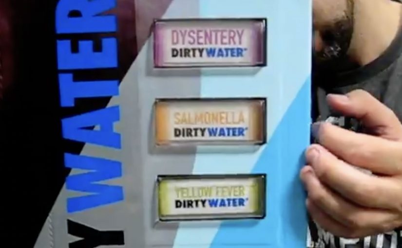
UNICEF Tap Project: Dirty Water Machine

What if someone bottled the water that millions in developing countries drink every day and offered it on the streets of New York?

For just a buck, during World Water Week (March 22-29), New Yorkers in the Union Square Park area are invited to “enjoy” the benefits of Dirty Water. It comes in a range of choices like Malaria, Cholera, or Typhoid Dirty Water, and is described as having 900 million consumers.

Dirty Water is not an actual product, but a real problem for millions of children around the world.

A vending machine that sells disgust

The mechanism is a classic reversal: a familiar vending machine is repurposed to dispense bottles labeled with water-borne diseases. The point is not to get anyone to drink it. The point is to make the problem visceral and immediate for people who normally never have to think about it. By keeping the interaction familiar, the reversal lands because it turns moral distance into a physical reaction in seconds.

In global cause marketing, turning an abstract statistic into a physical choice can move more people from awareness to action than another informational poster ever will.

The real question is whether you can turn a distant, abstract problem into a personal encounter that makes action feel unavoidable.

Why “nobody drinks it” is the message

New Yorkers are startled to see options like Yellow Fever or Hepatitis Dirty Water. They look at the machine in disgust. And that disgust is the creative payload, meaning the emotional reaction the campaign is designed to deliver, because it mirrors the reality that millions of families do not have the option to refuse unsafe water.

Extractable takeaway: When the barrier is “I cannot feel this problem,” engineer a harmless encounter that triggers the right emotion on contact, then attach one immediate action that turns that emotion into help.

The donation promise that makes the $1 meaningful

The idea of “selling” dirty water is framed as being inspired by UNICEF’s promise that every dollar donated provides safe drinking water to 40 children for a day. Even if the bottle is never purchased as a “product”, the transaction becomes a small, concrete unit of impact.

How the campaign stays active beyond the street

This Dirty Water initiative is positioned as ongoing, with continued donation options online at tapproject.org or via text message. Text TAP or AGUA to UNICEF (864233) to make a $5 donation.

Steal the Dirty Water pattern

  • Use reversal with familiar UX. Put the message inside an everyday interaction so the emotional hit lands before the rational debate starts.
  • Make the abstract a physical choice. Let people “choose” the problem in front of them, then offer one simple action to refuse it for someone else.
  • Price the action as a unit. Frame the donation as a small, concrete purchase so the person feels immediate impact, not vague virtue.

A few fast answers before you act

What is the “Dirty Water” vending machine in one line?

A public vending machine that dispenses “dirty water” bottles labeled with diseases to shock passers-by into donating for clean water.

Why price it at $1?

Because $1 is a friction-light ask that feels like a purchase, not a pledge, and it maps to a clear “unit” of impact in the campaign story.

What is the main creative trick that makes it work?

Reversal: it sells something no one wants, so the emotional response is disgust, and that response reframes clean water as a privilege rather than a given.

What should brands learn from this without copying the cause?

If the problem is invisible, make it physically encounterable, and tie the encounter to one simple action that feels immediately meaningful.

What is the lowest-risk way to adapt this pattern?

Keep the reversal honest and harmless, avoid sensational claims, and make the action as clear as the emotion: one step, one outcome, no hidden complexity.
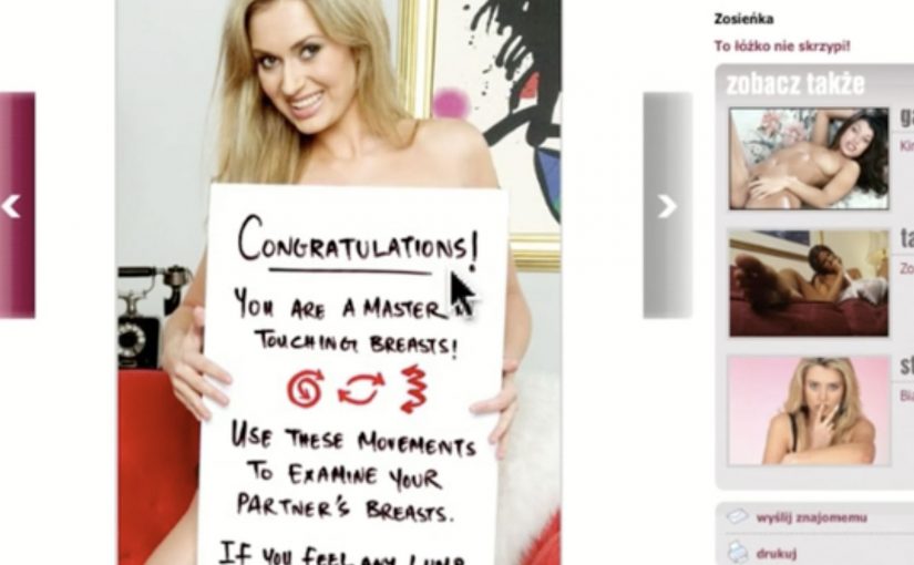
wp.pl: Magic Boobs for Breast Cancer Awareness

Digital can put learning in places people do not expect it. In this Polish breast cancer awareness idea, Change Integrated places an interactive experience inside the adult section of a major Polish portal, so men stumble into a lesson while they are there for something else.

The execution replaces a standard adult-gallery moment with a guided, click-and-touch interaction that demonstrates breast-check technique. It turns curiosity into a short, hands-on tutorial rather than a poster telling you to “be aware”.

The mechanic that makes it work

The mechanism is simple and deliberate. Use a high-attention environment to earn the first click, then use interactivity to pace the learning. Each interaction step nudges the user to explore the right areas and patterns, and the interface rewards correct moves with immediate feedback.

In public health communication, especially when the target audience avoids traditional education messages, playful interactivity can lower the barrier to learning.

Why this lands with the audience

It converts an awkward topic into a permissioned moment, meaning the audience feels they have chosen to enter the interaction rather than being pushed into a lesson. The adult context makes the entry feel natural rather than preachy, and the game-like format reduces the discomfort that often blocks attention. Because it is hands-on, the message is encoded as a physical routine, not just a line of copy.

Extractable takeaway: If you need people to learn a technique, do not just ask for awareness. Put the technique inside an interaction loop where attention is already high, then let feedback do the teaching.

What the campaign is really optimizing for

The real question is how to teach a sensitive behavior in a way people will actually complete. For cause-led digital work like this, teaching the behavior matters more than broadcasting awareness.

The intent is behavior change, not just recall. The case is designed to increase the odds that men will remember what “checking correctly” looks like and encourage it in real life. The case film reports the placement was live for one week and that it trained a very large number of participants in that window.

What to steal for your own cause-led work

  • Meet the audience where they already are. Relevance is sometimes a location choice, not a message choice.
  • Teach by doing. Interactivity works best when it is the lesson, not a decoration around the lesson.
  • Use feedback as the copy. Immediate response to user actions replaces long explanations.
  • Design for controversy without disrespect. If you use adult inventory, the line between attention and backlash is thin. The craft has to stay purposeful.

A few fast answers before you act

What is “Magic Boobs” in one sentence?

An interactive awareness placement on wp.pl’s adult section that teaches breast-check technique through a guided, game-like touch interaction.

Why place a health message in an adult environment?

Because it captures attention from a hard-to-reach audience and reframes the lesson as something people willingly explore rather than something they are told to do.

What is the key design principle behind the interaction?

Turn the desired learning into the interface itself. Each step of the interaction is the instruction, reinforced by feedback.

What makes this different from a standard awareness banner?

A standard banner asks for attention. This format makes the user perform the learning step by step, so the teaching happens through action rather than passive exposure.

What is the biggest risk with this approach?

Misalignment with the cause. If the execution reads as exploitative or tone-deaf, it can damage trust faster than it builds awareness.

Lexus LFA: Scrollbroaaaar

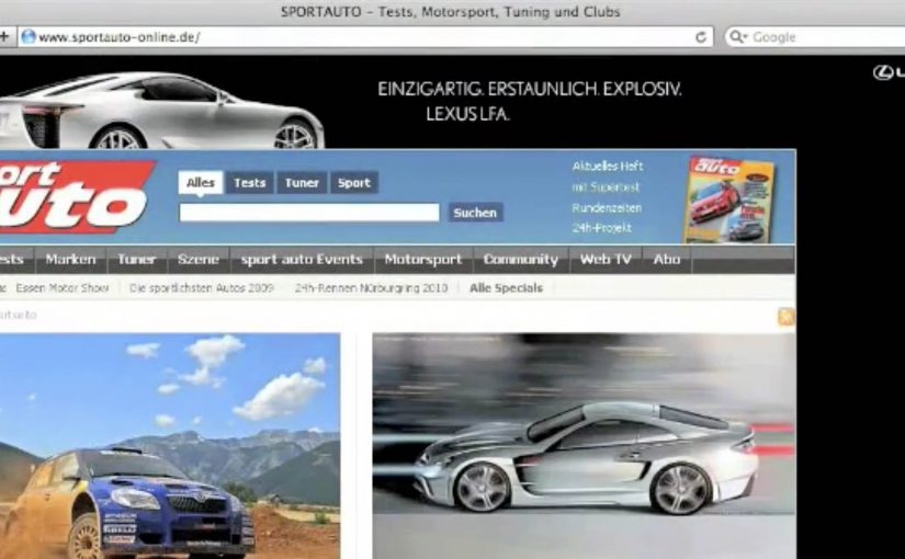
Saatchi & Saatchi Germany has created a clutter-breaking execution for the Lexus LFA on the Sport Auto website by turning a familiar interface element into the ad itself.

When the ad is the interface

The idea is disarmingly simple. Instead of fighting for attention inside a banner slot, the execution is described as a custom scrollbar experience on Sport Auto, shifting the user’s focus to the one thing everyone touches when they move through a long page.

How “Scrollbroaaaar” works

Mechanically, the work hijacks the expected behavior of scrolling and reframes it as a brand moment for a high-performance car. The name “Scrollbroaaaar” signals the point. Here, “Scrollbroaaaar” means the scrollbar itself becomes the branded ad unit. Scrolling becomes a sensory cue for speed and engine attitude, not just a way to navigate content.

In performance automotive marketing, using interface behavior as media can outperform traditional display formats because the user triggers the moment themselves.

The real question is whether you can turn a default UI habit into branded sensation without stealing time from the content.

Why it lands as clutter-breaking

This works because it does not ask for permission. It meets the user inside muscle memory. A scrollbar is invisible until it changes. The second it does, attention spikes. That moment of surprise is the whole value exchange.

Extractable takeaway: If you can attach your product truth to a UI habit the audience already performs, you get attention without demanding a click.

What the brand is really buying here

Beyond impressions, the intent is distinctiveness. Lexus gets a “did you see this” story that is native to the environment where car enthusiasts already browse. The experience also borrows the credibility of a specialist publisher context while keeping the brand in control of the punchline. This is a smarter bet than buying another standard display slot and hoping anyone notices.

What to steal for your own digital creative

  • Make the interaction the media. If a user action triggers the payoff, recall tends to be higher than passive formats.
  • Choose the smallest possible hack. One altered UI element can be more powerful than a page full of widgets.
  • Design for surprise, then exit fast. The novelty works best when it is immediate and does not overstay.
  • Match the mechanic to the product truth. Speed, sound, and control cues belong to a halo performance car.

A few fast answers before you act

What is “Scrollbroaaaar” in one line?

A web takeover that turns the page’s scrollbar into the ad, so scrolling itself becomes the Lexus LFA moment.

Why is it considered clutter-breaking?

Because it bypasses banner blindness by changing a core interface behavior users already rely on, creating instant surprise and attention.

What is the main creative principle behind it?

The principle is viewer control. The user’s action triggers the brand payoff instead of asking them to click away from what they came to do.

When should you use this pattern?

When you have a simple product truth that can be expressed through a single behavior change, and you want memorability more than message density.

What is the biggest risk with interface-as-ad?

If the mechanic slows the page, breaks expected controls, or feels like it traps the user, the surprise turns into frustration and the brand pays for it.