AT&T: ZugMO webcam heading banner game

The AT&T banner brings you right into the game, using Zugara’s augmented reality motion capture technology called ZugMO. You use your webcam to “head” crosses toward goal, with five shots to score as many as possible. There isn’t much more to it than that. But it is a very cool concept, especially because it is described as having run as a banner placement on ESPN.com with BBDO and Zoic Studios involved.

In performance-driven digital advertising, the fastest way to earn attention is to let people experience the message with their own body in seconds.

Why this banner feels different to click on

Most banners ask for a click and then try to convince you after the fact. This one flips the sequence. It gives you a tiny game first, then lets AT&T benefit from the time, focus, and small dopamine hit that comes from trying to score.

Standalone takeaway: A playable banner works when the mechanic is instantly legible, the interaction is frictionless, and the reward arrives fast enough that people try “just one more shot.”

What “augmented reality” means here

In this execution, “augmented reality” is less about 3D worlds and more about webcam-based motion capture layered with game graphics. Your movement is the controller. The screen overlays the ball path and goal feedback on top of live camera input, so the interaction feels physical even though you are still inside a standard banner unit.

The mechanic is the message

There are only a few moving parts. A webcam feed. Face and head tracking. A corner-kick animation. A simple scoring loop with five attempts. That minimalism matters because banners do not have time for onboarding. If the player cannot understand it in one glance, the banner has already lost.

The business intent behind the “cool concept”

Positioned around football attention, the deeper message is speed and responsiveness. Not by claiming it, but by making the ad itself respond to you. It is a small but smart translation of “fast network” into an experience you can feel.

What to steal for your own interactive ads

  • Design for zero instructions. If the mechanic cannot be understood instantly, simplify it.
  • Use the body as the controller. Webcam motion beats mouse clicks when you want memorability, not just reach.
  • Keep loops short. Five shots is a clear session boundary. It invites replay without feeling endless.
  • Make the feedback loud. Clear “goal” and “miss” cues turn confusion into compulsion.
  • Let the format prove the claim. If your message is speed, make the interaction snappy and responsive.

A few fast answers before you act

What is a “playable banner”?

A playable banner is a display ad that includes a lightweight interactive experience, usually a mini game, inside the ad unit itself. The goal is to trade passive impressions for active participation.

Why does webcam motion capture increase engagement?

Because it turns the user from a viewer into the controller. When your body movement drives the outcome, attention becomes harder to drop and easier to remember.

What makes this AT&T banner easy to understand?

The interaction maps to a real-world action. You head the ball. The scoring loop is obvious. The session is short. That combination removes the need for instructions.

What is ZugMO in simple terms?

ZugMO is Zugara’s webcam-based motion capture layer that detects user movement and converts it into game input. In this case, it translates head movement into a “header” action.

What is the biggest failure mode for interactive banner ads?

Too much friction. If the ad requires setup, permissions confusion, slow loading, or unclear controls, most people leave before the first reward moment arrives.

TwentyThree v/s Alex Bogusky

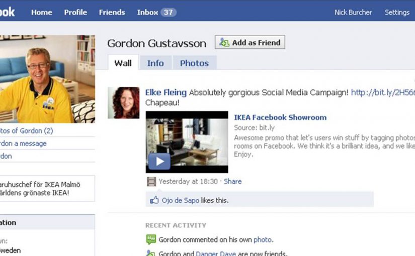
This is the very first Cannes entry for TwentyThree, a new advertising agency from Tel-Aviv that became famous by hijacking Alex Bogusky’ Facebook page and then posting a ransom video requiring him to buy 1% of their agency!

With having got some pretty serious free publicity the world over, they have now entered this case study into the 2010 Cannes Festival.

Uniqlo: The Lucky Switch Banner Campaign

A banner that hijacks the whole page

Here is a strong example of a banner campaign that refuses to stay inside the banner frame. For Uniqlo’s end-of-year clearance push, the idea came in two parts. A blog or website widget, and a set of banners connected to a competition.

Flip the switch. Every image becomes a ticket

The core mechanic is simple. Embed the widget on a site, press it, and it transforms every image on that page into a Uniqlo “Lucky Ticket” that promotes the sale and the competition.

A widget is a small embeddable code block that adds interactive functionality to a webpage. In this case, it acts like a page-level switch the viewer controls, rather than a passive ad slot.

In Japan’s fast-fashion clearance cycles, speed and novelty matter, and the web is a shortcut to scale.

Results that make the concept concrete

The outcome is the part that makes this more than a clever demo. The widget was voluntarily installed on almost 5,000 blogs and generated over 2.8 million banner clicks.

Why it lands. It feels like a playful hack

A standard banner asks for attention. Lucky Switch gives the user a satisfying action with immediate, visible impact across the entire page.

This is the mechanism to why sentence. Because the viewer controls the switch and sees the whole page change instantly, the ad feels like a game mechanic, not a media placement.

It also reframes “click” into “cause”. The click is not a request to leave the site. It is a trigger that changes the environment.

What Uniqlo is really optimising

This campaign is not just chasing CTR. It is building voluntary distribution. Every blogger who installs the widget is effectively turning their own site into Uniqlo media, and every visitor is invited to interact with the brand on someone else’s page.

Extractable takeaway: Lucky Switch is what happens when you treat distribution as the product. Make the interaction so satisfying, and the reward so clear, that other sites choose to carry your campaign for you.

What to steal for your next interactive format

  • Design for “whole-page impact”. If your interaction only affects the ad unit, you are still competing with content. If it affects the page, you become part of the experience.
  • Make the click do something now. Deliver instant feedback before you ask for any deeper action.
  • Use viewer control, not autoplay. The switch metaphor makes participation feel self-directed and repeatable.
  • Reward both the host and the visitor. If you want voluntary installs, give both sides a reason to play.
  • Turn scarcity into a daily rhythm. Limited goods or rotating rewards create a reason to come back, not just click once.

A few fast answers before you act

What is Uniqlo’s “Lucky Switch” in one sentence?

A widget and banner concept that turns every image on a host page into a Uniqlo “Lucky Ticket”, making the whole page behave like the ad.

What is the core mechanism?

A page-level switch the viewer controls. Pressing it transforms the environment immediately, so the click delivers instant visible impact before any deeper action.

Why does this feel more engaging than a normal banner?

Because the user triggers a change across the entire page. The interaction reads like a playful hack, not a boxed-in ad unit competing with content.

What business intent does it serve for fast fashion?

It creates a high-speed, novelty-driven route to scale through voluntary installs, while driving sale awareness and competition participation.

What is the most transferable takeaway?

If you want banners to perform, make the click do something “now” in the user’s environment, not just ask them to leave the page.