
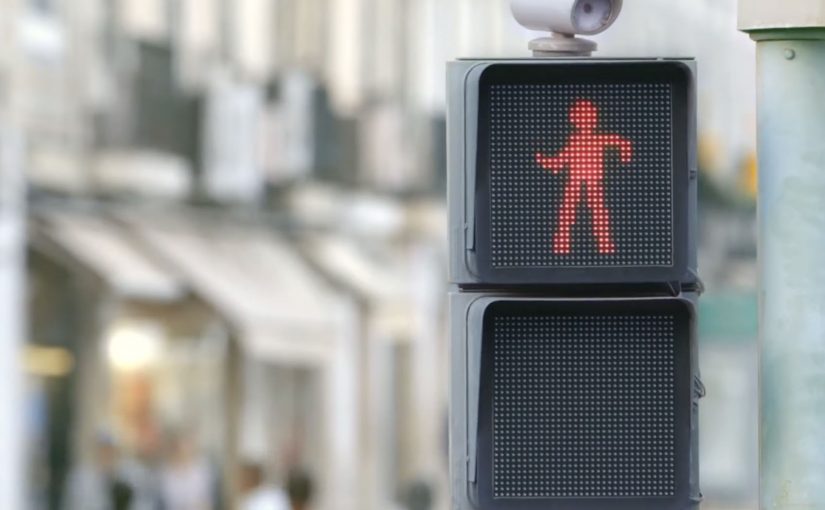
smart: The Dancing Traffic Light

Traffic lights can be dangerous for pedestrians, especially for those who do not like to wait for the light to change. So the Smart team from Mercedes-Benz created “The Dancing Traffic Light”, where a person’s dance moves were brought to a traffic light in real time. As a result, 81% more people stopped at that red light.

A red light that earns attention

The mechanism is simple. Put a person’s live dance into the “don’t walk” figure so waiting becomes entertainment rather than dead time. The red signal stays red, but the moment changes from friction to curiosity.

In busy cities, pedestrian safety interventions work best when they change what people do in the waiting moment, not when they rely on warnings people already ignore.

Why it lands

This works because it does not moralize. It redirects impatience. By turning the red figure into live motion, it converts passive waiting into anticipation, which is why people keep their attention on the signal instead of acting on impulse. People stop because they want to see what happens next, and because the signal feels like it is doing something for them instead of only restricting them.

Extractable takeaway: If your goal is compliance in a repeated micro-moment, do not just increase instruction. Add a small, repeatable reward that makes the safer choice feel like the more interesting choice.

What the brand is really demonstrating

The real question is how to make waiting at the curb feel better without weakening the rule itself.

The installation is framed as a safety idea, but it also functions as a brand proof point. “Smart” city thinking is expressed as an everyday behavior fix, not a futuristic gadget.

The stronger idea is not the choreography. It is the use of delight as a safety mechanism.

What to steal from this crossing

  • Design for boredom. Most unsafe shortcuts happen when people are impatient. Solve the impatience.
  • Keep the rule intact. The light still means stop. Only the experience changes.
  • Use real-time participation. Live input creates social magnetism and makes the system feel alive.
  • Measure behavior, not buzz. The strongest metric here is stopping behavior at the crossing, not views.

A few fast answers before you act

What is “The Dancing Traffic Light”?

It is an interactive pedestrian signal concept where a red “don’t walk” figure mirrors a nearby person’s dance moves in real time to make people more willing to wait.

What problem does it solve?

It reduces risky crossing behavior driven by impatience, by making the waiting phase more engaging.

Why does real-time motion matter?

Because it creates unpredictability and social attention. People watch longer when the content is live and human.

What kind of metric should you track for ideas like this?

Behavior change at the location, such as stopping and waiting rates, plus any reduction in unsafe crossing incidents.

How can another brand adapt this pattern?

Find a repeated safety or compliance moment, keep the rule unchanged, and add a small live reward that makes the safe choice feel like the better choice.
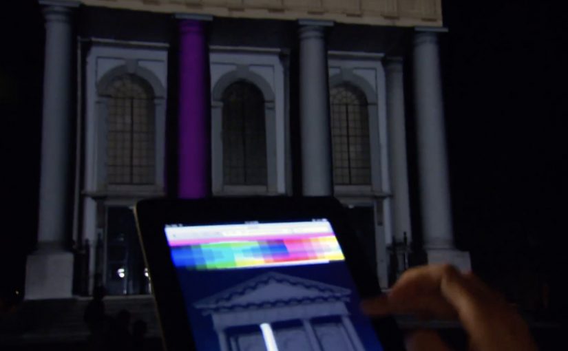
NuFormer: Interactive 3D video mapping test

NuFormer, after executing 3D video mapping projections onto objects and buildings worldwide, adds interactivity to the mix in this test.

Here the spectators become the controller and interact with the building in real time using gesture-based tracking (Kinect). People influence the projected content using an iPad, iPhone, or a web-based application available on both mobile and desktop. For this test, Facebook interactivity is used, but the idea is that other social media signals can also be incorporated.

From mapped surface to live interface

Projection mapping usually works like a film played on architecture. This flips it into a live system. The building is still the canvas, but the audience becomes an input layer. Gesture tracking drives the scene changes, and second-screen control, meaning a phone or browser used as a remote, extends participation beyond the people standing closest to the sensor.

Extractable takeaway: Interactive mapping is most compelling when the control model, the set of simple inputs people can learn instantly (wave, move, tap), is legible at a glance and the projection responds quickly enough that people trust the cause-and-effect.

In large-scale public brand experiences, projection mapping becomes more than spectacle when it gives the crowd meaningful viewer control instead of a one-way show.

Why the “crowd as controller” move matters

Interactivity changes what people remember. A passive crowd remembers visuals. An active crowd remembers ownership. The moment someone realises their movement, phone, or social input changes the facade, the projection stops being “content” and becomes “play.”

The real question is whether your interaction model makes people feel in control within seconds, or confused for minutes.

Because the facade responds immediately to a person’s input, the crowd shifts from watching to experimenting, which keeps people around long enough to teach each other and try again.

That also changes the social dynamics around the installation. People look for rules, teach each other controls, and stick around to try again. The result is longer dwell time and more organic filming, because participation is the story.

What brands can do with this, beyond a tech demo

As described in coverage and in NuFormer’s own positioning, branded content, logos, or product placement can be incorporated into interactive projection applications. The strategic upside is that you can design a brand moment that is co-created by the crowd, rather than merely watched.

When social signals are part of the input (Facebook in this case), the experience can also create a bridge between the physical venue and online participation. That hybrid loop is where campaigns can scale.

Patterns for your next mapping brief

  • Pick one primary control. Gesture, phone, or web. Then add a secondary layer only if it increases participation rather than confusion.
  • Make feedback immediate. The projection must respond fast or people assume it is fake or broken.
  • Design for “spectator comprehension.” Bystanders should understand what changed and why, from a distance.
  • Use social inputs carefully. Keep the mapping between input and output obvious so it feels fair, not random.
  • Plan for crowd flow. Interactive mapping is choreography. Sensors, sightlines, and safe space matter as much as visuals.

A few fast answers before you act

What is “interactive projection mapping” in this NuFormer test?

It is 3D projection mapping where the projected content changes in real time based on audience input. Here that input includes Kinect gesture tracking plus control via iPad, iPhone, and web interfaces.

Why add phones and web control when you already have gesture tracking?

Gesture tracking usually limits control to people near the sensor. Second-screen control expands participation to more people and enables a clearer “turn-taking” interaction model.

How does Facebook interactivity fit into a projection experience?

It acts as an additional input stream, letting social actions influence what appears on the building. The key is to make the mapping from social action to visual change understandable.

What is the biggest failure mode for interactive mapping?

Latency and ambiguity. If the response is slow or the control rules are unclear, crowds disengage quickly because they cannot tell whether their input matters.

What should a brand measure in an interactive mapping activation?

Dwell time, participation rate (people who trigger changes), repeat interaction, crowd size over time, and the volume and quality of user-captured video shared during the event window.

AT&T: ZugMO webcam heading banner game

The AT&T banner brings you right into the game, using Zugara’s augmented reality motion capture technology called ZugMO. Here, “augmented reality” means webcam-based motion capture with game graphics layered over live camera input. ZugMO translates head movement into game input. You use your webcam to “head” crosses toward goal, with five shots to score as many as possible. There isn’t much more to it than that. But it is a very cool concept, especially because it is described as having run as a banner placement on ESPN.com with BBDO and Zoic Studios involved.

Why this banner feels different to click on

Most banners ask for a click and then try to convince you after the fact. This one flips the sequence. It gives you a tiny game first, then lets AT&T benefit from the time, focus, and small dopamine hit that comes from trying to score.

Extractable takeaway: A playable banner works when the mechanic is instantly legible, the interaction is frictionless, and the reward arrives fast enough that people try “just one more shot.”

What “augmented reality” means here

In this execution, “augmented reality” is less about 3D worlds and more about webcam-based motion capture layered with game graphics. Your movement is the controller. The screen overlays the ball path and goal feedback on top of live camera input, so the interaction feels physical even though you are still inside a standard banner unit.

The mechanic is the message

There are only a few moving parts. A webcam feed. Face and head tracking. A corner-kick animation. A simple scoring loop with five attempts. That minimalism matters because banners do not have time for onboarding. If the player cannot understand it in one glance, the banner has already lost.

In performance-driven digital advertising, the fastest way to earn attention is to let people experience the message with their own body in seconds.

The real question is whether your ad can earn five seconds of voluntary play without explaining itself.

Playable banners are worth doing when the first interaction is immediate, legible, and ends quickly enough to invite a replay.

The business intent behind the “cool concept”

Positioned around football attention, the deeper message is speed and responsiveness. Not by claiming it, but by making the ad itself respond to you. It is a small but smart translation of “fast network” into an experience you can feel.

Steal this pattern for playable banners

  • Design for zero instructions. If the mechanic cannot be understood instantly, simplify it.
  • Use the body as the controller. Webcam motion beats mouse clicks when you want memorability, not just reach.
  • Keep loops short. Five shots is a clear session boundary. It invites replay without feeling endless.
  • Make the feedback loud. Clear “goal” and “miss” cues turn confusion into compulsion.
  • Let the format prove the claim. If your message is speed, make the interaction snappy and responsive.

A few fast answers before you act

What is a “playable banner”?

A playable banner is a display ad that includes a lightweight interactive experience, usually a mini game, inside the ad unit itself. The goal is to trade passive impressions for active participation.

Why does webcam motion capture increase engagement?

Because it turns the user from a viewer into the controller. When your body movement drives the outcome, attention becomes harder to drop and easier to remember.

What makes this AT&T banner easy to understand?

The interaction maps to a real-world action. You head the ball. The scoring loop is obvious. The session is short. That combination removes the need for instructions.

What is ZugMO in simple terms?

ZugMO is Zugara’s webcam-based motion capture layer that detects user movement and converts it into game input. In this case, it translates head movement into a “header” action.

What is the biggest failure mode for interactive banner ads?

Too much friction. If the ad requires setup, permissions confusion, slow loading, or unclear controls, most people leave before the first reward moment arrives.