eMart: Sunny Sale Shadow QR Codes

eMart: Sunny Sale Shadow QR Codes

Korea continues to set the standard in creative QR code campaigns. In June last year, Homeplus in South Korea used QR codes to create a virtual store in a subway station.

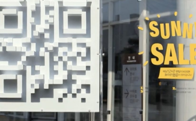
Now eMart, South Korea’s largest retailer, creates shadow QR codes across the city that only become visible when the sun is at the correct angle in the sky, between midday and 1pm. Consumers who scan the QR code during this period are redirected to the eMart online store, where they receive $12 coupons for products that are delivered to their homes.

Turning time into the trigger

The mechanism is a physical installation designed to cast a QR pattern as a shadow only during a narrow daily window. The code is effectively “off” for most of the day, then “on” at lunch. That forces a repeatable habit moment and makes the scan feel like a discovery rather than a prompt.

In dense, mobile-first retail markets, lunch hour is a high-frequency window where a time-boxed incentive can convert attention into immediate action.

The real question is whether you can make the trigger itself time-locked and unmistakable, so people self-schedule the behavior instead of waiting for another reminder.

A time-locked trigger is a stronger activation pattern than an always-on QR poster because the constraint becomes the story.

Why the shadow constraint works

The campaign does not just offer a discount. It creates scarcity you can see. If you miss the light, you miss the code. That turns a routine coupon into a small challenge, and it gives people a reason to talk about the “how” as much as the “what”.

Extractable takeaway: If you want to spike behavior in a specific time slot, make the call-to-action itself time-bound, not just the offer. When the trigger disappears outside the window, the audience learns the rhythm faster than they would from reminders alone.

The sundial-style QR codes, meaning the code is only scannable when sunlight hits at the right angle, were installed at 36 locations across Seoul and served more than 12,000 coupons. eMart membership increased by 58% and lunch hour sales went up by 25%.

Retail activation takeaways: time-locked QR

  • Make the rule instantly legible. “Only works at lunch” is easy to understand and easy to retell.
  • Use a constraint that creates urgency without pressure. The sun provides the timer. The brand does not need to shout.
  • Connect the scan to a clear payoff. Coupon plus delivery is a complete loop, not a teaser.
  • Design for repeat visits. A daily window encourages people to come back tomorrow, not just once.

A few fast answers before you act

What is the Sunny Sale “shadow QR code” idea?

A 3D installation casts a scannable QR code as a shadow only during a specific time window, so shoppers can unlock a coupon by scanning at the right moment.

Why limit the code to midday?

It concentrates attention into lunch hour, creates visible scarcity, and trains a daily habit around a predictable retail moment.

What makes this better than a normal QR poster?

The time-based constraint is the hook. The QR code is not always available, so scanning feels like discovery and the story becomes shareable.

How do you pick the right time window?

Choose a moment that already has repeatable footfall and intent, then make the window tight enough to feel special but wide enough that normal shoppers can realistically catch it.

What can go wrong with time-locked activations?

If the reward is weak or redemption is clunky, the constraint becomes frustration. The tighter the window, the more important the payoff and UX become.

PUMA: The World’s Fastest Purchase

PUMA: The World’s Fastest Purchase

PUMA Faas 500 are positioned as “fast” running shoes, so PUMA Mexico turned that promise into a store rule. The faster you complete the purchase, the bigger your discount.

It is retail gamification with a stopwatch. You take a time-stamped ticket when you enter, then hit the finish at checkout. Your elapsed time maps directly to a percentage off.

Speed, translated into a receipt

The mechanic is intentionally physical. A start button and a finish button. Two timestamps. A discount ladder, meaning predefined discount tiers tied to elapsed time. It converts a product claim into a behavior challenge shoppers can understand in one glance.

In store-based brand marketing, this kind of “simple rule. visible payoff” design is what turns a promotion into something people talk about and demonstrate. This is the right kind of promotion when the product promise is simple and the store can keep the timing fair.

In physical retail environments where staff can control flow and timing, a timed discount rule turns positioning into something customers can prove on the spot.

Why it works: tension, then relief at the till

Most discounts are passive. This one is earned under mild, playful pressure, which changes how the saving feels. Because the discount is calculated from your elapsed time, the saving feels earned rather than handed out. You are not just getting money off. You are winning.

Extractable takeaway: If you can translate a brand claim into a simple rule with a visible measurement, customers will internalize it faster and retell it more convincingly.

The case framing also borrows credibility from sport. The faster you move, the more you deserve, which fits the “fast” positioning without needing extra explanation.

What the brand is really buying

The real question is whether your operation can make the customer’s speed, not the queue, decide the discount.

Yes, it can drive conversion in the moment. More importantly, it makes “fast” measurable. The shoe is no longer described as fast. The shopping experience is fast, and the brand gets to own that feeling.

It is also a neat piece of shopper marketing craft: the discount is the reward, but the real output is attention inside the store and social retell outside it.

Borrowable moves for a speed-to-discount promo

  • Turn the product truth into a rule, not a tagline.
  • Make the measurement visible, tickets, timers, receipts, anything tangible.
  • Use a stepped reward, so “almost” still feels like something.
  • Keep the setup frictionless, one instruction. two actions. instant payoff.

A few fast answers before you act

What is the core mechanic here?

A timed in-store challenge. Entry timestamp plus checkout timestamp determines a discount tier.

Why is this stronger than a standard percent-off promotion?

Because shoppers earn the saving through behavior. That creates participation, attention, and a story, not just a transaction.

What kind of products fit this model best?

Anything with a defensible “speed” or “efficiency” claim, plus a purchase journey that can be completed quickly inside a controlled environment.

What is the biggest operational risk?

Queue dynamics. If checkout bottlenecks decide the discount, the game feels unfair. The store needs enough throughput so the customer’s speed is what matters.

How do you measure success beyond sales?

Participation rate, average completion time, discount distribution, and organic sharing that shows people proving their time and reward.

The smallest Ikea store in the world

The smallest Ikea store in the world

With city populations on the rise, living spaces have become increasingly limited. Ikea however believes that no matter how cramped your space, there’s always a solution. To demonstrate this, they built an entire Ikea store in a 298×250 pixels web banner.

People looking for studio flats as well as one/two bedroom apartments were targeted. The tiny Ikea store held 2800 products and was placed in ImmobilienScout 24, Germany’s largest online real estate market. As with their full size stores, shoppers were able to browse by department and buy all of the featured products.

A full store, compressed into one banner

The concrete move is the point. Ikea did not run a banner that “talked about” small-space living. It built a miniature storefront that behaved like a store, inside the same footprint where most brands would place a static message.

  • Format: 298×250 banner
  • Assortment: 2800 products
  • Placement context: shown where people were actively searching for apartments
  • Behaviour: browse by department and purchase, like a full-size store

Why the placement choice is the strategy

Putting the “store banner” inside a real estate marketplace aligns message and moment. If you are apartment hunting, you are already thinking in constraints. Size, layout, storage. That makes Ikea’s space-saving promise feel immediately relevant, because it shows up at the exact point the problem is top-of-mind.

Extractable takeaway: When the product promise is about solving everyday constraints, the media unit should demonstrate the solution inside the moment the constraint is felt.

In urban retail and home-living categories, the winning move is often to put the solution inside the moment people are actively negotiating space constraints.

What the banner is really trying to do

The real question is whether the media unit itself can do the selling work instead of just sending people somewhere else.

The business intent is to collapse awareness, product discovery, and purchase into one compact touchpoint. That is a stronger retail-media use of the banner than a static awareness message, because it turns the ad unit itself into a shoppable retail surface.

What to borrow for shopper marketing

  • Make the media unit do the job. If the claim is “there’s always a solution”, show solutions in action, not slogans.
  • Match the need environment. Place the idea where the need is active, not where attention is accidental.
  • Reduce steps to purchase. If people can browse and buy inside the experience, you keep momentum.

A few fast answers before you act

What was “the smallest Ikea store in the world”?

An entire Ikea store built inside a 298×250 pixel web banner.

How many products were included?

The banner store held 2800 products.

Where was it placed?

It was placed in ImmobilienScout 24, described as Germany’s largest online real estate market.

Who was it aimed at?

People looking for studio flats and one or two bedroom apartments.

Why does this work as shopper marketing?

It turns a small ad unit into a browsable store experience and puts it in front of people already thinking about limited living space.