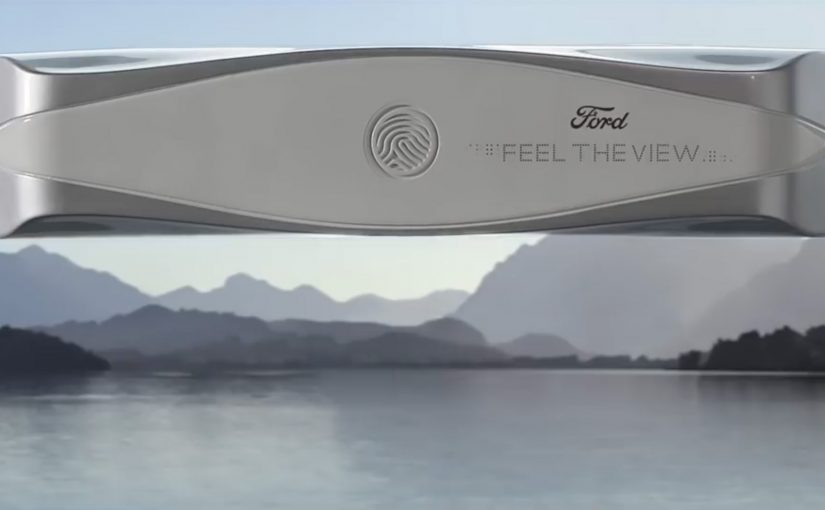
Ford in Italy, together with agency GTB Rome, teams up with Aedo, a local start-up that creates devices for people with visual impairments. Together they design a prototype device that attaches to a car window and decodes the landscape outside, allowing visually impaired passengers to experience it with the tip of their fingers.
The device transforms the flat surface of a car window into a tactile display. The prototype captures photos via an integrated camera and converts them into haptic sensory stimuli. Here, “haptic” means tactile patterns you can feel with your fingertips. The result is not primarily visual. It is perceptible through touch and hearing.
In automotive and mobility experience design, the real bar is whether the same journey can be translated across senses without creating a separate experience.
Why this matters as accessible experience design
This is an assistive interface built around a real, emotional moment. Looking out of a window during a drive. It treats “the view” as an experience that can be translated into other senses, rather than a privilege reserved for sighted passengers. Because the window is where attention naturally goes, using it as the tactile surface makes participation feel shared rather than segregated.
Extractable takeaway: If you want inclusive innovation to land, translate the same moment into multiple senses instead of designing a parallel version of the experience.
Inclusive innovation should be judged by whether it expands participation in the same moment, not by how novel the technology sounds.
The product idea in one line
Capture what is outside the car, then render it on the window surface as a tactile and audio layer that can be explored in real time.
The real question is whether your design lets people participate in the same moment as everyone else, without extra friction or stigma.
What to take from this if you build inclusive innovation
- Start with a human moment. Here, it is shared travel and the desire to participate in what others are seeing.
- Use the environment as the interface. The window is already where attention goes. It becomes the display.
- Translate, do not replace. The concept does not mimic sight. It converts the same input into touch and sound.
A few fast answers before you act
What is “Feel the View”?
A Ford Italy concept with GTB Rome and Aedo that prototypes a car-window device converting outside landscapes into a tactile and audio experience for visually impaired passengers.
How does the prototype work at a high level?
An integrated camera captures what is outside, then the system transforms the input into haptic stimuli on the window surface, supported by audio cues.
What is the core design principle?
Make the experience accessible by translating the same real-world scene into senses the user can rely on, in the moment.
Is this a production product or a prototype concept?
It is described as a prototype concept rather than a production feature, so treat it as a design pattern more than a released product.
What can you apply even if you do not build haptics?
Start from a shared human moment, pick the surface where attention already goes, then translate the same scene into other senses instead of creating a parallel experience.