McDonald’s: Everyone Saves for Something

McDonald’s: Everyone Saves for Something

When a low price becomes a citywide signal

McDonald’s and ad agency DDB Budapest launched a campaign to promote an offer of two cheeseburgers for one Euro. The positioning is simple. A price so low it gives the target audience room to save for things they want.

The twist: turn wrapping paper into media

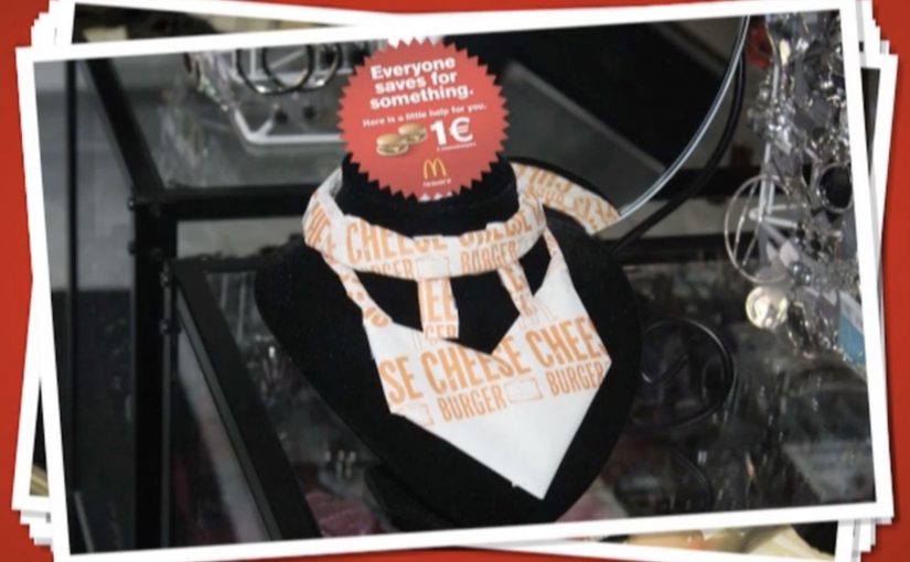
The challenge is standing out from the usual low-price playbook. Instead of shouting numbers louder, the campaign uses the most recognizable asset McDonald’s already owns. Its iconic cheeseburger wrapping paper.

They wrap “cool stuff” in the same paper, partner with different shops around the city, and turn those places into unusual touchpoints that visually encode the offer without needing to repeat the offer everywhere.

In European QSR value campaigns, price messaging sticks better when it is turned into a tangible object people encounter in everyday places.

The real question is how you make a low-price offer feel noticeable without turning it into just another louder discount ad.

Why it lands

This works because it makes value feel physical. The stronger move is to let a distinctive brand asset carry the value message instead of repeating the price claim more aggressively. People are trained to ignore price claims, but they notice an object that looks out of place. The wrapping paper acts like a visual shortcut. If you recognize it, you decode the brand instantly. If you do not, you still feel the oddness and look closer. The partner locations add credibility because the idea appears to have “escaped” the ad slot and entered the city.

Extractable takeaway: If your message is “cheap,” avoid saying “cheap” more often. Use a distinctive brand asset as a portable visual language, then place it where people already shop, browse, and compare.

What to steal from this value stunt

  • Make one brand asset do the heavy lifting. A recognizable wrapper can outperform another headline about price.
  • Build distributed touchpoints. Partner locations create repeated exposures that do not feel like repeated ads.
  • Let the audience complete the message. Recognition is satisfying. It increases memorability with less copy.
  • Keep the offer legible, but not loud. The stunt earns attention. The offer converts it.

A few fast answers before you act

What is “Everyone Saves for Something” for McDonald’s?

It is a value campaign that promotes an ultra-low cheeseburger deal by wrapping everyday objects in McDonald’s iconic cheeseburger paper and placing them across partner shops as unusual city touchpoints.

What is the core mechanic?

Use distinctive packaging as a portable visual language, then deploy it outside the restaurant to make the offer feel present across the city.

Why does wrapping objects work better than another price poster?

Because it turns a price message into a curiosity trigger. People notice the anomaly first, then decode the brand and offer.

What’s the transferable principle for other brands?

If your message is functional and easy to ignore, embed it inside a recognizable asset and place it where people already make choices.

What is the main risk with this approach?

If the asset is not instantly recognizable, or the placements feel random, the idea becomes decoration instead of a decodable message.

Radio Tel Aviv 102FM: The City Number Hack

Radio Tel Aviv 102FM: The City Number Hack

Turn the city’s own numbering system into media

There are many radio stations in Tel Aviv, but only one is called “Radio Tel Aviv”. It broadcasts on 102FM. The task is simple. Make the city associate Tel Aviv with the station.

Saatchi & Saatchi Tel Aviv finds a native hook. Major streets in Tel Aviv have building numbers, and “102” appears all over the city. One night, the agency transforms every building number “102” into an ad. Stickers are affixed so “102” becomes “102FM”, complete with the station’s logo and tagline.

The mechanic: hijack an existing cognitive shortcut

People already scan building numbers without thinking. They are part of navigation, deliveries, meeting points, and everyday orientation. By converting “102” into “102FM”, the campaign piggybacks on a habit the city already has and turns it into repeated brand encoding.

In local media branding, the strongest growth lever is often not “more messages”. It is embedding the frequency into a pattern people naturally repeat. The real question is how to make a station identifier feel like part of the city, not just part of the media plan.

Why it lands

It feels clever because it is discovered, not announced. The brand does not interrupt you. It meets you where your eyes already go. And because it is scattered across real places, the idea creates the impression that the station is everywhere, even if the media spend is tiny.

Extractable takeaway: If you want people to remember a frequency, number, or short identifier, graft it onto an existing urban pattern that people already read dozens of times a day.

What radio marketers can steal from 102FM

  • Use native infrastructure. Wayfinding, numbering, and signage are pre-existing attention systems.
  • Keep the modification minimal. The smallest change that flips meaning is often the most elegant.
  • Optimize for repetition. Memory is built through repeated micro-exposures, not one big shout.
  • Make it feel like a city inside-joke. “Spotted it” is a powerful driver of organic talk.

A few fast answers before you act

What did Radio Tel Aviv do with “102” building numbers?

They added stickers so building numbers reading “102” became “102FM”, turning everyday street numbering into repeated reminders of the station frequency.

What is the core creative mechanic?

It hijacks an existing behavior. People already scan building numbers, so the campaign repurposes that habit into brand recall.

Why does this work better than traditional posters for frequency recall?

Because it appears in places people already look, and it repeats naturally across the city, creating many small memory anchors.

What’s the transferable lesson for other brands?

Find a pattern the environment already supplies, then attach your identifier to it in the smallest possible way.

What is the main risk with this tactic?

If it is perceived as vandalism or causes confusion for residents, backlash can override the cleverness. Location choice and execution quality matter.

KitKat: Human Vending Machine

KitKat: Human Vending Machine

We all know how it feels to need a break from the routine of working like a machine. That is why KitKat brought a quirky trend from Japan over to the UK by installing a human vending machine in London’s busy Victoria Station.

Commuters were given a chance to buy a KitKat for 20p, but from a machine with a real difference. A real person operated it from inside, turning a quick purchase into a small moment of surprise and a quick chat. The money was described as going to charity.

A vending machine that replaces automation with a person

The mechanic is straightforward. It looks like a standard vending machine on the concourse. You put money in. You make a selection. Then a real “vendor” inside the unit hands you the bar, human-to-human, at vending-machine speed.

In high-traffic commuter environments, ambient activations (quick, in-the-flow brand interactions placed in public space) work best when the interaction is instant, the reward is obvious, and bystanders can understand the joke in one glance.

Why it lands

This works because it turns the very thing people are tired of, being treated like a machine, into the punchline. The vending format signals efficiency and routine. The human reveal breaks that expectation and delivers the “Have a break” idea as an experience, not a line of copy.

Extractable takeaway: If your brand promise is about relief, do not only describe relief. Stage a short, public interruption of routine where the consumer feels the promise in real time.

What the activation is really doing for the brand

The real question is whether you can make the “Have a break” promise felt without turning the commute into a bottleneck.

This is a strong format when the idea is obvious from a distance and the handoff stays genuinely fast.

At face value, it is a cheap bar and a good deed. Underneath, it is a behavioural prompt in a place where people are stressed, rushed, and receptive to a small uplift. The “human machine” also creates instant social proof. Every interaction becomes a tiny piece of live theatre that recruits the next person in line.

How to borrow the human-vending-machine pattern

  • Make the concept self-explanatory. The best stunts do not need instructions. The crowd teaches the crowd.
  • Build one clean reveal. A single unexpected moment beats multiple clever steps.
  • Design for the queue. Waiting becomes part of the experience and amplifies visibility.
  • Anchor the stunt to the brand line. The “break” is the product, and the bar is the proof.
  • Give people a reason to feel good. A charity tie-in can reduce cynicism and increase participation.

A few fast answers before you act

What is the “human vending machine” idea in one line?

A vending machine that dispenses KitKat bars, but the dispensing is done by a person inside the unit, turning a routine purchase into a surprise interaction.

Why does this work specifically in a commuter station?

Stations concentrate stress, repetition, and time pressure. A fast, playful interruption is more valuable there than a slow, explanatory brand experience.

What makes it feel like a KitKat idea rather than a random stunt?

The experience embodies the brand’s break positioning. It converts “take a break” from a slogan into a short, tangible moment.

What is the main execution risk?

Throughput. If the interaction slows down and the queue becomes frustrating, the stunt flips from “break” to “delay” and the mood collapses.

What should you measure beyond footfall?

Queue conversion rate (people who stop and join vs those who pass by), average interaction time, sentiment in on-site reactions, and whether the activation shifts purchase behaviour during the commute window.