
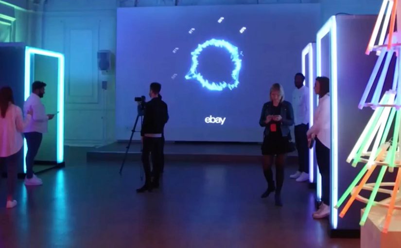
The world’s first emotionally powered store

You step into a pop-up store in central London because Christmas shopping feels like a chore. You sit down, look at product ideas on a screen, and the system watches your face as you react. Not in a creepy sci-fi way, but in a deliberately framed “let’s reconnect with the emotional spirit of giving” way. Your expressions become signals. The store turns those signals into a personal report, then suggests the gift that triggers the strongest “this feels right” response.

That is the idea behind eBay’s “emotionally powered store,” created with American technology firm Lightwave. Using intelligent bio-analytic technology and facial coding, eBay records which products provoke the strongest feelings of giving. Here, “facial coding” means software that classifies facial expressions into emotion signals. Then, through personalised emotion reports, it suggests the gift that stirs the most feeling.

What eBay is actually testing here

This is not only a seasonal stunt. It is a test of whether emotion can be treated as data in a retail environment, and whether that data can be turned into a better decision loop.

Treating emotion as data is compelling when it reduces stress and strengthens intent, not when it becomes a gimmick.

The store reframes the problem:

  • the problem is not “too little choice”
  • the problem is decision fatigue, stress, and loss of motivation
  • the solution is not more filters, it is faster emotional clarity

The mechanics. Simple, but provocative

At the core is a clean input-output system:

  • Input. A sequence of gift ideas shown in a tight flow.
  • Measurement. Facial coding and bio-analytic signals that infer which moments create the strongest emotional engagement.
  • Output. A personalised emotion report that recommends the gift that creates the strongest “giving” response.

The tech is almost secondary. The real innovation is the framing. A store that does not just sell products. It guides you toward the gift that feels most meaningful.

Because the flow turns in-the-moment reaction into a clear recommendation, it aims to cut decision fatigue and restore motivation.

In consumer retail and gifting contexts, the win is turning anxious browsing into a confident choice.

Why this matters for next-generation shopping environments

A lot of “next-gen retail” bets on bigger screens, more sensors, and more automation. This one bets on something more human.

Extractable takeaway: When people feel stuck choosing, experience design should optimize for emotional clarity and confidence, not just more options.

It treats the emotional state of the shopper as a first-class design constraint:

  • reduce stress
  • re-anchor the experience in intent and empathy
  • make the decision feel more satisfying, not just more efficient

That is a powerful signal for any brand that sells gifts, experiences, or anything identity-driven. The product is rarely the only thing being purchased. The feeling of choosing it matters.

The leadership question sitting underneath the pop-up

The real question is whether you want your retail experience to optimize for emotional confidence, or pure conversion efficiency.

If you can capture emotional response at the moment of choice, you can start redesigning:

  • the sequence in which products are presented
  • the language and imagery that drives confidence
  • the point at which a recommendation should trigger
  • the moment where a shopper’s motivation drops, and how to recover it

That is where this moves from a pop-up into a capability.

What to copy from this pop-up

  • Design for intent first. Frame the experience around the feeling the shopper wants to deliver, not the catalog size.
  • Shorten the path to “this feels right”. Use tight sequencing and clear prompts that reduce choice overload.
  • Make feedback immediate. Turn reactions into a simple, understandable next step, not another dashboard.
  • Measure to support, not to impress. Keep the technology secondary to the human framing that builds confidence.

A few fast answers before you act

What is an “emotionally powered store”?

An “emotionally powered store” is a retail concept that uses facial coding and bio-analytic signals to infer emotional reactions, then recommends products based on the strongest response.

What is eBay trying to solve with this experience?

The experience targets Christmas gift-buying stress and decision fatigue. It is designed to reconnect shoppers with the emotional spirit of giving.

What role does Lightwave play?

Lightwave provides the technology support for the bio-analytic and facial coding layer used in the pop-up.

What is the output for the shopper?

The output is a personalised emotion report and a gift recommendation based on the products that provoke the strongest feelings of giving.

What is the broader takeaway for retail innovation?

The broader takeaway is that emotion becomes a measurable input for experience design, not just a brand aspiration.

Air Canada: Gift of Home for the Holidays

It’s that time of the year again. This is my last and very Christmassy post for the year.

Since Christmas is the season of giving, Air Canada decided to spread a little love to unsuspecting Canadians at a local bar in London. Two Air Canada pilots talked to several Canadians about how they would not make it home this holiday season, and then announced they would be giving everyone in the bar a very special gift.

What happened next will make you wish you were there for this moment.

How the surprise is staged

The setup is intentionally low-key. Start with a real conversation in a normal place, then pivot to an unexpected announcement that turns empathy into action. The bar setting does the work of making it feel unproduced, and the pilots do the work of making it feel credible. That combination matters because low production cues reduce skepticism and make the reveal feel earned rather than engineered.

In travel brands, “getting home for the holidays” is one of the few emotional promises that translates across cultures without explanation.

Why this lands

This works because the tension is familiar and the payoff is immediate. You can feel the disappointment of not getting home, and you can feel the release when the gift arrives. The brand is not explaining values. It is demonstrating them through a human moment that people recognise as real. The real question is whether the emotion feels earned by the brand’s actual role. It does, because helping people get home is the airline promise in its most human form.

Extractable takeaway: If you want an emotional story to travel, start with a universally understood problem, keep the setup believable, and make the brand’s role an enabling action rather than a slogan.

What travel brands can borrow

  • Use a natural setting. Familiar environments lower skepticism fast.
  • Make the “turn” simple. Conversation, reveal, gift. No complicated mechanics.
  • Let real people carry the scene. Authentic reactions beat scripted lines.
  • Anchor to a seasonal truth. Holidays come with shared emotional stakes that do not need heavy copy.

Until 2015. Ramble over and out.


A few fast answers before you act

What is the core idea of this Air Canada holiday activation?

A surprise moment in a London bar where Air Canada pilots speak with Canadians about not making it home for the holidays, then reveal a special gift.

Why does the bar setting matter?

It makes the interaction feel everyday and believable, which strengthens the emotional payoff when the surprise lands.

What is the campaign really selling?

More than routes or fares, it sells reassurance. The feeling that the airline helps you get to the people that matter.

What is the transferable pattern for other brands?

Build a simple, credible setup around a universal tension, then resolve it with a concrete act that only your brand can enable.

What’s the biggest risk with “surprise and delight” campaigns?

If the setup feels staged or the brand role feels performative, the emotion collapses. Believability is the asset.

Playable Music Posters: Tap to Hear

Borders between media are blurring. Books are being swiped, magazines digitally scrolled and even in print one can today occasionally navigate. So it is no surprise when regular paper posters come to life on being combined with bluetooth, conductive ink, sensors and speakers.

Paper as an interface, not a surface

The mechanism is straightforward. Conductive ink turns parts of a poster into touch-sensitive zones. Sensors detect taps, knocks, or touch patterns. Bluetooth and small speakers, or a paired phone, provide the audio output. The poster stops being an image and starts behaving like a controller.

In public retail and event environments, touch-based posters only work when people feel safe and permitted to interact.

In consumer marketing and live environments, interactive print means print that senses touch and triggers a digital response. It is a way to turn passive out-of-home into a touchpoint that behaves like a device.

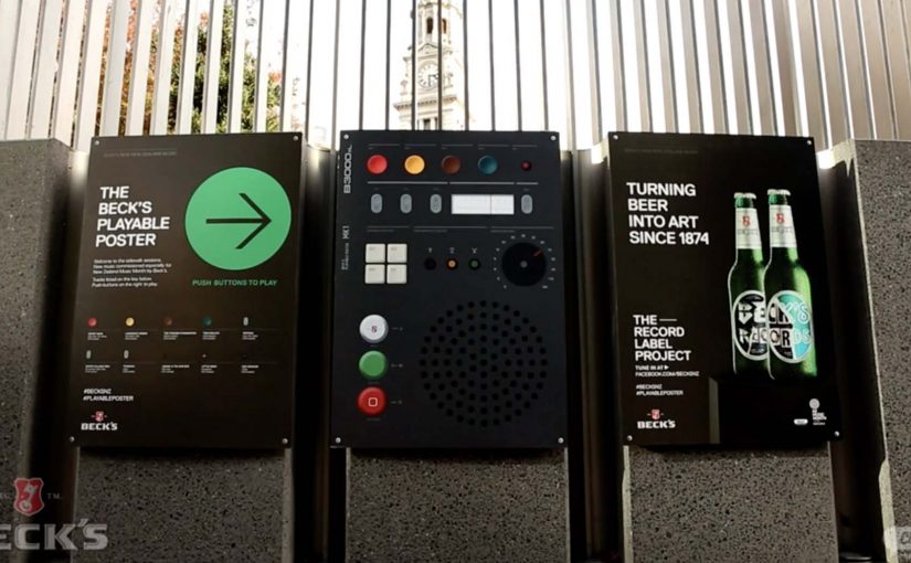
Beck’s Playable Poster

Looking for an innovative way to mark New Zealand’s Music Month, Beck’s partnered with Shine to design a playable poster. Using conductive ink and speakers the posters were made playable with a simple tap of the finger.

The Sound of Taste

Herb and spice brand Schwartz is all about flavour. So to dramatise flavour which was invisible and silent, they got print tech collective Novalia and ad agency Grey London to collaborate on an interactive poster. The poster used conductive ink to turn the surface area of the paper into an interactive interface that also connected to the viewers smartphone to deliver a richer experience.

Change the tune

Agency Republic from UK created a poster with an embedded sensor which when knocked changed the song being played on the agencies shared sound system.

Why these work: the demo happens in your hands

Each example keeps the interaction legible. Tap to trigger sound. Touch to explore flavour as audio. Knock to skip a track. The poster does not ask people to learn a new behavior. It hijacks an existing one, touching a surface, and rewards it instantly.

Extractable takeaway: When you want print to feel alive, make one obvious gesture trigger one immediate reward, and let the brand message ride on that moment of viewer control.

The real question is whether the interaction earns enough memorability to justify the added production. If the payoff is not instant and on-message, do not build it. Because the audience causes the outcome with a simple touch, the message sticks.

Practical patterns for interactive print

  • One interaction, one reward. Do not overload the surface with too many modes.
  • Make the “how” obvious. A tap zone, a knock cue, a simple instruction. Then deliver instantly.
  • Use phones as infrastructure. If pairing adds depth, let the phone do what paper cannot, audio, saving, sharing.
  • Design for public confidence. People will only touch a poster if it feels safe, clean, and socially acceptable.

A few fast answers before you act

What is “conductive ink” doing in these posters?

It creates touch-sensitive paths on paper, so taps or touches can be detected and mapped to actions like playing audio.

Do these posters need special printing like QR codes?

They still require specialist production, but the interaction can be integrated invisibly into the design. The poster itself becomes the control surface rather than carrying visible codes.

Why add Bluetooth to print?

Bluetooth allows paper to trigger sound through a phone or external speaker, which is essential when the content is audio or when you want richer layers than print can carry.

What makes an interactive poster feel “worth it” to a passer-by?

Immediate payoff and low friction. If the result is instant and satisfying, people will try it. If setup or pairing is slow, they walk past.

Where does this format fit best?

In environments where people have dwell time and curiosity, festivals, transit hubs, retail windows, office interiors, and brand experiences where interaction is socially normal.