Metro Trains Melbourne: Dumb Ways to Die

Accident rates on the Melbourne Metro were rising due to an increase in risky behavior around trains, and a rail safety message was the last thing people wanted to hear.

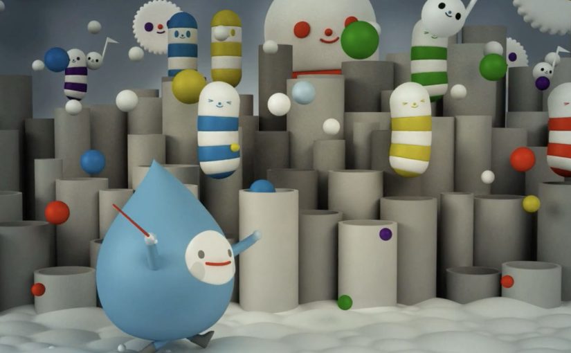
So McCann Melbourne turned the message people needed to hear into a message people wanted to hear, by embedding it into a song and an accompanying music video. Dumb Ways to Die.

Entertainment-first safety communication

The mechanism is a deliberate format swap. Replace shock tactics and lecturing with an original song, a playful animated world, and a chorus that makes the safety points memorable enough to repeat.

In large urban public-transport systems, the most effective safety communication often feels like entertainment first, with the message carried by repetition and recall rather than warning language.

Why it lands

It works because it respects audience resistance instead of fighting it. The real question is how you make a safety message travel when the audience does not want to hear a safety message at all. For resistant audiences, entertainment-first is the stronger safety strategy because it earns voluntary attention before it asks for behavior change. People who tune out safety ads will still watch and share a catchy video, and the refrain makes the cautionary points stick through rhythm and humor. The legacy write-up reports that the campaign quickly moved beyond advertising into social currency, with very high sharing in its first month.

Extractable takeaway: When your audience actively avoids the topic, make the format shareable enough that people choose to spread it for the entertainment value, then let repetition do the behavior-change work.

The proof of spread

By using entertainment rather than shock tactics, the message is described as transcending advertising to become something people shared. Here is the case video.

What safety communicators can borrow

  • Start with a format people opt into. If attention is the barrier, do not begin with a PSA tone.
  • Write for recall. A chorus and simple phrasing can outperform “important information” copy.
  • Build a visual system. Distinct characters and repeatable scenes make the idea remixable and memorable.
  • Package the case story separately. A dedicated case video helps the idea travel in marketing circles without diluting the original film.

A few fast answers before you act

What is Dumb Ways to Die?

A rail-safety campaign for Metro Trains Melbourne that delivers the safety message through a catchy song and animated music video instead of traditional PSA warnings.

Why use humor for a serious safety topic?

Because the target audience resists conventional safety messaging. A humorous, musical format earns voluntary attention and repeat viewing, which increases recall.

What made it spread so widely?

A simple hook, a memorable chorus, and highly shareable animation that people could pass along as entertainment, with the safety message embedded inside.

What is the case video for?

It explains the strategy and rollout behind the campaign, and it packages results and rationale for marketers and stakeholders.

What is the main risk with “entertainment-first” safety work?

If the humor overwhelms the behavioral point, the audience remembers the joke but not the safety action you want them to change.

FriendsWithYou: Cloudy

Miami based animation studio FriendsWithYou has produced “Cloudy”, a short film exploring the concept of clouds singing and performing their duties in a joyful manner while showing the viewer that everything in our world has a role and a purpose.

Sit back and enjoy this sweet visual soundscape that takes you through a personal journey into the sky. Here, “visual soundscape” means a piece where rhythm, tone, and imagery do the narrative work together.

A sky full of characters, not weather

“Cloudy” treats the atmosphere like a workplace musical. Clouds are not background texture. They are the cast, with jobs to do, rhythms to keep, and a mood that turns routine into celebration.

The mechanic: give nature a chorus

The film’s core device is straightforward. Personify the clouds, make the labor visible, and score it like a performance. Once the viewer accepts that premise, every movement becomes readable as intention rather than randomness.

In brand and studio storytelling, anthropomorphism lands when it is used to clarify a system rather than merely decorate a scene.

Why this lands as a “visual soundscape”

The piece is gentle, but it is not passive. It holds attention by pairing simple character purpose with musical momentum, so you feel guided through the sky rather than shown a series of pretty shots.

Extractable takeaway: If you want viewers to remember a message about meaning or purpose, do not explain it first. Stage it as a system of roles, then let the audience feel the order before you name it.

What it is really doing

Beyond the craft, the film is an attitude. It argues that work can look joyful, that duty can look like play, and that even the quiet background parts of a world can be the main event when you frame them that way.

The real question is whether purpose can be made felt before it is explained.

What to steal for your own short-form craft

  • Pick one premise and commit. Once clouds can sing, every scene should deepen that rule, not diversify into new ones.
  • Make “process” the plot. Showing how something gets done is often more watchable than inventing a separate story.
  • Let sound carry structure. A strong musical spine can turn a mood piece into a journey with forward motion.
  • Give the viewer one clean idea to take home. Purpose is easier to feel when every character has a job.

A few fast answers before you act

What is Cloudy?

“Cloudy” is a short animated film by FriendsWithYou that imagines clouds singing and joyfully doing their work, to suggest that everything has a role and a purpose.

What makes it a “visual soundscape”?

The experience is built as much on rhythm and audio mood as on imagery. The sound is not decoration. It is the structure that carries the viewer through the piece.

Why does anthropomorphizing clouds work here?

Because it makes an abstract system legible. Once clouds behave like characters with duties, the viewer can follow cause, effect, and intention without needing exposition.

What can brands learn from this kind of short?

When you want to communicate values like purpose, care, or optimism, show a world where roles are clear and the system feels coherent. That feeling transfers faster than a stated message.

What should creators copy first?

Start with the rule, not the ornament. Give the world one clear premise, then let character, sound, and motion keep proving it.

Kia: Nail Art Animation

A car commercial painted on a fake nail

Kia wanted to highlight the micro-features, meaning the small design and usability details, of their smallest car model, the Picanto. So they created a stop-motion car commercial on a fake nail. The film was billed at the time as the world’s first nail art animation.

It reportedly took 25 days to create, and used 1,200 bottles of nail polish across 900 fake fingernails.

The trick: match “micro-features” with micro-scale filmmaking

Stop-motion is an animation technique where you photograph small, incremental changes frame by frame, then play the frames back to create motion.

Here, the canvas is the punchline. By putting the story on a fingernail, the craft becomes the message. Because the viewer has to pay attention to tiny brushwork to follow the motion, the “micro” idea feels experienced, not merely claimed.

Kia’s Picanto Nail Art Animation is a stop-motion commercial created by painting hundreds of miniature frames onto fake fingernails, turning the “micro” idea into a literal production constraint.

In urban small-car marketing, novelty only matters when it directly reinforces the product promise in a way people can retell in one sentence.

The real question is whether your creative constraint makes the product promise feel inevitable, not just interesting.

This kind of craft-heavy micro-format is worth copying only when the constraint directly maps to the attribute you want people to believe.

Why it lands: the medium proves the claim

This is not just “a weird technique”. It is a tight alignment between what Kia wants you to notice and what the viewer cannot help noticing. Patience, precision, tiny details.

Extractable takeaway: When the medium forces attention onto the same detail you are selling, the audience experiences the claim rather than evaluates it.

The result is a feature demo that does not feel like a feature demo, because the viewer is busy admiring how it was made.

What the brand is buying with this level of craft

The intent is simple. Make a small car feel like a smart choice, not a compromise. Micro can mean cheap or micro can mean cleverly designed. This execution pushes the second interpretation.

It also creates built-in distribution. People share the making-of story as much as the spot itself.

Steal this micro-detail storytelling pattern

  • Let the production constraint carry the positioning. If you sell “small but smart,” make the format small but smart.
  • Design for instant explainability. “A car ad on a fingernail” is a headline by itself.
  • Make craftsmanship visible. When the effort is obvious, skepticism drops.
  • Connect novelty to product truth. Weirdness alone fades. Alignment endures.

A few fast answers before you act

What is Kia’s Picanto Nail Art Animation?

It is a stop-motion commercial for the Kia Picanto created by painting animation frames onto fake fingernails, so the car and its features appear in motion on a tiny nail-sized canvas.

How was the stop-motion effect created on nails?

Each frame was painted as a miniature nail artwork on separate fake nails. The nails were then photographed frame by frame, and the images were stitched together to create movement.

Why is this a smart way to communicate “micro-features”?

Because the medium embodies the message. A micro-scale format forces attention onto tiny details, which makes “small but thoughtfully designed” feel proven, not claimed.

How long did it reportedly take, and what made it so labor-intensive?

It reportedly took 25 days and required painting and photographing hundreds of tiny frame changes. The labor is the point. The visible effort makes “micro-details” feel credible.

What should you copy if you want to tell a “detail story” in your own category?

Pick a constraint that naturally spotlights the detail you care about. If the constraint does not reinforce the promise, the craft reads as novelty and the message evaporates.