Kraft Mac & Cheese: Dinner, Not Art iPad App

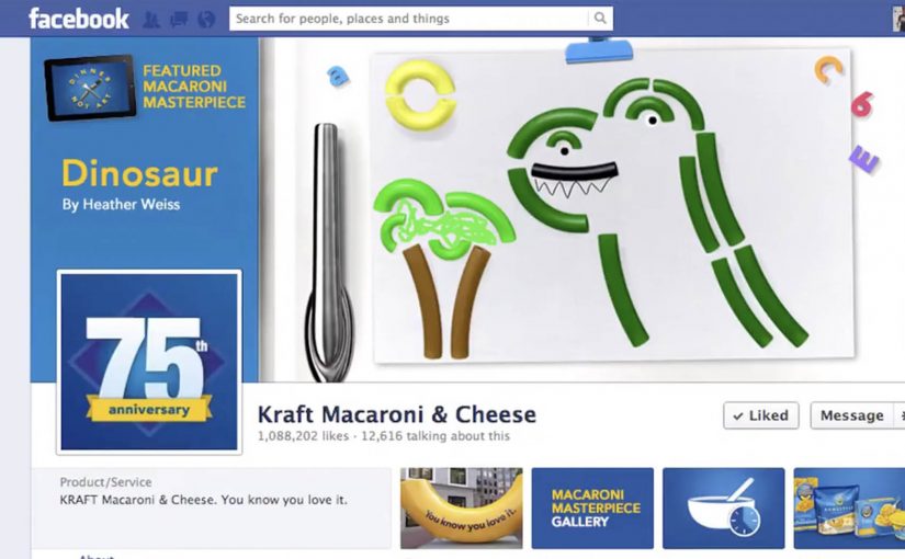
Kids the world over use Kraft’s macaroni noodles to create macaroni art. To stop wastage of its noodles, Kraft along with ad agency CP+B came up with an iPad app that allowed kids to create digital macaroni art.

The special ‘Dinner, Not Art’ app also donated 10 noodles to ‘Feeding America’ for every noodle used in the kids digital art, capped at 110 million noodles. The donation program is said to run till 31.12.2012. So if you would like to participate then head over to www.DinnerNotArt.com.

When “waste” becomes a UI problem

The cultural truth is simple. Kids love gluing macaroni to paper, and the brand ends up underwriting a craft habit that has nothing to do with dinner. Dinner, Not Art flips that behavior into a digital substitute, while keeping the kid-driven creativity intact.

The mechanics behind Dinner, Not Art

The app recreates macaroni art as a touch-first canvas. Kids place noodles, shape the picture, and finish a piece without using a single real noodle.

That substitution works because it preserves the same make-and-place ritual for the child while removing the product waste that makes the original behavior frustrating for parents.

The participation loop is quantified. Each digital noodle used is described as triggering a real-noodle donation to Feeding America, with a stated cap of 110 million noodles, and a program end date described as 31.12.2012.

In global FMCG organizations, utility-style brand apps work best when the interaction directly expresses the brand’s point of view, and produces a measurable counter in the real world.

Why this lands with parents and kids

The line “Dinner, Not Art” works because it is a gentle reprimand wrapped in play. Kids still get to make something. Parents get a reason to say “yes” without the cleanup and the waste, and the brand gets to reframe its product as food, not craft material.

Extractable takeaway: If you are trying to stop a behavior, do not only scold it. Offer a substitute that preserves the fun, then attach a visible benefit to every use.

What Kraft is really buying with this

The real question is whether a food brand can redirect a familiar household behavior without stripping out the fun that made it popular in the first place.

This is brand positioning with a conversion path. It reinforces that the product belongs on the table, creates positive family-time association, and uses the donation mechanic to make engagement feel purposeful rather than promotional.

What brand teams can borrow from Dinner, Not Art

  • Replace the waste, not the impulse. Keep the same creative behavior, move it to a medium that does not consume product.
  • Make the counter tangible. Tie each action to a simple unit that people instantly understand, like noodles donated per noodle used.
  • Cap with intention. A cap can protect budgets while still sounding meaningful, as long as the unit story stays clear.
  • Use a line that can parent-proof the idea. If the tagline helps a parent justify participation, adoption gets easier.

A few fast answers before you act

What is the Dinner, Not Art app?

It is an iPad app from Kraft and CP+B that lets kids create digital macaroni art, positioned as a way to avoid wasting real macaroni noodles on crafts.

How does the donation mechanic work?

The campaign is described as donating 10 real noodles to Feeding America for every digital noodle used in a child’s artwork, with a stated cap of 110 million noodles.

Why does this tactic fit the Kraft Mac & Cheese category?

Because it tackles a real behavior linked to the product, while reinforcing the intended usage. The experience says “this belongs at dinner,” without killing the creativity kids want.

What makes this more than a donation promotion?

It changes a product-adjacent behavior, makes the benefit visible per action, and ties the brand message to how the experience actually works.

What should other brands copy from this pattern?

Pick one wasteful or off-brand usage behavior, create a satisfying digital substitute, and connect every interaction to a simple, counted real-world outcome.

Misereor: The Power of a Coin

A billboard at Hamburg Airport does not just ask for money. It takes a 2-euro donation and immediately shows what that coin can do.

Misereor has been committed to fighting poverty in Africa, Asia and Latin America for over 50 years. To drive more donations, they install a billboard with a donation box built into it. When people put in 2 euros, the billboard brings to life how that coin can help across Misereor’s aid projects.

The billboard also links the offline act to an online conversation. It takes a photo of the donor and posts it to the campaign’s Facebook app. A QR code on the billboard lets donors share the promotion on their own Facebook page.

How the interaction is designed to convert

The mechanism is a tight, three-step loop. Physical donation triggers an immediate visual payoff. The payoff translates “impact” from an abstract promise into a concrete scene. The scene then becomes shareable proof through an automatic photo post and a QR-driven sharing prompt.

In high-traffic public spaces where attention is fragmented and dwell time is unpredictable, donation design wins when it minimizes steps and makes impact visible immediately.

Why it lands

This works because it replaces guilt with clarity. You do not just hear that your money helps. You see a specific outcome the moment you give, which makes the decision feel both meaningful and finished.

Extractable takeaway: If you want more donations, build a “give. see. share.” loop where the act of giving triggers instant, legible impact, and the sharing step is optional but effortless.

The real goal behind the 2-euro choice

The real question is whether a donation ask can feel immediate, visible, and worth doing before the traveler walks away. A 2-euro ask is small enough to feel impulse-safe, especially in an airport moment where people already make small purchases without overthinking. The campaign then uses the experience to recruit advocates, not just donors, by turning each donor into a visible participant online.

What this donation design gets right

  • Make the donation amount frictionless. Small, fixed amounts reduce decision paralysis.
  • Show impact instantly. The payoff must happen before the donor walks away.
  • Bridge offline to online. Capture a shareable artifact, but keep it consent-friendly.
  • Keep the interface obvious. A slot, a prompt, a clear result. No instructions required.

A few fast answers before you act

What is “The Power of a Coin”?

An interactive airport billboard for Misereor where a 2-euro donation triggers an animation that shows how the money helps, and then offers easy sharing via photo and Facebook.

What is the core mechanism?

Donate a fixed amount, get an immediate visual “impact reveal”, then optionally share via an automatically posted donor photo and a QR-enabled share prompt.

Why is the instant animation important?

It turns “trust us” into “watch this”. Immediate feedback reduces skepticism and increases the chance of giving in-the-moment.

What is the biggest risk with the social layer?

Consent and platform drift. If posting feels automatic in a way donors did not expect, or if platform permissions change, the sharing layer can backfire or break.

What is the transferable lesson for other causes?

Design the donation moment like a product demo. One action triggers a clear result, then the donor can share proof without extra effort.

MCSC: World’s Most Valuable Social Network

When a child goes missing, the first hours matter. The problem is that the people who could help are often nearby, busy, and scrolling.

The Missing Children Society of Canada, with Grey Canada, asks people to “donate” their Facebook and Twitter news feeds. By opting in, a person allows missing-child alerts to be posted directly into their feed, turning everyday social reach into a public-safety broadcast layer.

The distribution logic is local. Alerts are geographically coded, so someone in Toronto sees posts about missing children in their area, not a national firehose.

Turning social feeds into an emergency surface

The mechanism is permissioned publishing. Here, “permissioned” means people explicitly opt in to let the program post on their behalf. Instead of asking people to remember to share posters or retweet at the right moment, the campaign uses opt-in account access to place alerts where attention already lives. Because the alert is published automatically into feeds people already check, it moves faster than a request that depends on manual sharing.

In Canadian public-safety communications, speed and local relevance determine whether a message gets acted on or ignored.

Why this lands better than a generic awareness push

Most “support the cause” messaging competes with everything else in the feed. This flips the frame. The feed itself becomes the tool, and the content is time-sensitive and action-oriented. This is a stronger model than a generic awareness push because it routes attention into action without extra steps.

Extractable takeaway: If the mission depends on time, do not optimize for “awareness.” Optimize for distribution mechanics that reduce steps at the moment of need, and constrain the message to the people who can realistically act.

Geo-coding is the quiet hero here. Locality reduces fatigue, increases perceived responsibility, and makes the alert feel like a neighborhood problem, not distant tragedy content.

What the campaign is really building

Beyond any single case, this creates a repeatable digital volunteer layer. Every donated feed is a standing commitment, and every local alert becomes a test of whether the network can mobilize attention fast enough to matter.

The real question is whether you can convert passive sympathy into permissioned, local distribution during the first hours.

Design moves worth borrowing

  • Make opt-in feel like “donation.” People understand giving reach the way they understand giving money.
  • Automate the share. Remove the “I should post this” friction.
  • Localize by default. Relevance is the difference between help and noise.
  • Keep the message actionable. Clear identifiers and a next step beat emotional copy in urgent scenarios.

A few fast answers before you act

What does it mean to “donate” your social media feed in this campaign?

You opt in so missing-child alerts can be posted directly to your Facebook or Twitter feed, using your reach to distribute time-sensitive information.

Why use geo-coded alerts?

It keeps the feed relevant and increases the chance someone nearby recognizes the child or has useful information, while avoiding national alert fatigue.

What problem is this solving compared to posters or standard PSAs?

Speed and placement. It puts alerts into a high-attention channel immediately, without relying on people to take an extra step to share.

What should a program like this measure?

Opt-in volume, local reach per alert, time-to-first-distribution, engagement actions that indicate reading, and downstream reporting behavior where available.

What’s the smallest version you can pilot?

Start with a single opt-in flow, a clear local targeting rule, an approval workflow for posting, and one simple call to action that tells people exactly what to do if they have information.