Australia Post: Video Stamps

Australia Post: Video Stamps

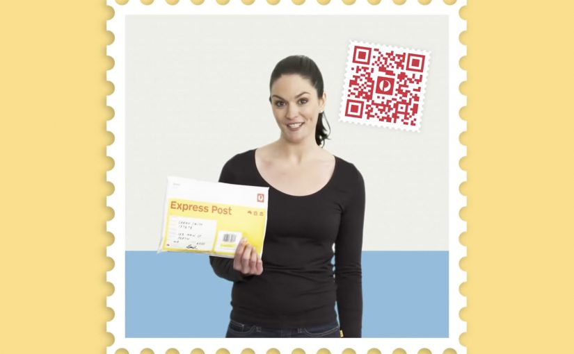
Unpacking a parcel can feel a bit like unpacking a gift. Australia Post builds on that instinct with a “video stamp” that lets senders add a personal message to a package.

The mechanic is straightforward. A QR code stamp is linked to a custom video message, so the recipient scans the stamp and watches a personal clip as part of the unboxing moment.

How the video stamp works

The value sits in the linkage between physical and digital. The parcel carries a QR stamp, the QR routes to a hosted video message, and the message becomes part of the delivery experience without changing the logistics underneath.

In holiday postal services and gifting moments, a simple personalization layer can increase perceived value without changing the core delivery product.

Why this lands

This works because it upgrades a utilitarian service into an emotional ritual. The postal service delivers the object, but the sender delivers the moment. The QR stamp is also a clean trigger because it is familiar, fast, and naturally placed where attention already goes during unboxing.

Extractable takeaway: If your product is operational by nature, add a lightweight digital layer that attaches to a physical touchpoint, so the experience gains meaning without adding friction to the core process.

The idea in context

Linking codes to personal messages is a proven pattern. J.C. Penney linked QR codes to voice messages in their Santa Tags sticker campaign in 2011. There was also a concept video circulating about a similar DHL-style Christmas video packet service. The notable part here is the step from concept and retail experiments into a postal service implementation.

The real question is not whether a QR code can play a video, but whether a postal service can make a routine delivery feel personal without complicating the service.

This is a smart service-layer idea because it adds emotion without asking the postal operation to become something else.

What postal and gifting teams can reuse

  • Attach meaning to a routine moment. Unboxing is already emotional. Add a trigger there.
  • Use a familiar bridge. QR is low-explaining and low-friction.
  • Let the sender create the content. Personalization scales when users do the work willingly.
  • Keep it additive. The digital layer should not interfere with delivery, tracking, or operations.

A few fast answers before you act

What is an Australia Post video stamp?

It is a QR code stamp on a parcel that links to a custom video message, so the recipient can scan and watch a personal clip.

Why does this work especially well at Christmas?

Because parcels are already treated like gifts. A video message makes the delivery feel more personal and intentional.

Is this a new idea or a new implementation?

The underlying concept has existed in other forms, but the notable move is a postal service implementing it as a practical consumer feature.

What’s the main UX requirement for this to succeed?

Instant playback with minimal steps. If scanning leads to friction, the emotional moment disappears.

What’s the easiest way to copy the pattern?

Identify a physical touchpoint people already look at, then attach a scannable trigger that opens a personal message or content layer immediately.

Macy’s iBeacon: Retail Enters Micro-Location

Macy’s iBeacon: Retail Enters Micro-Location

iBeacon moves from concept to real retail

Apple is working to bring iBeacon technology into retail stores. But the first real-world deployment lands fast.

On November 20, Shopkick deploys an iBeacon system at Macy’s, effectively bringing beacon-driven retail experiences live before Apple’s own retail rollout becomes mainstream.

At Macy’s, the implementation is branded as shopBeacon, an iBeacon-based in-store experience.

What iBeacon makes possible in-store

iBeacon, introduced with iOS 7, uses Bluetooth Low Energy (BLE) signaling to enable micro-location services inside stores, meaning aisle-level positioning rather than GPS-level proximity.

That matters because it changes what mobile in-store experiences can do. Because the signal is precise inside the environment, experiences can trigger at the moment of intent, reducing the need for shoppers to search.

Stores can deliver information and value based on a shopper’s precise location inside the environment, not just on GPS-level proximity.

Micro-location enables location-specific deals and discounts, product recommendations by aisle or department, loyalty rewards triggered by presence, and contextual content that enhances the shopping journey.

The promise is simple. The store becomes a responsive, context-aware interface.

In brick-and-mortar retail, micro-location only matters when it is permissioned, useful, and tied to measurable in-store behavior change.

What makes Macy’s deployment noteworthy

This is not a lab demo. It is a live retail environment.

The shopBeacon trial runs as a closed beta at Macy’s Herald Square in New York and Macy’s Union Square in San Francisco.

This marks the shift from talking about beacons to operationally testing them in flagship stores, where footfall, density, and shopper intent are real.

The strategic signal for retailers and brands

Beacon technology is not another channel. It is an in-store intelligence layer that links a shopper’s physical context to digital triggers and measurement.

Extractable takeaway: Micro-location only becomes strategic when it turns permissioned context into real utility that changes behavior, not just into more messages.

The real question is whether you can turn aisle-level context into permissioned help that measurably changes in-store behavior.

If executed with permission and relevance, it can reduce friction in discovery and decision-making, increase the utility of mobile without forcing shoppers to search, and bridge physical browsing with digital personalization.

If executed poorly, it becomes noise. The win condition is not proximity. It is context plus permission plus usefulness.

What to borrow for your beacon pilot

  • Win permission first. Treat opt-in and relevance as the product, not an afterthought.
  • Design for usefulness at the moment of intent. Use aisle-level context to reduce discovery and decision friction, not to spam offers.
  • Make measurement non-negotiable. Track opt-in rates, perceived usefulness, and impact on dwell and conversion to prove behavior change.

A few fast answers before you act

What does “micro-location” mean in a store context?

It means detecting a shopper’s location at aisle or department level, not just “near the store”, enabling experiences that change based on where the shopper is standing.

Why is BLE central to iBeacon-style deployments?

Bluetooth Low Energy enables persistent, low-power proximity signals that make in-aisle triggers and experiences feasible without draining devices.

Is the main value just pushing offers?

No. Offers are one use case. The stronger value is contextual service, guidance, and relevance when it reduces shopping friction.

What should retailers measure in early pilots?

Opt-in rates, perceived usefulness, impact on dwell and conversion, and whether the experience feels helpful rather than intrusive.

What is the quickest way for this to fail?

When it becomes noisy, repetitive, or unpermissioned. Proximity alone is not value. Context and usefulness are the win condition.

Checkout-Free Stores: 2 Startups Shape Retail

Checkout-Free Stores: 2 Startups Shape Retail

In-store shopping changes when the phone becomes the checkout

With smartphone penetration crossing the halfway point, two new start-ups push to change how we shop in-store.

The shift is simple. The phone is no longer just a companion to shopping. It becomes the point-of-sale, the service layer, and the trigger for fulfillment inside the store. By “checkout-free” here, I mean shoppers scan and pay on their own phone, with staff stepping in only for exceptions.

Because scanning and payment happen during the journey, peak demand spreads across aisles instead of stacking at one cashier line.

The real question is whether you can make the exception path feel as simple as the happy path.

Checkout-free is worth scaling only when your exception paths are as smooth as the happy path.

Why this lands in practice

In omnichannel retail operations, the biggest shopper experience gains often come from removing time sinks like queues and size-hunting, not from adding more screens.

Extractable takeaway: If you want measurable lift, redesign the store journey to delete time sinks first, then let the phone execute the flow.

QThru

QThru is a mobile point-of-sale platform that helps consumers at grocery and retail stores to shop, scan and check out using their Android and iOS smartphones…

The ambition is clear. Remove queues. Remove friction.

Shoppers move through the store with the same control they have online. Browse, scan, pay, and leave without the classic checkout bottleneck.

Hointer

Hointer automates jean shopping through QR codes.

When scanned using the store’s app, the jean is delivered in the chosen size to a fitting room in the store and the customer is alerted to which room to visit.

Once the jeans have been tried, customers can either send the jeans back into the system or swipe their card using a machine in each fitting room to make a purchase.

This approach removes two of the most frustrating in-store steps. Finding the right size and waiting to pay.

The store behaves like a responsive system rather than a manual process.

Steal these moves for checkout-free pilots

  • Delete one time sink first. Pick queues or size-hunting and design the flow to remove it end-to-end.
  • Make exceptions feel normal. Mis-scans, out-of-stocks, returns, and overrides need a fast, humane path.
  • Keep the shopper flow simple. The phone should execute scan-and-pay cleanly, without adding extra steps.
  • Operational reliability beats novelty. Inventory accuracy and in-store routing have to hold up when the store is busy.

A few fast answers before you act

What is the common idea behind both examples?

They move checkout and fulfillment logic into the shopper’s hands. Scanning, sizing, and payment become distributed across the store journey instead of centralized at a cashier line.

How do QThru and Hointer differ in the problem they solve?

QThru focuses on scan-and-pay to reduce queues. Hointer focuses on discovery and fitting-room fulfillment to remove size-hunting, then completes payment in the fitting room.

What has to be true operationally for checkout-free to work?

The system has to be reliable under load: accurate inventory, fast in-store routing, dependable scanning, and a payment flow that stays simple even when the store is busy.

What is the simplest way to pilot this without overbuilding?

Start with one store format and one tight journey. Measure queue time saved and staff exception workload, then expand only if operations stay stable.

What is the biggest failure mode teams underestimate?

Edge cases. Mis-scans, out-of-stocks, returns, fraud handling, and staff override paths. If exceptions are painful, the “friction-free” promise collapses at the worst moment.