The Lovart AI ‘designer for everyone’ moment just got real
For decades, creative software demanded expertise. Layers. Masks. Rendering. Color theory. Not because it was fun, but because the tools were built for specialists.
Lovart frames a different future. Instead of learning the tool, you describe the outcome, and an AI design agent orchestrates the work across assets and formats.
What Lovart is really selling. Creative output as an agent workflow
The shift is not “design got easier”. The shift is that the workflow collapses into intent. You type what you are trying to achieve, and the system produces a coordinated set of outputs.
In enterprise brand teams, the main unlock from agentic design tools is faster option generation while governance and taste still decide what ships.
For consumer experience teams, that matters because the same system can start feeding campaign adaptation, ecommerce assets, CRM creative, and localized variants from one brief.
In the positioning and demos around Lovart, the promise is that you can move from a prompt to a usable bundle of creative. Brand identity elements. Campaign assets. Even video outputs. Without tutorials, plugins, or the classic “maybe I will learn Photoshop someday” hurdle.
By “agentic design tools,” I mean systems that plan and execute multi-step creative work across assets and formats, not just generate a single output.
Why Photoshop starts to feel like Microsoft Paint
This is not a diss on Photoshop. It is a reframing of value.
When an agent can produce a coherent set of assets quickly, the advantage shifts away from operating complex software and toward higher-order thinking:
- What is the offer.
- What is the story.
- What is the differentiation.
- What should the system optimize for. Consistency, conversion, memorability, or speed.
If everyone can generate assets, the edge belongs to people who can direct the system with clarity and taste, not just execute.
The commercial test is simple. Does this reduce cycle time, lower production friction, and increase useful variation without weakening brand control.
The real constraint moves upstream. Taste, strategy, and governance
The future hinted at here is not more content. It is a faster creative pipeline, which means the operating challenge moves to guardrails, approvals, and reusable brand logic.
Extractable takeaway: When production gets cheap, the advantage shifts to upstream constraints. A shared definition of “good”, plus guardrails and review rhythms, beats faster output alone.
- How do you keep quality high when output becomes abundant.
- How do you keep brand coherence when anyone can spin up campaigns in minutes.
For enterprise teams, the real decision is where this sits in the stack. Concepting, campaign adaptation, localization, ecommerce variation, or CRM asset production, and who owns briefing, review, and quality control.
The real question is whether you can define “good” once and enforce it consistently when output becomes abundant.
Brand teams should treat agentic design as a governance problem first, not a production shortcut.
This is where the craft does not disappear. It relocates. From hands-on production to creative direction, guardrails, and decision-making.
Directing agentic design without losing the brand
Lovart is a signal that creative tooling is becoming agentic. The barrier is no longer the interface. The barrier is whether your team can turn brand intent into reusable rules, decision criteria, and review checkpoints across channels.
- Write the brief like a spec. Describe the offer, the audience, the constraints, and what “good” looks like before you generate.
- Decide the guardrails up front. Clarify what must stay consistent across assets, and what can vary for speed and experimentation.
- Keep humans as the decision layer. Use the agent for options and iteration, then apply taste and governance to choose what ships.
The pressure point is not adoption alone. It is whether your operating model, approval flow, and content stack are ready for it.
A few fast answers before you act
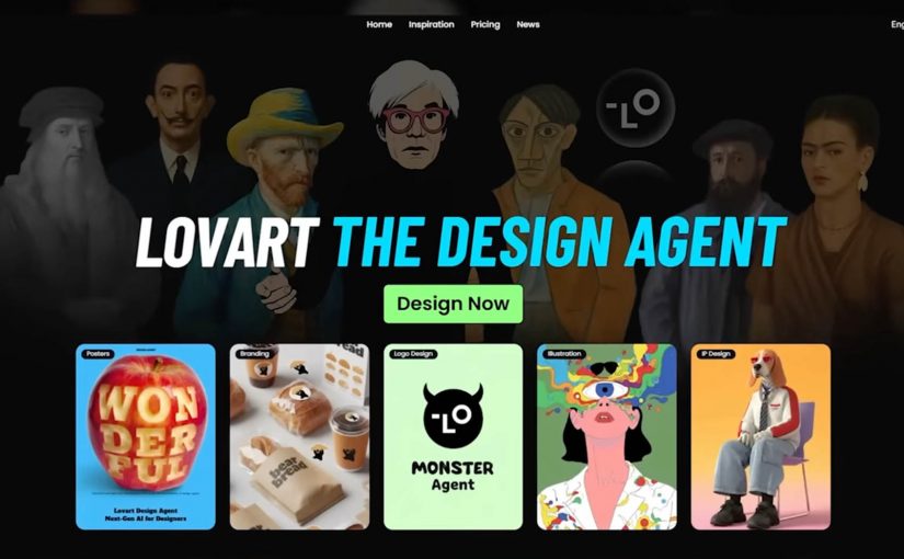
What is Lovart in one sentence?
Lovart is a design-oriented agent experience that turns a brief into a guided workflow. It plans, generates, and iterates across assets, rather than handing you a blank canvas.
How is this different from using Photoshop plus AI tools?
The difference is orchestration. Instead of switching between tools and prompts, the workflow becomes “brief to deliverables” with the system managing steps, versions, and outputs.
Does this replace designers?
It can replace some production tasks and speed up concepting. It does not replace taste, direction, brand judgment, and the ability to decide what is worth making.
What should brand teams watch closely?
Brand safety, rights and provenance, and consistency. Faster creation increases the need for clear guardrails, review, and a shared definition of “good.”
What is the simplest way to test value?
Pick one repeatable asset type, run the same brief through the workflow, and compare speed, quality, revision cycles, and brand-control effort against your current process.