
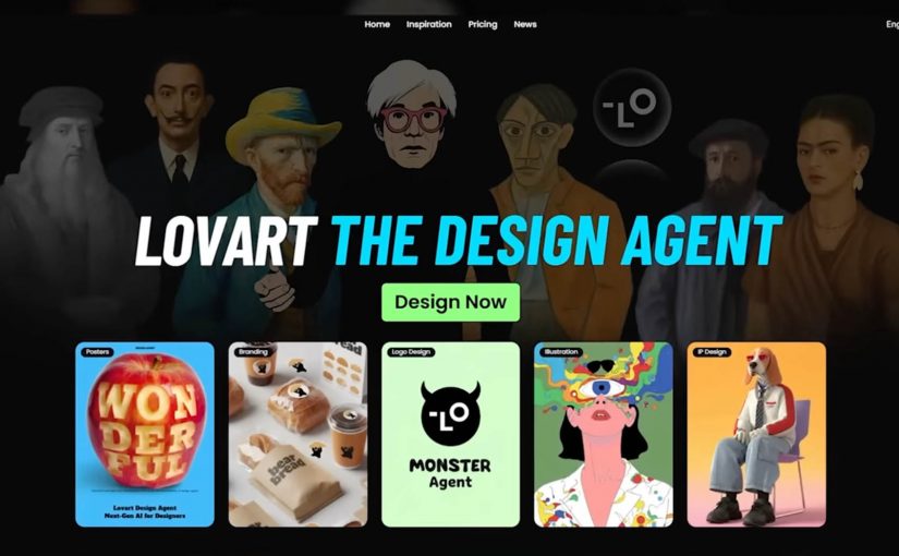
Lovart AI: Photoshop, Now as Simple as Paint

The Lovart AI ‘designer for everyone’ moment just got real

For decades, creative software demanded expertise. Layers. Masks. Rendering. Color theory. Not because it was fun, but because the tools were built for specialists.

Lovart frames a different future. Instead of learning the tool, you describe the outcome, and an AI design agent orchestrates the work across assets and formats.

What Lovart is really selling. Creative output as an agent workflow

The shift is not “design got easier”. The shift is that the workflow collapses into intent. You type what you are trying to achieve, and the system produces a coordinated set of outputs.

In enterprise brand teams, the main unlock from agentic design tools is faster option generation while governance and taste still decide what ships.

For consumer experience teams, that matters because the same system can start feeding campaign adaptation, ecommerce assets, CRM creative, and localized variants from one brief.

In the positioning and demos around Lovart, the promise is that you can move from a prompt to a usable bundle of creative. Brand identity elements. Campaign assets. Even video outputs. Without tutorials, plugins, or the classic “maybe I will learn Photoshop someday” hurdle.

By “agentic design tools,” I mean systems that plan and execute multi-step creative work across assets and formats, not just generate a single output.

Why Photoshop starts to feel like Microsoft Paint

This is not a diss on Photoshop. It is a reframing of value.

When an agent can produce a coherent set of assets quickly, the advantage shifts away from operating complex software and toward higher-order thinking:

  • What is the offer.
  • What is the story.
  • What is the differentiation.
  • What should the system optimize for. Consistency, conversion, memorability, or speed.

If everyone can generate assets, the edge belongs to people who can direct the system with clarity and taste, not just execute.

The commercial test is simple. Does this reduce cycle time, lower production friction, and increase useful variation without weakening brand control.

The real constraint moves upstream. Taste, strategy, and governance

The future hinted at here is not more content. It is a faster creative pipeline, which means the operating challenge moves to guardrails, approvals, and reusable brand logic.

Extractable takeaway: When production gets cheap, the advantage shifts to upstream constraints. A shared definition of “good”, plus guardrails and review rhythms, beats faster output alone.

  1. How do you keep quality high when output becomes abundant.
  2. How do you keep brand coherence when anyone can spin up campaigns in minutes.

For enterprise teams, the real decision is where this sits in the stack. Concepting, campaign adaptation, localization, ecommerce variation, or CRM asset production, and who owns briefing, review, and quality control.

The real question is whether you can define “good” once and enforce it consistently when output becomes abundant.

Brand teams should treat agentic design as a governance problem first, not a production shortcut.

This is where the craft does not disappear. It relocates. From hands-on production to creative direction, guardrails, and decision-making.

Directing agentic design without losing the brand

Lovart is a signal that creative tooling is becoming agentic. The barrier is no longer the interface. The barrier is whether your team can turn brand intent into reusable rules, decision criteria, and review checkpoints across channels.

  • Write the brief like a spec. Describe the offer, the audience, the constraints, and what “good” looks like before you generate.
  • Decide the guardrails up front. Clarify what must stay consistent across assets, and what can vary for speed and experimentation.
  • Keep humans as the decision layer. Use the agent for options and iteration, then apply taste and governance to choose what ships.

The pressure point is not adoption alone. It is whether your operating model, approval flow, and content stack are ready for it.


A few fast answers before you act

What is Lovart in one sentence?

Lovart is a design-oriented agent experience that turns a brief into a guided workflow. It plans, generates, and iterates across assets, rather than handing you a blank canvas.

How is this different from using Photoshop plus AI tools?

The difference is orchestration. Instead of switching between tools and prompts, the workflow becomes “brief to deliverables” with the system managing steps, versions, and outputs.

Does this replace designers?

It can replace some production tasks and speed up concepting. It does not replace taste, direction, brand judgment, and the ability to decide what is worth making.

What should brand teams watch closely?

Brand safety, rights and provenance, and consistency. Faster creation increases the need for clear guardrails, review, and a shared definition of “good.”

What is the simplest way to test value?

Pick one repeatable asset type, run the same brief through the workflow, and compare speed, quality, revision cycles, and brand-control effort against your current process.
Crafted By My Heart

A ring becomes more than a ring when the pattern is literally yours.

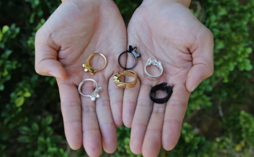
“Crafted By My Heart” is an app launched by DDB Group Hong Kong that lets you customize jewelry with your own heartbeat. You place a finger over the smartphone’s camera and flash. The app detects subtle changes in finger coloration, measures your heartbeat, then translates its intensity and rhythm into a unique digital rendering. That rendering becomes the basis for a one-of-a-kind ring.

From pulse to pattern

Turn a biometric signal into a personal design language, then manufacture it as a physical object. By “biometric signal,” I mean a measurable body output, like heart rhythm, captured directly from the user.

How the experience works

The flow is intentionally simple. The mechanism matters because it converts an invisible, emotional idea (“this is us”) into visible proof that feels undeniably personal.

  1. Capture
    You use the phone’s flash and camera to read your heartbeat through small changes in skin coloration.
  2. Translate
    The heartbeat becomes a digital rendering that is unique to your rhythm.
  3. Craft
    That rendering is used to create a ring. It is not a generic engraving. It is a form generated by your own signal.

In premium gifting categories, the story attached to the object often matters as much as the object itself.

The product choices are clear and bounded

The app offers two base designs, Surge and Sierra, with three finishes: gold, silver, or black silver. Rings cost between HK$1,198 and HK$1,588 (listed as US$155 to US$205), and take around 15 to 20 working days to complete.

Why a heartbeat beats engraving

Most “personalization” is decorative choice. This is structural personalization, where the customer input generates the form, which raises perceived meaning and makes the purchase easier to justify.

Extractable takeaway: If the customer’s input does not change the form of the product, you are offering decoration, not personalization, and it will be competed away by more options and lower price.

Personalization is structural, not cosmetic

A lot of customization is color, text, or surface. Here, the customer input generates the form. That feels materially more personal.

Technology removes the intimidation barrier

Biometrics and jewelry-making sound complex. The interaction is not. One finger. One phone. A result you can explain in one sentence.

The story is built-in

The product carries a narrative you can repeat instantly. It is your heartbeat, turned into a physical object. That makes it inherently giftable.

The deeper point

The real question is: how do you turn personalization from “more choices” into emotional proof people will pay for?

Meaningful personalization rarely comes from expanding menus. It comes from finding a signal that matters emotionally, translating it into a design system, and making the creation process easy enough that people actually do it.

What to steal

  • Start with a signal, not a style. Pick an input customers already value emotionally (not just data you happen to have).
  • Translate the signal into form. Make the input change geometry or structure, not just surface decoration.
  • Keep choices bounded. Offer a small set of base options so the “unique” part stays legible.
  • Design for retellability. If the owner cannot explain it in one sentence, it will not travel socially.

A few fast answers before you act

What is the core mechanic behind Crafted By My Heart?

The phone’s camera and flash detect heartbeat via subtle changes in finger coloration, then translate the rhythm into a digital rendering used to craft a ring.

What does the customer actually customize?

They select a base design and finish. The unique part is the heartbeat-generated rendering that drives the final piece.

What are the available designs and finishes?

Two base designs, Surge and Sierra. Three finishes, gold, silver, and black silver.

What are the price and production timelines?

HK$1,198 to HK$1,588 (US$155 to US$205). Around 15 to 20 working days.

What is the transferable lesson for other categories?

If you can capture a personal signal that people care about and make it visibly change the product’s form, you turn “customization” into meaning, not configuration.

Camp Nectar: Real Fruit Boxes

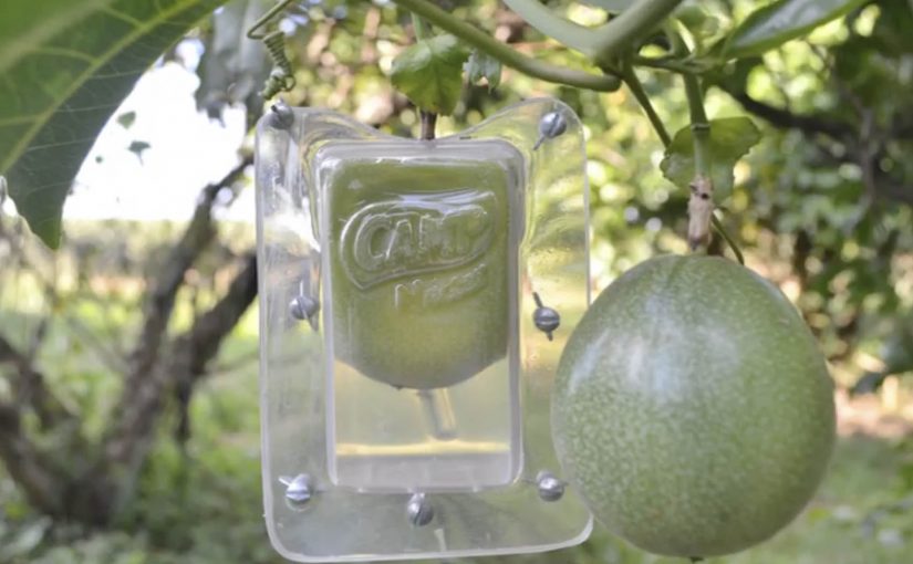
A piece of fruit is hanging from a tree. But it is not round. It is shaped like a juice pack, complete with the unmistakable carton silhouette.

Brazilian agency ageisobar was asked to prove that Camp Nectar juices were all natural. So they created molds in the shape of the brand’s packaging and attached them to fruit as it grew on farms. As the fruit developed and ripened, it took on the exact shape of the juice box, turning “made from real fruit” into something you can see without reading a claim.

The mold-on-tree mechanic

The mechanism is product proof, not persuasion. By product proof, the campaign uses the fruit itself as evidence instead of asking the audience to trust a written claim. Instead of showing ingredients or production steps, the campaign engineers a physical outcome that can only happen if real fruit is involved. The fruit becomes the packaging, and the packaging becomes the argument.

In packaged food and beverage marketing, “natural” claims are often distrusted, so literal demonstrations that collapse the gap between product and source earn attention faster than explanations.

Why the visual is hard to forget

The idea lands because it is a contradiction you can resolve instantly. You see something impossible, then you understand the trick, and the understanding reinforces the claim. It is also inherently shareable because the proof fits in a single frame. A fruit that looks like the pack.

Extractable takeaway: If your claim is routinely doubted, design a one-image demonstration that makes the claim self-evident, then let distribution follow the proof rather than the copy.

What the brand is really doing

Camp Nectar is not just saying “we’re natural”. It is trying to reset the credibility bar in a category full of vague promises. The stronger strategy is to make the claim visible, not louder. The execution borrows the authority of nature itself. Growth, time, and farming become the brand’s endorsement.

The real question is not whether the brand can say “real fruit”, but whether it can make that claim feel self-evident at a glance.

What food and beverage brands can take from this

  • Prove, do not promise. Engineer a physical or behavioral outcome that functions as evidence.
  • Compress the story into one frame. If the proof reads in a second, it travels further.
  • Let the medium match the message. A farm-grown artifact is more persuasive than a studio-made graphic.
  • Keep the claim implicit. When the proof is strong, the audience supplies the conclusion for you.

A few fast answers before you act

What is “Real Fruit Boxes”?

A demonstration campaign where real fruit is grown inside juice-box-shaped molds so it ripens into the shape of Camp Nectar’s packaging.

Why does this work better than ingredient messaging?

Because it is evidence-first. The audience sees a physical result that implies real fruit without needing technical explanation.

What is the core creative principle?

Make the proof visual, literal, and instantaneous. One glance should communicate the point.

What is the main execution risk?

If the proof looks fabricated or overly staged, trust collapses. The craft has to feel like a real-world process, not a prop.

When should brands use “literal proof” ideas?

When the category is saturated with claims and skepticism is high, and you can create a demonstration that is simple, safe, and repeatable.