To wake Pinterest users from a scrolling slumber, UNIQLO created an execution that turns the platform’s simplest behavior into the campaign format itself.
100 accounts, one coordinated reveal
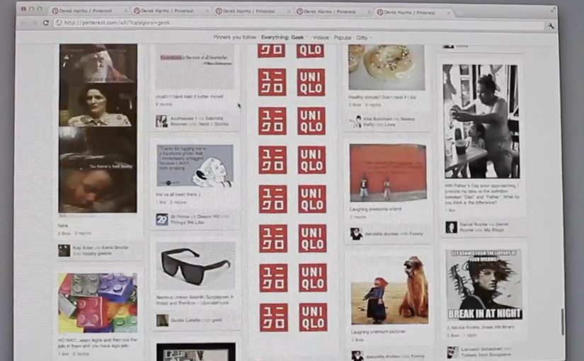
The setup is as clever as it is low-tech. Reportedly, UNIQLO created 100 separate shell Pinterest accounts, meaning empty accounts set up only to publish frames, that pinned images simultaneously. Users who scroll down categories like men’s apparel, women’s apparel, geek, fitness, and sports come across giant mosaics that appear to “animate” as the feed moves.
How the “animation” actually happens
Mechanically, this is a sequence of frames distributed across multiple accounts, aligned so that the grid resolves into a single moving image as the viewer scrolls. The motion is not a video player. It is the interface doing what it always does, and the campaign simply treats that movement as playback.
In social-first retail marketing, using native interface behavior as the delivery system can outperform richer formats because it feels like discovery, not an interruption.
Why it breaks through on a visually saturated platform
Pinterest is already a wall of images, which makes conventional brand posts easy to ignore. A mosaic that only makes sense when you keep scrolling changes the deal. It rewards continuation. It creates a small “I need to see the next bit” tension, which is exactly what passive browsing lacks. This is stronger than adding more “nice content” to a feed people are already skimming. The real question is whether your idea has a clear visual payoff that becomes obvious within a few scroll steps.
Extractable takeaway: If a platform has a native, repeatable interaction, design the reveal so that interaction becomes the play button and the user’s motion becomes the pacing.
Others that turn platform basics into an ad
Steal the scroll-play mosaic pattern
- Design for viewer control. Let the user’s normal behavior trigger the reveal, rather than asking for a click.
- Use sequencing as the creative device. The story lives in the order, not in any single tile.
- Exploit the grid. On mosaic-based platforms, composition can be more attention-grabbing than individual images.
- Make the payoff legible fast. The moment the mosaic “clicks”, people understand what to do next.
A few fast answers before you act
What is the UNIQLO DRY MESH Project in one line?
A Pinterest takeover where coordinated pins form giant mosaics that appear to animate as users scroll through key categories.
Why does it feel like animation if it is not a video?
Because the experience is frame-based. Scrolling advances the sequence, so the interface movement functions like playback.
What is the core creative principle here?
Turn a platform’s default behavior into the media unit. The feed becomes the screen.
What has to be true for this pattern to work?
You need a frame sequence that reads clearly in a grid, plus coordinated publishing so the mosaic resolves predictably as people scroll.
When should a brand use this pattern?
When the platform has a strong native interaction you can repurpose, and when your idea can be communicated through simple sequencing and visual payoff.