Pizza Hut Interactive Table: order by touch

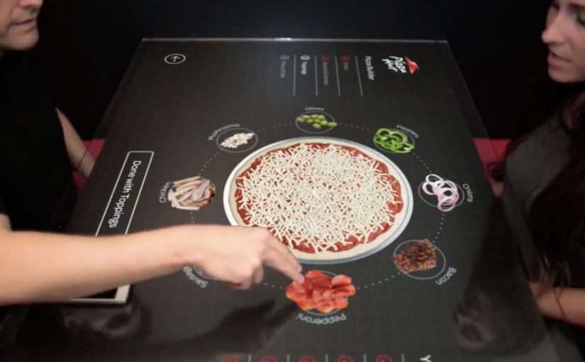
Multi-touch media that uses highly engineered glass and companion technologies feels like the future. So Pizza Hut partners with Chaotic Moon Studios in the USA to create an interactive concept table that lets customers in retail outlets create and customize their pizzas on the spot.

The promise is simple: instead of a static menu, the table becomes the interface, turning ordering into something you can explore, assemble, and adjust with your hands.

A table that turns ordering into a build experience

The mechanism is a multi-touch tabletop UI that walks you through base, sauce, toppings, and sides as a sequence of visual choices. Your pizza is assembled live on-screen, so the product takes shape while you decide.

In quick-service restaurants, the easiest way to increase customization confidence is to make choices visual and immediate.

Why it lands: it reduces friction and adds play

Ordering pizza can be surprisingly error-prone: misheard toppings, unclear sizes, forgotten extras, awkward group decisions. A touch-first interface turns that into a shared, visible process where everyone can see what is being built before it is submitted.

Extractable takeaway: When customization is the product, make the build visible to everyone, so groups converge on one order with fewer misunderstandings.

What Pizza Hut is really trying to prove

Beyond “cool tech,” this kind of table concept signals modernity in the dine-in experience. It frames Pizza Hut as a place where the experience is part of the product, not only the food.

These interfaces are worth doing only when they reduce ordering errors and keep dine-in throughput intact.

The real question is whether turning ordering into a shared build process increases confidence without slowing the line.

Borrowable patterns for touch-first ordering

  • Make the product assemble itself. Visual construction beats textual configuration for speed and accuracy.
  • Design for groups, not only individuals. Shared screens turn indecision into collaboration.
  • Keep the interaction shallow. Limit the flow to a few obvious steps with minimal typing.
  • Let the interface do the upsell quietly. Sides and add-ons perform better when they appear as natural next steps.

A few fast answers before you act

What is the Pizza Hut Interactive Concept Table?

It is a multi-touch tabletop ordering concept designed to let dine-in customers build and customize pizzas directly on the table interface.

What problem does a touch-table solve in restaurants?

It reduces ordering friction by making customization visual, shared, and less dependent on staff hearing, memory, or paper menus.

Is this an ordering system or a marketing concept?

It is presented as a concept experience to demonstrate a possible future dine-in flow, with the interface itself acting as the headline.

Why is multi-touch a good fit for pizza customization?

Pizza is modular. When options can be added, removed, and previewed instantly, customers feel more confident and order faster.

What is the main takeaway for experience design?

If you want people to customize, make the choices tangible. Let them see the product changing as they decide.

Touch the Sound: 3D printed radio history

PolskieRadio.pl is described as a news portal with the largest radio recordings database in Poland. To promote it at Science Picnic in Warsaw, Hypermedia Isobar creates a special event built around one simple idea: make sound physically touchable.

Using 3D printing technology, they print out some of the most famous historical radio recordings, turning audio into tangible objects that visitors can hold and explore as “important sounds” of the 20th century.

How “sound you can touch” is staged

The experience works because it is instantly legible on a crowded show floor. You see unusual 3D printed forms, you learn they represent famous recordings, and you understand the invitation without needing a demo or instruction manual.

Instead of asking people to browse a deep archive, the activation turns the archive into a physical exhibit. That shift changes the audience mindset from “searching content” to “discovering artifacts”.

The real question is whether your archive can become something people discover in the room before they ever search it online.

In European public media and culture marketing, giving people a hands-on way to experience an intangible archive can outperform any “come visit our site” message.

Why this fits Science Picnic

Science Picnic is positioned as a hands-on, experiment-first environment. A 3D printed sound object belongs there because it feels like a real scientific trick: invisible data becomes a thing you can touch, compare, and talk about with strangers.

Extractable takeaway: When your asset is intangible, design the first touchpoint as a hands-on reveal that people can explain to each other in a sentence.

How to make an archive feel physical

  • Materialize the invisible. If your product is digital, give people a physical handle on the idea.
  • Start with curiosity, then explain. A strange object earns attention before any copy does.
  • Turn an archive into a highlight reel. People engage faster when you curate “the famous 10” rather than expose “the full 10,000”.
  • Design for conversation. Installations that provoke “what is that?” get shared on the spot.

Last year tourists visiting the La Rambla neighborhood in Barcelona also experienced 3D printing technology. But at that time they were able to pose and create their very own three-dimensional statues.


A few fast answers before you act

What is “Touch the Sound” for PolskieRadio.pl?

It is a live event concept where famous historical radio recordings are turned into 3D printed objects, so visitors can literally touch “sounds” as physical artifacts.

Why use 3D printing for a radio archive?

Because it converts an intangible asset into a tangible experience. People understand the idea instantly and remember it because it feels like a scientific reveal.

Why does this kind of activation work at a science fair?

Science fairs reward hands-on discovery. A physical “sound object” matches the environment, so visitors treat it like an exhibit rather than an ad.

What is the key strategic benefit for the brand?

It reframes a large digital archive as cultural heritage worth exploring, and it creates a memorable story people can retell in one sentence.

What is the most transferable lesson?

If your brand owns data, recordings, or digital history, curate the best pieces and give people a tactile, participatory way to encounter them.

The Folding Car: Hiriko

Hiriko is a folding car that has been in the making for the last 5 years. This city car is positioned for mobility services (car sharing) that aim to reduce the congestion generated by automobiles in cities.

The folding car resembles a Smart Car and has the ability to fold itself into an upright, space-saving parking position that feels straight out of a sci-fi novel.

A working model of Hiriko is unveiled in Brussels, and it is described as commercially available in 2013.

At a reported estimated price of around €12,500 (excluding tax), the future of driving feels close.

How the fold-up parking mode works

The core trick is simple: Hiriko can retract into an upright, space-saving parking position, shrinking the footprint it occupies when it is not moving.

In dense European city centers, shared electric city-car concepts live or die on parking efficiency and last-mile convenience.

The real question is whether a dramatic fold-up parking mode delivers enough operational advantage to make shared fleets meaningfully more viable in tight urban cores.

Done well, a fold-up parking mode is worth betting on for shared mobility, because it turns parking from a constraint into a lever for utilization and staging.

Why it lands in dense city fleets

Because the car can retract into a smaller parked footprint, operators can stage more vehicles closer to the places riders actually start and end trips, which reduces pickup friction and dead time.

Extractable takeaway: If your product promise is “better city mobility,” make the benefit visible in one glance, especially at the moment that usually breaks the experience (parking, pickup, handoff).

What it optimizes for

This is framed for car sharing rather than private ownership because the value is operational: higher parking density, easier staging near demand, and better fleet utilization in tight city environments.

What to copy from Hiriko

  • Make the constraint visible: Turn the hard part (parking density) into a concrete before/after moment.
  • Design for staging, not only driving: Optimize where vehicles live between trips, not just how they perform in motion.
  • One-glance differentiation: If you need behavior change, build a benefit people understand without a manual.

A few fast answers before you act

What is Hiriko?

Hiriko is a fold-up two-seat electric city car concept designed for urban mobility services such as car sharing, with a body that retracts to reduce parking footprint.

What problem is the folding mechanism trying to solve?

Parking density. By shrinking its footprint when parked, the car is meant to make it easier to operate shared fleets in tight city environments.

Why is this framed for car sharing rather than private ownership?

Because the core value comes from fleet efficiency: easier parking, easier staging near transit nodes, and higher utilization in dense areas.

What makes the concept feel “sci-fi” in practice?

The upright, compact parked stance changes the familiar silhouette of a car and makes the space-saving benefit immediately visible.

What is the simplest lesson for mobility and product teams?

If your promise is “better city mobility,” make the benefit visible in one glance. A fold-up parking mode is a benefit people can understand without explanation.