Philips launched the Walita Avance, positioned as its most advanced blender in Brazil. With 800W power and ultra-sharp blades, the product promise is simple. It mixes ingredients in a way most consumers have not experienced.
A blender demo that goes beyond the blender
Rather than trying to “prove” performance with expensive media, Ogilvy Brazil brought in a molecular cuisine specialist to create a demonstration people would stop for. The idea: physically blend two fruits into one, as if the blender could do the impossible.
The mechanism: inventing hybrid fruits
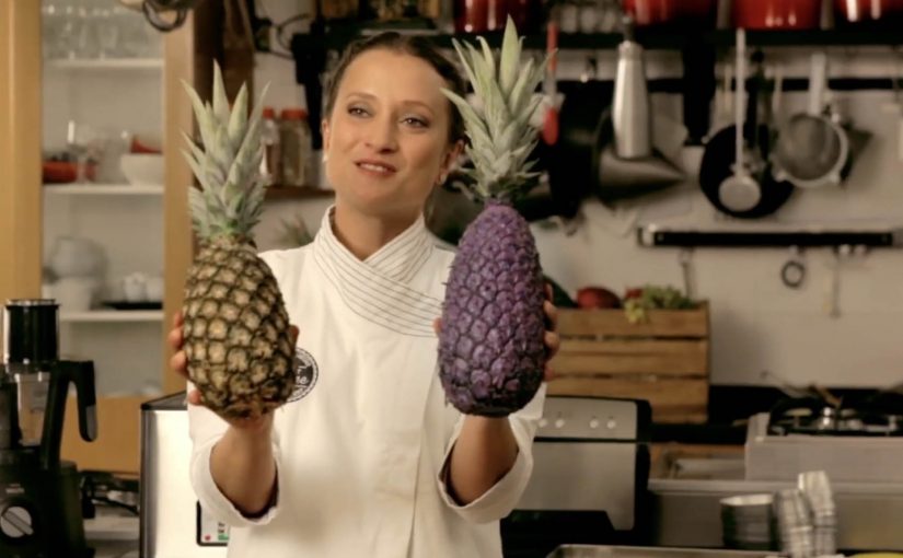
After months of experimentation, three “new” fruits were created for the campaign: Pinegrape, Bananaberry, and Kiwigerine. Ogilvy used these hybrids as a proxy for the blender’s core benefit. Extreme mixing power made tangible. By turning mixing power into a visible result people can name and remember, the demo makes the performance claim easier to believe and retell.
In FMCG marketing, turning a functional claim into a concrete, surprising artifact is often the fastest way to earn attention without over-explaining the spec sheet.
Why this lands
This works because it collapses “performance” into an immediate visual. You do not need to understand watts or blade geometry to get the point. You see a fruit that should not exist, and your brain fills in the story: this blender must be intense.
Extractable takeaway: When your product advantage is technical, build a demo artifact that expresses the benefit at a glance, so the audience understands the promise before you ever mention features.
What the brand is really doing
The real question is how you make a technical launch travel beyond people who already care about the spec.
The smart move here is not the fruit gimmick itself, but the decision to turn a hard-to-feel product claim into a demo people can instantly understand and repeat.
The hybrids are not just a stunt. They are a communication shortcut. They turn a launch into a shareable proof object that can live in PR, social clips, retail talk-tracks, and influencer content without changing the message.
Brazilian agencies have a track record of inventive fruit-related communication. Also see the real fruit boxes campaign from Ageisobar Brazil.
What blender marketers should copy
- Translate specs into symbols. Make one surprising object carry the whole product story.
- Choose an artifact people can describe in one sentence. “Two fruits blended into one” travels well.
- Let the demo do the explaining. Reduce copy. Increase show-and-tell.
- Connect to a category pattern. If you have a related example, link it to create a “watch this space” thread.
A few fast answers before you act
What is the Philips Walita Fruit Mashup campaign?
It’s a product-launch idea that uses engineered hybrid fruits as a metaphorical “proof” of the Walita Avance blender’s mixing power.
What are Pinegrape, Bananaberry and Kiwigerine?
They are campaign-created hybrid fruits used as the central demo objects to communicate extreme blending performance.
Why is this more effective than listing features?
Because the audience understands the benefit visually, without needing technical literacy. The artifact does the persuasion.
What’s the key constraint if you copy this pattern?
The demo must be instantly legible and repeatable on camera. If people need explanation to “get it,” the mechanic weakens.
How do you adapt this to other FMCG launches?
Create a single surprising artifact that makes your benefit obvious. Then design content formats that capture reactions and reveal the mechanism quickly.