Lynx: Invisible Ad with polarized glasses

Lynx: Invisible Ad with polarized glasses

Last month, McDonald’s in Canada created a billboard that could only be seen in the night with car headlights.

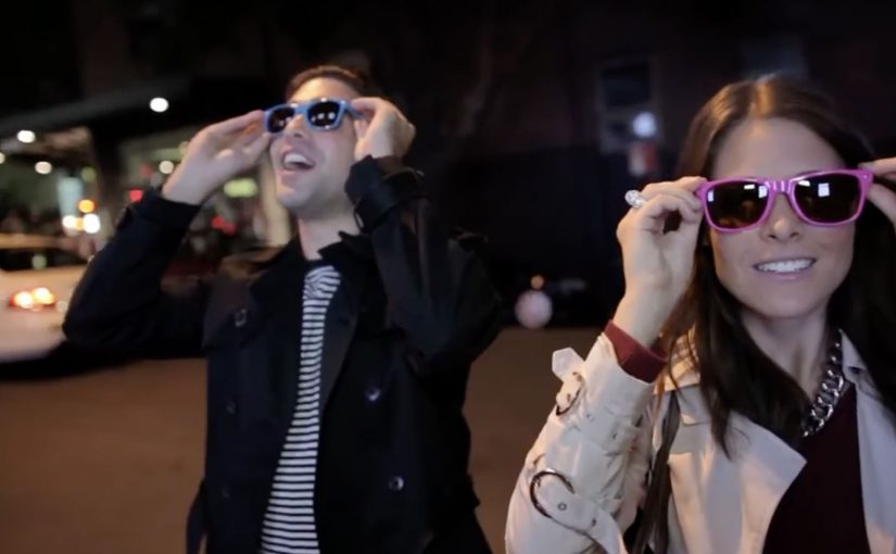
Now Lynx, for its “Unleash the chaos” campaign in Australia, replaces the windows of a house in Sydney with special LCD screens. Sexy hostesses stationed outside hand out polarized sunglasses to passersby, and the glasses suddenly unveil the chaos going on inside the house.

What makes this an “invisible ad”

An invisible ad is a message that is intentionally hidden in plain sight, then revealed only when the audience meets a condition. Here, the condition is wearing polarized lenses, which gate what the screens are able to show.

The result is a street-level experience that looks ordinary to everyone, but becomes explicit and chaotic for the people who opt in by putting on the glasses.

The mechanism: selective visibility creates instant intrigue

The setup is simple and bold. Take an everyday terrace house. Swap its windows for LCD panels. Hand out sunglasses that make the content readable. Suddenly the street becomes a live demo, with viewer control over whether they see it.

Because only people wearing the glasses can see the content, the contrast between “ordinary” and “chaotic” creates instant intrigue and pulls passersby into the demo.

Coverage of the activation describes it as part of the Lynx Anarchy launch, produced as a filmed stunt to capture reactions and extend reach beyond the street.

In consumer marketing, hidden-in-plain-sight stunts work best when the reveal feels like a reward you discovered, not a message delivered at you.

Why it lands: it feels like a secret you earned

Outdoor advertising usually broadcasts. This flips the script. The street stays “clean” until you choose to participate, and that choice makes the reveal feel more personal, more exclusive, and more share-worthy. It also borrows a familiar human impulse. If someone hands you “special glasses”, you want to know what you’re missing without them.

Extractable takeaway: If the audience has to take one small action to unlock the message, the reveal feels earned and sticks longer than a broadcast impression.

The real question is whether your reveal earns attention or merely feels like a trick.

What the brand is buying with this kind of stunt

  • Permissioned attention. People self-select into the experience rather than being interrupted.
  • A built-in talk trigger. The format is easy to explain and retell, even without showing the content.
  • Proof of product personality. The medium embodies the message. Chaos is not only said, it is staged.

Design rules for your next hidden reveal

  • Make the reveal binary. Either you see nothing, or you see everything. Half-reveals feel like malfunctions.
  • Let the audience choose. The opt-in moment (taking the glasses) is what creates commitment.
  • Design for spectators too. Even people who do not opt in should understand that something is happening, and feel curious.
  • Film reactions as a second asset. The live moment is local. The reaction video travels.

A few fast answers before you act

What is a brand “invisible ad”?

It is an ad designed to look blank or ordinary until a specific condition reveals it, such as headlights at night or special glasses in daylight.

What is Lynx doing in the Invisible Ad stunt?

Lynx replaces a house’s windows with screens and hands out polarized sunglasses that reveal hidden content, turning an ordinary street view into a private, chaotic reveal.

Why use polarized sunglasses as the trigger?

Because it creates an opt-in moment. People decide to participate, and that choice makes the reveal feel earned and more memorable.

What is the strategic benefit of hiding the message?

Hiding the message creates curiosity, controls who sees the explicit content, and makes the experience feel like a secret worth sharing.

How do you scale a one-street activation?

By designing it to be filmed, then distributing the reaction footage as the wider campaign asset.

PUMA: The World’s Fastest Purchase

PUMA: The World’s Fastest Purchase

PUMA Faas 500 are positioned as “fast” running shoes, so PUMA Mexico turned that promise into a store rule. The faster you complete the purchase, the bigger your discount.

It is retail gamification with a stopwatch. You take a time-stamped ticket when you enter, then hit the finish at checkout. Your elapsed time maps directly to a percentage off.

Speed, translated into a receipt

The mechanic is intentionally physical. A start button and a finish button. Two timestamps. A discount ladder, meaning predefined discount tiers tied to elapsed time. It converts a product claim into a behavior challenge shoppers can understand in one glance.

In store-based brand marketing, this kind of “simple rule. visible payoff” design is what turns a promotion into something people talk about and demonstrate. This is the right kind of promotion when the product promise is simple and the store can keep the timing fair.

In physical retail environments where staff can control flow and timing, a timed discount rule turns positioning into something customers can prove on the spot.

Why it works: tension, then relief at the till

Most discounts are passive. This one is earned under mild, playful pressure, which changes how the saving feels. Because the discount is calculated from your elapsed time, the saving feels earned rather than handed out. You are not just getting money off. You are winning.

Extractable takeaway: If you can translate a brand claim into a simple rule with a visible measurement, customers will internalize it faster and retell it more convincingly.

The case framing also borrows credibility from sport. The faster you move, the more you deserve, which fits the “fast” positioning without needing extra explanation.

What the brand is really buying

The real question is whether your operation can make the customer’s speed, not the queue, decide the discount.

Yes, it can drive conversion in the moment. More importantly, it makes “fast” measurable. The shoe is no longer described as fast. The shopping experience is fast, and the brand gets to own that feeling.

It is also a neat piece of shopper marketing craft: the discount is the reward, but the real output is attention inside the store and social retell outside it.

Borrowable moves for a speed-to-discount promo

  • Turn the product truth into a rule, not a tagline.
  • Make the measurement visible, tickets, timers, receipts, anything tangible.
  • Use a stepped reward, so “almost” still feels like something.
  • Keep the setup frictionless, one instruction. two actions. instant payoff.

A few fast answers before you act

What is the core mechanic here?

A timed in-store challenge. Entry timestamp plus checkout timestamp determines a discount tier.

Why is this stronger than a standard percent-off promotion?

Because shoppers earn the saving through behavior. That creates participation, attention, and a story, not just a transaction.

What kind of products fit this model best?

Anything with a defensible “speed” or “efficiency” claim, plus a purchase journey that can be completed quickly inside a controlled environment.

What is the biggest operational risk?

Queue dynamics. If checkout bottlenecks decide the discount, the game feels unfair. The store needs enough throughput so the customer’s speed is what matters.

How do you measure success beyond sales?

Participation rate, average completion time, discount distribution, and organic sharing that shows people proving their time and reward.

smart: eBall interactive ping pong duel

smart: eBall interactive ping pong duel

At the Frankfurt Motor Show (IAA) in 2011, Daimler promoted the third generation smart fortwo electric drive with a special interactive game event. Berlin-based Proximity BBDO designed a game called eBall that translates the joy of a highly responsive car into something visitors can play.

Visitors sign up with their driver’s license, get quick instructions on forward and reverse, and then step into a live ping pong duel. Instead of a controller, they use the car itself. Driving forward and back moves the “paddle,” with measurement technology tracking the rally on a large display.

When “responsive” becomes the gameplay

Electric drive messaging often struggles because it is full of abstractions. Efficiency, torque, responsiveness. eBall makes one of those claims physical. The faster and more precisely you control forward and reverse, the better you play. That is a rare alignment. The product behaviour is the mechanic.

Extractable takeaway: If your product promise is about control, speed, or precision, build an experience where performance is visible to a crowd and felt by the participant in under a minute.

In European automotive launches, live interaction works best when it turns a technical attribute into a simple skill people can feel and repeat.

The real question is whether your interaction turns the claim into a repeatable skill, not a slogan.

The tech trick is invisible on purpose

As described in coverage of the installation, the paddles on the LED wall are controlled by two real smart fortwo electric drive cars using laser measurement and transmission technology. The important detail is not the hardware. It is the immediacy. When the wall responds instantly, the player trusts the cause-and-effect and stays in the duel.

Why the driver’s license step matters

The license check does two jobs. It manages safety and liability, and it creates a small “this is real” threshold. You are not playing a simulator. You are operating a vehicle in a branded arena. That seriousness increases attention, and it makes the win feel earned.

What smart is really selling here

eBall does not try to convince you with specs. It frames the car as a fun, responsive object that behaves like a sports device in the hands of the driver. The subtext is clear. If it can play ping pong with precision, it will feel effortless in tight city driving too.

Moves worth copying in event mechanics

  • Translate one attribute into one action. “Responsive” becomes “hit the ball back.” No extra storytelling required.
  • Design for spectators. The LED wall makes the game readable from distance, so the crowd becomes the amplifier.
  • Keep the control model binary. Forward and reverse is legible, teachable, and low-cognitive-load.
  • Make the feedback immediate. Interactivity only feels truthful when response is fast.
  • Engineer the queue. A duel format naturally builds anticipation and repeat attempts.

A few fast answers before you act

What is smart eBall?

It is a live event game where visitors play a ping pong style duel by driving a smart fortwo electric drive forward and backward to control a digital paddle on a large screen.

Why does ping pong fit an electric city car story?

Because it is a precision game. It makes responsiveness and control visible in a way a brochure cannot, and it fits the “small, agile, quick” associations smart wants to own.

What makes this different from a normal driving simulator?

The controller is the vehicle, and the outcome is public. That changes the psychology from private play to performance, which increases energy, memorability, and word of mouth.

What is the biggest operational risk with this kind of activation?

Latency, safety, and throughput. If the system lags, people stop trusting the interaction. If safety or queue management fails, the experience becomes stressful instead of fun.

What should brands measure in a “playable product demo” like this?

Participation rate, average dwell time, repeat plays, audience size over time, and how many people capture and share the experience, plus any downstream test-drive or lead signals.