Lexus LFA: Scrollbroaaaar

Saatchi & Saatchi Germany has created a clutter-breaking execution for the Lexus LFA on the Sport Auto website by turning a familiar interface element into the ad itself.

When the ad is the interface

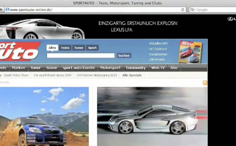
The idea is disarmingly simple. Instead of fighting for attention inside a banner slot, the execution is described as a custom scrollbar experience on Sport Auto, shifting the user’s focus to the one thing everyone touches when they move through a long page.

How “Scrollbroaaaar” works

Mechanically, the work hijacks the expected behavior of scrolling and reframes it as a brand moment for a high-performance car. The name “Scrollbroaaaar” signals the point. Here, “Scrollbroaaaar” means the scrollbar itself becomes the branded ad unit. Scrolling becomes a sensory cue for speed and engine attitude, not just a way to navigate content.

In performance automotive marketing, using interface behavior as media can outperform traditional display formats because the user triggers the moment themselves.

The real question is whether you can turn a default UI habit into branded sensation without stealing time from the content.

Why it lands as clutter-breaking

This works because it does not ask for permission. It meets the user inside muscle memory. A scrollbar is invisible until it changes. The second it does, attention spikes. That moment of surprise is the whole value exchange.

Extractable takeaway: If you can attach your product truth to a UI habit the audience already performs, you get attention without demanding a click.

What the brand is really buying here

Beyond impressions, the intent is distinctiveness. Lexus gets a “did you see this” story that is native to the environment where car enthusiasts already browse. The experience also borrows the credibility of a specialist publisher context while keeping the brand in control of the punchline. This is a smarter bet than buying another standard display slot and hoping anyone notices.

What to steal for your own digital creative

  • Make the interaction the media. If a user action triggers the payoff, recall tends to be higher than passive formats.
  • Choose the smallest possible hack. One altered UI element can be more powerful than a page full of widgets.
  • Design for surprise, then exit fast. The novelty works best when it is immediate and does not overstay.
  • Match the mechanic to the product truth. Speed, sound, and control cues belong to a halo performance car.

A few fast answers before you act

What is “Scrollbroaaaar” in one line?

A web takeover that turns the page’s scrollbar into the ad, so scrolling itself becomes the Lexus LFA moment.

Why is it considered clutter-breaking?

Because it bypasses banner blindness by changing a core interface behavior users already rely on, creating instant surprise and attention.

What is the main creative principle behind it?

The principle is viewer control. The user’s action triggers the brand payoff instead of asking them to click away from what they came to do.

When should you use this pattern?

When you have a simple product truth that can be expressed through a single behavior change, and you want memorability more than message density.

What is the biggest risk with interface-as-ad?

If the mechanic slows the page, breaks expected controls, or feels like it traps the user, the surprise turns into frustration and the brand pays for it.

Volkswagen Polo GTI: Fast Lane

Fast Lane: turning routine into a shortcut you choose

Volkswagen is soon going to launch its new Polo GTI. To create awareness and generate buzz, it built a “Fast Lane” in subways, malls and elevators around Germany. In this campaign, “Fast Lane” means a playful, faster-feeling alternative route placed beside the normal one, dedicated to everyone who likes to go beyond the regular, who is curious for new stuff, and who enjoys speeding it all up a little.

How it works: add a faster option that feels like play

The mechanism is simple. Place an obvious “normal” route next to an unexpected alternative that is quicker and more fun. Then let people self-select into it. The viewer controls the switch by choosing the fast lane, and that choice becomes the story.

In German urban commuting environments, small design changes in high-footfall spaces can shift behaviour quickly because routine is strong and the contrast is instantly visible.

The real question is whether you can turn “fast” from a spec into a shortcut people choose in public.

Fast Lane 1: The Slide

Long staircase. Next to it a slide. Which way would you go?

Fast Lane 2: The Shopping Carts

Some carts are pimped with a skateboard. Up for some extra shopping fun?

Fast Lane 3: The Elevator

A sound system turns the ride into a rocket take-off. Welcome on-board.

Why it lands: speed becomes a feeling, not a spec

The campaign does not explain performance. It lets people experience a mindset. Faster. Lighter. A little rebellious. Because the “fast” option is obvious and self-selected, it feels earned, which makes the idea stick without needing specs. Each execution creates a moment where the “fast” choice feels like a reward, not just efficiency.

Extractable takeaway: If you want people to believe a feature, design a situation where they can choose it and feel it, not just read about it.

The business intent: borrow everyday behaviour as proof

For a GTI launch, “fast” can easily become generic language. This is stronger than repeating performance adjectives. Fast Lane makes it concrete. It attaches the idea of speed to real-world micro-decisions, and turns the resulting participation into shareable proof that travels beyond the physical placements.

What to steal if you want to turn a feature into a behaviour

  • Build the contrast into the environment. Normal route next to the fun shortcut.
  • Make the faster choice self-evident. People should understand it in one glance.
  • Let viewer control do the persuasion. Choosing it is more convincing than being told.
  • Create a story per location. Each execution is a complete, watchable moment on its own.

A few fast answers before you act

What is Volkswagen’s “Fast Lane” for the Polo GTI?

A set of playful public-space installations (slide, skate carts, rocket-sound elevator) that let people choose a “faster” option, designed to build buzz for the Polo GTI.

What is the core mechanism?

Put a normal route next to an unexpected shortcut that is quicker and more fun. People self-select, and the choice becomes the story.

Why does this work better than talking about performance specs?

It turns “fast” into a felt experience. Participation makes the feature believable without needing explanation.

What business intent does it serve?

It makes the GTI’s positioning concrete and talkable, then relies on the resulting participation moments to travel beyond the physical placements.

What is the most transferable takeaway?

If you want people to believe a feature, design a situation where they can choose it and feel it, not just read about it.

Germanwings: Planemob at 30,000 Feet

Five creatives board a competitor’s flight with nothing but cardboard signs, a camera, and a plan. At cruising altitude, they run a “planemob” in the aisle. In practice, that means a flashmob-style brand stunt staged on a plane and filmed to travel later as content. The cabin becomes the set, and the passengers become the audience.

A brand comparison staged where the problem happens

The idea is credited to Lukas Lindemann Rosinski in Hamburg. The stunt is described as taking place on a rival low-cost carrier flight, and it uses the rival’s own boarding and seating dynamics as the backdrop for the message.

The execution is deliberately low-tech. A small group reveals a sequence of placards that make a simple point about “quality” versus the small annoyances of no-frills flying, especially the chaos that comes with free seating when groups try to sit together.

The mechanic: hijack the moment, not the media

This is guerrilla advertising in the literal sense. Instead of buying more airtime, the campaign borrows a moment that already has full attention: passengers strapped in, phones out, and nothing else to do.

That works because the stunt captures attention at the exact moment the irritation is most legible, so the comparison feels less like copy and more like proof.

Filming the stunt is not an afterthought. It is the distribution strategy. The onboard moment creates the story, and the video carries it to everyone who was not on the plane.

In European low-cost aviation, brand promises live or die on small frictions that frequent flyers feel immediately.

Why it lands: it turns irritation into proof

Most airline positioning stays abstract because the product is hard to “show” in a single line. Planemob goes the other way. It demonstrates the promise by contrasting it against a situation passengers recognize without explanation. This is smart brand theatre because the proof arrives inside the passenger experience instead of sitting above it as a slogan.

Extractable takeaway: If your differentiator is a reduction of friction, stage the proof inside the friction. Do it in a setting where the audience is already feeling the problem, and keep the message simple enough to travel as a clip.

The business intent: earned attention that outlives the flight

The immediate audience is small. The real audience is everyone who sees the video afterwards. That’s the trade. A short, high-constraint performance buys a longer, shareable narrative, and it tends to get discussed precisely because it happens “in real life” rather than inside a media slot.

The real question is whether a tiny live audience can trigger a much larger story once the moment is filmed and shared.

Award listings also suggest the work gained industry recognition, including a Spotlight Festival Gold in web & mobile categories for “Planemob”.

What to steal for your next guerrilla moment

  • Exploit a captive moment ethically: pick a context where attention is naturally high and interruption is minimal.
  • Use props that read instantly: big typography, one point per beat, no cleverness that needs a caption.
  • Build the distribution into the idea: if it does not work as a video, it does not scale.
  • Anchor the claim in a felt pain point: “quality” lands when it maps to a concrete irritation people already know.
  • Keep the crew small: constraints make it believable, and believability is the fuel for sharing.

A few fast answers before you act

What is a “planemob”?

A planemob is a flashmob-style stunt staged on an aircraft, designed to create an attention-grabbing in-flight moment that can be filmed and shared as a campaign video.

Why does this count as guerrilla marketing?

Because it uses a real-world environment and a minimal set of materials to generate earned attention, rather than relying primarily on paid media placements.

What is the core persuasive trick in this execution?

It connects the brand claim to a situation passengers have experienced. The message feels like evidence because it is delivered inside a recognizable pain point.

What should you watch out for if you copy this approach?

Operational risk and brand risk. You need a concept that is safe, respectful to bystanders, and strong enough to survive without heavy explanation. If it needs a long caption, it will not travel.

How do you measure success for this kind of stunt?

Video reach and completion rates are the baseline. More meaningful signals include press pickup, share-to-view ratio, branded search lift, and whether the stunt strengthens a specific product attribute in brand tracking.