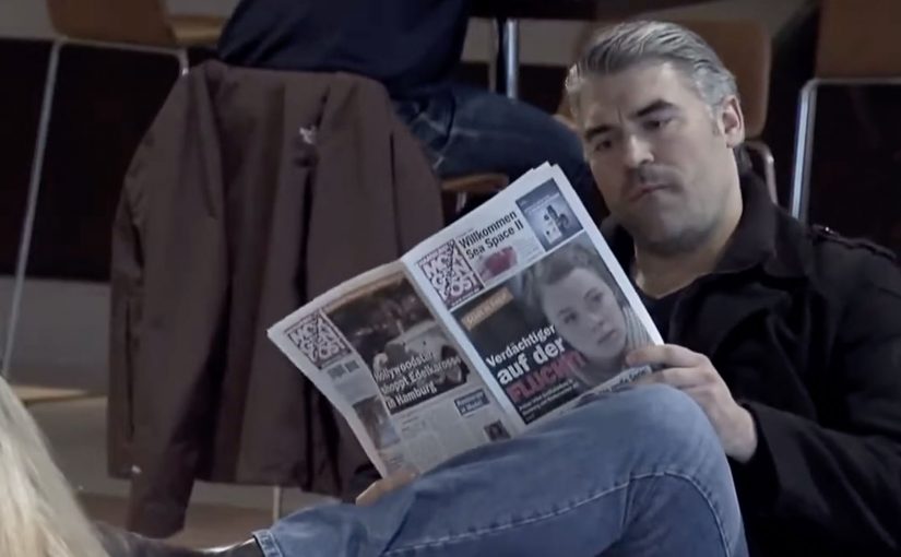
A woman waits in an airport lounge. A newspaper lands nearby. Her face is on the cover, framed as a dangerous suspect. Seconds later, a TV broadcast repeats the same “wanted” story. The room shifts. People stare. The pressure spikes.
This is the “Stress Test” prank used to launch NIVEA Deo Stress Protect in Germany. The set-up covertly photographs real passengers, then inserts their images into a rapid sequence of believable media moments. A fake front page. A fake news segment. A looming “security” approach. Then the reveal. The suitcase opens and the product appears as the punchline.
Prankvertising is a brand activation that creates a real-world surprise for unsuspecting participants, then packages the reaction as content. It is only worth doing when the prank is tightly controlled, the audience understands the logic, and the reveal cleanly connects the stress to the product promise.
Turning “stress sweat” into something you can feel
Stress-induced sweating is hard to demonstrate in advertising without sounding clinical. This campaign solves that with one blunt translation. Make stress visible. Make it public. Make it uncomfortable. Then position the deodorant as the relief valve.
In European FMCG launches, where functional claims are easy to ignore, a live stunt can turn a product benefit into a story people retell.
The real question is whether the stress you trigger is in service of the product truth, or just spectacle that turns the audience against you.
Why this landed, and why it drew criticism
The mechanism is instantly legible, so viewers stay for the reactions. But that same realism creates a risk. If the line between tension and harm feels too thin, the brand gets attention for the wrong reason. Trade coverage at the time noted both the viral momentum and the backlash, which is the trade-off with high-intensity stunts.
Extractable takeaway: When you use real-world tension to dramatize a benefit, the reveal has to resolve that tension fast, and make the product the clear relief.
Borrow the stunt without inheriting the downside
- Anchor the stunt to a single product truth. Here it is stress. Everything in the sequence reinforces it.
- Make the reveal unmissable. The product has to arrive as the resolution, not as an afterthought.
- Design an ethical escape hatch. Keep the duration short, avoid escalating beyond what you can safely control, and ensure participants are cared for immediately.
- Pre-plan the criticism. If you choose fear as a lever, you must be ready to justify it and explain safeguards.
A few fast answers before you act
What happens in the NIVEA Deo “Stress Test” airport prank?
Unsuspecting passengers are covertly photographed and then confronted with fake media outputs that portray them as “wanted”. The tension builds until the reveal introduces NIVEA Stress Protect as the relief and the message.
What product benefit is this trying to dramatize?
Stress-induced sweating. The activation makes stress feel immediate and physical, then frames the deodorant as protection in high-pressure moments.
Who created the campaign?
Trade write-ups commonly credit Felix & Lamberti (Hamburg, Germany), with production credits listed in trade write-ups. Labamba is also mentioned as a partner in some execution notes and case material.
Why do stunts like this go viral?
They compress a clear story into a few minutes. Viewers understand the situation instantly, then watch for human reactions and the reveal.
What is the biggest risk with prankvertising?
Brand damage from perceived cruelty or unsafe escalation. If the audience thinks you harmed people for clicks, the message flips from “clever” to “reckless”.