O2: Be More Dog

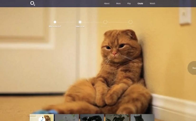
A cat decides it has had enough of being indifferent. It chases, leaps, splashes, and generally behaves like a dog. O2 UK uses that simple flip to ask people to do the same with technology. Less “meh”. More curious.

With VCCP and the Moving Picture Company, the campaign extends beyond the TV spot into a participation layer. That participation layer means the idea does not stop at the film but gives people something to do and share. On visiting www.bemoredog.com, people are greeted by a cat that acts more like a dog, then pulled into interactive play through a dual-screen HTML5 Frisbee game and a set of customisable cat videos designed for sharing.

How the integration is designed

The mechanism is a clean handoff. TV creates the character and the phrase. Mobile turns into the controller for a dual-screen game. Social carries the customisable video layer so people can pull friends into the same joke and the same attitude shift.

In UK consumer telecoms, where functional claims blur quickly, a memorable behavioural metaphor can do more positioning work than another round of feature talk.

Why it lands

It works because it uses a familiar truth. The cat-to-dog flip works because it turns an abstract behaviour change into a visual joke people understand in seconds. Cats look cool and detached. Dogs look curious and all-in. That contrast is instantly readable, and it translates directly into what O2 wants from people. Try the new thing. Explore. Stop acting like technology is background noise.

Extractable takeaway: If you want people to reframe a category, give them a single, sticky metaphor and one simple interaction that lets them experience the new attitude, not just hear about it.

What O2 is really trying to shift

This is brand positioning dressed as entertainment. The real question is how to make curiosity about new technology feel socially easy and emotionally attractive, not technically demanding. O2 is steering perception toward optimism and exploration, and using connected play to make “embracing the new” feel easy, not technical. In context, the timing also supports a broader push into newer network experiences, including 4G-era behaviour change.

What brand teams can steal from Be More Dog

  • Use one character as the bridge. The cat carries TV, site, game and shareables without needing extra explanation.
  • Make mobile do a job. Second-screen control is more convincing than a generic “download our app” prompt.
  • Build sharing into the format. Customisable videos give people a reason to tag or send, not just watch.
  • Keep the interaction lightweight. Quick play beats complicated onboarding when the goal is broad participation.

A few fast answers before you act

What is “Be More Dog”?

It is an O2 UK brand campaign that uses a cat acting like a dog as a metaphor for being more curious and enthusiastic about new technology, supported by second-screen and shareable digital experiences.

What is the core digital mechanic?

A dual-screen HTML5 Frisbee game that uses a phone as the controller, plus customisable cat videos designed for social sharing.

Why does the cat versus dog metaphor work so well?

It compresses a complex ask into a simple behavioural contrast people instantly understand, then turns that contrast into a repeatable line and a repeatable action.

What makes this an integrated campaign rather than “TV plus a website”?

The channels do different jobs that depend on each other. TV creates meaning. Mobile enables interaction. Social distributes personalised variants that pull others back into the idea.

What is the biggest way this pattern fails?

If the digital layer feels bolted on. The interaction has to express the same promise as the film, otherwise it becomes a novelty that does not move perception.

Chrome: Super Sync Sports

Google has recently released their latest Chrome Experiment called “Super Sync Sports” which allows players to convert their mobile phones and tablets into a remote control for their desktop browser.

To give it a spin visit www.chrome.com/supersyncsports/, choose a game i.e. running, swimming or cycling and then follow the instructions to sync your mobile phone. Once the sync is complete you can then play your way to victory, while the game plays out on your desktop.

What “super sync” really means in practice

The core mechanic is simple. Your desktop browser becomes the shared “big screen” for the race, while each phone or tablet becomes a personal input surface. Instead of mirroring the desktop, the mobile device acts like a controller and streams gestures to the browser in real time.

This is a classic second-screen pattern. A shared display for feedback, plus personal devices for control. It is a small idea with a lot of leverage when the onboarding is frictionless.

In digital marketing and product teams, multi-device web interactions are a repeatable way to turn passive screens into participatory experiences.

Why it lands (even when it is “just a game”)

It also makes a quiet point about distribution. The browser is the platform, so the “controller” is something people already have in-hand. That matters if you are designing for living rooms, events, retail floors, or any moment where downloads and logins kill momentum.

Extractable takeaway: When you want participation, put the rich visual feedback on a shared screen and keep input on personal devices. This lowers setup friction, supports groups naturally, and makes interaction feel immediate without specialized hardware.

The tech stack is the message

What will be interesting to see is how this type of interaction and technology is finally leveraged. The experience is described as being built on HTML5-era capabilities such as WebSockets for live synchronization, plus Canvas and CSS3 for rendering and motion. For brands, the value here is the interaction model, not the sports theme. The real lesson is not the specific APIs. It is the end-to-end pattern of low-latency input, shared feedback, and lightweight pairing.

The real question is whether you are building a one-off demo or a repeatable interaction model that people can join with the device already in their hand.

What to steal for brand experiences

  • Pairing flow: Use a short, forgiving pairing step (code on the big screen, quick join on the phone) and get to interaction fast.
  • Shared spectacle, private control: Keep the crowd watching one shared output, while each participant has a private “control lane” on their device.
  • Competition as UI: A leaderboard (even a lightweight one) can turn a demo into a repeatable loop.
  • Design for latency: Prefer simple, discrete gestures that still “feel” athletic even with imperfect connectivity.
  • Make it modular: The same controller concept can drive product configurators, quizzes, sampling stations, or event installations.

A few fast answers before you act

What is Super Sync Sports?

It is a Chrome Experiment that lets you run a sports game on a desktop browser while using a phone or tablet as the controller.

Why use a phone as the controller instead of the desktop keyboard?

It reduces the learning curve, supports multiplayer easily, and makes the interaction feel more physical. Touch gestures can map naturally to “run”, “swim”, and “cycle” without extra hardware.

What makes this pattern useful beyond games?

The same multi-device approach can turn any shared screen into a participatory surface. Think demos, audience voting, retail activations, guided experiences, or interactive storytelling where people control outcomes from their own device.

Which technologies are doing the heavy lifting?

The experience is described as using WebSockets for real-time synchronization, and Canvas and CSS3 for visuals and animation, all running in the browser.

What is the biggest risk if a brand tries this pattern?

Onboarding and latency. If pairing takes too long or input feels delayed, the magic disappears. The best executions keep the join flow short and the interaction vocabulary simple.

Interactive iPad ads: five touch-first patterns

New research from the IAB has shown that when it comes to advertising on tablets, interactivity is the key. And once you look at what the best iPad units are doing, that conclusion makes intuitive sense.

Take Microsoft’s iAd for Windows Azure. Instead of explaining “code in the cloud,” it lets you touch and change code inside the ad, and the layout responds. That is the core pattern for tablet advertising. Don’t describe the value. Let the reader experience it in seconds.

On tablets, display works best when the ad behaves like a small piece of product UI rather than a static interruption.

The IAB point, translated into creative

If your audience is holding a touchscreen, your ad has an extra superpower. Touch-first is the creative posture where the first meaningful thing the unit asks for is a gesture, and the response delivers the point. Drag, swipe, tap, reveal, simulate. The objective is not “more features.” It is to earn attention by giving the user a simple action and an immediate payoff. Because the payoff is immediate, the value lands without needing a paragraph of claims.

Extractable takeaway: On tablets, design the first gesture so it proves one promise immediately, then let everything else be optional.

In tablet-heavy retail and media environments, the strongest units turn touch into a tiny product moment that pays off in seconds.

The real question is whether your tablet creative proves the promise through a single gesture, or just says it in copy.

Interactivity should be the default assumption for tablet display, not a bonus layer.

Five iPad ad interactions worth stealing

White Collar

As a simple use of touchscreen behaviour, users solve a puzzle by dragging an icon across the screen to locate answers to questions displayed in the banner. It’s lightweight, but it turns a passive placement into an active moment.

Volkswagen Park Assist

To experience the Volkswagen Tiguan’s Park Assist, users touch two targets on the screen. The car then reverses and parks itself between those targets. A feature demo becomes a two-tap “proof” moment.

Visa Signature

Built in HTML5, the ad presents a virtual wallet that lets users browse and plan a holiday, buy theatre or cinema tickets, or reserve a hotel. It behaves like a mini service experience rather than an ad.

Toyota

Using the slogan “Filled with People,” the ad lets users drag a slider to watch an unfinished Toyota move through the factory floor while it is assembled. The interaction makes the narrative feel earned, not narrated.

Microsoft

Microsoft wanted developers to understand that Windows Azure allows code to be created in the cloud. So they built an iAd that lets readers alter its code, which in turn changes the layout. It’s a direct translation of message into mechanism.

What these examples have in common

  • One obvious gesture. Drag, tap, swipe. No tutorial needed.
  • Fast payoff. The response is immediate, so the user feels in control.
  • Feature-as-experience. Parking, planning, building, assembling. The “meaning” is in the interaction.
  • Tablet-native pacing. These units assume longer attention than mobile banners and reward it.

Touch-first moves to reuse in your next tablet ad

  • Make the first interaction the headline. The opening instruction should be one short verb. “Drag.” “Tap.” “Swipe.”
  • Use interactivity to prove one point. Pick one promise and build one satisfying micro-demo around it.
  • Design for fat-finger reality. Targets must be generous. Feedback must be unmistakable.
  • Keep exits graceful. If someone watches but doesn’t interact, the unit should still communicate the core idea.

A few fast answers before you act

Why does interactivity matter more on tablets than on desktop banners?

Because touch is the native input. When an ad uses the same gestures as the device, it feels more like content and less like a bolt-on placement.

What’s the simplest “interactive” pattern that still works?

A single drag or tap that reveals something meaningful. A before/after, a quick feature demo, or a short guided reveal with instant feedback.

What’s the most common way interactive tablet ads fail?

Too much complexity. Multiple steps, unclear targets, or slow loading kills the moment before the user gets a reward.

Do interactive ads always beat static ads?

No. Interactivity helps when it makes the message easier to understand or more satisfying to experience. If it’s interaction for its own sake, it becomes friction.

How do you decide whether a tablet idea should be a “mini app” like Visa’s example?

Only do it when the brand’s value is in navigation and choice. If you need users to explore options, then a mini UI can be the product story. Otherwise, a single micro-demo is usually stronger.