Kenco: Kenneth the Talking Vending Machine

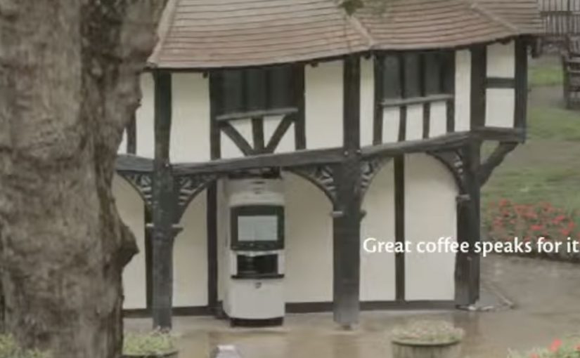
Kenco Millicano’s whole bean instant coffee is positioned as the closest thing to a proper coffee from a vending machine. However, people often have negative perceptions about drinking instant coffee from a machine. So, to engage and excite people enough to consider swapping their coffee shop routine for a vending option, Kenco Millicano worked with its agency team on a talking vending machine. The voice for the machine was provided by comedian and voice actor Mark Oxtoby, who spent a whole day in Soho Square interacting with passers-by.

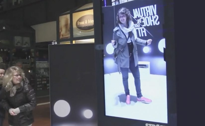
Similarly in Hong Kong, Levi’s worked with TBWA on a talking phone booth dubbed the “Levi’s Summer Hotline”. Inside the booth, two popular local radio hosts connected via video and challenged visitors to answer questions or do stunts. The crazier the stunt, the bigger the prize. The prize printed out in the booth like a receipt, and could be redeemed at nearby Levi’s stores. The activation was reported to have drawn more than half a million interactions over three days and to have driven a 30% sales uplift.

Two executions. One shared trick

Both ideas take a familiar street object. A vending machine. A phone booth. Then they add something people do not expect from an object like that. A voice, a challenge, a human response, and a reward that arrives immediately.

How the “talking interface” mechanic works

A “talking interface” is a familiar street object that responds with voice, turning a simple transaction into a short ask, response, reward loop.

  • Interrupt the script. People approach expecting a predictable transaction, then the unit talks back.
  • Create a small social contract. You do something simple or slightly brave, and the unit rewards you.
  • Turn participation into theatre. Bystanders can understand what is happening fast, and the crowd recruits the crowd.

In busy public places where attention is scarce, interactive installations win when the first five seconds are obvious and the payoff is immediate.

The real question is whether you can make a vending moment feel like a social interaction, not a compromise.

Why it lands

The “talking” element is not a gimmick. It flips an inanimate object into a social moment, which makes the interaction feel personal even when it is happening in public. That shift changes the emotional framing from “machine coffee” to “a quick story I was part of”. For brands, that is how you replace a negative perception without arguing about it.

Extractable takeaway: If you want people to try something they think they dislike, do not debate the product. Change the moment around the product so the first experience feels human, surprising, and worth retelling.

What these activations are really doing for the brands

Kenco’s machine makes “vending” feel warmer, and it makes the product choice feel less like compromise. Levi’s booth turns brand interaction into a game with a tangible receipt-style reward that pushes people towards a nearby store. Both installations are a conversion point and a content engine at the same time.

Steal this loop for street activations

  • Use a familiar object. Familiarity reduces explanation time and increases participation.
  • Make the first step low-risk. A small action opens the door to a bigger payoff.
  • Keep the loop short. Ask. Respond. Reward. Long flows die in public space.
  • Design for onlookers. The audience around the participant is the multiplier.
  • Make redemption effortless. If the reward requires extra effort later, participation drops.

Vending machines are one of my favourite formats for street-level innovation. I have featured plenty of them on Ramble. If you want to go deeper, browse the vending-machine archive.


A few fast answers before you act

What is a “talking vending machine” in marketing terms?

It is an interactive out-of-home installation where a vending unit uses live or scripted voice interaction to trigger participation, then delivers an immediate reward to reframe the product experience.

Why does “talking back” increase participation?

Because it breaks the expected script of a transaction. That surprise creates curiosity, and curiosity pulls people closer long enough for the reward loop to start.

What makes these ideas work in high-footfall locations?

They are instantly legible, fast to complete, and entertaining for bystanders. The environment supplies the amplification through crowd behaviour.

What is the biggest execution risk?

Throughput and reliability. If interactions slow down, misfire, or confuse people, the installation becomes friction, not fun.

How do you measure success beyond views?

Participation rate per hour, completion rate, average dwell time, sentiment, and whether the activation produces measurable trial or store redemption lift.

Görtz: Virtual Shoe Fitting

In September last year I had written about a Nike Sneaker Customization concept from Miami Ad School. Since then, ad agency kempertrautmann, along with German shoe retailer Görtz, creates the same virtual shoe store at Hamburg Central Station and transforms a digital billboard into a point of sale for shoes.

A station billboard that behaves like a shop window

Using Microsoft Kinect gesture controls, the shopper’s feet are scanned and reproduced on the screen. A selection of shoes is then presented to try on and compare virtually. A social component lets shoppers share a snapshot of themselves with the shoes on Facebook. Those who decide to buy receive a QR code that leads to a mobile checkout, with next-day delivery.

Virtual shoe fitting is an interactive retail experience that overlays a chosen shoe style onto a live on-screen view of your feet, so you can judge look and proportion before purchasing.

In European retail environments where commuters split time between offline browsing and mobile checkout, the strongest executions connect fast “try” moments to a low-friction purchase path.

Why it lands: it compresses the path from curiosity to checkout

The idea removes the biggest barrier in out-of-home retail, which is the gap between “that looks interesting” and “I can actually get it”. The Kinect scan creates a personal moment, the virtual try-on creates confidence, and the QR code turns intent into an immediate transaction rather than a promise to remember later. That matters because each step reduces the drop-off that usually happens between public interest and private purchase.

Extractable takeaway: If you want digital out-of-home to sell, not just impress, design the experience so the last step is not “find us later”. Make the last step “buy now”, with the minimum possible handoff friction.

What the campaign is really proving

The real question is whether a public screen can do enough selling work in the moment to replace the need for a later retail visit.

It is less about tech novelty and more about role change. The billboard stops being a broadcast surface and starts behaving like a staffed shop assistant. It recognizes you, helps you evaluate options, and hands you a clear next step to purchase.

This works best when the technology serves the buying decision, not when it becomes the point of the experience.

What this retail screen gets right

  • Personalize instantly: a scan, a fit, a quick moment that feels made for the passer-by.
  • Keep choices bounded: a curated range beats a full catalog when people are in a hurry.
  • Build a shareable artifact: snapshots extend the experience beyond the station.
  • Make the handoff obvious: QR-to-checkout should feel like the natural next click, not a separate journey.
  • Promise something operationally real: next-day delivery turns “stunt” into “service”.

A few fast answers before you act

What is the core idea?

A digital billboard in a train station becomes a virtual shoe store. Shoppers try on shoes using gesture control, then complete purchase on mobile via a QR code.

Why use Kinect in a public space?

Because it enables hands-free interaction and creates a personal “fit” moment without requiring an app download or typing in a rushed environment.

What makes this different from a normal QR poster?

The poster does not only link out. It provides evaluation first. The virtual try-on is the persuasion layer, and the QR code is the conversion layer.

What is the biggest execution risk?

Latency and calibration. If the scan feels inaccurate or the overlay looks wrong, the experience loses trust and the checkout step will not happen.

What should you measure?

Interaction starts, completed try-ons, QR scans, checkout completion rate, and next-day delivery satisfaction. Those metrics show whether the billboard is acting as a true point of sale.

eBay: Give-A-Toy Store

One of the things that all people do during the holidays, besides real shopping, is window shopping. Storefront window displays therefore have a stronger significance during the holiday season. Keeping that in mind, eBay has developed a way to make this experience move from passive to interactive and engaging.

Give-A-Toy Store is a 3D Christmas window installation with QR code tagged toys, built to evoke the passer-by’s giving side. Scanning the QR codes inside the eBay app allows passers-by to donate that toy on the spot, with the window lighting up and rewarding them for the donation.

The window installation is currently available at Toys for Tots in New York (at 35th and Broadway) and San Francisco (at 117 Post St).

Additionally customers can also customize their own toys on eBay’s Facebook page. For each toy created, eBay will donate $1 (up to $50,000).

From window shopping to “giving on the sidewalk”

This is a simple flip. The window is no longer just display media. It becomes a donation interface. You look, you scan, you give. Then you get instant feedback in the physical world.

How the mechanism does the heavy lifting

The mechanic is intentionally friction-light. Toys are visually presented as scannable choices. The QR tag is the call-to-action. The eBay app is the checkout. The window lighting up is the reward loop, confirming that something happened and making the act feel social even if you are alone.

In high-traffic retail corridors, a good interactive storefront turns waiting and wandering into measurable intent, without asking people to step inside.

Why it lands in a holiday crowd

It works because it respects the window-shopping mindset. People are already browsing. They are already comparing. This just adds a small, clear next step that feels aligned with the season. The visual “thank you” in the window also matters. It makes the donation feel immediate and real, not abstract and back-end.

Extractable takeaway: If you can make the environment visibly react to a mobile action, you create trust and momentum. The moment becomes self-explanatory, and bystanders learn the behavior just by watching.

What the brand is really building

The real question is whether a holiday storefront can turn passing attention into a mobile action that feels immediate enough to complete on the sidewalk.

This is not only about donations. It is a product demo for mobile commerce in disguise. It shows that scanning can be a legitimate buying action, that the phone can complete a transaction in seconds, and that the brand can connect physical retail ritual with digital conversion.

What this teaches about interactive storefronts

  • Make the first action obvious. If scanning is the behavior, the codes must look like the product tag.
  • Design a physical confirmation. Light, motion, or animation reduces doubt and makes the act feel rewarding.
  • Keep the choice set tight. Fewer, clearer options beat a cluttered scene when people are walking past.
  • Match the moment. Holiday giving is a natural fit for “instant donate” mechanics.
  • Make it watchable. When others can see the window respond, you get free teaching and free social proof.

A few fast answers before you act

What is the core idea behind Give-A-Toy Store?

Turn a holiday window into a scannable donation experience, so giving happens in the same moment as browsing.

Why does the window lighting up matter?

It provides immediate confirmation and reward. That reduces hesitation, makes the interaction feel real, and invites others nearby to notice and copy the behavior.

What makes this different from a normal QR campaign poster?

The display is the product experience. The scene feels like a store window first, and the QR code is integrated as a natural “price tag” action rather than a separate ad instruction.

What is the biggest execution risk?

Friction. If scanning is unreliable, the app flow is slow, or the codes are hard to spot at walking distance, people will not complete the action.

How would you adapt this if you do not have an app?

Keep the structure. Use a fast mobile entry point, and pair it with a visible physical confirmation so people know their action worked.