Pepsi Max: Unbelievable Bus Shelter

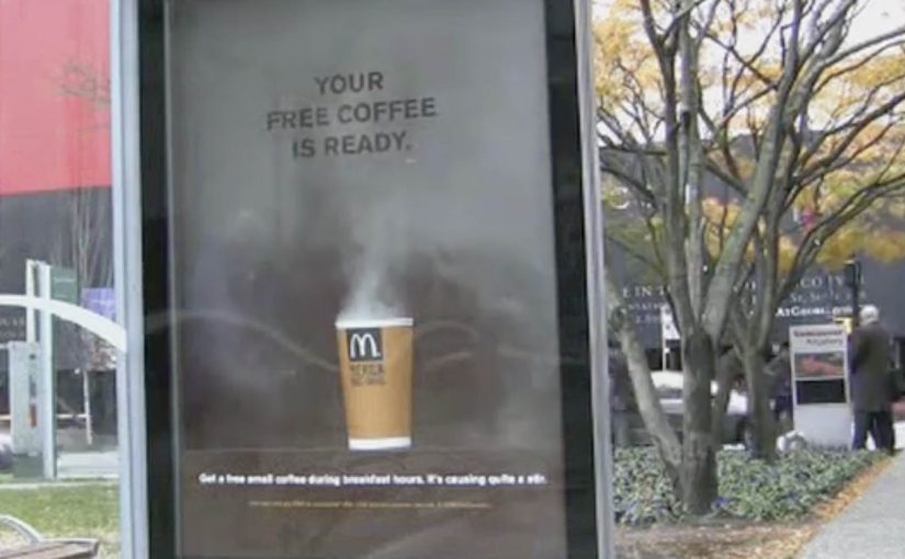
Pepsi Max for its new ‘Unbelievable’ campaign rigged an ordinary bus shelter in London, to perform tricks on unsuspecting travellers.

Using a custom see-through digital display, people waiting at the bus shelter were made to believe that they were actually seeing things like hovering alien ships, a loose tiger, a giant robot with laser beam eyes and so on.

The reactions to these ‘unbelievable’ scenarios were then captured and put in the below viral video.

Why this works. Even before you talk about “tech”

The technology is impressive, but the mechanic is simple. Here, “mechanic” means the repeatable audience interaction pattern, not the underlying tech. It takes an everyday moment. It inserts a believable layer of impossible. Then it lets people do the rest. React, laugh, point, film, share. Because the impossible is framed inside a familiar “window”, disbelief lands fast and reactions become the content. In high-footfall urban out-of-home environments, a brand moment has to work wordlessly, in seconds, for strangers who did not opt in.

Extractable takeaway: If you can turn passive waiting time into a personally witnessed story, you get emotion, proof and distribution before you spend on media.

That is the real move. It transforms passive waiting time into a story that feels personally witnessed.

The bus shelter as a “media product”

This activation treats the bus shelter like a product interface, not just a placement. It has inputs and outputs. Here, “activation” means a physical installation that creates a live brand experience in public space.

  • Input. People arrive with low expectations and spare attention.
  • System. A “window” that looks like reality, then breaks it in a controlled way.
  • Output. Instant emotion, social proof from nearby strangers, and a camera-ready moment.

In other words, it is not only out-of-home. It is an experience designed to be recorded and re-distributed.

The real question is whether your experience turns bystanders into witnesses, and witnesses into voluntary distribution.

What makes it shareable. And why the video is the second product

The live moment is the first product. The viral video is the second product. The second product extends the reach far beyond the street corner.

Tech is optional. If the premise is not instantly legible, it will not travel.

  • High signal in seconds. You understand what is happening instantly.
  • Escalation. Each new “unbelievable” scene raises the stakes and keeps attention.
  • Human faces. The reactions are the content. The brand stays present but not intrusive.
  • Social permission. If others are reacting, you react too. Then you share.

What to take from this if you build brand experiences

  • Design the moment first. The best “viral videos” start as real-world moments people want to show others.
  • Keep the premise instantly legible. If it needs explanation, it loses momentum.
  • Make capture a feature. If people will film it, stage it so the footage works.
  • Build a repeatable format. One idea, multiple scenarios, consistent payoff.
  • Let the audience star. The most believable proof is human reaction, not brand claims.

A few fast answers before you act

What is Pepsi Max “Unbelievable” in one sentence?

It is a London bus shelter activation that used a see-through digital display to create impossible scenes, then turned real public reactions into a viral video.

Is this augmented reality?

It functions like augmented reality for the audience, because it overlays illusions onto what looks like a real street view, even though the experience is delivered through a physical digital screen.

Why do people share this kind of content?

Because it triggers instant emotion and disbelief, and it is easy to explain visually. People share it to pass on the surprise.

What is the key design principle behind the activation?

Make the better story happen in the real world. Then make it easy for the story to travel as video.

What is the practical takeaway for marketers?

When you create a moment that people genuinely want to record, distribution becomes an outcome of the experience, not a separate media plan.

McDonald’s: Steaming Bus Shelter

Over the last couple of months we have seen some innovative bus shelter ideas from Cadbury and Coca-Cola. Now McDonald’s joins in with a cup of coffee that looks like it is still breathing.

Steam that writes the message for you

Instead of printing “hot coffee” on the poster, the execution uses real-looking steam rising from the cup. As the steam drifts across the panel, a simple line appears and disappears, turning a static bus shelter into a time-based reveal.

Interactivity here is low-tech but real. The ad changes over time in front of you, without screens, taps, or instructions. That works because a behavior you can see in real time makes the product benefit feel proved rather than merely claimed.

In out-of-home advertising, the strongest work turns waiting time into a short, sensory experience that people understand in a glance.

Why this lands in the street

Steam is a credibility cue. It signals warmth, freshness, and immediacy. At a bus stop, that matters because you are standing still, watching your breath in the cold, and you have time for one small surprise that feels physical rather than “ad-like”. The reveal also creates a micro-rhythm. By micro-rhythm, the ad creates a simple pattern of pause, reveal, and reset that a passer-by can read in seconds. Nothing happens. Then it happens. That pacing earns a second look.

Extractable takeaway: If you can make the medium behave like the product, you reduce explanation to near zero. The environment becomes your proof point, and the call-to-action feels like the obvious next step.

What McDonald’s is really buying with this shelter

This is a promotion mechanic disguised as a moment of theatre. The shelter does three jobs at once: it dramatizes the heat of the coffee, it frames the offer as “ready now”, and it catches commuters at the exact time window when a breakfast purchase is plausible.

The real question is whether the shelter makes hot coffee feel immediately available in the exact moment a commuter might buy it.

It also borrows the social logic of street magic. When something unexpected happens in public, people point it out. That turns one paid placement into multiple conversations, and it does it without adding complexity for the passer-by.

What to steal for your next transit activation

  • Use a single sensory cue. One clear signal beats layered cleverness in a noisy street.
  • Build a reveal that loops. A repeating moment gives late arrivals a chance to see it.
  • Make the message readable mid-glance. Design for people who look up for two seconds, not twenty.
  • Time the call-to-action to the context. Commuters make different choices at 8am than at 8pm.
  • Let the placement do the targeting. Transit media already filters for routines. Do not overcomplicate the copy.

A few fast answers before you act

What makes this bus shelter execution “interactive”?

The panel changes in real time in front of the viewer. The steam effect creates a repeating reveal, so the message appears and disappears rather than sitting permanently on the poster.

Does this need digital screens to feel modern?

No. The “modern” part is the behavior. A physical effect that updates over time can feel as fresh as a screen when it is tightly connected to the product benefit.

What is the main marketing objective here?

To drive immediate trial during a breakfast window by making “hot coffee” feel tangible, and by framing the offer as available right now.

What is the biggest risk with executions like this?

If the effect is subtle, unreliable, or hard to see from a normal standing distance, the entire idea collapses. The reveal must be legible without effort.

When is a bus shelter the right medium for this kind of idea?

When your message benefits from a short looped demonstration, and when your audience is naturally paused. Transit environments provide both attention and repetition.

Coca-Cola: Velcro Posters for Grip Bottle

A bus-shelter poster you can literally grip

Here is another cool innovation at the bus shelters. Coca-Cola has come up with a new Grip Bottle which has a better grip for holding. To let people know they printed posters with Velcro on them and placed them in bus shelters in Paris to make people interact with the grip.

Here, “interact” means a simple touch that demonstrates the grip benefit on the spot.

The campaign was a big success as people were literally hooked on to the campaign and there was a 3.8% brand volume growth in France compared to 2007.

The campaign was created by Marcel in Paris, France.

The smartest part: the demo is the media

If the claim is “better grip,” then the fastest proof is to make you grip something. Velcro turns the poster into a hands-on argument.

In European urban transit shelters, people wait close enough to the media that touch-based demos are possible.

Why it sticks in your head

Bus shelters give you time. And touch beats talk. You do not just read about the benefit. You feel it while you wait, which makes the proof harder to ignore.

Extractable takeaway: If a benefit can be proven in one gesture, design the media so the gesture happens by default.

The business point

The real question is how to make a product claim self-evident in a few seconds.

When the proof fits inside the medium, demonstrate the benefit instead of explaining it.

Make the new Grip Bottle noticeable, and make the “better grip” benefit instantly understandable through interaction.

What to take from this

  • Tactile benefits: When the benefit is tactile, communicate it through touch, not explanation.
  • High-dwell placements: Use high-dwell environments, meaning places where people naturally wait, to earn interaction, not just impressions.
  • Simple mechanics: Keep the mechanic, meaning the action you ask people to do, simple enough to repeat at scale.

A few fast answers before you act

What was the Coca-Cola Grip Bottle campaign?

A bus-shelter activation in Paris promoting Coca-Cola’s Grip Bottle by using Velcro posters that encouraged people to interact with the grip.

Where did the campaign run?

It was placed in bus shelters in Paris, France.

What outcome did the post cite?

The post cited a 3.8% brand volume growth in France compared to 2007.

Who created the campaign?

The post credits Marcel in Paris, France.