Marie Claire: Print Pages You Can Tap to Buy

Enabling readers to buy directly from magazines or newspapers is slowly going to become the industry standard, as revenues from print continue to slip.

Last year Ikea re-imagined their catalog via a special visual recognition app that brought its pages and offerings within to life. Now Marie Claire has taken it one step further by letting their readers use the Netpage app to interact with its printed pages, clip, save, share, watch and buy.

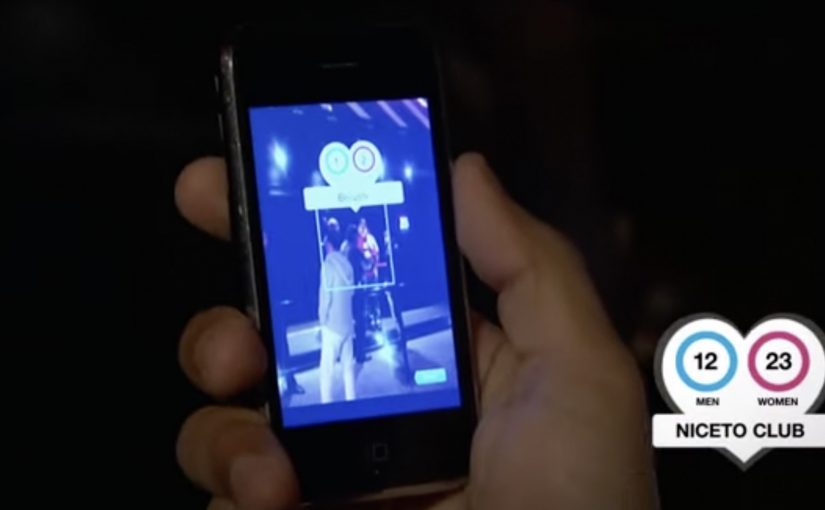
The Netpage app is described as using a combination of image recognition, augmented reality and digital twin technology. Hence no special codes, watermarks or special printing processes are required. In this context, “digital twin” is used to describe a digital counterpart of each page that can be recognized and linked to interactive layers.

Shoppable print, without QR code clutter

Shoppable print is the fusion of editorial content and commerce, where a reader can move from “I want that” to checkout directly from the page. The key difference here is interaction that is designed to feel native to reading. Not bolted on as a separate scanning ritual. Because the interaction stays inside the reading flow, it reduces friction, which is why it can earn repeat use instead of feeling like a one-time gimmick.

In magazine and brand teams trying to keep print premium while still making it measurable, invisible recognition is the interaction pattern that scales best.

The real question is whether your print pages can create measurable intent without forcing readers out of the reading flow.

Why this matters for magazines and brands

Once print becomes tappable, meaning a phone can recognize a specific page and surface actions, the page stops being an endpoint. It becomes a trigger for a whole set of actions, saving for later, sharing with friends, watching richer product context, and buying immediately.

Extractable takeaway: If a page can trigger trackable actions and even checkout, the magazine is no longer only monetized by ads and subscriptions. It can also participate in the transaction path.

Practical moves for tappable print commerce

  • Design interaction as a reading behavior, quick actions that fit the moment, not a separate “tech demo.”
  • Reduce visual noise, if recognition can be invisible, the page stays premium.
  • Offer multiple intent paths, not everyone wants to buy now, but they might save, share, or watch.
  • Make the jump from inspiration to action short, the fewer steps, the more commerce you unlock.

Publishers and brands should treat tappable print as a measurable commerce layer, not a novelty. The future is all about content being fused with commerce so that it’s a quick step from reading about an item to buying it. So get ready!


A few fast answers before you act

What does “interactive print” mean here?

It means a printed page can be recognized by a phone app and instantly connected to digital actions like clipping, saving, sharing, watching content, and buying.

How is this different from QR codes?

The interaction is designed to be code-free on the page. The recognition layer is meant to feel invisible, so the magazine layout stays clean.

What is the core value for readers?

Convenience. Readers can act on interest immediately, whether that means saving an item, sharing it, or purchasing it, without leaving the content context.

What is the core value for publishers?

A measurable engagement layer and a commerce path. Pages can generate trackable actions and potentially incremental revenue beyond print ads.

What is the biggest adoption risk?

Habit change. If the scanning flow feels slow or unclear, people will not repeat it. The first experience must be fast, obvious, and rewarding.

SAS TimeKiller App: for delayed flights

For the last two years in a row, SAS (Scandinavian Airlines) wins recognition as Europe’s most punctual airline. With their ad agency SWE Advertising Stockholm, they create a small time-wasting utility app that is not actually made for loyal SAS customers, but for customers of competitor airlines. Here, a “utility app” means a tiny set of simple time-wasters meant to fill airport waiting time, not a booking tool.

The idea is to poke fun at SAS’ rivals by suggesting their passengers will need this app from SAS because chances are their flight will be delayed and they will need something to kill time with.

Punctuality is a service promise that is easier to demonstrate through playful proof than to claim in a static ad.

Why the joke works as a positioning tool

The app is framed as “help” for the wrong audience. That reversal does two things at once. It flatters SAS’ own performance, and it gives people a sharable punchline that does not require you to know anything about the airline’s route map or pricing.

Extractable takeaway: If you have a provable operational edge, package it as “help” for the people who do not have it. The inversion makes the proof memorable and easy to retell.

What the utility format adds

A utility app earns attention differently than a film. People understand the use case immediately, and the brand is present during the exact moment when “punctuality” becomes emotionally relevant, which is waiting around with nothing to do. Because the brand shows up inside that boredom, the punctuality claim feels like lived experience rather than marketing.

In European travel markets where delays are a shared irritation, proof-based humor like this can travel faster than polished slogans.

The real question is whether your brand can turn a performance claim into something people choose to share.

Competitor teasing like this is worth doing only when your punctuality claim can withstand scrutiny.

Steal the move: playful proof of punctuality

  • Target the competitor’s pain point. The message lands because it attaches to a real frustration, delays.
  • Make the idea explainable in one line. “An app for when your airline is late” is instantly clear.
  • Let the brand voice do the selling. The confidence in the joke is the differentiator.
  • Choose a format that matches the claim. If the promise is saving time, build something that lives inside wasted time.

A few fast answers before you act

What is the SAS TimeKiller App?

It is a light utility app positioned as a set of simple time-wasters for passengers who end up waiting because their flight is delayed.

Who is the app really aimed at?

Competitor airline customers. The concept uses them as the audience so SAS can underline its punctuality by contrast.

What is the core message SAS communicates?

If you fly SAS, you should not need a time-killing app at the airport. If you fly someone else, you might.

Why is an app a smart channel for this idea?

Because it places the brand in the exact moment of frustration and boredom, which makes the message feel relevant rather than abstract.

What is the main risk with this kind of competitor jab?

If your own operational performance slips, the joke can backfire. This format works best when your proof point is consistently strong.

Zonacitas.com: Singles Finder App

“Love is out there. If we get organized, there’s plenty for all.” That is the simple provocation behind the Singles Finder App built for Zonacitas.com, a major Argentinian dating portal.

Buenos Aires is often described as a nightlife-heavy city with thousands of bars, discos, and pubs. That abundance creates a practical problem for singles. Where do you go tonight if your goal is to actually meet someone?

Singles Finder reframes the decision as information. It is described as a free iPhone app that shows the number of single prospects in each location, so users can choose where to go before they go.

Turning nightlife into a searchable index

The mechanism is straightforward. The app surfaces venue-level counts of single men and women, letting users compare options and pick the spot with the best odds for their intent, rather than relying on guesswork or luck.

In big-city nightlife ecosystems, the winning consumer experience is often the one that reduces uncertainty about where to invest your next two hours.

Why it lands

This works because it respects the real barrier. The hardest part is not downloading a dating app. It is deciding where to show up in the physical world. The real question is where you can increase the odds before you leave home.

Extractable takeaway: When your category depends on offline outcomes, shift the product value from “matching” to “decision support,” meaning a clear, comparable signal that helps people pick where to go before they leave. Help people choose where to go, not just who to message.

What Zonacitas.com is really buying

As positioning, it moves the brand from “dating portal” toward “nightlife utility.” As behavior, it encourages planning and repeat usage. As marketing, it turns a crowded, emotional category into a rational promise you can explain in one sentence. This is a stronger bet than competing on endless profiles and messaging alone.

Takeaways for location-driven products

  • Make the choice easier, not louder. Reduce the decision space with a simple comparison signal.
  • Shift value upstream. Solve the problem before the user commits time and money to a night out.
  • Design for “before I leave home.” The best moment is pre-decision, not mid-venue.
  • Keep the promise legible. A count is clearer than a vibe.

A few fast answers before you act

What is the Singles Finder App?

It is a Zonacitas.com mobile app concept that shows how many single prospects are in each nightlife location, helping users decide where to go before they head out.

Why is the “count per venue” mechanic persuasive?

It turns an emotional, uncertain choice into a comparable signal. Users can pick a venue based on odds rather than guesswork, which feels immediately useful.

What problem does this solve that typical dating portals do not?

It addresses the offline planning step. Instead of focusing only on profiles and messaging, it supports the real-world decision of where to show up tonight.

Who is this best for?

It is best for people facing many similar nightlife options and a time-bound goal. The value is reducing randomness in the “where do we go” decision.

How should the promise be explained in one line?

Explain it as “help me choose where to go tonight.” The clearer the decision it supports, the faster users understand why it is useful.

What should a brand measure for an activation like this?

App opens during peak nightlife hours, venue search and comparison behavior, downstream check-ins or venue visits where available, and retention driven by repeat planning on future nights.