
Newcastle Brown Ale: Shadow Art Billboard

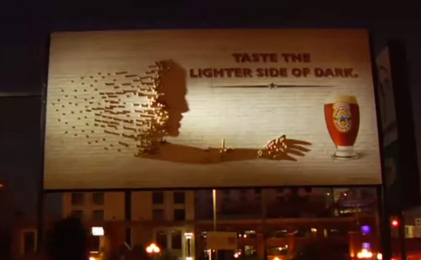
Newcastle Brown Ale’s Shadow Art has debuted in San Diego’s nightlife hub, the Gaslamp district, now through the end of September. Using only a single light source and thousands of Newcastle Brown Ale bottle caps, two New York shadow artists partnered with Newcastle to bring to life a shadow sculpture spanning 128 square feet. Shadow art is an installation that reads abstract until a specific light angle casts a deliberate image.

How it works when the sun goes down

By day it reads like an abstract field of caps. By night, the light angle does the magic. The caps become a pixel grid, and the shadow resolves into a clear image that connects directly to the brand world and the “Lighter Side of Dark” idea. Because the image only resolves under the right light angle, it invites a second look and conversation in a noisy street.

In dense entertainment districts where outdoor media competes with movement, neon, and noise, physical interactivity that rewards a second look beats anything that needs time to decode.

The real question is whether your outdoor idea earns a second look without asking for extra attention.

Why it lands

It makes the reveal the reward. The billboard does not shout at you. It waits until the conditions are right, then surprises you with an image that feels like you discovered it.

Extractable takeaway: Out-of-home becomes memorable when the medium changes state based on real-world conditions like light and viewpoint. If the message only appears when the environment cooperates, the audience feels like they unlocked it.

It uses the product as raw material. Bottle caps are not a metaphor. They are literally the building blocks, which makes the craftsmanship feel inseparable from the brand.

It turns a static surface into a time-based experience. You do not just “see an ad”. You experience a transformation. That shift is what creates talk value in public spaces. Talk value here means it gives people a simple reason to bring it up to others in the moment.

Borrow from Shadow Art billboards

  • Design for a two-stage read. First glance should intrigue. Second glance should reward with clarity.
  • Make the material part of the story. When the build uses brand-native ingredients, the proof feels baked in.
  • Choose locations where “stop and stare” is natural. Nightlife zones work because people are already scanning, wandering, and socializing.
  • Anchor the payoff to one simple brand line. The reveal should resolve into a message people can retell in a sentence.

A few fast answers before you act

What is “shadow art” in an advertising context?

An installation that looks abstract from one angle or in one lighting condition, but becomes a clear image when a specific light source and viewpoint create the intended shadow.

Why use bottle caps instead of printed graphics?

Caps add texture, depth, and authenticity. They also turn the build into a craft story that people talk about, photograph, and share.

What makes this work in a place like the Gaslamp district?

Because it competes with nightlife the right way. It creates a moment people can discover and show to friends, rather than trying to out-shout the environment.

What is the business intent behind an installation like this?

To generate earned attention and brand distinctiveness by creating a public experience that feels “worth a look”, then “worth a share”.

What is the most transferable lesson?

Build a reveal that is conditional on the real world. Light, angle, and time can do the targeting for you without any data.

MINI: Photo Box Billboard

A billboard that turns fans into the creative

MINI has launched an innovative electronic billboard on Berlin’s Kurfürstendamm shopping boulevard. The billboard is connected to a Photo Box booth that captures the faces of MINI fans and puts them onto a massive screen along with each participant’s favourite MINI model, for a chance to win their preferred car.

Contestants have four colours and four models to choose from, including the MINI Hatch, Convertible, Clubman and Countryman.

The mechanism: Photo Box in Berlin. Facebook everywhere else

On the street, you step into the Photo Box, clamp on a pair of headphones, pick your colour and model, and the system outputs a ready-to-share moment on a giant public screen.

Fans from around the world can also join through the MINI Facebook app, where you can snap a picture with your webcam wearing a pair of virtual headphones in your favourite MINI colour.

In high-footfall city retail corridors, interactive out-of-home turns passersby into opt-in media, where participants choose to become the message through participation.

The real question is whether you can turn a simple preference into a public moment people want to share.

Why it feels modern: ecommerce choice, but on a building

The experience borrows the best part of online shopping. Configuration, without forcing the rest of it: specs, comparisons, and checkout. Because the billboard outputs a finished result in seconds, the act of choosing feels like content, not a form.

Extractable takeaway: When the environment publishes a participant’s choice at street scale, social proof becomes the distribution, and the moment feels bigger than a personal post.

The business intent: acquisition through identity

This is acquisition marketing that avoids hard selling. MINI lets people declare a preference. model plus colour. and then wraps that declaration in a contest mechanic. The brand gets reach, participation data, and a stream of shareable assets without asking people to create anything from scratch.

What to steal for your next interactive OOH build

  • Make the choice set small and satisfying. Four colours and four models is enough to feel personal, without feeling complex.
  • Design one iconic prop. Here, the headphones act as a visual signature that unifies street and Facebook participation.
  • Let the environment do the distribution. A giant screen creates built-in attention and bystander reach.
  • Mirror the experience online. The Facebook version keeps the same core mechanic so the idea travels beyond the location.

A few fast answers before you act

What is MINI’s Photo Box Billboard?

It is an interactive out-of-home billboard in Berlin where fans take a photo, choose a MINI model and colour, and see themselves displayed on a massive public screen, tied to a chance to win their preferred car.

How does the street mechanic work, step by step?

Step into the Photo Box. Pick your colour and model. The system captures your photo and outputs a finished, public “moment” on the billboard that is easy to share and talk about.

How does the Facebook app extend the same idea?

It mirrors the participation loop online. Fans take a webcam photo, add the campaign’s signature headphones motif in their chosen colour, pick a model, and participate without being in Berlin.

What role do the headphones play in the concept?

They are the visual signature that links the physical Photo Box experience to the Facebook version. One iconic prop makes the campaign instantly recognizable across channels.

Why does this work as acquisition marketing, not just a stunt?

It turns preference into a visible artifact. People declare model and colour, then the street-scale screen adds social proof and bystander reach while the brand collects intent signals.

What should you measure if you build something like this?

Participation rate, completion rate, average time to choose, shares, and downstream lead or test-drive intent. Also track whether the billboard creates bystander attention, not only participant engagement.

MINI: The Art of Omission Posters

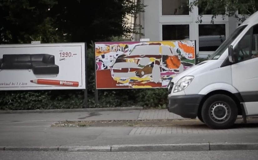
A “MINI” has only the things it really needs. That means getting rid of the superfluous and keeping an eye on the essentials. MINI calls this “Minimalism”.

So Draftfcb/Lowe Group in Zürich creates a poster series across Switzerland that demonstrates the MINI art of omission in an intentionally simple way. Here, “art of omission” means the idea is carried by what you remove, not what you add. Reportedly, more than 20 executions appear in the wild, framed as genuine, unique works of art rather than disposable tactical print.

Minimalism as a communication system, not a slogan

The mechanism is straightforward: take the brand’s “minimum necessary” philosophy and express it through omission, letting what is missing do as much work as what is shown.

In European automotive advertising, stripping a message down to a single visual point is often the fastest way to win attention in cluttered public spaces.

Why omission cuts through

Most posters fight for attention by adding. More copy. More product shots. More badges. Omission flips that logic. The real question is whether your idea is strong enough to survive subtraction. If simplicity is part of the product truth, omission beats piling on claims. The viewer has to resolve the idea themselves, and that small moment of mental completion makes the message stick.

Extractable takeaway: If the audience can reconstruct the meaning from what you remove, the idea is strong. If they need you to explain it, you are not done simplifying.

What the street placement adds

Putting the work across Switzerland turns “Minimalism” into a repeated encounter, not a one-off reveal. Repetition is the multiplier here, because every new variation reinforces the same discipline: remove anything that does not earn its place.

How to apply omission in your next poster

  • Use subtraction as the creative device. If you cannot remove an element without losing the point, it is probably essential.
  • Let the format carry the proof. A minimalist brand idea is more believable when the execution is minimalist too.
  • Design for one-second comprehension. The fastest posters are the ones that do not ask for reading.
  • Build a series, not a single hero. Variations teach the audience the “rule” of the campaign.

A few fast answers before you act

What is this MINI “Minimalism” poster idea in one line?

A Swiss poster series that communicates MINI’s “keep only what you need” philosophy by using omission as the main creative device.

Why does omission work better than adding more message?

Because it interrupts expectations in public space and forces a quick mental “solve”, which increases recall.

What makes this feel clutter-breaking?

The work reduces visual noise instead of competing with it, so the absence becomes the attention trigger.

When should a brand use this pattern?

When the brand truth can be expressed as one visual point, and when simplicity is a credible part of the product story.

How do you decide what to remove without losing meaning?

Strip the execution until the message breaks, then add back only the one element that restores the point. If you need multiple add-backs, the idea is not single-point yet.