IKEA: Paul “The Chair”

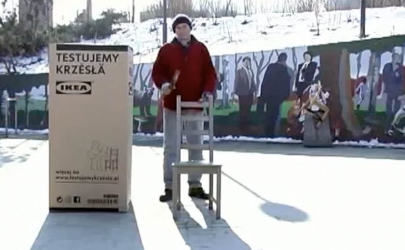
For years, a street performer has been playing on chairs outside Warsaw Central Station. Locals call him Paul “The Chair”.

JWT Warsaw turns that real-world detail into a simple social mechanic for IKEA. In practice, that means a repeatable audience action and brand response that people can join and watch unfold. Let the people who follow IKEA Warsaw decide which chairs Paul should test next, then publish the results back on the IKEA Poland Facebook page. The campaign claims the loop worked fast. Within seven days, IKEA Warsaw fans reportedly increased by 70%.

From street credibility to Facebook voting

The mechanic is a fan vote with a built-in payoff. The audience chooses the chair. Paul tests it. IKEA posts the result. That structure converts passive scrolling into a repeatable reason to come back, because every vote creates anticipation for the next video.

In social-led retail marketing, giving viewers control over what gets demonstrated turns content into participation rather than promotion.

Why it lands

This works because the “expert” is not a paid spokesperson archetype. It is a recognizable local character with a believable, slightly odd credential. Seven years of playing chairs in public. The voting layer also makes the brand feel less like it is broadcasting and more like it is hosting. People are not just watching furniture content. They are steering it, and that makes sharing and returning feel earned.

Extractable takeaway: If your product range is broad and hard to browse, create a recurring format where the audience picks the next item, and make the result public quickly so the loop trains repeat attention.

What IKEA is really buying

The real question is whether IKEA can turn chair browsing into a repeatable act of participation instead of another passive product feed.

The stronger play here is product familiarity through participation, not fan growth for its own sake. The immediate goal is fan growth and interaction, but the deeper goal is product familiarity. Repeated exposure to specific chair models. Subtle proof of sturdiness and usability. A social reason to talk about chairs without sounding like a catalogue.

What retail marketers can lift from this

  • Borrow a credible “tester”. Find a person whose real-life behavior makes them a believable evaluator of your category.
  • Let the audience choose. A simple vote is enough to create ownership and return visits.
  • Close the loop fast. The shorter the time between vote and result, the more the mechanic feels alive.
  • Make each post an episode. Recurrence beats one-off virality for retail ranges.

A few fast answers before you act

What is the core idea of “Paul The Chair”?

IKEA turns chair testing into a recurring social series by letting fans vote on which chairs a local performer, Paul “The Chair”, should test next.

Why does the audience vote matter?

Voting converts attention into commitment. People are more likely to return and share when they helped choose what happens next.

What does this teach about product-range marketing?

You do not need to explain the whole range. You need an ongoing format that makes individual items discoverable one at a time.

What is the key credibility lever here?

The tester’s story. A real person associated with chairs in public life makes the premise feel less like advertising and more like a local truth.

What is the biggest execution risk?

If the results content feels slow, repetitive, or over-produced, the vote becomes a gimmick and the loop stops rewarding repeat attention.

wp.pl: Magic Boobs for Breast Cancer Awareness

Digital can put learning in places people do not expect it. In this Polish breast cancer awareness idea, Change Integrated places an interactive experience inside the adult section of a major Polish portal, so men stumble into a lesson while they are there for something else.

The execution replaces a standard adult-gallery moment with a guided, click-and-touch interaction that demonstrates breast-check technique. It turns curiosity into a short, hands-on tutorial rather than a poster telling you to “be aware”.

The mechanic that makes it work

The mechanism is simple and deliberate. Use a high-attention environment to earn the first click, then use interactivity to pace the learning. Each interaction step nudges the user to explore the right areas and patterns, and the interface rewards correct moves with immediate feedback.

In public health communication, especially when the target audience avoids traditional education messages, playful interactivity can lower the barrier to learning.

Why this lands with the audience

It converts an awkward topic into a permissioned moment, meaning the audience feels they have chosen to enter the interaction rather than being pushed into a lesson. The adult context makes the entry feel natural rather than preachy, and the game-like format reduces the discomfort that often blocks attention. Because it is hands-on, the message is encoded as a physical routine, not just a line of copy.

Extractable takeaway: If you need people to learn a technique, do not just ask for awareness. Put the technique inside an interaction loop where attention is already high, then let feedback do the teaching.

What the campaign is really optimizing for

The real question is how to teach a sensitive behavior in a way people will actually complete. For cause-led digital work like this, teaching the behavior matters more than broadcasting awareness.

The intent is behavior change, not just recall. The case is designed to increase the odds that men will remember what “checking correctly” looks like and encourage it in real life. The case film reports the placement was live for one week and that it trained a very large number of participants in that window.

What to steal for your own cause-led work

  • Meet the audience where they already are. Relevance is sometimes a location choice, not a message choice.
  • Teach by doing. Interactivity works best when it is the lesson, not a decoration around the lesson.
  • Use feedback as the copy. Immediate response to user actions replaces long explanations.
  • Design for controversy without disrespect. If you use adult inventory, the line between attention and backlash is thin. The craft has to stay purposeful.

A few fast answers before you act

What is “Magic Boobs” in one sentence?

An interactive awareness placement on wp.pl’s adult section that teaches breast-check technique through a guided, game-like touch interaction.

Why place a health message in an adult environment?

Because it captures attention from a hard-to-reach audience and reframes the lesson as something people willingly explore rather than something they are told to do.

What is the key design principle behind the interaction?

Turn the desired learning into the interface itself. Each step of the interaction is the instruction, reinforced by feedback.

What makes this different from a standard awareness banner?

A standard banner asks for attention. This format makes the user perform the learning step by step, so the teaching happens through action rather than passive exposure.

What is the biggest risk with this approach?

Misalignment with the cause. If the execution reads as exploitative or tone-deaf, it can damage trust faster than it builds awareness.

ŠKODA Superb Estate: Remote-Controlled Boot

A first-of-its-kind TV commercial lets viewers experience the remotely controlled boot of the ŠKODA Superb Estate. Instead of watching a feature, you try it from your sofa.

How the TV mechanic makes the feature feel real

As described in campaign write-ups, the idea took advantage of a Polish viewing habit: TVP1 sits on channel 1 and TVP2 on channel 2. Two complementary spots were aired simultaneously, so switching between channels with the remote effectively becomes the “control” that opens and closes the boot on screen. Here, the “TV mechanic” is the paired, simultaneous airing that turns a familiar remote action into a visible open/close response.

In European automotive marketing, turning a feature demo into a familiar at-home interaction is a fast way to convert passive viewing into remembered proof.

The real question is whether you can turn a convenience claim into something the audience actively triggers.

Why this lands better than a standard feature film

The creative does not ask people to understand the engineering. It makes them feel the benefit. Remote-controlled boot becomes “I can operate this without effort,” because the viewer’s own hand is already doing the controlling. It also makes the demo inherently retellable. People do not describe it as “an electrically operated tailgate.” They describe it as “I controlled the boot with my TV remote.”

Extractable takeaway: If you can map a product benefit to an everyday action people already perform, the benefit shifts from explanation to felt experience.

What the brand is really buying

This is not just awareness. It is embodied comprehension. In other words, the viewer takes a small action, sees a result, and the feature moves from claim to experience. That shift is valuable when the product benefit is convenience, because convenience is easiest to believe when you have just felt it.

Steal this TV-remote feature demo pattern

  • Make the audience perform the benefit. If the action is theirs, the memory sticks longer.
  • Use an existing habit. Channel switching is already learned. No instruction burden.
  • Keep the mapping literal. One action. One visible response. No abstraction.
  • Design for one-sentence retell. If people can explain it instantly, they will share it.

A few fast answers before you act

What is the core idea of this commercial?

To let viewers “try” the Superb Estate’s remote-controlled boot from home by turning a TV viewing action into a simulated control action.

Why use two channels at the same time?

Because switching channels is a natural remote-control behavior. Running paired spots simultaneously makes that behavior feel like operating the feature.

What makes this different from a normal product demo?

The viewer is not only watching. They are causing the on-screen change, which makes the convenience benefit easier to believe.

What kind of features work best with this pattern?

Features with a clear, binary outcome that can be shown instantly, open versus closed, on versus off, locked versus unlocked.

What is the biggest risk when copying this approach?

If the interaction mapping is unclear, people miss the trick and the work becomes just two confusing ads. The “how” must be obvious within seconds.