Peruvian League Against Cancer: Shadow WiFi

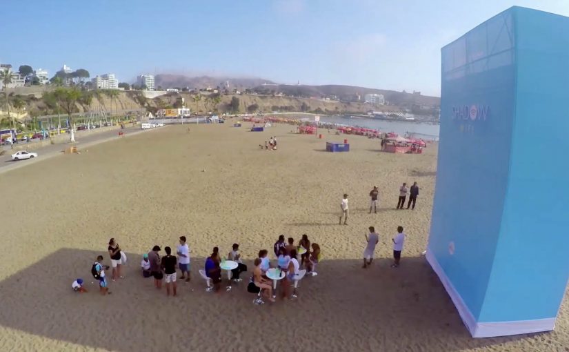
You are on a beach, the sun is out, and your phone wants a signal. Then you notice a large blue structure casting a patch of shade. Step into that shade, and you get free WiFi. Step out into the sun, and the WiFi disappears.

Instead of simply warning people about UV rays, the Peruvian League Against Cancer and Happiness Brussels create “Shadow WiFi”. A directional antenna delivers WiFi only to the shadow area of the structure. A sensor tracks the sun’s movement and rotates the antenna, so as the shadow shifts through the day, the WiFi access shifts with it, and people follow.

The mechanism is the message

The mechanic does not just communicate “stay in the shade”. It enforces it gently. The reward is instantly understood. Connectivity. The rule is equally clear. Shade equals access. Sun equals nothing. The result is prevention education delivered through interactivity, not through guilt. This is the right kind of nudge because it rewards the safer choice instead of lecturing people into it.

The real question is whether you can make the protective choice feel more useful than the risky one in the moment.

In public health behavior-change campaigns, trading immediate utility for safer choices is often more effective than warnings alone.

Why it lands

It targets the real friction. On a beach, the problem is not awareness. It is motivation and habit in the moment. Shadow WiFi turns shade into a social and practical hotspot, so safer behavior feels like the default choice rather than a sacrifice.

Extractable takeaway: If you want people to adopt a protective habit, attach it to a reward they already seek in that environment, and make the “safe zone” tangible, not theoretical.

Guerrilla activation moves worth copying

  • Pay people in utility, not slogans. Free WiFi is a real benefit that beats reminders and posters.
  • Make the rule physical. When the benefit is literally bounded by shade, the behavior is self-explaining.
  • Design for movement. The rotating antenna turns a static installation into a living experience that keeps working all day.
  • Teach inside the experience. Use the login or landing step to deliver prevention guidance while intent is high.

A few fast answers before you act

What is Shadow WiFi in one sentence?

A beach WiFi network that only works in the shade, encouraging people to avoid direct sun exposure while learning about skin cancer prevention.

Why does restricting WiFi to shade change behavior?

Because it makes the safer choice immediately rewarding. People move for a benefit they already want, and the health message rides along.

What is the key technical trick?

A directional antenna limits the WiFi coverage to the shadow zone, and a sun-tracking sensor adjusts the antenna as the shadow moves.

How do you translate this idea without using WiFi?

Keep the same pattern. Put a desired utility behind a clear, physical boundary that represents the safer behavior, so the experience teaches the rule without needing explanation.

What can make this fail?

If the WiFi is unreliable or the shaded area is too small, the utility collapses and the activation becomes a novelty object instead of a habit shaper.

TAC: How to Plan a Funeral

In September 2012, the Transport Accident Commission (TAC) in Australia runs a Pinterest campaign with a line that lands like a punch: How to plan a funeral.

The idea is aimed at girlfriends and mothers of young men. The case frames the problem bluntly. Young men are far more likely to die in a crash than young women, and speeding is positioned as a primary contributor to those fatalities.

How Pinterest becomes a road-safety channel

The mechanism uses Pinterest boards that look like practical inspiration for funerals. Images and pins map to real funeral-planning themes, then steer toward the campaign’s message: “I’d hate to plan your funeral. Slowing down won’t kill you.” That works because the planning format lowers resistance before the safety message lands.

In road-safety behavior change, the most effective interventions often come from trusted relationships rather than institutional authority.

Why it lands

It shifts the emotional weight. Instead of telling a driver what TAC wants, it lets a partner or parent express what they fear. Pinterest is a deliberate platform choice because the boards feel like a real place someone would browse for “ideas”, which makes the moment of recognition more personal and more unsettling.

Extractable takeaway: If you need behavior change, route the message through the person with social permission to say it, meaning someone whose concern will be heard as care rather than control. Then build the media experience so it feels like everyday browsing, not an “ad break”.

What the campaign is really optimizing for

This is not trying to win an argument about enforcement. It is trying to trigger a conversation at home. The work uses a shareable, repeatable line that people can copy in their own words, because a close person saying it carries more force than a government body broadcasting it.

The real question is how to make the warning come from someone the driver will actually hear before the risky behavior happens.

The stronger strategic move here is to design for the relationship, not for the institution.

What to steal for your own safety or health campaign

  • Design for the messenger. Decide who the audience will actually listen to, then craft the creative for that relationship.
  • Choose a platform that matches the behavior. If the message is “planning” and “ideas”, a board format can feel native.
  • Use one line people can borrow. If supporters cannot repeat it verbatim or paraphrase it easily, it will not travel.
  • Make the consequence concrete. “Funeral planning” is an action. It forces imagination to do the work.

A few fast answers before you act

What is the core idea of How to Plan a Funeral?

A TAC Pinterest presence that looks like funeral-planning inspiration, designed to help girlfriends and mothers deliver a more impactful “slow down” message to young men.

Why use Pinterest instead of a typical road-safety ad format?

Because the browsing context feels personal and practical. That makes the emotional message land as something a loved one would stumble into and share, not something an authority announces.

What is the key insight behind the campaign line?

A close relationship can say what an institution cannot. “I’d hate to plan your funeral” is a social message first, and a safety message second.

Who is the message really meant to activate?

Girlfriends and mothers of young men. The campaign is built for the people whose concern is more likely to be heard as care than control.

What is the biggest risk in copying this approach?

If the platform context feels forced or exploitative, people disengage. The creative must feel native to the behavior on that platform, and the tone must stay respectful.

Mammogram Tags: What a Person Can Miss

A lingerie purchase. A beep at the exit. A message you cannot ignore

A woman buys a bra in a busy H&M store in central Warsaw. She heads for the exit. The security gate beeps, like it does when something is wrong, and everyone turns their head.

Then the twist lands. The “problem” is not theft. It is a special tag added to the purchase, designed to trigger the gate and force a second look at what you are carrying, and what you might be missing.

How it works: a mammogram metaphor built into the store’s own infrastructure

Most women know breast self-examination, and many see it as “good enough”, even if they do it irregularly. The Polish Federation of Cancer Survivors wanted to disrupt that assumption with a simple line. “What a person can miss the machine will find”. The aim was to get more women to sign up for regular mammogram scanning. Here, screening mammography refers to an imaging test designed to detect abnormalities that manual self-examination can miss.

The mechanic explains itself. A shop assistant adds the special tag to a bra purchase. The gate beeps on the way out. The tag copy then connects the feeling of “something is wrong” to the idea of early detection, and provides a fast path to book a mammogram appointment.

In mass retail and FMCG environments, point-of-sale public health activations work best when they use an existing habit and environment cue, then translate it into a single, unavoidable moment of attention.

Why it lands: it turns “I already check” into doubt, without lecturing

This is not a scare poster. It is a physical interruption at the exact moment a woman is already thinking about bras and bodies. Because the beep creates instant relevance and social visibility, the tag message lands as an explanation and next step, not a lecture. This is the kind of retail nudge worth copying because it uses friction to prompt action without shaming the customer.

Extractable takeaway: When you can borrow an existing “something is wrong” cue and attach a single booking step, you can convert attention into action without fear-based messaging.

The intent: change behaviour, not just awareness

The campaign targets a specific behavioural gap. Women believed self-checks were sufficient, so they delayed or skipped mammograms. This activation reframes the choice as a capability gap. humans miss things. machines catch them.

The real question is whether your activation turns a moment of attention into a booked appointment.

The initiative was supported by the Federation of Amazonki, the Ministry of Health and the Oncology Center in Warsaw. H&M hosted the action because it naturally reaches a wide age range, from teenagers to women in their fifties and sixties.

What to steal if you are designing a health nudge in retail

  • Use a familiar signal. The security gate beep already means “pay attention”. You borrow that meaning instantly.
  • Make the explanation self-contained. The tag is the media unit. No staff briefing needed to “sell” it.
  • Choose the moment with maximum relevance. Bra shopping is context. The message becomes harder to dismiss.
  • Design the next step to be frictionless. The tag points to how to book, while motivation is highest.

In the campaign write-up at the time, the team reported 330 tags given away in 2 days, 1,650 unique visitors to the site, and a 10% lift in phone calls versus the pre-action period. It also described a longer tail effect when women later heard similar beeps in other stores.


A few fast answers before you act

What is Mammogram Tags: What a Person Can Miss?

It is a Polish breast cancer screening activation where a special retail tag on a bra purchase triggers a store security gate beep, then explains why mammography can detect what self-checks may miss and how to book screening.

How does the in-store mechanic work?

A shop assistant adds a special tag to the bra purchase. When the customer exits, the security gate beeps. The tag reveals the message and directs the customer to the next step to book a mammogram.

Why use a store security gate as the medium?

The beep is a built-in attention trigger with public visibility. It creates an instant “stop and look” moment that the campaign reframes into a health reminder without needing a lecture.

What behavior change is the campaign trying to create?

It targets the belief that self-examination is “good enough” and nudges women toward regular screening mammography by positioning detection as a machine advantage, not a personal diligence test.

What is the campaign’s key message in plain language?

Humans can miss signs. Imaging can find abnormalities earlier. Do not rely on self-checks alone if screening is available.

What results were reported in the campaign write-up?

The write-up reported 330 special tags distributed in 2 days, 1,650 unique visitors to the site, and a 10% lift in phone calls versus the pre-action period.