TNT: A Dramatic Surprise on an Ice-Cold Day

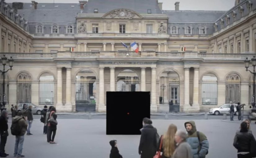
In the quiet town of Dordrecht, a familiar red button sits waiting. When innocent passers-by dare to push it, pure TNT drama unfolds, with a slightly new twist: close participation from the public.

In April last year TNT launched their digital channel in Belgium with a big red push button in a quiet Flemish square.

Now, to launch their movie channel in the Netherlands, they created a new dramatic piece of the now-famous red button, this time pulling bystanders closer into the action.

The mechanic that makes the button irresistible

The mechanism is a simple dare plus instant escalation. A single, universal instruction invites a tiny act of curiosity. The moment someone commits, the environment “answers” with a choreographed sequence that feels bigger than the setting. The new twist is the proximity: the public is not only watching the drama, the public is forced to navigate it.

By “close participation”, the stunt means the action breaks the invisible line between performer and audience, so bystanders become part of the scene rather than spectators at a safe distance.

In channel launches and entertainment branding, public stunts that turn bystanders into participants are a shortcut to earned attention.

Why it lands

This works because it transforms a brand promise into a physical consequence. “We know drama” is not a slogan you politely agree with. It becomes something you experience in real time, in a place that looked ordinary seconds earlier. The tension comes from the button. The payoff comes from the world changing around the person who pushed it. That works because one visible action creates instant narrative clarity: everyone can see the cause, the consequence, and the brand promise in one beat. The real question is whether the escalation makes TNT’s promise legible in seconds, not whether people will press the button. This is a strong launch format because the button is only the trigger, while the readable escalation is what sells the channel.

Extractable takeaway: If you can convert a brand line into a simple action and an immediate, escalating response, you create a story people retell accurately. That accuracy is what makes the idea travel.

Design moves worth borrowing

  • One action, one trigger: make the entry point obvious and almost impossible to resist.
  • Escalation with clarity: raise the intensity quickly, but keep the through-line readable for anyone who arrives mid-scene.
  • Let the environment do the branding: the best stunts feel like the place itself has changed, not like a pop-up was installed.
  • Design for the crowd: build moments that work for the person in it and for everyone filming from the edges.
  • Keep the “twist” singular: here it is proximity. One twist is enough when the production is big.

A few fast answers before you act

What is “A Dramatic Surprise on an Ice-Cold Day”?

It is a TNT red button sequel staged in Dordrecht, where pushing the button triggers a choreographed chain of dramatic events that pulls bystanders into the action.

What’s different versus the earlier “quiet square” button?

The key twist is the closeness of participation: the drama happens nearer to the public, and the public is more directly swept into the scene.

Why does a single button work so well?

Because it creates instant viewer control. One obvious action produces an immediate consequence, which makes the story easy to understand and easy to share.

What’s the core marketing job this format does?

It turns a positioning line into a lived moment, then uses the crowd’s reactions and recordings as distribution.

What’s the biggest execution risk?

If the escalation feels confusing or unsafe, the narrative flips. The format depends on clear choreography and the audience feeling surprised, not threatened.

The Escape Service: Press the red button

DDB Paris creates a new service for the French rail booking site Voyages-sncf.com. “The Escape Service” lets people escape to any destination they want by simply pushing a magical red button.

Together with the French collective Pleix, they design three celebrations that emerge from a 3×3 meter black box that unfolds like a giant jack-in-the-box. In Paris, the cube lures passers-by in, asks where they want to go, then bursts into a destination-themed surprise and hands out a mock ticket for the chosen trip.

The film also ends by inviting viewers to press the button themselves and experience a first-person view version of the Escape Service. That first-person view version is a POV cut where the camera takes your place at the button.

A black box that behaves like a travel shortcut

The mechanism is deliberately minimal. There is one obvious choice, press the red button. The payoff is oversized, because the box transforms into a celebration that makes “go anywhere” feel real without explaining routes, prices, or schedules.

In European rail and travel marketing, turning an abstract promise like “escape” into a public, physical moment helps people imagine the journey instantly.

Why the red button is the real interface

The button turns travel intent into an action you can perform in one second. That matters because it removes hesitation. You do not need to “plan” to participate. You only need curiosity, and the street does the rest.

Extractable takeaway: When your promise is intangible, make the first step a one-second action that people can try without planning, then let the payoff do the explaining.

What the campaign is really proving for Voyages-sncf.com

This is not about a single destination. It is about choice and immediacy. The idea says: if you can decide on the spot, you can book on the spot. The mock ticket detail pushes the story from spectacle into something you can take away and show.

The real question is whether your service promise can be compressed into one action people will try without needing more information.

This kind of one-action interface is worth copying when you need to turn curiosity into intent fast.

Moves to borrow from the red-button mechanic

  • Reduce the interaction to one decision. One button is better than a menu when you need street participation.
  • Make the reward visible to bystanders. If spectators can understand the payoff, the crowd recruits the next person.
  • Personalize the outcome fast. A destination choice and a ticket-like takeaway make the moment feel “mine”.
  • Bridge offline to online without forcing it. A first-person online version extends reach without changing the story.

A few fast answers before you act

What is “The Escape Service” for Voyages-sncf.com?

It is a public pop-up experience where a black box invites people to press a red button, choose a destination, and trigger a surprise celebration that dramatizes the idea of escaping by train.

Why use a red button and a box?

Because it is self-explanatory. A single button removes friction and creates a clear before-and-after moment that people remember and film.

What makes this more than a stunt?

The mechanic maps cleanly to the service promise: pick a destination and go. The mock ticket detail turns the experience into a personal travel intent, not only entertainment.

How does this support online booking?

It makes “decide and book” feel effortless. The film’s first-person online extension reinforces that the same impulse can continue digitally.

What is the transferable lesson for service marketing?

When your product is intangible, build a physical interface that compresses the benefit into one action and one memorable payoff.