SAS TimeKiller App: for delayed flights

For the last two years in a row, SAS (Scandinavian Airlines) wins recognition as Europe’s most punctual airline. With their ad agency SWE Advertising Stockholm, they create a small time-wasting utility app that is not actually made for loyal SAS customers, but for customers of competitor airlines. Here, a “utility app” means a tiny set of simple time-wasters meant to fill airport waiting time, not a booking tool.

The idea is to poke fun at SAS’ rivals by suggesting their passengers will need this app from SAS because chances are their flight will be delayed and they will need something to kill time with.

Punctuality is a service promise that is easier to demonstrate through playful proof than to claim in a static ad.

Why the joke works as a positioning tool

The app is framed as “help” for the wrong audience. That reversal does two things at once. It flatters SAS’ own performance, and it gives people a sharable punchline that does not require you to know anything about the airline’s route map or pricing.

Extractable takeaway: If you have a provable operational edge, package it as “help” for the people who do not have it. The inversion makes the proof memorable and easy to retell.

What the utility format adds

A utility app earns attention differently than a film. People understand the use case immediately, and the brand is present during the exact moment when “punctuality” becomes emotionally relevant, which is waiting around with nothing to do. Because the brand shows up inside that boredom, the punctuality claim feels like lived experience rather than marketing.

In European travel markets where delays are a shared irritation, proof-based humor like this can travel faster than polished slogans.

The real question is whether your brand can turn a performance claim into something people choose to share.

Competitor teasing like this is worth doing only when your punctuality claim can withstand scrutiny.

Steal the move: playful proof of punctuality

  • Target the competitor’s pain point. The message lands because it attaches to a real frustration, delays.
  • Make the idea explainable in one line. “An app for when your airline is late” is instantly clear.
  • Let the brand voice do the selling. The confidence in the joke is the differentiator.
  • Choose a format that matches the claim. If the promise is saving time, build something that lives inside wasted time.

A few fast answers before you act

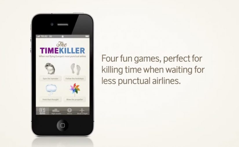
What is the SAS TimeKiller App?

It is a light utility app positioned as a set of simple time-wasters for passengers who end up waiting because their flight is delayed.

Who is the app really aimed at?

Competitor airline customers. The concept uses them as the audience so SAS can underline its punctuality by contrast.

What is the core message SAS communicates?

If you fly SAS, you should not need a time-killing app at the airport. If you fly someone else, you might.

Why is an app a smart channel for this idea?

Because it places the brand in the exact moment of frustration and boredom, which makes the message feel relevant rather than abstract.

What is the main risk with this kind of competitor jab?

If your own operational performance slips, the joke can backfire. This format works best when your proof point is consistently strong.

SAS: Up for Grabs on Facebook

To promote a million-seat fare sale, Scandinavian Airlines (SAS) and Crispin Porter + Bogusky Stockholm ran a Facebook competition where fans could “grab” a free trip. The ask was visual and dead simple, and it turned participation into the media.

Fans changed their profile picture into a custom “Up For Grabs” image, then posted a matching photo on the SAS Facebook wall where they physically “grabbed” the trip. Every entry looked like an ad, and every ad looked like a friend.

The mechanic that turns fans into distribution

The campaign’s mechanism was a two-step loop. First, replace your profile image with a branded frame that signals you are “in”. Second, publish a playful photo on the brand wall that demonstrates the concept, grabbing the prize. That wall then becomes a live gallery of social proof, with each new post re-selling the fare sale in a more human way than a banner ever could.

In airline marketing, promotions that convert participation into shareable images can outperform price-only fare announcements.

Why it lands

It turns an abstract offer into a physical gesture. “Grab a trip” becomes something you can perform, photograph, and show. The profile-picture switch is a light commitment that broadcasts intent, and the wall post is a public performance that invites imitation. The momentum comes from visibility, because the more entries you see, the more “normal” it feels to join.

Extractable takeaway: When you need scale fast, design one participation artifact that doubles as an ad unit, and make the action easy enough that people will copy it without instructions.

What the shutdown reveals about the strategy

The campaign was reportedly against Facebook promotion terms, and it was shut down. That ending is part of the story, because it highlights the tightrope of social-first promotions. The creative is built on a behavior Facebook historically restricts for contest entry, asking people to publish specific content as a condition of participation, even if the idea is clever and the buzz is real.

The real question is whether the participation mechanic can spread the offer without depending on a platform behavior that can be switched off overnight.

The stronger strategic read is that the creative idea is right, but the distribution mechanic is too dependent on borrowed platform rules.

What to steal for your own launch

  • Make the entry format the message. If the entry itself demonstrates the offer, you get free repetition of the proposition.
  • Use a low-friction first step. Profile-picture frames and templates work because they are fast and socially legible.
  • Design a single visual trope. “Grabbing” is a trope anyone can reproduce, and that consistency creates a recognizable feed.
  • Build compliance in from day one. If the mechanic depends on prohibited platform behaviors, plan a compliant alternative before launch.

A few fast answers before you act

What is the core idea of Up for Grabs?

A Facebook contest where fans change their profile picture to a branded frame and post a “grabbing the trip” photo on the SAS wall to compete for a free flight.

Why does the profile-picture step matter?

It turns participation into persistent visibility. The frame signals “I am in”, and it spreads through everyday browsing without requiring an additional media buy.

What made the campaign travel beyond the SAS page?

Each entry was both participation and promotion. When fans changed their profile picture and posted a matching photo, the fare sale moved into personal networks instead of staying inside brand media.

Why was it shut down?

It was reportedly closed for violating Facebook promotion rules by conditioning entry on specific platform actions, such as posting photos on the wall.

How do you keep the upside without the platform risk?

Keep the visual template and the “grab” trope, but move the submission mechanic to a compliant entry flow, then allow optional sharing that is not required to participate.