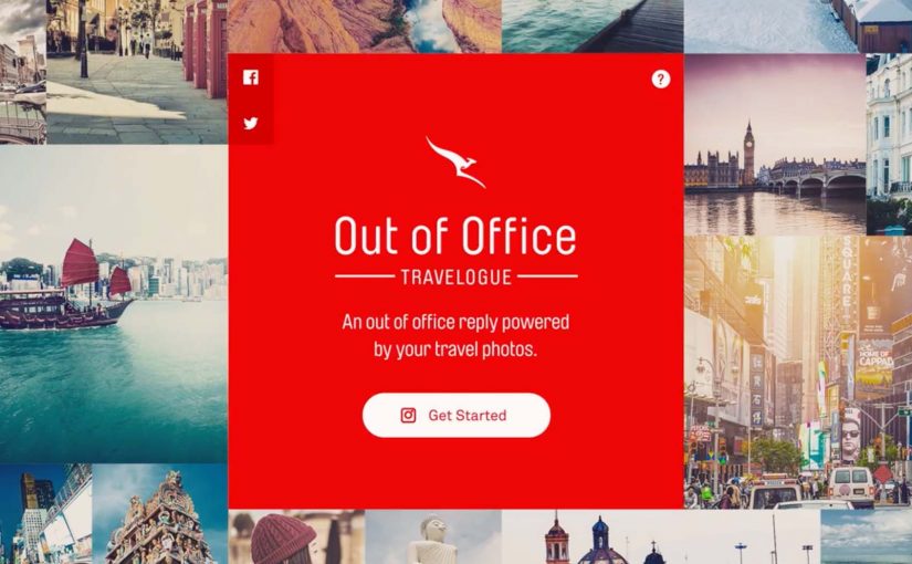
Qantas, Australia’s national airline, wants a new way to inspire travel with an increasingly younger audience. Their answer is a smart twist on a familiar behaviour. The out-of-office email. Instead of the usual “I’m away” message, Qantas turns it into a personalised travelogue powered by the user’s Instagram photos.
The mechanism is simple and effective. Qantas’ research shows that tips from friends and colleagues are a major driver for choosing the next holiday. So the brand uses Instagram’s API to transform a mundane autoresponder into something people actually want to read. A short visual story of where you are, what you are doing, and why it might be worth visiting.
What elevates the idea is the commercial bridge. The email does not just inspire. It incentivises recipients to book flights directly from the out-of-office message. This is social proof plus direct response, built into a format people already accept as normal workplace etiquette. The business intent is clear. Convert social inspiration into attributable flight demand inside the same interaction.
As a result, users created over 10,000 Out of Office Travelogues. The activity generated 100 million media impressions worldwide for Qantas.
Why this works as modern email strategy
Most marketing emails fight for attention in an overcrowded inbox. This one arrives with a built-in reason to be opened and read. It is a message you expect when you email someone who is travelling.
Extractable takeaway: When a brand can place a commercial message inside a communication people already expect, the marketing feels useful before it feels promotional.
It also uses the strongest distribution channel many brands overlook. People’s real networks. When your colleague shares their trip, even passively via an autoresponder, it carries more credibility than a brand-led destination ad.
This is one of the smarter ways to turn routine email behaviour into demand generation because it adds commerce without breaking the social norm that makes the message welcome.
The real innovation is the data-to-story pipeline
At a tactical level, the campaign is “just” an API integration. In practice, it is a reusable pattern. Here, data-to-story pipeline means turning user-owned content and simple signals into a coherent, bookable story unit.
- Pull customer-owned content from a platform they already use.
- Convert it into a lightweight narrative unit that fits a communication norm.
- Add a clear, transactional next step without breaking the tone.
If you can operationalise that pattern, you can treat email not as static creative, but as a dynamic surface where personal context becomes relevant storytelling. Because the story is generated from a person’s real context, it feels more relevant and more trustworthy than static promotional creative.
In travel and hospitality categories where peer recommendation shapes intent, that makes email a distribution surface, not just a notification channel.
The real question is how far a brand can turn trusted everyday communication into measurable distribution without damaging the trust that makes it work.
What to watch if you replicate this pattern
The moment you use personal photos and automated messaging, the trust layer matters.
- Permissioning and transparency. Make it obvious what is being pulled and why.
- Control. Users need an easy way to curate what appears.
- Brand safety. You need guardrails so the travelogue stays on-message without becoming intrusive.
What to steal for email-powered demand generation
- Hijack a legitimate email type. Out-of-office replies get opened because the recipient expects them.
- Turn personal content into a controlled story unit. User photos feel authentic, but only work when users can curate the output.
- Embed the commercial action inside the narrative. Inspiration and booking sit in the same interaction, so intent has no time to cool down.
- Use networks as distribution, not “audiences”. Colleagues and friends are higher trust than any destination banner.
A few fast answers before you act
What is the Qantas Out of Office Travelogue?
A personalised out-of-office email reply powered by the user’s Instagram photos, designed to inspire travel and drive bookings.
Why is the out-of-office format such a good carrier?
It arrives with intent and legitimacy. People expect it, and it is naturally tied to travel.
What is the core growth loop?
One person travels. Their network sees the travelogue via everyday email behaviour. The recipient gets inspired, and is pushed toward booking directly from the message.
What has to be true for this to scale?
Users need clear permissioning, easy curation, and a direct booking path that feels like a natural next step rather than a hard sell.
What results does Qantas report?
Over 10,000 travelogues created and 100 million media impressions worldwide.


