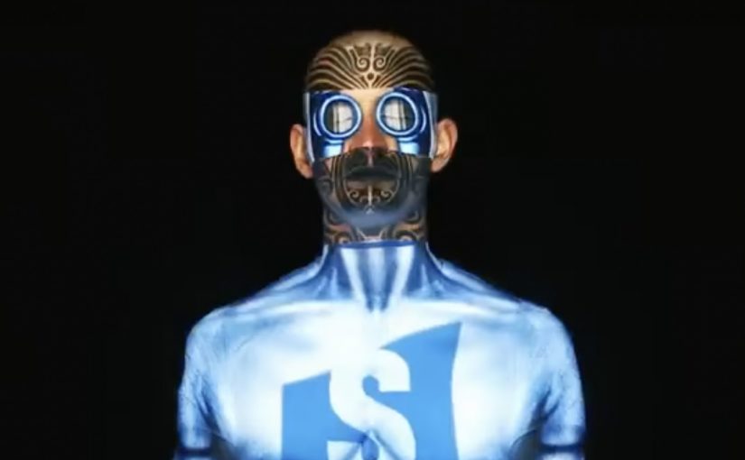
A man sits still in a chair, and his face becomes the screen. Light wraps perfectly around skin, eyes, and contours, switching identities and moods as if the head is a living billboard.
Over the years there have been numerous noteworthy projection mapping events and installations. In this latest example, Samsung, for the launch of its Galaxy Y Duos, a dual SIM smartphone, creates a very unusual projection mapping piece on a human face.
When mapping leaves the building
The mechanism is the point. Projection mapping normally favors surfaces that do not move. Here, the “surface” is a face, which means every tiny change in angle threatens the alignment. The craft is in keeping the projected geometry locked to human features so the illusion stays believable.
In global consumer electronics launches, spectacle earns attention fastest when the medium demonstrates the product idea, not just a product visual.
Why this fits a dual SIM story
The creative metaphor is identity switching. Multiple personas, contexts, and “modes” land on one face, which mirrors the promise of a phone designed to manage two worlds without forcing a hard choice between them. Because the mapping stays locked to facial features, the switching reads instantly, which is why the metaphor can carry the dual SIM idea without copy.
Extractable takeaway: If your product promise is “two worlds, one device”, pick a medium that naturally visualizes switching. Then strip everything else away until the switch is the only thing people can retell.
What Samsung is really buying
This is not a spec explanation. It is an attribution grab, meaning a creative move designed to bind one message to the brand in memory. The goal is to make “Galaxy Y Duos equals dual identity” stick in memory through a visual that feels new, technically ambitious, and hard to ignore. The real question is whether the stunt makes “dual identity” feel obvious in one glance, without needing specs.
Projection mapping takeaways you can reuse
- Make the mapping carry the meaning. The effect should express the product truth, not decorate it.
- Choose a single metaphor and commit. Here it is identity switching. Everything supports that.
- Design for instant comprehension. If it does not read in two seconds, the stunt becomes “cool tech” with no brand imprint.
- Keep the hero shot simple. One clean sequence that people can retell beats five clever sequences no one can describe.
A few fast answers before you act
What is “human face mapping” in this context?
Projection mapping where the projected visuals are calibrated to a real face, so light and motion appear to sit on the skin and follow facial geometry.
Why is mapping onto a face harder than mapping onto a wall?
A face is complex and can move. Small shifts break alignment, so the illusion depends on precise calibration and controlled motion.
How does this connect to the Galaxy Y Duos product idea?
The piece uses shifting identities on one face as a visual metaphor for managing two SIM identities on one device.
What is the main advantage of a mapping stunt for a phone launch?
It earns attention through novelty, then links that attention to a single, memorable product idea people can repeat.
What is the biggest creative risk with this approach?
If the metaphor is weak, the audience remembers the technique but not the brand or the product message.


