The Great Escape

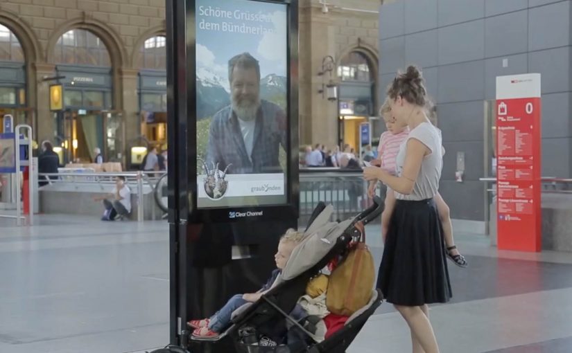
A stressed commuter walks through Zurich’s main train station, eyes forward, pace set to “late again.” Then a large interactive display stops them. On screen is a real Graubünden mountain man. He sees them. He speaks to them. He invites them to step out of the city and into the mountains. The offer is not “someday.” It is now. An all-expense-paid trip to Vrin, a mountain village in the Lumnezia Valley. The only catch is brutal and perfect. They have to drop everything and jump on the train leaving from the next platform.

Escape in one decision

Bring the mountain to the most hectic place in Switzerland, then make escape a one-decision act.

The context you already build on

In 2011, Graubünden Tourism and Jung von Matt had created a clever stunt to publicize the remote mountain village of Obermutten on Facebook. There they targeted people closer to home, specifically stressed urban commuters in a Zurich train station.

What happens at Zurich station

Step 1. Replace “beautiful scenery” with a human invitation

Instead of showing landscapes, the campaign puts a real local face in front of commuters. He can see and talk to people as they walk past. It feels personal, not broadcast.

Step 2. Turn interaction into an offer with real stakes

Anyone who engages is offered an all-expense-paid trip to Vrin. The offer is framed as a cure for stress, delivered at the exact moment stress is visible.

Step 3. Make the brand promise non-negotiable with one constraint

The only catch is the mechanism. By mechanism, I mean the single rule that turns the offer into a test. They have to drop everything and take the train that is about to leave from the next platform. That single constraint transforms the idea from a nice story into a real test of desire.

In European destination marketing, the hardest part is turning “someday” escape into a choice people will make on an ordinary weekday.

The real question is: can you turn “escape” from a promise into a decision someone can make in under a minute?

Why this works as live communication

Here, “live communication” means a real person responding in real time, not a pre-recorded loop.

Extractable takeaway: When you sell an experience, shorten the gap between promise and proof. Use live interaction plus one simple constraint so the choice becomes meaningful.

It collapses the distance between promise and proof

Tourism often sells “escape” as a future plan. Here, escape is immediate, and the decision is binary. Stay, or go.

It uses technology to create intimacy, not spectacle

The interactive display is not the point. The point is that someone in the mountains is speaking to you directly in the middle of the city.

The constraint is the creative

The “next train” rule is what makes it unforgettable. It forces commitment. It also creates the story people retell because it is a moment with consequence.

The deeper point

Escape marketing works best when it demands a real choice, not passive appreciation. If you want people to believe in a destination, do not just show it. Put a human being from that place in front of the audience, then convert emotion into action with a simple, immediate next step.

Practical moves for instant escape offers

  • Lead with a human: Put a real local face in front of people, not a montage of scenery.
  • Make “now” the default: Frame the reward as immediate, not a future plan or a delayed sweepstakes.
  • Use one constraint: Add a single rule like “next train” so the offer becomes a test of intent.
  • Design for retellability: Build a moment with consequence that people can summarize in one sentence.

A few fast answers before you act

What is The Great Escape in one sentence?

An interactive display in Zurich station lets a real Graubünden mountain man speak to commuters and invite them on an immediate trip to Vrin.

What makes it different from standard digital out of home?

It is not a looped video. It is a live, human interaction that turns attention into a real decision.

What is the key mechanic that creates urgency?

The “next platform, next train” constraint. People have to go now, not later.

How does it connect to the earlier Obermutten work?

It builds on the same strategy. Make a remote mountain place culturally visible through an idea that people actively participate in.

What is the reusable pattern for brands?

If your promise is experiential, create a live proof moment, then add a constraint that forces a meaningful choice.

KPT/CPT: Smileball

Since June 2010, I had seen smile detection technology used in vending machines and Facebook apps to create innovative engagement with target audiences.

Now, in this example, KPT in Switzerland decides to show that it has the happiest health insurance clients. To demonstrate that, they create Smileball, a pinball machine controlled by smiles.

Unlike normal pinball machines where the two paddles are controlled by buttons on either side, Smileball uses motion sensing technology to detect changes in a person’s smile and map that input to the respective paddles. By playing the game, participants get a chance to win a trip to a comedy show in New York.

A pinball machine that rewards the emotion it wants

The twist is that the game cannot be mastered by tense concentration. You need to keep smiling. That forces the behavior the brand wants to claim, and it makes the proof visible to anyone watching, because the input is literally on the player’s face.

How the mechanism works

The machine replaces buttons with a camera-based smile input. Smile more on one side and the corresponding flipper becomes easier to trigger. Relax your face and you lose precision. The interface quietly trains you into the brand message through play, not persuasion.

In Swiss health insurance marketing, turning an intangible promise like “happier customers” into a visible, shared moment can outperform any satisfaction statistic.

The real question is whether the interface makes a soft brand claim believable in public.

Why it lands

It is self-explaining, socially contagious, and it creates a public demonstration loop. People walk up because it is a pinball machine. They stay because it behaves differently. The crowd laughs because the control method is human and slightly absurd. In the end, the player’s smile becomes the performance, and the brand gets credit for orchestrating it.

Extractable takeaway: If your proof point is an emotion, design an interaction where that emotion is the input. When the audience can see the input in real time, the claim stops sounding like marketing.

What health brands can steal from Smileball

  • Make the proof visible to bystanders. Spectators are your free distribution channel.
  • Replace a standard control with a brand-relevant one. The control method is the message.
  • Keep the first 10 seconds obvious. If people do not “get it” instantly, they will not try.
  • Add a lightweight reward. A prize gives hesitant people a reason to step up.

A few fast answers before you act

What is Smileball?

A pinball machine where the flippers are controlled by changes in the player’s smile instead of physical buttons.

Why is smile-based control a strong branding choice for a health insurer?

Because it turns “happy customers” into a visible behavior. The player’s smile becomes proof in the moment, not a claim in copy.

Does this store or profile people’s faces?

The campaign is presented as in-the-moment smile detection used only to control the game interface. No storage or profiling is described in the original framing.

What is the biggest risk in executions like this?

Calibration. If the smile detection feels inconsistent, people assume the game is rigged and the experience collapses.

How could a brand apply this pattern without face-based input?

Keep the principle. Make the brand’s desired behavior the control input, then make that input visible so the claim proves itself in public.

MINI: The Art of Omission Posters

A “MINI” has only the things it really needs. That means getting rid of the superfluous and keeping an eye on the essentials. MINI calls this “Minimalism”.

So Draftfcb/Lowe Group in Zürich creates a poster series across Switzerland that demonstrates the MINI art of omission in an intentionally simple way. Here, “art of omission” means the idea is carried by what you remove, not what you add. Reportedly, more than 20 executions appear in the wild, framed as genuine, unique works of art rather than disposable tactical print.

Minimalism as a communication system, not a slogan

The mechanism is straightforward: take the brand’s “minimum necessary” philosophy and express it through omission, letting what is missing do as much work as what is shown.

In European automotive advertising, stripping a message down to a single visual point is often the fastest way to win attention in cluttered public spaces.

Why omission cuts through

Most posters fight for attention by adding. More copy. More product shots. More badges. Omission flips that logic. The real question is whether your idea is strong enough to survive subtraction. If simplicity is part of the product truth, omission beats piling on claims. The viewer has to resolve the idea themselves, and that small moment of mental completion makes the message stick.

Extractable takeaway: If the audience can reconstruct the meaning from what you remove, the idea is strong. If they need you to explain it, you are not done simplifying.

What the street placement adds

Putting the work across Switzerland turns “Minimalism” into a repeated encounter, not a one-off reveal. Repetition is the multiplier here, because every new variation reinforces the same discipline: remove anything that does not earn its place.

How to apply omission in your next poster

  • Use subtraction as the creative device. If you cannot remove an element without losing the point, it is probably essential.
  • Let the format carry the proof. A minimalist brand idea is more believable when the execution is minimalist too.
  • Design for one-second comprehension. The fastest posters are the ones that do not ask for reading.
  • Build a series, not a single hero. Variations teach the audience the “rule” of the campaign.

A few fast answers before you act

What is this MINI “Minimalism” poster idea in one line?

A Swiss poster series that communicates MINI’s “keep only what you need” philosophy by using omission as the main creative device.

Why does omission work better than adding more message?

Because it interrupts expectations in public space and forces a quick mental “solve”, which increases recall.

What makes this feel clutter-breaking?

The work reduces visual noise instead of competing with it, so the absence becomes the attention trigger.

When should a brand use this pattern?

When the brand truth can be expressed as one visual point, and when simplicity is a credible part of the product story.

How do you decide what to remove without losing meaning?

Strip the execution until the message breaks, then add back only the one element that restores the point. If you need multiple add-backs, the idea is not single-point yet.