Jibo: The Social Robot for the Family

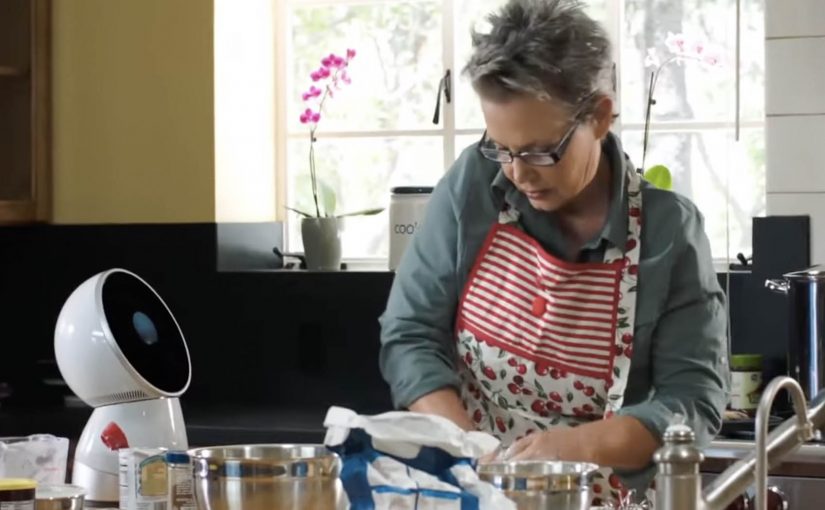
A robot that provides a personal and meaningful human experience is set to become reality through Jibo, an 11 inch tall, 6 pound, swiveling circular robot. Friendly, helpful and intelligent, Jibo is billed as the world’s first social robot for the family. Here, “social robot” means a robot designed to feel present and interactive in everyday home life, not just to complete tasks.

Here is a short demo video created for its crowdfunding campaign.

The pitch is “relationship”, not “utility”

The mechanism is straightforward. A small tabletop robot with a swiveling body and a screen uses motion, timing, and conversational cues to feel present in the room, rather than behaving like a static gadget. That matters because a sense of presence makes the product easier to imagine in the home than a static device would.

In consumer technology launches, the hard part is not explaining what the product does. It is making people feel why they would want it in their home.

Why it lands

This works because it frames the robot as a character. When a device has personality, the viewer stops evaluating it like a spec sheet and starts imagining it as part of daily routines. That shift is exactly what a crowdfunding-style launch needs, because belief and emotional attachment matter before the product is widely available.

Extractable takeaway: If you are launching something unfamiliar, do not lead with feature lists. Lead with a clear role the audience can picture, then use design and behavior to make that role feel natural and desirable.

What the business intent really is

The demo video is doing more than product explanation. It is creating a category frame. “Social robot for the family” is a positioning stake, and the crowdfunding moment is the fastest way to turn curiosity into momentum, pre-orders, and a community that will advocate for the concept.

The real question is not whether the robot can do enough, but whether people can imagine wanting it around them every day. For a product like this, positioning the relationship comes before explaining the utility.

What product marketers should borrow

  • Make a new category legible. Give the audience a simple label they can repeat to others.
  • Use behavior as proof. How the product moves, reacts, and “shows attention” can persuade faster than technical claims.
  • Sell the role. “What is this in my life” beats “what is this in the lab”.
  • Build community early. Crowdfunding works best when supporters feel like first insiders, not early buyers.

A few fast answers before you act

What is Jibo?

Jibo is a small tabletop robot positioned as a “social robot for the family”, designed to deliver a more personal, human-feeling interaction than a typical gadget.

How big is it?

The project describes Jibo as about 11 inches tall and around 6 pounds.

What does “social robot” mean here?

It refers to a robot designed for human interaction and presence in the home, using behavior and personality cues rather than only task execution.

Why launch via a crowdfunding demo video?

Because new categories need belief before they need scale. A demo video can communicate the role, the feeling, and the promise quickly, then convert interest into early supporters.

What is the main lesson for product marketers?

When the product is unfamiliar, show the “relationship” it creates in context, then let the technology sit behind the experience.

Pizza Hut Interactive Table: order by touch

Multi-touch media that uses highly engineered glass and companion technologies feels like the future. So Pizza Hut partners with Chaotic Moon Studios in the USA to create an interactive concept table that lets customers in retail outlets create and customize their pizzas on the spot.

The promise is simple: instead of a static menu, the table becomes the interface, turning ordering into something you can explore, assemble, and adjust with your hands.

A table that turns ordering into a build experience

The mechanism is a multi-touch tabletop UI that walks you through base, sauce, toppings, and sides as a sequence of visual choices. Your pizza is assembled live on-screen, so the product takes shape while you decide.

In quick-service restaurants, the easiest way to increase customization confidence is to make choices visual and immediate.

Why it lands: it reduces friction and adds play

Ordering pizza can be surprisingly error-prone: misheard toppings, unclear sizes, forgotten extras, awkward group decisions. A touch-first interface turns that into a shared, visible process where everyone can see what is being built before it is submitted.

Extractable takeaway: When customization is the product, make the build visible to everyone, so groups converge on one order with fewer misunderstandings.

What Pizza Hut is really trying to prove

Beyond “cool tech,” this kind of table concept signals modernity in the dine-in experience. It frames Pizza Hut as a place where the experience is part of the product, not only the food.

These interfaces are worth doing only when they reduce ordering errors and keep dine-in throughput intact.

The real question is whether turning ordering into a shared build process increases confidence without slowing the line.

Borrowable patterns for touch-first ordering

  • Make the product assemble itself. Visual construction beats textual configuration for speed and accuracy.
  • Design for groups, not only individuals. Shared screens turn indecision into collaboration.
  • Keep the interaction shallow. Limit the flow to a few obvious steps with minimal typing.
  • Let the interface do the upsell quietly. Sides and add-ons perform better when they appear as natural next steps.

A few fast answers before you act

What is the Pizza Hut Interactive Concept Table?

It is a multi-touch tabletop ordering concept designed to let dine-in customers build and customize pizzas directly on the table interface.

What problem does a touch-table solve in restaurants?

It reduces ordering friction by making customization visual, shared, and less dependent on staff hearing, memory, or paper menus.

Is this an ordering system or a marketing concept?

It is presented as a concept experience to demonstrate a possible future dine-in flow, with the interface itself acting as the headline.

Why is multi-touch a good fit for pizza customization?

Pizza is modular. When options can be added, removed, and previewed instantly, customers feel more confident and order faster.

What is the main takeaway for experience design?

If you want people to customize, make the choices tangible. Let them see the product changing as they decide.

The Adaptive Storefront: BLE Retail Display

Shop windows, billboards, bus stops, and car showrooms do not have to be passive experiences. In the video below, a prototype interactive digital display adapts to whoever stands in front of it.

The display identifies shoppers using Bluetooth Low Energy (BLE) and reacts to personal data stored on the shopper’s mobile device, such as shopping habits and preferences. Shoppers can swipe through personalised content, place items in a virtual shopping cart, and purchase straight from the display.

When glass turns into a shoppable interface

This “adaptive storefront” concept takes a familiar retail surface and makes it behave like a storefront UI. Here, “adaptive storefront” means the window can recognise a nearby device via BLE and change what it shows based on data available on that device. Not a poster. Not a looped video. A live interface that changes per person and lets you complete an action while you are still in that high-intent moment of attention.

How the prototype behaves in front of a shopper

  • Detect. BLE proximity is used to recognise that a specific shopper is present.
  • Adapt. The display adjusts what it shows based on data available on the shopper’s phone.
  • Let the shopper drive. Swiping changes what is on screen, rather than forcing a fixed sequence.
  • Close the loop. Items can be added to a cart and purchased directly from the display.

In physical retail environments, the storefront is the first high-attention interface a brand controls before a shopper reaches the shelf.

Why it lands

Because the display can recognise a nearby device and accept input on the surface, it compresses discovery, consideration, and purchase into one interaction. The value is not the novelty of a “smart window”. It is the reduction of steps between interest and action, while the shopper’s intent is still fresh. The real question is whether you can do that with clear permission and control, not silent personalisation.

Extractable takeaway: A surface becomes valuable when it combines context with immediate action. Personalisation only earns its keep when it removes friction and helps a shopper decide faster, not when it merely looks clever.

What it is really trying to unlock for brands

Behind the demo is a clear ambition. Turn high-footfall surfaces into conversion surfaces. If the experience is permissioned and useful, it can bridge the gap between physical browsing and digital checkout without forcing a shopper to open an app, search, and start over.

That also hints at a measurement upgrade. A storefront that can be interacted with can be instrumented. What people swipe. What they ignore. What they add. Where they drop. That is a very different feedback loop than counting impressions.

Practical takeaways for adaptive storefronts

  • Start with one job-to-be-done. For example, “help me shortlist”, “show me what is in stock”, or “let me buy in two taps”.
  • Make control obvious. If swiping is the interaction, design the UI so people understand it in one second.
  • Keep data minimal and on-device. Use only what is needed to improve relevance, and avoid making the experience feel intrusive.
  • Design for the environment. Glare, distance, dwell time, and group behaviour change everything compared to mobile UX.
  • Plan the opt-in moment. The experience works best when the shopper understands why the screen adapts and what they get in return.

A few fast answers before you act

What is an “adaptive storefront” in plain terms?

It is a storefront display that changes what it shows based on who is standing in front of it, and lets the shopper interact and buy directly on the surface.

Why use BLE for this type of experience?

BLE enables low-power proximity detection, so a display can recognise a nearby device and trigger the right experience without requiring scanning a code each time.

What data is needed to personalise the display?

Only enough to improve relevance. For example, stated preferences, browsing history, or saved items, ideally kept on the shopper’s phone and shared with clear permission.

What makes this feel useful instead of creepy?

Permission, transparency, and value. The shopper should understand what is happening, control it, and get something meaningfully better than a generic screen.

What should you measure in a pilot?

Opt-in rate, interaction rate, add-to-cart rate, conversion rate, and whether the experience reduces time-to-decision without increasing drop-off.