
The Folding Car: Hiriko

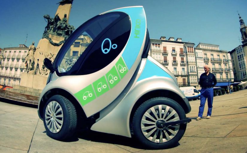
Hiriko is a folding car that has been in the making for the last 5 years. This city car is positioned for mobility services (car sharing) that aim to reduce the congestion generated by automobiles in cities.

The folding car resembles a Smart Car and has the ability to fold itself into an upright, space-saving parking position that feels straight out of a sci-fi novel.

A working model of Hiriko is unveiled in Brussels, and it is described as commercially available in 2013.

At a reported estimated price of around €12,500 (excluding tax), the future of driving feels close.

How the fold-up parking mode works

The core trick is simple: Hiriko can retract into an upright, space-saving parking position, shrinking the footprint it occupies when it is not moving.

In dense European city centers, shared electric city-car concepts live or die on parking efficiency and last-mile convenience.

The real question is whether a dramatic fold-up parking mode delivers enough operational advantage to make shared fleets meaningfully more viable in tight urban cores.

Done well, a fold-up parking mode is worth betting on for shared mobility, because it turns parking from a constraint into a lever for utilization and staging.

Why it lands in dense city fleets

Because the car can retract into a smaller parked footprint, operators can stage more vehicles closer to the places riders actually start and end trips, which reduces pickup friction and dead time.

Extractable takeaway: If your product promise is “better city mobility,” make the benefit visible in one glance, especially at the moment that usually breaks the experience (parking, pickup, handoff).

What it optimizes for

This is framed for car sharing rather than private ownership because the value is operational: higher parking density, easier staging near demand, and better fleet utilization in tight city environments.

What to copy from Hiriko

  • Make the constraint visible: Turn the hard part (parking density) into a concrete before/after moment.
  • Design for staging, not only driving: Optimize where vehicles live between trips, not just how they perform in motion.
  • One-glance differentiation: If you need behavior change, build a benefit people understand without a manual.

A few fast answers before you act

What is Hiriko?

Hiriko is a fold-up two-seat electric city car concept designed for urban mobility services such as car sharing, with a body that retracts to reduce parking footprint.

What problem is the folding mechanism trying to solve?

Parking density. By shrinking its footprint when parked, the car is meant to make it easier to operate shared fleets in tight city environments.

Why is this framed for car sharing rather than private ownership?

Because the core value comes from fleet efficiency: easier parking, easier staging near transit nodes, and higher utilization in dense areas.

What makes the concept feel “sci-fi” in practice?

The upright, compact parked stance changes the familiar silhouette of a car and makes the space-saving benefit immediately visible.

What is the simplest lesson for mobility and product teams?

If your promise is “better city mobility,” make the benefit visible in one glance. A fold-up parking mode is a benefit people can understand without explanation.
Windows of Opportunity: Smart Car Windows

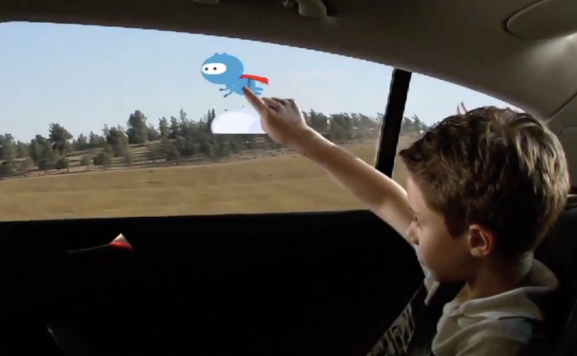
Got backseat boredom? DVD players and Game Boys are so five years ago, but a concept in rear-seat entertainment that uses the windows themselves could replace squirming and snoozing with interactive scribbling, sweeping, and pinching.

General Motors Research and Development put up a challenge to researchers and students from the Future Lab at Bezalel Academy of Art and Design in Israel. The task was to conceptualize new ways to help rear-seat passengers, particularly children, have a richer experience on the road.

The outcome is shown below, even though GM is described as having no immediate plans to put this smart glass technology into vehicles. Here, “smart glass” means the window can act as a display surface and detect touch or gestures.

When the window becomes the interface

The mechanism is simple to grasp. Treat the rear side window as a transparent display surface, then add touch and gesture interaction so passengers can draw, play, and manipulate content directly on the glass while still looking out at the world passing by. Because it is the same surface passengers already look through, the interaction stays outward-facing rather than becoming another head-down screen.

In family car journeys, rear-seat attention is a hard constraint, and experiences that keep kids engaged without isolating them from the ride reduce friction for everyone.

What the brief is really asking for

This is not “more screens”. It is a different relationship between passengers and their surroundings. The concept is described as using the outside view as the canvas. Instead of escaping the trip, you interact with it.

The real question is whether you can turn the outside world into content without disconnecting passengers from the journey.

Why it lands

The idea feels fresh because it upgrades a dead surface into something active without adding another device to hold or another head-down screen to stare at. It also creates a shared backseat dynamic. Multiple passengers can point, draw, and react together, which changes the feel of long trips. This is the right direction for in-car entertainment because it replaces device-based distraction with shared, context-linked play.

Extractable takeaway: The best in-car entertainment does not only distract. It connects passengers to the context they are already in, and makes the journey itself part of the experience.

What GM is buying by running a concept challenge

Even without production intent, the exercise is useful. It expands the idea space around “smart glass” and passenger experience, and it generates prototypes and interaction patterns that can later inform other interfaces, materials, and interior design decisions.

Practical steals for smart-glass passenger UX

  • Use the environment as content. Overlay and interact with what is already outside rather than inventing a separate world.
  • Design for low instruction. If it cannot be understood in seconds, kids will abandon it and parents will ignore it.
  • Favor shared play. Multi-user interactions create calm through engagement, not through isolation.
  • Keep interaction lightweight. Short loops beat long missions in a moving vehicle.
  • Prototype early. Concepts like this live or die on latency, glare, and ergonomics, not on storyboard polish.

A few fast answers before you act

What is “Windows of Opportunity” in one sentence?

It is a GM concept project that turns rear side windows into interactive “smart glass” displays so passengers can draw, play, and explore during the ride.

Why use windows instead of adding more screens?

Because windows are already where passengers look. Turning them interactive can keep attention outward and shared, rather than head-down and isolated.

What makes this feel useful for families?

It targets the real pain point, keeping children engaged on long journeys, while preserving a sense of connection to the trip and to each other.

What are the biggest practical risks?

Glare and readability in daylight, touch accuracy on glass, latency, durability, and avoiding distraction for the driver through reflections or overly bright visuals.

What would you measure in a pilot?

Engagement duration, repeat use, whether it reduces restlessness and conflict, and whether it avoids unintended driver distraction in real driving conditions.

Foursquaropoly: Real-World Monopoly via Foursquare

Can you imagine playing a real-world version of Monopoly wherever you go, 24/7. A bunch of students decide to explore exactly that, and the result is a concept video that mashes up Foursquare-style check-ins with classic Monopoly rules.

Mechanic in plain terms: your location becomes the board. You “move” by going places, you “claim” by checking in, and ownership plus rewards become part of everyday movement through a city.

In mobile-first consumer experiences, location-based play works best when it turns routine movement into a simple loop of progression, competition, and collectible status.

Why it lands

It takes an abstract board game and makes it instantly legible in the real world. Because the check-in becomes both the move and the proof, the player gets status feedback without learning new controls. The joy comes from recognition. Streets become properties, venues become squares, and everyday decisions get a light layer of consequence. The real question is whether you can keep the loop fair and legible once real places and real rewards enter the rules.

Extractable takeaway: When you translate a familiar game into a real-world experience, keep the rules understandable in one sentence and the feedback immediate. The faster a player can see “what I did” and “what it unlocked,” the longer the concept stays sticky.

What this hints at for brands

The intriguing angle is not just “Monopoly in the streets.” It is the reward layer. By “reward layer,” I mean a simple, visible benefit attached to a check-in. Brands could join in by sponsoring virtual rewards that are redeemable for real-world objects, using check-ins as the trigger and redemption as the payoff. Done carefully, the value exchange is clear: attention and footfall in return for something tangible. This works best as an opt-in, time-boxed layer, not a permanent loyalty system.

Steal these mechanics for location activations

  • Turn geography into progress. Make “being somewhere” the action, so participation feels effortless.
  • Use scarcity that maps to reality. Limited locations, limited time windows, and visible ownership are more compelling than generic points.
  • Reward the behavior you actually want. If you want visits, reward arrivals. If you want repeat, reward streaks and routes.
  • Keep the redemption simple. The moment the payoff is confusing, the game stops being a game and becomes admin.

A few fast answers before you act

What is Foursquaropoly?

A concept for turning Monopoly into a 24/7, location-based game where check-ins and real-world movement replace dice rolls and board squares.

Why is Monopoly a good fit for a real-world location game?

Because it already maps cleanly to places, ownership, and rivalry. Those ideas translate naturally into neighborhoods, venues, and repeat visits.

What makes a location-based game loop feel sticky?

It feels sticky when each check-in produces immediate feedback, such as status or ownership, and the rules stay understandable without a manual.

How could brands participate without breaking the experience?

By sponsoring rewards that feel additive, such as limited-time bonuses at specific locations, and keeping the rules consistent so the game still feels fair.

What is the biggest risk in making this real?

Player fatigue and confusion. If the rules are too complex or the rewards feel arbitrary, people stop understanding what to do next and the loop collapses.