
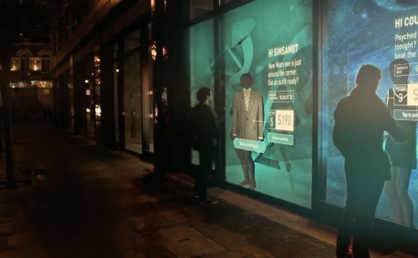
The Adaptive Storefront: BLE Retail Display

Shop windows, billboards, bus stops, and car showrooms do not have to be passive experiences. In the video below, a prototype interactive digital display adapts to whoever stands in front of it.

The display identifies shoppers using Bluetooth Low Energy (BLE) and reacts to personal data stored on the shopper’s mobile device, such as shopping habits and preferences. Shoppers can swipe through personalised content, place items in a virtual shopping cart, and purchase straight from the display.

When glass turns into a shoppable interface

This “adaptive storefront” concept takes a familiar retail surface and makes it behave like a storefront UI. Here, “adaptive storefront” means the window can recognise a nearby device via BLE and change what it shows based on data available on that device. Not a poster. Not a looped video. A live interface that changes per person and lets you complete an action while you are still in that high-intent moment of attention.

How the prototype behaves in front of a shopper

  • Detect. BLE proximity is used to recognise that a specific shopper is present.
  • Adapt. The display adjusts what it shows based on data available on the shopper’s phone.
  • Let the shopper drive. Swiping changes what is on screen, rather than forcing a fixed sequence.
  • Close the loop. Items can be added to a cart and purchased directly from the display.

In physical retail environments, the storefront is the first high-attention interface a brand controls before a shopper reaches the shelf.

Why it lands

Because the display can recognise a nearby device and accept input on the surface, it compresses discovery, consideration, and purchase into one interaction. The value is not the novelty of a “smart window”. It is the reduction of steps between interest and action, while the shopper’s intent is still fresh. The real question is whether you can do that with clear permission and control, not silent personalisation.

Extractable takeaway: A surface becomes valuable when it combines context with immediate action. Personalisation only earns its keep when it removes friction and helps a shopper decide faster, not when it merely looks clever.

What it is really trying to unlock for brands

Behind the demo is a clear ambition. Turn high-footfall surfaces into conversion surfaces. If the experience is permissioned and useful, it can bridge the gap between physical browsing and digital checkout without forcing a shopper to open an app, search, and start over.

That also hints at a measurement upgrade. A storefront that can be interacted with can be instrumented. What people swipe. What they ignore. What they add. Where they drop. That is a very different feedback loop than counting impressions.

Practical takeaways for adaptive storefronts

  • Start with one job-to-be-done. For example, “help me shortlist”, “show me what is in stock”, or “let me buy in two taps”.
  • Make control obvious. If swiping is the interaction, design the UI so people understand it in one second.
  • Keep data minimal and on-device. Use only what is needed to improve relevance, and avoid making the experience feel intrusive.
  • Design for the environment. Glare, distance, dwell time, and group behaviour change everything compared to mobile UX.
  • Plan the opt-in moment. The experience works best when the shopper understands why the screen adapts and what they get in return.

A few fast answers before you act

What is an “adaptive storefront” in plain terms?

It is a storefront display that changes what it shows based on who is standing in front of it, and lets the shopper interact and buy directly on the surface.

Why use BLE for this type of experience?

BLE enables low-power proximity detection, so a display can recognise a nearby device and trigger the right experience without requiring scanning a code each time.

What data is needed to personalise the display?

Only enough to improve relevance. For example, stated preferences, browsing history, or saved items, ideally kept on the shopper’s phone and shared with clear permission.

What makes this feel useful instead of creepy?

Permission, transparency, and value. The shopper should understand what is happening, control it, and get something meaningfully better than a generic screen.

What should you measure in a pilot?

Opt-in rate, interaction rate, add-to-cart rate, conversion rate, and whether the experience reduces time-to-decision without increasing drop-off.

KPT/CPT: Smileball

Since June 2010, I had seen smile detection technology used in vending machines and Facebook apps to create innovative engagement with target audiences.

Now, in this example, KPT in Switzerland decides to show that it has the happiest health insurance clients. To demonstrate that, they create Smileball, a pinball machine controlled by smiles.

Unlike normal pinball machines where the two paddles are controlled by buttons on either side, Smileball uses motion sensing technology to detect changes in a person’s smile and map that input to the respective paddles. By playing the game, participants get a chance to win a trip to a comedy show in New York.

A pinball machine that rewards the emotion it wants

The twist is that the game cannot be mastered by tense concentration. You need to keep smiling. That forces the behavior the brand wants to claim, and it makes the proof visible to anyone watching, because the input is literally on the player’s face.

How the mechanism works

The machine replaces buttons with a camera-based smile input. Smile more on one side and the corresponding flipper becomes easier to trigger. Relax your face and you lose precision. The interface quietly trains you into the brand message through play, not persuasion.

In Swiss health insurance marketing, turning an intangible promise like “happier customers” into a visible, shared moment can outperform any satisfaction statistic.

The real question is whether the interface makes a soft brand claim believable in public.

Why it lands

It is self-explaining, socially contagious, and it creates a public demonstration loop. People walk up because it is a pinball machine. They stay because it behaves differently. The crowd laughs because the control method is human and slightly absurd. In the end, the player’s smile becomes the performance, and the brand gets credit for orchestrating it.

Extractable takeaway: If your proof point is an emotion, design an interaction where that emotion is the input. When the audience can see the input in real time, the claim stops sounding like marketing.

What health brands can steal from Smileball

  • Make the proof visible to bystanders. Spectators are your free distribution channel.
  • Replace a standard control with a brand-relevant one. The control method is the message.
  • Keep the first 10 seconds obvious. If people do not “get it” instantly, they will not try.
  • Add a lightweight reward. A prize gives hesitant people a reason to step up.

A few fast answers before you act

What is Smileball?

A pinball machine where the flippers are controlled by changes in the player’s smile instead of physical buttons.

Why is smile-based control a strong branding choice for a health insurer?

Because it turns “happy customers” into a visible behavior. The player’s smile becomes proof in the moment, not a claim in copy.

Does this store or profile people’s faces?

The campaign is presented as in-the-moment smile detection used only to control the game interface. No storage or profiling is described in the original framing.

What is the biggest risk in executions like this?

Calibration. If the smile detection feels inconsistent, people assume the game is rigged and the experience collapses.

How could a brand apply this pattern without face-based input?

Keep the principle. Make the brand’s desired behavior the control input, then make that input visible so the claim proves itself in public.

Yahoo! JAPAN: Hands On Search

Yahoo! JAPAN introduces what it calls “Hands On Search”. A hands-on search experience that lets visually impaired children explore online concepts through touch, not screens.

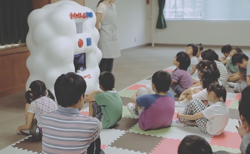
A voice-activated kiosk is set up so children can speak what they want to “search” for. The system recognises the verbal request, pulls a corresponding 3D model, and prints a small physical object. For the first time, children can hold what they usually only hear described. From animals to landmarks and buildings.

Search becomes a physical output

The mechanism is voice input plus 3D printing output. Instead of returning text, images, or audio, the search result is manufactured into a tactile model the child can feel in their hands. Because the output is tactile, the child can verify shape and scale directly, which is why the interaction shifts from description to discovery.

In accessible technology design, the strongest innovation is often a translation layer that converts a dominant medium into the sense that an excluded audience can reliably use. That is the pattern worth copying. Change the output medium, not just the narration layer.

In accessible-learning contexts, the constraint is rarely intent but whether the output can be inspected without sight.

Why it lands

It reframes “search” as something more than browsing. It becomes discovery you can share in a classroom. The real question is whether your product can render its core value into the senses your excluded users actually rely on. The moment the object prints is also the moment learning becomes concrete. It is not an abstract promise about inclusion. It is a visible, touchable outcome.

Extractable takeaway: If your experience is inherently visual, do not just add narration. Add an equivalent output that preserves shape and scale in a form people can physically inspect, so learning moves from description to direct exploration.

Tactile-search patterns for product teams

  • Design for the missing sense, not the average user. Start with the constraint, then build the interface around it.
  • Make the interaction one-step. Voice request in. Physical result out. No menus, no setup rituals.
  • Curate the object library. Accessibility fails when content quality is inconsistent. The “catalogue” is part of the product.
  • Prototype in real learning environments. Schools and educators reveal whether the tool supports teaching, not just demos.

A few fast answers before you act

What is Hands On Search in one sentence?

It is a concept machine that turns spoken searches into small 3D-printed models, so visually impaired children can “touch” search results.

Why does 3D printing matter here?

Because it converts information into form. For someone who cannot see images, a physical model can communicate shape, proportion, and structure directly.

Is this a campaign or a product direction?

It plays like a campaign film, but the underlying idea is a product direction. Search as an output system that can render to different senses depending on user needs.

What is the biggest risk in copying this idea?

Building a beautiful prototype without a sustainable content pipeline. If the object library is thin, slow to expand, or low fidelity, usefulness drops quickly.

Where should you prototype first?

Prototype where learning happens. Schools and educators will quickly show whether the tool supports teaching, not just demos.