Nokia Push: Connected Snowboarding in Beta

Even though Nokia has joined the Google and Apple smartphone party pretty late, they are clearly trying to innovate fast. With Nokia Push, they take a run at re-imagining snowboarding as a connected game you can play on any mountain in the world.

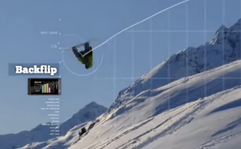
The idea is to mix gaming and reality using the data you generate while you ride. Bigger tricks, higher speed, crazier turns, more points. The experience is synced to your social life in real time, while also logging your full day on the mountain online.

Snowboarding, scored like a game

The core move is to treat a sport session as a live system of signals. Your board and your body generate performance data, and the platform translates that into a score and a story you can share.

In global consumer tech marketing, sensor-driven “real-world games” help turn product capability into a shared, measurable experience.

Why Nokia frames it as “Push”

Nokia is not only showcasing hardware. It is showcasing a way of thinking. Open experimentation, community participation, and a product narrative that evolves in public instead of arriving fully finished.

That matters because the value is not just in the feature set. It is in the ecosystem effect. A connected experience becomes more compelling when other people can react to it, compare it, and build on it.

Where the story is heading next

In 2011, Nokia Push is set to collaborate with Burton Snowboards, described at the time as the world’s biggest snowboarding company, to create a new type of connected snowboarding. Work has already started, and the collaboration is positioned to run in the spirit of the Push project. Transparently, and openly in beta.

Regular progress videos are expected to detail what is being built and to count down to a beta moment at next year’s Burton Euro Open in January.

What to steal from this approach

  • Make the user the instrument. If the user’s movement creates the data, engagement becomes intrinsic, not forced.
  • Turn performance into a narrative. A score is useful. A replayable story is shareable.
  • Design for viewer control. Let people choose where, when, and how intensely they participate.
  • Ship in public. If the build is evolving, show the evolution so the community feels like a co-owner.

A few fast answers before you act

What is Nokia Push, in simple terms?

A concept that turns a real-world activity into a connected game by capturing performance data, scoring it, and sharing it socially.

What makes this different from a normal sports tracker?

The framing. It is built like a game with points and progression, not only like a dashboard for self-measurement.

Why does the “any mountain” promise matter?

It suggests the arena is the world, not a controlled venue. That universality is what makes it feel like a platform rather than a one-off stunt.

How does the beta, open approach help the campaign?

It creates an unfolding story. People can follow progress, anticipate milestones, and feel part of something that is being built, not just sold.

What is the biggest execution risk with this type of idea?

If setup is complex or sensor reliability is weak, the magic collapses. The experience has to feel effortless enough to use on a cold mountain with gloves on.

Volkswagen: Talking Newspaper Ad

In India, Volkswagen has created a “talking” press ad that makes a newspaper behave like a greeting card. Reports described it as one of the most talked about topics of the day on Facebook and Twitter, because the ad does something print is not supposed to do. It speaks.

If you bought the Times of India edition carrying the special wrap, you would have seen a clutter-breaking execution with a built-in audio module. When you open the newspaper, a light-sensitive sensor acts like a switch and the message starts playing. Fold the paper and the audio shuts off.

The activation is widely reported as part of Volkswagen’s launch push for the Vento, executed at massive scale in India’s daily press.

Print that behaves like a device

The genius here is not the audio file. It is the interface. Open equals on. Close equals off. That single rule makes the experience feel magical, because it requires no instructions and no “tech literacy”. The paper itself becomes the power button.

It also creates a physical moment of surprise in an environment that is normally predictable. You expect ink. You do not expect a voice.

In mass-circulation newspaper markets, turning a silent medium into a sensory one is a reliable way to earn attention, as long as the mechanic is instant and self-explanatory.

Why this spread so fast

The format does the distribution work. People do not share “a new car ad”. They share “my newspaper started talking”. That is the difference between a message and a story.

It also turns the reader into a demonstrator. Once you discover it, you want to show someone else by repeating the action. Open. Close. Open again. That loop is built for office desks, breakfast tables, and social feeds.

What Volkswagen is really buying

The business intent is to make “arrival” unmissable. A new model launch needs attention in a crowded category, and this format forces a moment of engagement even if someone is only half-reading the paper.

It also signals “German engineering” through the medium itself. The ad does not just claim innovation. It performs it.

What to steal

  • Build a one-rule mechanic. If people can explain it in one sentence, it will travel.
  • Make discovery physical. The more “showable” the action, the faster it spreads.
  • Let the medium carry the proof. If you are selling engineering, make the communication feel engineered.
  • Design for repeat demonstration. A loopable experience gets re-played and re-shared.

A few fast answers before you act

How does a “talking newspaper” ad work?

A small audio module is attached to the printed wrap or page. A light-sensitive sensor detects when the paper is opened and triggers playback. Closing or folding the paper stops the audio.

Why is this more effective than a normal print ad?

Because it forces a moment of attention through surprise, and it creates a story people repeat. The format itself becomes the message.

What kind of campaign is this best suited for?

Launch moments, announcements, and “new arrival” messaging, where the job is to break through clutter and get people talking immediately.

What is the biggest risk with sensory print executions?

Annoyance. If the audio is too loud, too long, or hard to stop, the novelty flips into irritation. The on and off behavior must feel fully under the reader’s control.

What should you measure if you run something like this?

Earned mentions, correct retelling of the mechanic, and immediate brand linkage to the intended message. If people talk about the talking paper but forget the brand, you paid for novelty, not impact.

Technology in 2014

A 2014 screen daydream from The Astonishing Tribe

This is essentially an experience video by Swedish interface gurus The Astonishing Tribe, envisioning the future of screen technology with stretchable screens, transparent screens and e-ink displays, to name a few.

How the film turns “new screens” into real interactions

Instead of listing specs, the video uses everyday moments to make the screen itself feel like a material you can bend, place, and share. The point is not the exact device. The point is the interaction model that becomes possible when the display is flexible, see-through, or paper-like.

An experience video is a short concept film that prototypes interface behavior and user flows before the underlying hardware is ready for the market.

In consumer electronics and enterprise device ecosystems, display form factors shape interaction patterns, content formats, and the business models built on top of them.

Why “stretchable, transparent, e-ink” is a strong provocation

Stretchable screens challenge the idea that UI must live inside rigid rectangles. Transparent screens challenge the idea that a screen must block the physical world. E-ink displays challenge the assumption that every screen is emissive, high-refresh, and power-hungry.

E-ink is a reflective display technology designed for readability and low power use, which makes it a useful contrast to bright, always-on panels.

Steal these moves for your next interface pitch

  • Show behaviors, not features. Demonstrate how people move, share, and switch context when the screen stops behaving like a slab.
  • Prototype the handoffs. The “wow” is usually in the transitions, not the destination screen.
  • Use one material shift as the story engine. Flexible, transparent, or reflective. Pick one and build a coherent set of moments around it.
  • Make it boring on purpose. Ground the future in ordinary work, home, and commuting situations so the audience focuses on usability.

A few fast answers before you act

What is “Technology in 2014” about?

It is a concept experience video that imagines how screens could evolve by the year 2014. The focus is on new display form factors and the interactions they enable.

Which display ideas does it highlight?

The video spotlights stretchable screens, transparent screens, and e-ink displays. Those three examples are used to suggest different ways UI could live in the physical world.

What should marketers or product teams take from it?

Use concept films to communicate interaction shifts early, when prototypes are still rough. Anchor the story in everyday scenarios so the intended behavior is unmistakable.

How do you apply the idea without future hardware?

Focus on the interaction principles: continuity across surfaces, simple sharing moments, and readable, low-friction information layers. You can prototype those behaviors with today’s devices and materials.

What’s the biggest pitfall when making this kind of video?

Over-indexing on visual spectacle and under-explaining the user flow. If viewers cannot repeat the “how it works” in one sentence, the concept will not travel inside an organization.