Following the grand success of Lacta’s interactive film in November 2009, Kraft Foods and OgilvyOne Athens set out to create yet another integrated campaign for Lacta, Greece’s leading chocolate brand. This time, instead of producing another love story themselves, they set out to create one with their audience.
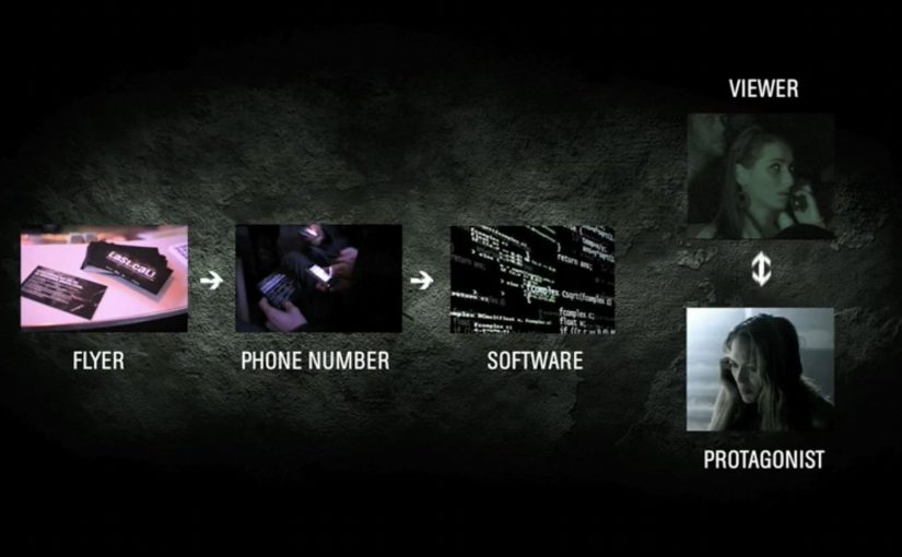
Kraft Foods and OgilvyOne crowdsourced a 27-minute branded-entertainment film, involving the audience in everything from writing to casting and styling the actors. Some even popped up as extras in the finished film. During filming, audiences were kept updated through the campaign blog, Facebook, Twitter, YouTube and Flickr.
Here is a 3 minute video case study on the same.
Then on Valentine’s Day the film was aired on Greece’s top TV channel and online, with great success.
What makes this more than “UGC”
The smart leap is that the audience is not just submitting stories. They are being pulled into the messy, high-signal parts of production. Decisions that normally sit behind closed doors. Casting, styling, and creative direction. That raises commitment, because participation shifts from “I sent something” to “I helped shape what shipped.”
In European FMCG branded entertainment, letting people influence production decisions can turn a single film into a sustained participation loop that runs for weeks, not minutes.
Why this lands
This works because it gives people a credible reason to keep coming back. Not to watch ads, but to follow progress, vote, debate, and see whether their influence makes the final cut. The film becomes the payoff, but the real engine is the journey. A public build, meaning a production process made visible as it develops, turns pre-release into its own entertainment.
Extractable takeaway: If you want long-lived attention, make the audience’s role structural, not decorative. Put participation into decisions that change the output, then publish visible progress so people feel their involvement has weight.
The commercial intent underneath
Lacta gets what a standard Valentine’s spot struggles to buy. Time, conversation, and emotional ownership at scale. The brand also stays relatively in the background, so the entertainment is allowed to carry the attention while the association builds quietly.
The real question is whether the audience is helping shape the asset or merely reacting to it.
What to borrow from participatory production
- Open up real decisions. Voting on meaningful choices beats asking for comments.
- Show progress publicly. Updates and behind-the-scenes keep momentum alive.
- Let contributors appear in the output. Even small “extra” moments create powerful ownership.
- Build a finale moment. A premiere date gives the whole participation arc a shared finish line.
A few fast answers before you act
What is Lacta “Love in Action”?
It is a crowdsourced branded-entertainment film initiative where audiences contributed to and influenced key parts of the production, from story and casting to styling.
What makes this different from a normal brand film?
The audience is involved before release and in decisions that shape the final output, so the build process becomes part of the entertainment.
Why run it across so many platforms?
Because production is a multi-week narrative. Different channels support different behaviours. Updates, voting, sharing, and behind-the-scenes participation.
Why is Valentine’s Day a strong launch moment?
The theme is culturally aligned with love stories, and the calendar creates a natural deadline and shared viewing moment.
What is the main risk when crowdsourcing content like this?
If participation feels cosmetic, people drop out. The audience needs visible proof that their input changes outcomes, and the process must be curated so quality stays high.