Fits.me: Virtual Fitting Room

One of the main problems with buying clothes online is simple. You cannot feel the fit. So you guess, the parcel arrives, and the return loop starts again.

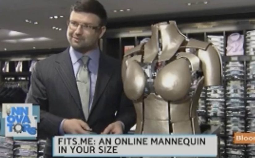
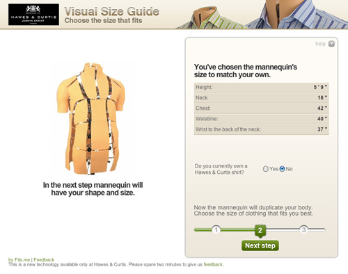
Fits.me, an Estonian company, builds a Virtual Fitting Room around a shape-shifting robotic mannequin. Instead of trying to “predict” fit with a size chart, the mannequin physically changes form to match your body dimensions, letting you preview how different sizes sit on a body shaped like yours.

A mannequin that changes shape so the garment can do the explaining

The mechanism is a robotic mannequin, often referred to as a FitBot, a shape-adjustable mannequin that can be tuned across a wide range of body measurements. Clothing is photographed on the mannequin in multiple sizes, and the shopper can compare how the same item behaves as size changes, on a body that resembles their own. Because the garment is shown on the same body shape across sizes, the comparison makes fit differences visible and reduces guesswork.

A robotic mannequin providing a Visual Size Guide.

In online apparel retail, fit uncertainty drives returns and suppresses conversion, so anything that reduces sizing doubt tends to outperform its surface-level novelty.

Why this approach feels more “real” than a size chart

What makes it persuasive is that it turns sizing into a visual comparison instead of a number. The real question is whether you can help a shopper see the trade-offs between sizes before checkout, without asking them to trust a black-box recommendation. If you have that problem, this is the right pattern to use. You are not being told “you are a Medium.” You are shown what Small, Medium, and Large look like on a similar shape, which is closer to the in-store decision process.

Extractable takeaway: When a purchase decision depends on a physical sensation you cannot deliver online, replace the missing sensation with a repeatable visual proof that helps shoppers compare options, not just read recommendations.

What the rollout says about where the pain is

At the time, the system is positioned around a male mannequin first, with Fits.me saying it is planning to unveil a female version in November. That sequencing is a reminder that “who we can fit well” is often a product constraint, not a marketing choice, especially when the technology depends on physical ranges and repeatable photography.

For more information visit www.fits.me.

What to steal from Fits.me’s FitBot

  • Make fit a comparison, not a verdict. Let shoppers see multiple sizes side by side on a body-like reference instead of outputting a single “recommended” size.
  • Design for confidence, then measure it. Track size changes after viewing, conversion on fitted items, and return-rate shifts by category.
  • Respect constraint sequencing. If the system only fits certain body ranges well at first, be explicit about where it is reliable and expand the range as the asset library grows.

A few fast answers before you act

What is a “Virtual Fitting Room” in this Fits.me context?

It is a system that uses a shape-adjustable robotic mannequin to model how garments look across sizes on a body shaped to match the shopper’s measurements, so shoppers can compare fit visually before buying.

Why does this reduce returns in theory?

Because it reduces guesswork. When shoppers can see how different sizes drape and sit, they are less likely to buy multiple sizes “just in case,” and less likely to be surprised when the item arrives.

What is the key difference versus typical size charts or recommendation widgets?

This approach is comparison-first. It shows a garment on a body-like reference across multiple sizes, rather than outputting a single recommended size and asking the shopper to trust it.

When does a visual fit tool like this not help much?

It helps most with size uncertainty, but it cannot fully replace tactile judgments like fabric feel or personal comfort preferences, so some returns will still be driven by “feel” rather than fit.

What should retailers measure if they deploy something like this?

Engagement with the fitting experience, size-selection changes after viewing, conversion lift on fitted products, and return-rate reduction by category and by first-time versus repeat shoppers.

Orange UK: Singing Tweetagrams

When “say it on Twitter” becomes “say it in song”

Got a friend who needs cheering up? Or maybe you just want to tell them that you love them, miss them, or really like their new haircut. Now you can say it with Orange UK’s new singing tweetagram. In this activation, a tweetagram is a short tweet that gets turned into a personalized song you can share.

The mechanic: hashtags in, custom songs out

It works like this. You write the tweetagram message to someone, adding the hashtag #singingtweetagrams. Orange then picks the best ones and has the Rockabellas record the message in song within a few hours. Orange then uploads the song and tweets it to you with a link, so you can send it on to the person.

A tweetagram is a short message written in the native language of Twitter, then converted into a personalized media artifact that feels like it was made for one person.

In consumer social marketing, the strongest hashtag activations reward participation with a tangible output that people can share without extra explanation.

Why it works: the reward is the content

The clever part is that the prize is not a discount or a badge. The prize is the thing you actually want to share. This is a smart activation because it turns participation into a gift-like artifact people actually want to pass on. A custom song is inherently gift-like, and it gives the sender social credit while giving the receiver a genuine moment.

Extractable takeaway: If you can turn a native platform input into a fast, polished, personal artifact, the reward becomes the share, and the experience travels without extra persuasion.

This also reduces the usual user-generated content risk. Users write the raw line, but the brand controls selection, production, and final output quality.

When a brand turns a user’s message into a polished artifact and returns it quickly, it converts “engagement” into a keepsake. That creates higher motivation to participate and higher likelihood of forwarding.

The operational question: can Orange produce at internet speed?

The question will be whether they can keep up the pace set by Wieden + Kennedy in its Old Spice effort, which was described at the time as producing more than 180 videos in a couple days and pumping out responses nearly immediately. The real question is whether Orange can keep the “within hours” turnaround feeling real at scale.

That comparison matters because the magic is not only the idea. It is the turnaround time. If the lag feels slow, the moment passes and the sender stops feeling clever for trying.

Steal this pattern: hashtag-to-song rewards

  • Make the output unmistakably personal. Names, in-jokes, and direct address beat generic templates.
  • Return value fast. “Within hours” is part of the product, not a service detail.
  • Keep creation native. Let people use the platform behavior they already know. Here it is a tweet plus a hashtag.
  • Curate to protect quality. Selection is a feature. It keeps the final artifacts share-worthy and on-brand.

A few fast answers before you act

What is Orange UK’s Singing Tweetagrams campaign?

It is a Twitter-based activation where people post a message with #singingtweetagrams. Orange selects some messages and has the Rockabellas record them as short personalized songs, then sends the result back as a shareable link.

Why is “speed” so important in this format?

Because the sender’s motivation is tied to the moment. Fast turnaround keeps the interaction feeling live, current, and socially relevant.

What role does curation play in making it work?

Curation protects output quality and brand tone. Users provide raw inputs, but the brand controls which messages become finished content.

How is this different from typical user-generated content contests?

The reward is not external. The reward is the finished content itself, which is designed to be shared and kept.

What is the biggest execution risk?

Production bottlenecks. If demand outpaces recording capacity, turnaround slows and the concept loses the real-time feeling that drives participation.

WWF: Augmented Reality Tiger T-Shirt

A retail AR gut-punch for WWF’s Siberian tiger

This is a great piece of Augmented Reality for WWF aimed at raising awareness around the plight of the Siberian tiger, created by Leo Burnett Moscow.

WWF printed thousands of tiger t-shirts and distributed them online and to key stores in Moscow featuring specially placed AR video mirrors that would instantly activate the AR experience the moment a tiger t-shirt was detected. An AR video mirror is a camera plus screen installation that overlays digital effects on your live reflection in real time. And at that moment, the experience became quite graphical to anyone wearing the t-shirt, complete with bullet wounds, huge amounts of blood and sound effects to match it.

How the “video mirror” mechanic does the heavy lifting

The setup is simple. Put the message on the body. Put the trigger in the store. Put the reveal in a mirror people already trust as “truth”.

An AR video mirror is a camera plus screen installation that shows your live reflection while overlaying digital effects in real time. In this case, the mirror detects the tiger shirt and then renders the simulated injuries and audio as if they are happening to you. Because the overlay is pinned to your live reflection, the reveal feels immediate, which is why the message hits before you can distance yourself from it.

In retail environments and public spaces, AR activations work best when the interaction is instant, unmistakable, and socially visible to bystanders.

Why the experience lands so hard

It converts an abstract cause into a first-person moment. You do not just look at an endangered animal. You temporarily “become” the target.

Extractable takeaway: If you want awareness to stick, bind the reveal to a trusted routine and reduce viewer control, so the audience feels the story in their own reflection before they can rationalize it away.

The intent behind making it graphic

The creative choice forces attention and memory. A polite AR overlay would be easy to ignore. A visceral one is harder to dismiss and more likely to be retold, especially when friends are watching from behind you.

The real question is whether the shock serves the story or becomes the story.

Graphic AR is a valid tool only when the cause is unmistakable and the reveal points back to it within seconds.

Design moves to borrow from this AR mirror

  • Use a frictionless trigger. Detection happens automatically. No app download. No QR hunt. No instructions.
  • Choose a culturally “trusted” surface. Mirrors feel like evidence, which makes overlays feel more real than a phone screen effect.
  • Make the message social. The bystander view matters. People react together, and that reaction becomes the spread mechanism.
  • Design the reveal as a single sentence. “This is what it feels like to be hunted.” If the concept cannot be repeated instantly, it will not travel.

A few fast answers before you act

What is the core idea of the WWF tiger t-shirt AR campaign?

It uses an AR video mirror to detect a tiger t-shirt and instantly overlay a graphic “poaching” simulation on the wearer, turning awareness into a first-person experience.

Why use an AR mirror instead of a mobile AR app?

The mirror removes friction and makes the moment public. Everyone nearby sees the same reveal at the same time, which increases impact and sharing.

What makes this activation effective as cause marketing?

It translates a distant problem into a personal reaction. The wearer feels shock and vulnerability, and that emotional spike improves recall and conversation.

What are the key components if you want to replicate the mechanism?

You need a clear trigger (the shirt), a camera plus screen “mirror” setup, real-time overlay rendering, and a reveal that communicates the message in seconds.

What is the main risk with shock-based AR experiences?

If the graphic content overwhelms the cause, people remember only the stunt. The message has to be explicit enough that the emotional reaction points to the intended story.