WWF: The .wwf Unprintable PDF Format

German ad agency Jung von Matt is back with another stellar idea. A new green file format called .WWF.

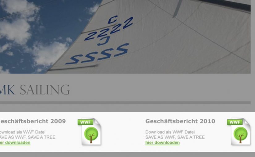
The WWF format is a PDF-like document that is designed not to print. The point is simple: avoid unnecessary printing by making the “do I really need paper for this?” decision explicit at the moment you save or share a file.

How the .wwf idea works

At the center is a small tool that lets you “save as WWF”. The resulting file behaves like a regular PDF for reading and sharing, but the print option is blocked by design. In other words, it is a familiar format with one permission deliberately switched off.

WWF frames this as a practical nudge within its broader “think before you print” message. It is not trying to shame printing. It is trying to stop the default reflex of printing what never needed to exist on paper in the first place.

In document-heavy organizations, small defaults like a print-disabled file option reduce waste because they change the decision moment without changing the workflow.

Why this lands beyond the gimmick

It turns a values statement into a product behavior. Plenty of sustainability campaigns ask people to care. This one asks people to choose differently in a place they already spend time: saving, sharing, and circulating documents.

Extractable takeaway: When you want less waste, change the default at the moment of action, and keep an intentional override for the few cases that truly need it.

The real question is whether you can make “think before you print” feel like a normal workflow choice, not a policy fight.

It preserves user choice. The format does not decide what “should” be printed. It pushes the decision back to the sender, who knows the context. That framing matters, because it avoids the “policy tool” vibe and keeps it as a lightweight, voluntary habit.

It spreads by forwarding. A file format is distribution. When people send documents around, the format travels with the content and keeps reintroducing the idea in a natural, non-media-buy way.

Steal this pattern for document workflows

  • Change the default, not the lecture. If you want different behavior, move the intervention into the everyday step where the behavior happens.
  • Make the “good choice” feel like a normal choice. Keep the action one click away and compatible with existing habits.
  • Design for shareability. Tools and formats can be media when they travel inside the work people already exchange.
  • Define the mechanism in one sentence. “A .wwf file is essentially a PDF with printing permissions locked, saved under a different extension to force a conscious print decision.”

A few fast answers before you act

What is a .wwf file, in plain terms?

A .wwf file is a PDF-style document saved with a different extension and configured so that printing is blocked by default.

Is it truly impossible to print a .wwf document?

The intent is to block the normal print command, not to claim physical impossibility in every edge case. The point is to remove the easy, mindless print path.

How is this different from just using a “do not print” note?

A note is social friction. A format change is functional friction. The latter works even when people ignore instructions.

Where does this work best?

In teams that pass around drafts, read-only decks, internal updates, agendas, and reference documents. Anywhere printing is mostly habit, not requirement.

What is the real behavior change goal?

To make printing a deliberate act again. The win is fewer automatic prints, not zero printing.

Yellow Pages: Location Based Banner

Here is the next generation of interactive web banners. Tel Aviv agency Shalmor Avnon Amichay/Y&R promoted the Yellow Pages augmented reality location-based app by creating a banner that does the same thing. Here “location-based” means it surfaces nearby businesses based on where you are.

The banner opens your webcam and lets you see the businesses around you. Wave your hand to switch between businesses. Click a business to jump straight to its Yellow Pages listing.

A banner that behaves like the product

The clever part is that this is not “interactive” for decoration. It is a working demo of the core value proposition. If the app helps you find what is near you, the banner proves that promise immediately, inside the placement, without asking you to imagine anything. Utility products should be advertised by demonstrating usefulness, not by describing features.

The mechanic: webcam as context, hand wave as UI

The flow is intentionally simple. Turn on the camera. Overlay nearby business options. Use a wave to move through results. Use a click to convert curiosity into action via the listing page.

In local discovery experiences, the strongest persuasion is a live, context-matched preview of usefulness rather than a feature claim.

Why it lands: it removes the “so what” gap

Most directory and local-search advertising dies in the space between promise and proof. The real question is whether your ad can turn a promise into proof without leaving the page. This banner collapses that gap, because it starts with your own context, then shows results, then lets you act. The interaction is the explanation.

Extractable takeaway: The fastest way to make a utility app feel essential is to let people experience the “aha” moment before they ever leave the page they are on.

What Yellow Pages is really trying to achieve

The business intent is to reposition Yellow Pages as modern, digital, and situationally useful, not just a legacy directory brand. The banner also creates a clear performance path. Engagement inside the unit, then click-out to a listing that can drive calls, visits, or follow-on app consideration.

Steal the demo-first local discovery pattern

  • Mirror the product in the ad. If the product is a tool, make the ad behave like the tool.
  • Use one gesture people understand. A wave as “next” is instantly legible. No tutorial needed.
  • Keep the ladder of commitment short. Preview. Browse. Click through. No extra steps.
  • Make the experience readable for bystanders. Obvious motion plus clear on-screen change sells the mechanic in shared environments.
  • Watch privacy optics. If you turn on a camera, be explicit that it is for interaction and context, not identification.

A few fast answers before you act

What is a “location based banner”?

It is a banner ad that adapts its content to the user’s situation, typically location or environment cues, so the ad can show relevant nearby options instead of generic messaging.

How does this Yellow Pages banner work?

It opens a webcam view, overlays nearby business options, lets you wave to cycle through businesses, and lets you click a result to open the corresponding Yellow Pages listing.

Why use a webcam at all?

Because it makes the experience feel immediate and personal. The ad becomes a live “finder” interface rather than a static claim about finding things.

What makes gesture-controlled banners risky?

Friction and variability. If the gesture detection fails or is unclear, users assume the ad is broken. The interaction must be forgiving and the feedback must be instant.

What is the safest way to replicate the idea today?

Keep the mechanic to one simple input, provide clear on-screen feedback, and ensure the user can still get value even if they do not enable the camera.

Dentsu London and BERG: Making Future Magic

Dentsu London has made two films with BERG as part of an ongoing collaboration to bring their “Making Future Magic” strategy to life. Both films treat the growing number and variety of media surfaces as a canvas.

Here, “media surfaces” means everyday objects and touchpoints that can carry useful information without behaving like traditional screens or ads.

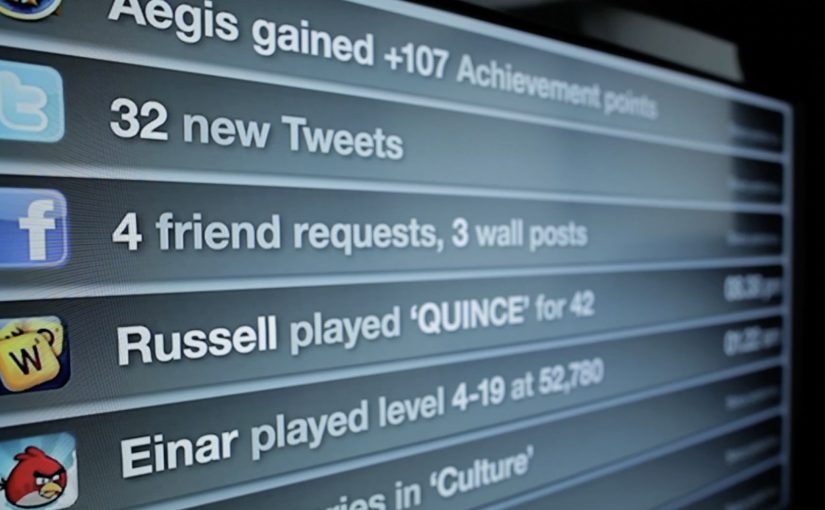
Incidental Media sketches a near future where media surfaces are everywhere, but used to be playful, informative, and better at connecting you to friends and family.

The Journey shifts the same thinking into travel, focusing on opportunities in stations and on trains.

What the “media surfaces” idea actually proposes

The mechanic is a design-fiction approach. Instead of inventing new hardware, the films show existing surfaces behaving differently. Receipts, windows, clocks, tickets, and public displays become quieter, more contextual, and more useful. Small pieces of information appear where they help, then fade back into the background.

In urban, mobile-first consumer environments, the most effective ambient media tends to be context-aware, lightweight, and respectful of attention.

Why it lands

It feels plausible because it is built from things we already recognize. The films do not pitch a sci-fi leap. They demonstrate a series of small shifts in how content could live on everyday surfaces, and that makes the future feel “next door” rather than distant.

Extractable takeaway: If you want people to believe a future-facing strategy, show it as a set of concrete, everyday interactions on familiar surfaces. Keep the behaviors small, specific, and repeatable.

What Dentsu London is really doing with this work

This is strategy communication as an artifact. The films give teams and clients a shared mental model for what “Making Future Magic” could mean in practice, and they do it in a format that is easy to circulate, discuss, and reuse in planning conversations.

The real question is how you make a future-facing strategy tangible enough that teams and clients can picture it, discuss it, and reuse it.

This is a stronger way to communicate future experience thinking than leaving it as abstract language in a deck.

How to make future concepts feel usable

  • Show, then explain. Start with a believable vignette before you introduce principles.
  • Use familiar surfaces. Credibility rises when the canvas is already part of everyday life.
  • Prioritize quiet utility. Ambient media works best when it helps without demanding constant input.
  • Design for context shifts. Travel, waiting, and transition moments are rich canvases for information that matters.

A few fast answers before you act

What is “Incidental Media” in one sentence?

A near-future sketch where everyday surfaces carry small, useful pieces of media that are playful and contextual rather than loud and interruptive.

What does “The Journey” focus on?

Travel contexts like stations and trains, showing how ambient, contextual media could reduce friction and improve the experience of moving through transport systems.

Why use concept films instead of a written strategy deck?

Because films make the future tangible. They align teams faster by letting everyone see the same interactions, not just read abstractions.

Why does this future feel believable instead of sci-fi?

Because the films build from ordinary surfaces and small behavior shifts. That makes the idea feel adjacent to current life rather than dependent on a radical technology jump.

What is the main risk in copying this approach?

Staying too high-level. If the vignettes are not specific enough to feel real, the work becomes mood, not a usable model for decisions.