Uniqlo: The Lucky Switch Banner Campaign

Uniqlo: The Lucky Switch Banner Campaign

A banner that hijacks the whole page

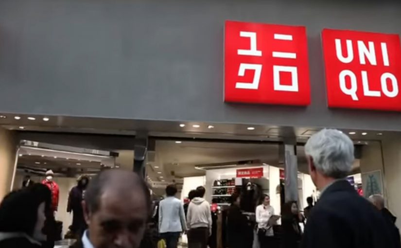
Here is a strong example of a banner campaign that refuses to stay inside the banner frame. For Uniqlo’s end-of-year clearance push, the idea came in two parts. A blog or website widget, a small embeddable code block that adds interactive functionality to a webpage, and a set of banners connected to a competition.

Flip the switch. Every image becomes a ticket

The core mechanic is simple. Embed the widget on a site, press it, and it transforms every image on that page into a Uniqlo “Lucky Ticket” that promotes the sale and the competition.

In this case, it acts like a page-level switch the viewer controls, rather than a passive ad slot.

In Japan’s fast-fashion clearance cycles, speed and novelty matter, and the web is a shortcut to scale.

Results that make the concept concrete

The outcome is the part that makes this more than a clever demo. The widget was voluntarily installed on almost 5,000 blogs and generated over 2.8 million banner clicks.

Why it lands. It feels like a playful hack

A standard banner asks for attention. Lucky Switch gives the user a satisfying action with immediate, visible impact across the entire page.

Because the viewer controls the switch and sees the whole page change instantly, the ad feels like a game mechanic, not a media placement.

It also reframes “click” into “cause”. The click is not a request to leave the site. It is a trigger that changes the environment.

The real question is whether your format earns voluntary distribution by making the first interaction feel like a reward, not a request.

What Uniqlo is really optimising

This campaign is not just chasing CTR. It is building voluntary distribution. Every blogger who installs the widget is effectively turning their own site into Uniqlo media, and every visitor is invited to interact with the brand on someone else’s page.

Extractable takeaway: Lucky Switch is what happens when you treat distribution as the product. Make the interaction so satisfying, and the reward so clear, that other sites choose to carry your campaign for you.

What to steal for your next interactive format

  • Design for “whole-page impact”. If your interaction only affects the ad unit, you are still competing with content. If it affects the page, you become part of the experience.
  • Make the click do something now. Deliver instant feedback before you ask for any deeper action.
  • Use viewer control, not autoplay. The switch metaphor makes participation feel self-directed and repeatable.
  • Reward both the host and the visitor. If you want voluntary installs, give both sides a reason to play.
  • Turn scarcity into a daily rhythm. Limited goods or rotating rewards create a reason to come back, not just click once.

A few fast answers before you act

What is Uniqlo’s “Lucky Switch” in one sentence?

A widget and banner concept that turns every image on a host page into a Uniqlo “Lucky Ticket”, making the whole page behave like the ad.

What is the core mechanism?

A page-level switch the viewer controls. Pressing it transforms the environment immediately, so the click delivers instant visible impact before any deeper action.

Why does this feel more engaging than a normal banner?

Because the user triggers a change across the entire page. The interaction reads like a playful hack, not a boxed-in ad unit competing with content.

What business intent does it serve for fast fashion?

It creates a high-speed, novelty-driven route to scale through voluntary installs, while driving sale awareness and competition participation.

What is the most transferable takeaway?

If you want banners to perform, make the click do something “now” in the user’s environment, not just ask them to leave the page.

ŠKODA Superb Estate: Remote-Controlled Boot

ŠKODA Superb Estate: Remote-Controlled Boot

A first-of-its-kind TV commercial lets viewers experience the remotely controlled boot of the ŠKODA Superb Estate. Instead of watching a feature, you try it from your sofa.

How the TV mechanic makes the feature feel real

As described in campaign write-ups, the idea took advantage of a Polish viewing habit: TVP1 sits on channel 1 and TVP2 on channel 2. Two complementary spots were aired simultaneously, so switching between channels with the remote effectively becomes the “control” that opens and closes the boot on screen. Here, the “TV mechanic” is the paired, simultaneous airing that turns a familiar remote action into a visible open/close response.

In European automotive marketing, turning a feature demo into a familiar at-home interaction is a fast way to convert passive viewing into remembered proof.

The real question is whether you can turn a convenience claim into something the audience actively triggers.

Why this lands better than a standard feature film

The creative does not ask people to understand the engineering. It makes them feel the benefit. Remote-controlled boot becomes “I can operate this without effort,” because the viewer’s own hand is already doing the controlling. It also makes the demo inherently retellable. People do not describe it as “an electrically operated tailgate.” They describe it as “I controlled the boot with my TV remote.”

Extractable takeaway: If you can map a product benefit to an everyday action people already perform, the benefit shifts from explanation to felt experience.

What the brand is really buying

This is not just awareness. It is embodied comprehension. In other words, the viewer takes a small action, sees a result, and the feature moves from claim to experience. That shift is valuable when the product benefit is convenience, because convenience is easiest to believe when you have just felt it.

Steal this TV-remote feature demo pattern

  • Make the audience perform the benefit. If the action is theirs, the memory sticks longer.
  • Use an existing habit. Channel switching is already learned. No instruction burden.
  • Keep the mapping literal. One action. One visible response. No abstraction.
  • Design for one-sentence retell. If people can explain it instantly, they will share it.

A few fast answers before you act

What is the core idea of this commercial?

To let viewers “try” the Superb Estate’s remote-controlled boot from home by turning a TV viewing action into a simulated control action.

Why use two channels at the same time?

Because switching channels is a natural remote-control behavior. Running paired spots simultaneously makes that behavior feel like operating the feature.

What makes this different from a normal product demo?

The viewer is not only watching. They are causing the on-screen change, which makes the convenience benefit easier to believe.

What kind of features work best with this pattern?

Features with a clear, binary outcome that can be shown instantly, open versus closed, on versus off, locked versus unlocked.

What is the biggest risk when copying this approach?

If the interaction mapping is unclear, people miss the trick and the work becomes just two confusing ads. The “how” must be obvious within seconds.

Mercedes-Benz: Flying Car

Mercedes-Benz: Flying Car

Mercedes-Benz, with the help of Ponto de Criacao from Brazil, executed a highly segmented vertical action to increase visibility for the brand among top executives and business people. Here, “vertical action” means a narrowly targeted activation placed in a single corridor that concentrates the exact audience you want.

Flying Car by Mercedes Benz

As a courtesy, passengers also received a miniature car.

Flying Car by Mercedes Benz

In one month, 100% of the target audience was reached, nearly 400 executives.

In premium automotive marketing aimed at senior business travelers, attention is scarce and context is often the only reliable way to earn it.

When the audience is this narrow and valuable, precision distribution can outperform broad reach because the placement becomes the idea.

Why this placement is so effective

The mechanism is simple and the payoff is immediate. By turning the aircraft window into the “media unit,” the mind completes the illusion, which makes the moment feel native, surprising, and worth retelling.

Extractable takeaway: When your audience is concentrated in a repeatable corridor, design a message that only works in that context so the situation does the persuasion for you.

  • Context does the work. The illusion only makes sense in-flight, which turns a standard window view into a brand moment.
  • Precision beats scale. Shuttle flights concentrate the exact audience Mercedes-Benz wanted, without wasting impressions.
  • Low friction, high memorability. A simple sticker creates an instant “did you see that?” effect, then the miniature car extends the memory.

What to take from it

The real question is which high-value corridor your audience repeats, where attention is naturally high, and where your message can feel native instead of intrusive.

When the audience is narrow and valuable, distribution can be the idea. This activation did not rely on complex tech. It relied on selecting the right corridor, placing the message where attention is naturally high, and creating a visual that feels native to the moment.

  • Start with the corridor. Identify the repeatable moment where your audience is already together and already looking.
  • Make the context do the explaining. Build the visual so it only makes sense there, so the placement becomes the punchline.
  • Extend the memory. Add a small, simple takeaway that keeps the moment alive after the corridor ends.

A few fast answers before you act

What was “Flying Car” by Mercedes-Benz?

It was a targeted activation that placed SLS AMG window stickers on shuttle flights, creating the illusion of the car “flying” outside the aircraft window for executive travelers.

Why use shuttle flights for this?

Because those routes clustered top executives and business travelers, delivering near-perfect audience fit with minimal wasted reach.

What role did the miniature car play?

It extended the experience beyond the flight as a physical takeaway, reinforcing recall after the moment passed.

What is the transferable pattern?

Pick a narrow, high-value corridor, design a context-native visual that only works there, then add a small extension to carry the memory forward.

How do you apply this pattern without access to flights?

Find any repeatable corridor that concentrates your audience, then design a context-native cue that only works in that moment and can be carried forward with a simple takeaway.