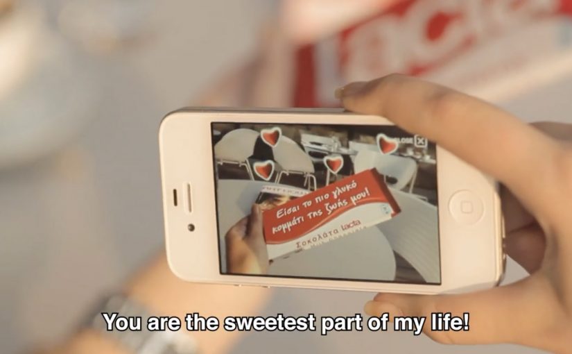
Dali Museum iPhone App

To build awareness for “The Dali Museum’s” fantastical new building, ad agency Goodby Silverstein & Partners developed a customized picture-editing app that created dreamy surrealist overlays over photos.

With zero budget, they turned to Hipstamatic to help bring the smartphone app to life. The team at Hipstamatic liked the idea so much that they waived their fees and pledged to donate the proceeds from the app to the museum. Plus, their 1.2 million loyal followers provided the critical mass needed to reach the general public.

In the first couple days after the release, the Hipstamatic site crashed due to extremely high traffic. The blogosphere bubbled with over 19,000 mentions and in the first month alone 50,000 people purchased the app.

Why the “zero budget” part mattered

Most museum awareness efforts struggle with the same constraint. Great content, limited reach. This solved it by building the campaign inside an existing distribution engine. Hipstamatic already had the habit, the audience, and the sharing behavior. The app simply plugged into that.

That is the key move. Instead of spending money to manufacture attention, it borrowed attention from a platform that was already culturally relevant to iPhone photography.

What to borrow if you are marketing a place or institution

  • Turn the subject into a tool. A museum became a creator utility, not a brochure.
  • Partner for distribution, not just production. Hipstamatic brought the audience and the habit.
  • Make sharing the default output. Every edited photo is a piece of media that carries the idea forward.

A few fast answers before you act

What was the Dali Museum iPhone app?
A customized picture-editing app that applied surrealist, dream-like overlays to users’ photos to build awareness for The Dali Museum’s new building.

Who created it?
Goodby Silverstein & Partners developed the app concept and execution.

How did they launch it with zero budget?
They partnered with Hipstamatic, which waived fees and pledged to donate app proceeds to the museum.

What did Hipstamatic contribute beyond technology?
Distribution. Their 1.2 million followers provided the critical mass to reach beyond the museum’s natural audience.

What were the early results?
Hipstamatic’s site crashed from high traffic, the campaign generated over 19,000 mentions, and 50,000 people purchased the app in the first month.

Samsung Galaxy Y Duos: Human Face Mapping

A man sits still in a chair, and his face becomes the screen. Light wraps perfectly around skin, eyes, and contours, switching identities and moods as if the head is a living billboard.

Over the years there have been numerous noteworthy projection mapping events and installations. In this latest example, Samsung, for the launch of its Galaxy Y Duos, a dual SIM smartphone, creates a very unusual projection mapping piece on a human face.

When mapping leaves the building

The mechanism is the point. Projection mapping normally favors surfaces that do not move. Here, the “surface” is a face, which means every tiny change in angle threatens the alignment. The craft is in keeping the projected geometry locked to human features so the illusion stays believable.

In consumer technology launches, spectacle earns attention fastest when the medium demonstrates the product idea, not just a product visual.

Why this fits a dual SIM story

The creative metaphor is identity switching. Multiple personas, contexts, and “modes” land on one face, which mirrors the promise of a phone designed to manage two worlds without forcing a hard choice between them.

What Samsung is really buying

This is not a spec explanation. It is an attribution grab. The goal is to make “Galaxy Y Duos equals dual identity” stick in memory through a visual that feels new, technically ambitious, and hard to ignore.

What to steal for your next projection-led campaign

  • Make the mapping carry the meaning. The effect should express the product truth, not decorate it.
  • Choose a single metaphor and commit. Here it is identity switching. Everything supports that.
  • Design for instant comprehension. If it does not read in two seconds, the stunt becomes “cool tech” with no brand imprint.
  • Keep the hero shot simple. One clean sequence that people can retell beats five clever sequences no one can describe.

A few fast answers before you act

What is “human face mapping” in this context?

Projection mapping where the projected visuals are calibrated to a real face, so light and motion appear to sit on the skin and follow facial geometry.

Why is mapping onto a face harder than mapping onto a wall?

A face is complex and can move. Small shifts break alignment, so the illusion depends on precise calibration and controlled motion.

How does this connect to the Galaxy Y Duos product idea?

The piece uses shifting identities on one face as a visual metaphor for managing two SIM identities on one device.

What is the main advantage of a mapping stunt for a phone launch?

It earns attention through novelty, then links that attention to a single, memorable product idea people can repeat.

What is the biggest creative risk with this approach?

If the metaphor is weak, the audience remembers the technique but not the brand or the product message.

Parrot AR.Drone: The Flying Banner

The Parrot AR.Drone is a quadrotor you can control with an iPhone or iPad. Instead of explaining that in copy, Beacon Communications Tokyo built an interactive web banner that lets people experience the idea.

The banner displays a QR code. Scan it and your phone becomes the controller for a virtual AR.Drone that appears inside the banner. You pilot it around the screen using your smartphone, effectively turning the ad into a small playable product demo.

In consumer electronics launches, the most persuasive interactive advertising is a playable demo that mirrors the product experience in seconds.

Why this banner stands out

Most banners talk about what a product can do. This one makes the product behaviour the message. If the AR.Drone is “controlled by your phone,” the ad is controlled by your phone. That direct mapping makes the idea instantly believable.

Standalone takeaway: If your product is an interface, let the audience use that interface inside the ad unit, even in a simplified form.

The mechanic: QR to second screen control

The QR code is not decoration. It is the bridge that turns a passive placement into a two-device experience. The banner stays on the desktop screen. Control moves to the phone. That split makes the interaction feel closer to the real product, and it also creates a small sense of “this is special” because the ad is no longer self-contained.

How it creates attention without shouting

As described in industry coverage, users could fly the drone around the page and even “blast” parts of the site to reveal the full-screen message. That gives the interaction a purpose and a payoff. It is not just movement. It is progression.

Beacon also reported unusually strong click-through performance compared to typical expectations for the placement. In this case, that makes sense. People do not click because they were interrupted. They click because they were already playing.

What to steal from The Flying Banner

  • Replicate the product, do not describe it. A short, real interaction beats a long explanation.
  • Use one clear bridge between devices. QR works here because it is immediate and simple.
  • Design an obvious payoff. A reveal, a score, a result. Give the interaction a reason.
  • Keep the controls teachable. If people cannot learn it in seconds, the banner loses them.
  • Make it readable for spectators. Movement on the main screen helps others understand what is happening fast.

A few fast answers before you act

What is “The Flying Banner” for Parrot AR.Drone?

It is an interactive web banner where scanning a QR code turns your smartphone into a controller for a virtual AR.Drone that you can pilot inside the banner.

Why is this a stronger demo than a normal video ad?

Because it lets people feel the core promise. Phone-controlled flight. through direct interaction, not description.

What role does the QR code play in the experience?

It is the handoff mechanism from desktop to phone. The desktop shows the “world.” The phone becomes the controller, matching how the real product is used.

What is the biggest risk with multi-device banner ideas?

Drop-off. If the connection step is slow, confusing, or unreliable, most users abandon before they experience the payoff.

How would you modernize this mechanic today?

Keep the principle of second-screen control, but reduce friction. Use a fast connect flow and ensure the experience is still satisfying even if someone chooses not to connect a phone.