Nike SPARQ: Immersive Digital Training

When training becomes the differentiator. Nike SPARQ goes digital

Not too long ago, talent determined greatness. Today, talent is a given, but training is what separates the exceptional from the merely promising. So to help athletes everywhere reach their true potential through better training, Nike along with ad agency R/GA New York created an immersive digital experience for the SPARQ program (Speed, Power, Agility, Reaction, and Quickness).

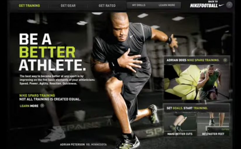
Athletes could now follow the same training regimens as professional athletes through detailed, customized video demonstrations delivered via iPods or handheld video players that made it accessible anywhere. The SPARQ website also let athletes set goals, track progress, find Nike SPARQ Trainers across the country, get an official SPARQ rating, and purchase gear.

The smart move: make elite training portable and personal

The experience does two things at once. It brings pro-level drills to anyone with a device, and it makes training feel individualized through customization and video guidance. That combination shifts SPARQ from “program” to “daily habit.”

In sports-performance brands and youth training programs, the winners make instruction portable enough to survive real life.

Why this feels bigger than content

The real question is whether your digital experience builds a habit-forming training loop, or just publishes drills. Because it is not just inspiration. It is infrastructure. Video demonstrations give you the “how,” goal setting and tracking give you the “keep going,” the rating gives you a yardstick, and trainers plus gear connect the digital loop to the real world. Here, the digital loop is the cycle of instruction, goals, tracking, and feedback that pulls you into the next session. Treat training as infrastructure, not content, if you want durable engagement.

Extractable takeaway: Pair instruction with goals, tracking, and feedback loops so progress is visible and practice becomes a habit.

The business intent hiding in plain sight

Build a performance ecosystem that increases commitment over time. The more you train, track, and compare, the more SPARQ becomes the platform you return to. And the more natural gear purchase becomes inside that flow.

Steal the habit loop, not just the videos

  • Ship a loop, not content. Guidance, goals, tracking, and a measurable score.
  • Design for anywhere use. Portability turns intention into repetition.
  • Connect digital motivation to real-world touchpoints. Trainers, ratings, and commerce.

A few fast answers before you act

What does SPARQ stand for?

Speed, Power, Agility, Reaction, and Quickness.

What did Nike and R/GA New York build?

An immersive digital experience for SPARQ that delivered customized training video demonstrations and a supporting website for goals, tracking, trainers, ratings, and gear.

How did athletes access the training content?

Through detailed video demonstrations delivered via iPods or handheld video players, making the training accessible anywhere.

Why did this feel bigger than training videos?

Because it combined instruction with goal setting, tracking, a rating, and connections to trainers and gear, creating a repeatable training loop.

What made the SPARQ website useful beyond videos?

It let athletes set goals, track progress, find SPARQ trainers, get an official SPARQ rating, and purchase gear.

What is the simplest principle to copy from SPARQ?

Pair guidance with goals and feedback so people can see progress and have a reason to return.

Dali Museum iPhone App

To build awareness for “The Dali Museum’s” fantastical new building, ad agency Goodby Silverstein & Partners developed a customized picture-editing app that created dreamy surrealist overlays over photos.

With zero budget, they turned to Hipstamatic to help bring the smartphone app to life. The team at Hipstamatic liked the idea so much that they waived their fees and pledged to donate the proceeds from the app to the museum. Plus, their 1.2 million loyal followers provided the critical mass needed to reach the general public.

In the first couple days after the release, the Hipstamatic site crashed due to extremely high traffic. The blogosphere bubbled with over 19,000 mentions and in the first month alone 50,000 people purchased the app.

Why the “zero budget” part mattered

Most museum awareness efforts struggle with the same constraint. Great content, limited reach. This solved it by building the campaign inside an existing distribution engine. Here, a distribution engine means a platform with a large active audience and a built-in habit of sharing. Because Hipstamatic already had the audience, the use case, and the sharing behavior, the museum could turn a niche cultural launch into something that traveled through everyday iPhone photography. The business intent was simple: make the new building culturally visible far beyond the museum’s owned audience.

Extractable takeaway: When budgets are thin, do not start by buying reach. Start by embedding the idea in a tool, platform, or habit that already has distribution.

For museums, destinations, and other cultural institutions, the scalable challenge is usually not creating content but accessing a behavior people already repeat.

The real question is not how to advertise the building, but how to turn public participation into distribution.

The smarter move is to build the awareness mechanic inside a behavior people already want to perform and share.

What to borrow if you are marketing a place or institution

  • Turn the subject into a tool. A museum became a creator utility, not a brochure.
  • Partner for distribution, not just production. Hipstamatic brought the audience and the habit.
  • Make sharing the default output. Every edited photo is a piece of media that carries the idea forward.

A few fast answers before you act

What was the Dali Museum iPhone app?

A customized picture-editing app that applied surrealist, dream-like overlays to users’ photos to build awareness for The Dali Museum’s new building.

Who created it?

Goodby Silverstein & Partners developed the app concept and execution.

How did they launch it with zero budget?

They partnered with Hipstamatic, which waived fees and pledged to donate app proceeds to the museum.

What did Hipstamatic contribute beyond technology?

Distribution. Their 1.2 million followers provided the critical mass to reach beyond the museum’s natural audience.

What were the early results?

Hipstamatic’s site crashed from high traffic, the campaign generated over 19,000 mentions, and 50,000 people purchased the app in the first month.

Samsung Galaxy Y Duos: Human Face Mapping

A man sits still in a chair, and his face becomes the screen. Light wraps perfectly around skin, eyes, and contours, switching identities and moods as if the head is a living billboard.

Over the years there have been numerous noteworthy projection mapping events and installations. In this latest example, Samsung, for the launch of its Galaxy Y Duos, a dual SIM smartphone, creates a very unusual projection mapping piece on a human face.

When mapping leaves the building

The mechanism is the point. Projection mapping normally favors surfaces that do not move. Here, the “surface” is a face, which means every tiny change in angle threatens the alignment. The craft is in keeping the projected geometry locked to human features so the illusion stays believable.

In global consumer electronics launches, spectacle earns attention fastest when the medium demonstrates the product idea, not just a product visual.

Why this fits a dual SIM story

The creative metaphor is identity switching. Multiple personas, contexts, and “modes” land on one face, which mirrors the promise of a phone designed to manage two worlds without forcing a hard choice between them. Because the mapping stays locked to facial features, the switching reads instantly, which is why the metaphor can carry the dual SIM idea without copy.

Extractable takeaway: If your product promise is “two worlds, one device”, pick a medium that naturally visualizes switching. Then strip everything else away until the switch is the only thing people can retell.

What Samsung is really buying

This is not a spec explanation. It is an attribution grab, meaning a creative move designed to bind one message to the brand in memory. The goal is to make “Galaxy Y Duos equals dual identity” stick in memory through a visual that feels new, technically ambitious, and hard to ignore. The real question is whether the stunt makes “dual identity” feel obvious in one glance, without needing specs.

Projection mapping takeaways you can reuse

  • Make the mapping carry the meaning. The effect should express the product truth, not decorate it.
  • Choose a single metaphor and commit. Here it is identity switching. Everything supports that.
  • Design for instant comprehension. If it does not read in two seconds, the stunt becomes “cool tech” with no brand imprint.
  • Keep the hero shot simple. One clean sequence that people can retell beats five clever sequences no one can describe.

A few fast answers before you act

What is “human face mapping” in this context?

Projection mapping where the projected visuals are calibrated to a real face, so light and motion appear to sit on the skin and follow facial geometry.

Why is mapping onto a face harder than mapping onto a wall?

A face is complex and can move. Small shifts break alignment, so the illusion depends on precise calibration and controlled motion.

How does this connect to the Galaxy Y Duos product idea?

The piece uses shifting identities on one face as a visual metaphor for managing two SIM identities on one device.

What is the main advantage of a mapping stunt for a phone launch?

It earns attention through novelty, then links that attention to a single, memorable product idea people can repeat.

What is the biggest creative risk with this approach?

If the metaphor is weak, the audience remembers the technique but not the brand or the product message.