Coca-Cola: Sharing Can That Splits in Two

Coca-Cola: Sharing Can That Splits in Two

When “share” is built into the can

With summer coming up and an ice cold soda in your hand, people around you are bound to hope that you will share the soda with them. The normal way of doing so would be to sip from the same opening.

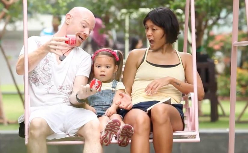
Now in an attempt to create another way of sharing happiness, Coca-Cola teamed up with Ogilvy in Singapore and France to create a shareable can of Coke that splits into two and creates two half pints. The results.

The packaging hack: one can becomes two

The can does not just contain the drink. It choreographs the moment. Split it. Hand one half over. The product becomes the gesture.

In global FMCG brands, packaging is often the fastest way to turn “share” from a line of copy into a behavior.

If the behavior matters, design it into the object. Because the can physically divides into two drinkable halves, the social negotiation disappears and the gesture becomes obvious.

Why it changes the social moment

The post nails the truth. People want a sip. This design turns that awkward micro-negotiation into a simple ritual that feels natural in the moment. Here, “ritual” means a tiny repeatable sequence anyone can copy. Split, hand one half over, drink.

Extractable takeaway: When the friction lives in a shared micro-moment, redesign the object so the desired behavior is the default, not a negotiation.

The job it solves

Create another way of sharing happiness in summer, without two people sipping from the same opening. Here, “sharing happiness” is not abstract. It is one can producing two separate openings, so two people can drink without swapping sips.

The real question is how to make sharing feel effortless and hygienic at the exact moment someone is holding the drink.

Steal the split-and-share ritual

  • Encode the behavior: If the behavior matters, build it into the object, not only the message.
  • Remove micro-friction: Design for the real scenario, then remove friction inside that moment.
  • Make the ritual portable: Create a repeatable ritual. The best ones travel without explanation.

A few fast answers before you act

What is the “sharing can” concept?

A Coke can engineered to split into two drinkable halves, creating two half pints from one can.

Who was involved?

Coca-Cola partnered with Ogilvy. The post associates the work with Singapore and France.

What moment does it target?

The everyday situation where someone has a cold drink and others around them hope they will share it.

What is the core creative move?

Turning “sharing happiness” into a physical product feature rather than a line of copy.

Gladiator: USB Can

Gladiator: USB Can

A “USB” that is really packaging as a key

Mexican energy drink Gladiator created a “USB Can” which is not exactly a USB, but it features a packaging innovation that gives users storage when they need it.

Users who want to use the USB Can are directed to a website where they connect with Facebook and scan their can to upload files from their computer. Those uploaded files can then be unlocked on another computer by scanning the same USB Can.

The mechanic: one physical object, reused as authentication

The core move is simple. The can becomes the key. You do not carry a drive. You carry the proof that you own the can, and that proof unlocks your files. It is a packaging-as-authentication mechanic that turns a throwaway object into a repeatable login ritual.

By that, I mean the pack itself functions as the proof needed to unlock the digital benefit.

In FMCG promotions, utility mechanics work best when the physical object is the credential and the digital benefit is immediate.

The real question is whether a disposable pack can earn repeat use by acting like a credential instead of just carrying a logo.

Why it lands

It creates an easy story people can retell. “This can unlocks your files.” The idea also fits the energy drink mindset because it borrows tech culture cues without needing to become a real hardware product. You get the surprise of a “USB” promise, then the reveal that it is a smart access system rather than storage inside the can. Because the can itself becomes the credential, this is smarter than a standard promo-code promotion: it is easier to remember, explain, and reuse.

Extractable takeaway: When you want packaging to be more than a label, give it a repeatable job. Make the pack the key that unlocks a benefit people can use more than once.

What packaging-led utility brands can borrow

  • Make the object the credential. A physical key reduces friction and increases memorability.
  • Keep the ritual quick. Scan, unlock, done. If it takes too long, it stops feeling like a perk.
  • Use a benefit people can demo. “Unlock files on another computer” is easy to explain and easy to show.
  • Let the gimmick resolve into utility. The “USB” hook earns attention. The access mechanic earns credibility.

A few fast answers before you act

What is Gladiator’s “USB Can”?

It is a packaging-led activation where the can is scanned to unlock an online file upload and retrieval flow, so the can behaves like a reusable access key rather than a literal USB drive.

What is the core creative mechanic?

Packaging as authentication. The same physical can is scanned again to unlock access to the files later.

Why does this work better than a normal promo code?

Because the object is the code. It is harder to ignore, easier to remember, and it turns the pack into a functional part of the experience.

What is the transferable principle for other brands?

Give packaging an action people can repeat. If the pack becomes a key, token, or trigger, it can extend the campaign beyond first purchase.

What is the main risk of this kind of execution?

If scanning or login is unreliable, the “magic” collapses. The tech flow has to be faster than the novelty.

Camp Nectar: Real Fruit Boxes

Camp Nectar: Real Fruit Boxes

A piece of fruit is hanging from a tree. But it is not round. It is shaped like a juice pack, complete with the unmistakable carton silhouette.

Brazilian agency ageisobar was asked to prove that Camp Nectar juices were all natural. So they created molds in the shape of the brand’s packaging and attached them to fruit as it grew on farms. As the fruit developed and ripened, it took on the exact shape of the juice box, turning “made from real fruit” into something you can see without reading a claim.

The mold-on-tree mechanic

The mechanism is product proof, not persuasion. By product proof, the campaign uses the fruit itself as evidence instead of asking the audience to trust a written claim. Instead of showing ingredients or production steps, the campaign engineers a physical outcome that can only happen if real fruit is involved. The fruit becomes the packaging, and the packaging becomes the argument.

In packaged food and beverage marketing, “natural” claims are often distrusted, so literal demonstrations that collapse the gap between product and source earn attention faster than explanations.

Why the visual is hard to forget

The idea lands because it is a contradiction you can resolve instantly. You see something impossible, then you understand the trick, and the understanding reinforces the claim. It is also inherently shareable because the proof fits in a single frame. A fruit that looks like the pack.

Extractable takeaway: If your claim is routinely doubted, design a one-image demonstration that makes the claim self-evident, then let distribution follow the proof rather than the copy.

What the brand is really doing

Camp Nectar is not just saying “we’re natural”. It is trying to reset the credibility bar in a category full of vague promises. The stronger strategy is to make the claim visible, not louder. The execution borrows the authority of nature itself. Growth, time, and farming become the brand’s endorsement.

The real question is not whether the brand can say “real fruit”, but whether it can make that claim feel self-evident at a glance.

What food and beverage brands can take from this

  • Prove, do not promise. Engineer a physical or behavioral outcome that functions as evidence.
  • Compress the story into one frame. If the proof reads in a second, it travels further.
  • Let the medium match the message. A farm-grown artifact is more persuasive than a studio-made graphic.
  • Keep the claim implicit. When the proof is strong, the audience supplies the conclusion for you.

A few fast answers before you act

What is “Real Fruit Boxes”?

A demonstration campaign where real fruit is grown inside juice-box-shaped molds so it ripens into the shape of Camp Nectar’s packaging.

Why does this work better than ingredient messaging?

Because it is evidence-first. The audience sees a physical result that implies real fruit without needing technical explanation.

What is the core creative principle?

Make the proof visual, literal, and instantaneous. One glance should communicate the point.

What is the main execution risk?

If the proof looks fabricated or overly staged, trust collapses. The craft has to feel like a real-world process, not a prop.

When should brands use “literal proof” ideas?

When the category is saturated with claims and skepticism is high, and you can create a demonstration that is simple, safe, and repeatable.