Ben & Jerry’s: Fair Tweets

Ben & Jerry’s: Fair Tweets

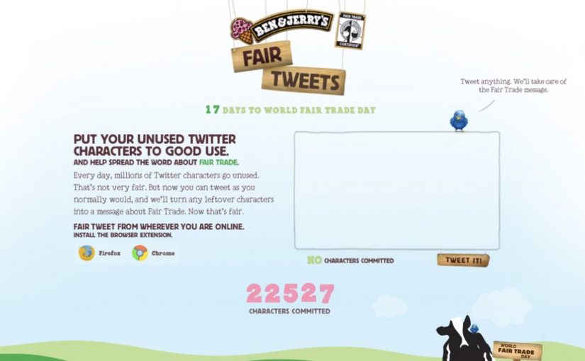
How can an ice cream maker use social media to help provide farmers a fair income across the globe. Ben & Jerry’s positions itself as a Fairtrade-first mover in ice cream, then takes on the challenge with a deceptively simple Twitter utility called Fair Tweets.

The idea is to let followers donate their unused tweet space to the cause. “Unused social media space” here means the leftover characters inside a tweet that does not hit the then-standard 140 character limit. Fair Tweets fills those remaining characters with an advocacy message that promotes World Fair Trade Day (May 14) and Fair Trade issues more broadly.

Turning leftover characters into a donation mechanic

The mechanism is a lightweight interface that behaves like a plug-in for your behavior. You tweet as normal. The system automatically appends a Fair Trade message into the empty character space you did not use. It is a small “opt-in constraint” that converts millions of tiny, personal broadcasts into consistent campaign impressions. By “opt-in constraint,” I mean a voluntary limit the user accepts, so the campaign can add a message without hijacking their voice.

In global consumer brands with always-on social channels, this pattern scales because it turns everyday posting into distributed, opt-in media inventory.

The real question is whether you can piggyback on an existing habit without hijacking what people meant to say.

In brand-led cause marketing, the fastest way to earn participation is to reduce effort to one familiar action inside a channel people already use daily.

Why it lands

It does not ask people to change who they are on Twitter. It asks them to keep tweeting, while quietly upgrading the payload. This pattern is worth copying only when the appended message stays clearly secondary to the user’s own voice. The constraint is the hook. It makes the act feel clever rather than preachy, and it turns participation into a visible badge that friends can copy in seconds.

Extractable takeaway: If you want a cause message to spread without feeling like an ad, attach it to a behavior users already repeat, then “tax” only the slack in that behavior. The slack is where adoption hides.

What to steal for your next social utility

  • Exploit a real constraint. The character limit is not a creative brief. It is a platform rule that makes the idea instantly understandable.
  • Make the value exchange obvious. Users give you what they were going to waste anyway, then they get an identity signal for supporting the cause.
  • Keep the activation single-step. One click, one tweet, done. Every additional step kills the multiplier.
  • Design for imitation. The best proof is not a campaign site. It is seeing friends do it in-feed.

A few fast answers before you act

What is the Fair Tweets idea in one line?

It automatically fills the unused characters in a tweet with a Fair Trade message, so normal tweeting becomes lightweight cause promotion.

Why does “unused characters” work as a donation model?

Because it feels free. Users are not giving money or time. They are donating spare capacity inside something they were already doing.

What makes this approach different from a hashtag campaign?

A hashtag asks users to change their message. Fair Tweets rides along with any message, which increases participation without forcing people into campaign language.

What is the biggest risk when brands copy this pattern?

Over-automation. If the appended message feels spammy, repetitive, or hijacks the user’s voice, people will stop using it and may resent the brand.

How do you write the appended message so it feels shareable?

Keep it short, clearly optional, and visibly additive to the user’s tweet. If it reads like a branded footer or repeats too aggressively, it stops feeling like a badge and starts feeling like spam.

Nissan: Create Your Terrain

Nissan: Create Your Terrain

You hold your hands up to the webcam, and the landscape changes. Peaks rise, valleys drop, and a Nissan SUV gets challenged to drive across whatever terrain you just “sculpted” in mid-air. It takes an off-roading mindset and translates it into a simple piece of viewer control. Here, viewer control means your gestures directly shape the terrain in real time. Build a route. See if the car can handle it.

That is the core idea behind Nissan’s “Create Your Terrain,” built by TBWA\RAAD to help launch Nissan’s SUV family in the Middle East. Instead of showing capability with another glossy montage, it invites off-roaders to invent the terrain first, then watch the vehicle conquer it.

Create Your Terrain uses webcam detection as the input method. In plain terms, the camera reads your gestures and turns them into a terrain editor, so you can shape dunes and obstacles without a mouse or controller.

In automotive marketing, the strongest digital launches turn enthusiast culture into an interaction loop, not a viewing moment.

The microsite (www.createyourterrain.com) was reported to have attracted thousands of user-made terrains, adding up to more than 80,000 square kilometres of created landscape. The build is also credited with recognition at Dubai Lynx 2011 (Bronze, Microsites & Websites) and a GEMAS Effies 2011 finalist placement (Automotive), which fits the ambition. Make the product story feel earned through play, not told through claims.

Why this mechanic fits off-roading

Off-roading is personal. Everyone has their own “perfect line,” their own idea of what counts as a challenge, and their own pride in tackling terrain others avoid. This activation borrows that psychology. The viewer creates the course, so the payoff feels like their test. Nissan just shows up to pass it.

Extractable takeaway: When you let enthusiasts define the test, the brand’s proof point feels like a response to their standards, not a claim the brand asks them to accept.

What Nissan is really buying with “Create Your Terrain”

This is not only a tech demo. The real question is whether your mechanic makes the capability story feel earned, not asserted. It is a positioning move. The message is that Nissan’s SUVs can handle anything, including terrain you have never seen before. And because the experience is interactive, it naturally increases dwell time, encourages sharing, and gives people a reason to return and try a “harder” build.

What to borrow for your own interactive launch

  • Let the audience create the challenge. Self-made tests feel more authentic than brand-made obstacles.
  • Use input that matches the story. Gestures and a webcam make “hands-on terrain” feel physical, not like another web game.
  • Keep the loop tight. Create. Challenge. Watch. Repeat. The shortest loop is the one people replay.
  • Design for bragging rights. The shareable unit is not the ad. It is “my terrain” and “my result.”

A few fast answers before you act

What is “Create Your Terrain” in one sentence?

It is an interactive Nissan microsite where webcam-based gestures let viewers build a digital off-road landscape and then challenge a Nissan SUV to drive across it.

Why does viewer-created terrain matter?

Because it flips the usual launch pattern. Instead of the brand defining the challenge, the audience defines it. That increases personal investment and makes the capability story feel more credible.

What does “webcam detection” mean here?

It means the experience uses the camera feed to interpret basic gestures as inputs, turning the viewer’s hands into a simple controller for shaping the terrain.

What is the key takeaway for digital campaign design?

Build an interaction loop that mirrors real-world behaviour. When the mechanic matches the passion, like building and conquering terrain here, people stay longer, replay more, and share more naturally.

What is a common failure mode for experiences like this?

Overcomplicating the first minute. If setup is fiddly, calibration is fragile, or the payoff is slow, people bounce before the “magic” lands.

Mercedes-Benz Interactive Print Ad

Mercedes-Benz Interactive Print Ad

The interactive print ad mania continues. After RWB and Axa, we have Mercedes Benz joining in with their ad for the new Mercedes CL63 AMG. Here, “interactive print” means a printed ad that triggers a second action beyond the page itself.

Why “interactive print” keeps showing up

Print is fighting for attention against screens, so the stronger responses are the ones that make print behave a little more like digital. That works because the page stops acting like a finished message and starts acting like a trigger, which gives people a reason to continue.

Extractable takeaway: Interactive print works when the page creates one obvious next step that makes the brand promise feel more vivid, not when it adds novelty without payoff.

In brand marketing, this matters because print only earns another look when it turns attention into a deliberate next step.

What Mercedes-Benz is trying to do

The real question is not whether print can be made interactive, but whether the interaction makes the brand feel more immediate and memorable.

Interactive print is only worth doing when the mechanic sharpens the brand idea rather than distracting from it.

For Mercedes-Benz, the business intent is to make the CL63 AMG feel more active, premium, and attention-worthy by turning a static print placement into a more engaging brand encounter.

The useful takeaway for brands

  • Give print a job. Not just to inform, but to activate.
  • Keep the interaction obvious. If the mechanic needs explanation, it dies on the page.
  • Let the reveal earn the attention. The payoff should justify the extra step.

A few fast answers before you act

What is this Mercedes-Benz post pointing to?

It points to Mercedes-Benz joining the interactive print wave with an execution for the Mercedes CL63 AMG.

What were the earlier references in this interactive print trend?

Earlier examples referenced here include the RWB execution and an AXA-related print activation.

What is the core mechanic of interactive print ads?

The print ad becomes a trigger that invites a second step, so the experience continues beyond the page.

Why does the format matter in 2011?

It helps print compete by creating engagement rather than relying on a static message alone.

What should brands learn from this format?

Brands should use interactivity only when it makes the printed asset more useful, more memorable, or more aligned to the brand idea.