EOS Magazine: Talking Tree

EOS Magazine: Talking Tree

Everybody has an opinion on Nature. But what about Nature’s opinion. EOS Magazine decides to give Nature the means to talk, by turning a single tree into a live publisher of its own conditions.

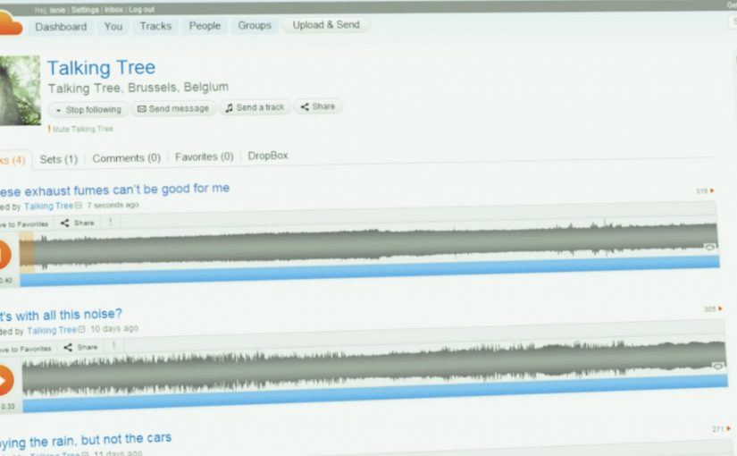
A 100-year-old tree on the edge of Brussels is hooked up to a fine dust meter, ozone meter, light meter, weather station, webcam, and microphone. This equipment constantly measures the tree’s living circumstances and translates the signals into human language. Then the tree lets the world know how it feels.

From sensors to sentences

The mechanic is a simple chain that stays readable. Capture the environment in real time. Translate measurements into plain-language statements. Publish those statements where people already spend time, so “air quality” and “noise” stop being abstract and start sounding like mood.

In European environmental communication, translating invisible conditions into a relatable voice is a practical way to turn passive concern into everyday awareness.

Why giving Nature a voice changes the reaction

It reframes data as empathy. People do not debate particulate matter in casual conversation, but they do respond to a living thing saying it feels dizzy, stressed, or relieved. The tree becomes a social character, which makes the topic shareable without needing a lecture.

Extractable takeaway: If your message is driven by measurements, do not lead with the measurements. Lead with a human-readable translation that carries emotion, then let the data sit underneath as credibility.

What EOS is really building here

This is not just a one-off film. It is a living channel. The tree becomes a continuous stream of micro-updates that can be followed, quoted, and revisited, which gives the idea longevity beyond a single media burst. The real question is not whether the sensors are impressive, but whether the translated voice is strong enough to make environmental data socially relevant every day.

What to steal for your own sustainability storytelling

  • Pick one “spokes-object”. A single, specific entity makes a broad topic easier to care about.
  • Translate, do not dump. Make the system output statements people can repeat in their own words.
  • Make it continuous. A live feed builds habit and credibility faster than a single campaign headline.
  • Keep the voice consistent. The tone should feel stable, or the project reads like a gimmick.

A few fast answers before you act

What is the core idea of Talking Tree?

A sensor-equipped tree that translates environmental conditions into human language and publishes how Nature “feels” through social media-style updates.

Why does anthropomorphizing data work here?

Because it creates an emotional entry point. People respond to a character and a voice faster than they respond to metrics.

What is the key design decision behind the experience?

The translation layer. The project succeeds or fails on whether the outputs feel meaningful and readable, not on how many sensors are installed.

How do you measure success for a concept like this?

Ongoing engagement and repeat visits, plus evidence that the phrasing spreads into conversations, shares, and press pickup beyond the campaign’s owned channels.

Why does the idea need to stay live, not static?

Because continuity is part of the persuasion. Repeated updates turn the project from a one-time awareness stunt into a channel people can return to and reference over time.

UNIQLO: Lucky Machine Social Pinball Launch

UNIQLO: Lucky Machine Social Pinball Launch

Here is another cool digital campaign from UNIQLO, this time they are promoting the launch of their new UK store via an online pinball machine (built in Papervision) that is socially connected.

You start with a single ball, but on connecting with Facebook you get a bonus 3 to help you climb the leader board for a share of thousands in prizes.

UNIQLO are well known for their digital campaigns and this once again hits the mark, providing a seriously simple pinball machine that feels so easy to master that you’ll be there, racking up some great brand engagement time over the campaign.

Why a simple game is a strong store-launch mechanic

A new store opening is a local moment. A game turns it into a repeated behavior. If the experience is light, fast, and replayable, it can generate more total attention than a one-off announcement.

Extractable takeaway: For store launches, a lightweight replay loop can compound attention over days, not just spike it once.

  • Instant entry. You can play immediately without committing time to learn.
  • Built-in replay loop. “One more try” is the whole point of pinball.
  • Competition creates stickiness. Leaderboards turn casual play into a goal.

Social connection as a value exchange

The Facebook connection is not framed as “follow us”. It is framed as a direct advantage in the game. Extra balls. Better odds of climbing the leaderboard. A clearer path to prizes. Here, the value exchange is simple: you trade a Facebook connection for immediate in-game advantage.

That is the important shift. Social is not an add-on. It is a gameplay benefit, which makes the opt-in feel earned rather than demanded.

The real question is whether your “social” step feels like friction, or like a fair trade that makes the experience better.

What this teaches about gamification done properly

  1. Keep the mechanic obvious. If people do not understand how to win, they leave.
  2. Reward the right action. Extra balls is a reward that directly improves the experience.
  3. Make progress visible. Leaderboards and scores give people a reason to return.
  4. Make prizes feel real. A “share of thousands” is a tangible incentive that fits the competitive loop.

In retail launch marketing, a simple replay loop can outperform a big announcement because it turns curiosity into time spent.

What to take from this if you run retail or digital campaigns

  1. Design for time spent, not just reach. A replayable game builds engagement minutes, not impressions.
  2. Use social as a functional advantage. Tie opt-ins to benefits users actually value.
  3. Let the format do the messaging. A campaign that is fun is a campaign people return to voluntarily.
  4. Keep the barrier to entry close to zero. The simpler the first 10 seconds, the better the retention.

A few fast answers before you act

What is UNIQLO “Lucky Machine”?

It is a socially connected online pinball game built to promote the launch of a new UNIQLO UK store, with leaderboards and prizes.

How does Facebook connection change the experience?

Connecting with Facebook gives players a bonus three balls, improving their chances to climb the leaderboard and compete for prizes.

Why is pinball a good format for engagement?

It is quick to start, easy to replay, and naturally encourages “one more try”, which increases time spent with the brand.

What is the main growth mechanic?

A simple value exchange. Social connection provides a direct gameplay advantage, which drives opt-ins without heavy persuasion.

What is the transferable lesson for campaign design?

If you want engagement time, choose a format that is inherently replayable, then attach social behaviors to real user benefits.

Technology in 2014

Technology in 2014

A 2014 screen daydream from The Astonishing Tribe

This is essentially an experience video by Swedish interface gurus The Astonishing Tribe, envisioning the future of screen technology with stretchable screens, transparent screens and e-ink displays, to name a few. An experience video is a short concept film that prototypes interface behavior and user flows before the underlying hardware is ready for the market. E-ink is a reflective display technology designed for readability and low power use.

How the film turns “new screens” into real interactions

Instead of listing specs, the video uses everyday moments to make the screen itself feel like a material you can bend, place, and share. The point is not the exact device. The point is the interaction model that becomes possible when the display is flexible, see-through, or paper-like. That works because a familiar human moment makes an unfamiliar screen feel usable, not speculative.

In consumer electronics and enterprise device ecosystems, display form factors shape interaction patterns, content formats, and the business models built on top of them.

The real question is which interaction model you want your screens to enable before you commit to devices, layouts, and content formats.

Concept experience videos are still one of the fastest ways to align teams on interaction shifts before the hardware is ready.

Why “stretchable, transparent, e-ink” is a strong provocation

Stretchable screens challenge the idea that UI must live inside rigid rectangles. Transparent screens challenge the idea that a screen must block the physical world. E-ink displays challenge the assumption that every screen is emissive, high-refresh, and power-hungry.

Extractable takeaway: Pick one screen assumption to break (rigid, opaque, emissive) and demonstrate the behaviors that follow.

Steal these moves for your next interface pitch

  • Show behaviors, not features. Demonstrate how people move, share, and switch context when the screen stops behaving like a slab.
  • Prototype the handoffs. The “wow” is usually in the transitions, not the destination screen.
  • Use one material shift as the story engine. Flexible, transparent, or reflective. Pick one and build a coherent set of moments around it.
  • Make it boring on purpose. Ground the future in ordinary work, home, and commuting situations so the audience focuses on usability.

A few fast answers before you act

What is “Technology in 2014” about?

It is a concept experience video that imagines how screens could evolve by the year 2014. The focus is on new display form factors and the interactions they enable.

Which display ideas does it highlight?

The video spotlights stretchable screens, transparent screens, and e-ink displays. Those three examples are used to suggest different ways UI could live in the physical world.

What should marketers or product teams take from it?

Use concept films to communicate interaction shifts early, when prototypes are still rough. Anchor the story in everyday scenarios so the intended behavior is unmistakable.

How do you apply the idea without future hardware?

Focus on the interaction principles: continuity across surfaces, simple sharing moments, and readable, low-friction information layers. You can prototype those behaviors with today’s devices and materials.

What’s the biggest pitfall when making this kind of video?

Over-indexing on visual spectacle and under-explaining the user flow. If viewers cannot repeat the “how it works” in one sentence, the concept will not travel inside an organization.