3D projection mapping on a Toyota Auris

Instead of projecting onto a building, Glue Isobar projects a CG car directly onto a real Toyota Auris Hybrid. Here, projection mapping means aligning animated visuals to the contours of a physical object so the imagery appears built into the car itself. With seven projectors working together, the result is a true 3D, 360-degree projection mapping experience on all sides of the car. You can walk around it and experience the visuals from any angle.

What makes this projection mapping different

The twist is the surface. A real car brings complex curves, edges, and reflections. Mapping to that shape, and keeping the illusion consistent as people move around it, is the challenge that makes this feel genuinely new.

How the experience is delivered

The work uses a mix of keyframe, 2D, 3D, algorithmic, and dynamic animation to deliver the experience. The projection setup supports a 360-degree view, which is why the story holds up from multiple angles instead of depending on a single “best seat”.

In live auto launches and showroom-style reveals, this matters because the product demo and the spectacle happen in the same physical moment.

Why this lands as a launch moment

This format turns a product reveal into a live event. It gives people a reason to stop, watch, walk around, and talk. The real question is not whether the projection looks advanced, but whether the launch makes the car feel worth approaching, discussing, and remembering. The business job of a launch moment is not passive viewing but active attention that carries into conversation and recall. This is stronger than a static display because it turns the car itself into the source of attention.

Extractable takeaway: When the product becomes the performance surface, the launch works harder because the spectacle and the proof of product presence happen in the same place.

What to steal for live product reveals

  • Make the product the canvas. When the object carries the story, the experience feels specific and harder to copy.
  • Design for movement in the crowd. A 360-degree setup keeps the illusion intact even when people walk around and viewpoints change.
  • Use complexity where it creates visible payoff. Multiple projectors are justified when they unlock surfaces and angles a single beam cannot cover.
  • Treat it as a performance, not a display. The reveal works best when the product appears to “do something”, not just sit there.

A few fast answers before you act

What is 3D projection mapping in this example?

It is the technique of projecting animated visuals onto a physical object, aligned to its shape so the imagery appears to belong to the object rather than a flat screen.

Why use seven projectors?

To cover the full vehicle and maintain the illusion across multiple surfaces, including areas you can only see when walking around the car.

Why project onto the car instead of a separate screen?

Because the effect feels more product-specific. The visuals appear attached to the vehicle, which makes the reveal more memorable than showing the same animation beside it.

What makes “360-degree” important for live audiences?

People do not stand in one spot. If the experience works from many angles, it feels real in a public space and stays compelling as crowds move.

What is the main lesson for product launches?

Make the product the stage. When the object itself becomes the canvas, the experience feels specific, memorable, and inherently shareable.
Mitsubishi: Test Drive From Your Browser

The future of test driving a car is here. 180/Los Angeles has hooked up the Mitsubishi Outlander Sport to a unique system allowing people to test drive it through their browser.

The interactive element, with the claim from the agency that it is the world’s first online test drive, is the first in a series of launch components in an integrated campaign that is running through January.

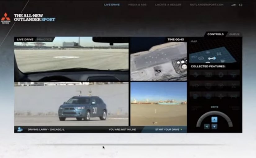
Working with production company B-Reel, 180 and Mitsubishi have developed a remote control system that will allow prospective buyers to take the Outlander Sport for a drive on a closed course, over the web.

Multiple cameras, in-car servos and GPS mapping, with the help of a robotics engineer, will keep the Outlander Sport on-course and responsive to online drivers’ commands.

Starting October 15th you can sign up (US residents only) for the test drive at www.outlandersport.com.

How the remote test drive is staged

The mechanism is a tight loop between live video and machine control. You watch the car from multiple camera angles. Your browser inputs translate into steering and pedal actions via servos. GPS mapping and safety logic keep the vehicle constrained to a closed course while still feeling responsive.

In automotive launches, reducing “dealership friction”, the time, travel, and commitment people associate with a showroom visit, is a reliable way to move people from curiosity to consideration.

Why it lands

This works because it reframes a test drive as an event. It is not only “learn about the car”. It is “drive it now” from wherever you are. That live control loop matters because the moment people see the car respond to their own inputs, the demo stops feeling like content and starts feeling like proof. The closed-course constraint does not weaken the idea. It actually signals seriousness, safety, and engineering intent.

Extractable takeaway: If you can let people control a real-world object remotely, even within strict guardrails, you turn a product demo into a personal story. That story is easier to share and harder to forget than a standard video.

What the campaign is really selling

Beyond features, this sells confidence in the brand’s relationship with technology. The real question is whether the launch gives people a reason to move from passive viewing to active participation. It also creates a strong reason to register and show up at a specific time. That turns passive awareness into an active lead moment without forcing an immediate dealership visit.

Steal this pattern

  • Make the product controllable: remote control, configurators, live demos. Anything that turns viewers into participants.
  • Use guardrails, not free-for-all: closed courses and constraints can increase trust and reduce risk while keeping the thrill.
  • Design for “I have to try this”: the premise should be understandable in one sentence and irresistible in the next.
  • Pair novelty with capture: registration and scheduling turn a stunt into measurable demand.
  • Ship proof, not promises: let the mechanism do the persuasion instead of piling on claims.

A few fast answers before you act

What is the “test drive from your browser” concept?

It is a remote driving experience where a real Mitsubishi Outlander Sport is driven on a closed course while participants control it over the web and watch via multiple cameras.

How does it stay safe and on-course?

The setup combines in-car servos, GPS mapping, and production controls that keep the vehicle constrained to a defined route while still responding to user commands.

Why do this instead of a normal video or configurator?

Because control changes attention. A controllable demo creates involvement, and involvement creates memory and sharing.

Is “world’s first online test drive” the important part?

It is the headline hook. The transferable value is the format: a real product experience delivered remotely with live feedback.

What is the main marketing benefit?

It turns awareness into action. People register, show up, and participate. That makes the launch measurable and builds intent without requiring an immediate dealership visit.

Fits.me: Virtual Fitting Room

One of the main problems with buying clothes online is simple. You cannot feel the fit. So you guess, the parcel arrives, and the return loop starts again.

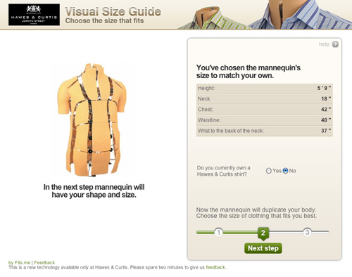
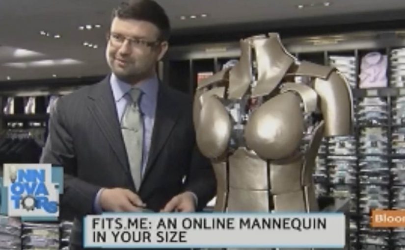
Fits.me, an Estonian company, builds a Virtual Fitting Room around a shape-shifting robotic mannequin. Instead of trying to “predict” fit with a size chart, the mannequin physically changes form to match your body dimensions, letting you preview how different sizes sit on a body shaped like yours.

A mannequin that changes shape so the garment can do the explaining

The mechanism is a robotic mannequin, often referred to as a FitBot, a shape-adjustable mannequin that can be tuned across a wide range of body measurements. Clothing is photographed on the mannequin in multiple sizes, and the shopper can compare how the same item behaves as size changes, on a body that resembles their own. Because the garment is shown on the same body shape across sizes, the comparison makes fit differences visible and reduces guesswork.

A robotic mannequin providing a Visual Size Guide.

In online apparel retail, fit uncertainty drives returns and suppresses conversion, so anything that reduces sizing doubt tends to outperform its surface-level novelty.

Why this approach feels more “real” than a size chart

What makes it persuasive is that it turns sizing into a visual comparison instead of a number. The real question is whether you can help a shopper see the trade-offs between sizes before checkout, without asking them to trust a black-box recommendation. If you have that problem, this is the right pattern to use. You are not being told “you are a Medium.” You are shown what Small, Medium, and Large look like on a similar shape, which is closer to the in-store decision process.

Extractable takeaway: When a purchase decision depends on a physical sensation you cannot deliver online, replace the missing sensation with a repeatable visual proof that helps shoppers compare options, not just read recommendations.

What the rollout says about where the pain is

At the time, the system is positioned around a male mannequin first, with Fits.me saying it is planning to unveil a female version in November. That sequencing is a reminder that “who we can fit well” is often a product constraint, not a marketing choice, especially when the technology depends on physical ranges and repeatable photography.

For more information visit www.fits.me.

What to steal from Fits.me’s FitBot

  • Make fit a comparison, not a verdict. Let shoppers see multiple sizes side by side on a body-like reference instead of outputting a single “recommended” size.
  • Design for confidence, then measure it. Track size changes after viewing, conversion on fitted items, and return-rate shifts by category.
  • Respect constraint sequencing. If the system only fits certain body ranges well at first, be explicit about where it is reliable and expand the range as the asset library grows.

A few fast answers before you act

What is a “Virtual Fitting Room” in this Fits.me context?

It is a system that uses a shape-adjustable robotic mannequin to model how garments look across sizes on a body shaped to match the shopper’s measurements, so shoppers can compare fit visually before buying.

Why does this reduce returns in theory?

Because it reduces guesswork. When shoppers can see how different sizes drape and sit, they are less likely to buy multiple sizes “just in case,” and less likely to be surprised when the item arrives.

What is the key difference versus typical size charts or recommendation widgets?

This approach is comparison-first. It shows a garment on a body-like reference across multiple sizes, rather than outputting a single recommended size and asking the shopper to trust it.

When does a visual fit tool like this not help much?

It helps most with size uncertainty, but it cannot fully replace tactile judgments like fabric feel or personal comfort preferences, so some returns will still be driven by “feel” rather than fit.

What should retailers measure if they deploy something like this?

Engagement with the fitting experience, size-selection changes after viewing, conversion lift on fitted products, and return-rate reduction by category and by first-time versus repeat shoppers.